5 Design Principles of Improving your Presentation Style
Just because even the most inexperienced designers can now create their own graphic designs online doesn’t mean your own created design has to look equally unprofessional. Many make the mistake of thinking that presentation style is all about getting creative and has little to do with communicating a message effectively. When in fact, visual design shouldn’t just be limited to looks but must also consider the style in which information is presented.
For a more effective way to get your message across, here are 5 basic design principles that will help improve your presentation style.
Proximity
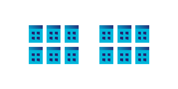
Proximity is a basic yet powerful design fundamental for grouping related elements together so they become one visual unit rather than several specific ones.
Purpose: rather than simply giving your viewers a linear arrangement of elements, proximity is like trying to organize your files in the same way a librarian would classify books according to the Dewey Decimal System. It serves as a guide to your viewers to the different parts of your message. Hence, by applying proximity, you are adding unity and continuity to your page. And proximity is not just relevant for texts but for all your design elements.
Here’s an example of how proximity is applied in a deck:
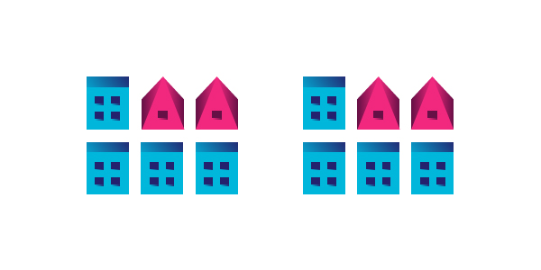
Alignment/h2>
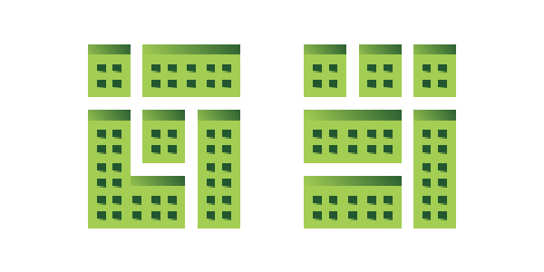
This is another crucial design principle to bring about a visual and readable design arrangement. Considering alignment is being conscious of where you place elements.
Purpose: Like proximity, proper alignment creates a sense of unity and cohesion to keep your design balanced and presentation style proper. Even if separate elements don’t appear physically close on a page and seem chaotic, aligning these can make them appear connected, related and unified with the rest of the information simply by their placement.
Below is a good example:
Repetition
Also known as consistency, repetition is about repeating elements in a graphic design to add visual appeal and emphasize the style you want to keep in your presentation.
Purpose: Aside from aesthetics purposes, consistency draws your readers’ attention to certain elements. Creating repetition enhances your design and the clarity of information. When used correctly, repetition allows your viewers to efficiently transfer knowledge to new contexts, learn new things faster and focus their attention on the relevant aspects of a task without being obtrusive.
Here’s one example of a design that makes good use of repetition:
Contrast
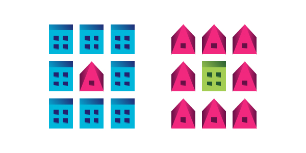
What happens when you have two very different elements? This is where you apply contrast to your advantage. Contrast is when you juxtapose dissimilar elements in presentation style.
Purpose: contrast between design elements makes a presentation stand out and get noticed. It grabs your audience’s attention to the important parts of your presentation. Other than stirring up interest, contrast also aids in organizing information presented.
You can see below an example of how a striking contrast can make a startling difference:
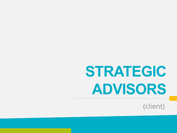
White Space

Many novices are afraid of leaving white space when designing. However, depending on the presentation and appropriateness, the use of white space can be very powerful and useful in design. The principle of white space supports the idea that less is better because it allows you to simplify and focus on the essential aspects.
Purpose: White space can make your message stand out above the clutter found in many graphic designs. It breaks down information presented to more digestible pieces to reduce cognitive overload and allows you to convey a more direct message. White space can also serve as a form of contrast.
Here’s an illustration of how you can maximize the use of white space:
These principles should all work hand in hand to make for an effective design and presentation style. For example, a well-aligned design without the proper contrast may not be as successful in getting your intended message across. Or a good alignment alone without consistency can defeat its purpose.
Which of these design principles do you apply most often and work quite well for you?
Sources: makeuseof.com , graphicdesign.stackexchange.com