5 Tips Picking the Perfect Font for Your Next Presentation!

Investing time and effort into your presentation design is a must if you want to end up with a nice, professional-looking slide deck. However, there’s one aspect of presentation design that many people forget about: Choosing your fonts! In this article, you’ll learn all the basics about typography and how to make the most of the visual aspect of the text in your presentation.
Working with fonts in PowerPoint presentations
One of the biggest challenges people face when working with presentation design is choosing a font. Fonts (technically called typefaces) are the lettering designs you can choose from. If you have ever gone through the font list of any Office software, you’ll recognize names like Times New Roman, Arial, and Comic Sans.
We tend to associate certain fonts with specific personality attributes. Serif fonts like Times New Roman and Georgia scored highest on traits like stable, practical, mature and formal. There’s also a reason why Microsoft changed their default font from Times New Roman to Cambria. Times New Roman just screams traditional.
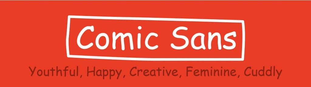
On the other hand, fonts such as Monotype Corsiva and Comic Sans scored the highest for youthful, happy, creative, feminine, casual, and cuddly. Monospaced fonts like Courier New were attributed to adjectives like dull, plain, unimaginative, and conforming.

However, this is not an exact science! Typography can be difficult to grasp because there are so many terms and definitions. This is not meant to be a complete class on typography but rather to give you a few useful pointers to work with text in your presentation slides.
That being said, learning the vocabulary and terminology can help you understand better why a specific font looks that way and what purpose they can fill the best. Canva’s illustrated typography glossary is a great resource for those looking for a more theoretical approach if you’re up for it!

By understanding how most people associate certain personalities with specific fonts, you can get the most benefits from them by selecting the most appropriate fonts for your presentations in delivering the right mood, impact, and message.
There’s not any objective rule when it comes to choosing fonts. Rather, it’s all about the feeling they evoke and the context in which they are used. It’s difficult to divide fonts since there’s not one objective consensus on how they should be divided.
Why is typography important?
Short and simple, typography is the visual aspect of written words. This includes things like the point size, the space between lines and between characters, the length of the lines, and of course, fonts (also called typefaces). These (along with many other elements) are what determine the way text is arranged and displayed. Typography will help you make sure your text looks orderly and is easily readable.
Of course, the text’s substance and meaning matter. But how your text looks can and will make an impact on your audience. The main objective of typography is to reinforce the message. Investing time and effort into the visual aspect of your text can definitely pay off and make your communication more efficient.
Of course, being a master of typography is not a matter of one day. That’s why graphic designers exist! Typography is not an exact science, and there’s not just one correct answer. Just as there is no one-size-fits-all!
Learning how to use typography is all about learning how to make the best choices for each situation. You don’t need to be an expert to improve your projects’ typography. And some basic knowledge on how to make your text display more engaging and effective can go a long way!
You might also like: How to Install Fonts in PowerPoint
How can typography affect your PowerPoint presentation?
Typography is a basic part of graphic design in fields such as advertising and web design. They need to retain their ideal audience’s attention and keep it, so they can convey their message effectively as possible. In the world of graphic design, typography is one of many tools you should take into consideration when working on a project.
And just like for advertising and web design, typography is an invaluable design asset when working on your PowerPoint presentation slides! Taking a strategic approach to typography can make your text easier to read, help you grab your audience’s attention, and even make your message more compelling. And, of course, it gives you an extra aesthetic appeal by making your presentation design look more clean and professional.
While it is true that text is not the best way to convey ideas through PowerPoint, you’ll probably still have some kind of text in your slides. Remember that when working with text on PowerPoint you want to avoid full paragraphs (and even full sentences!) as it can distract your audience from the speaker.
But precisely because text should be limited in PowerPoint slides, it’s extra important how it’s displayed. PowerPoint presentations are meant to be visual aids and complement the speaker. Thus, so must your text!
Think about it this way: You wouldn’t use an italic, highly elaborated, wedding-invitation-like font for a highway sign. Typography can help you highlight certain aspects of your presentations and give depth and sleekness to your slide design.
5 Basics Tips to Work with Fonts in your PowerPoint presentations
#1. Use a template
When in doubt, go to the professionals! Why torture yourself trying to do everything on your own? Professionally design PowerPoint templates have been prepared by designers who have way more experience and practice in working with fonts and typography. You don’t even have to use the whole template. Just open any of PowerPoint’s default themes and emulate the font combinations. You’ll be able to rest assured that you are working with typography that has been proven to work!
#2. Pick maximum 2 typefaces
If you’re new to design, better to keep things simple. A 2-font combination is more than enough for a PowerPoint presentation. The most common suggestion is to pair a serif and a sans-serif font together. This will help you create contrast between your different fonts and avoid that your text looks too flat.
#3. Create hierarchy
Now that you have your 2 fonts, you should use them to create hierarchies! Use these fonts for different types of elements. Maybe one for titles and the other one for plain text, or bullet points. Working with hierarchy can also help you give more emphasis to your presentation’s key points, and get your point across more effectively.
The bigger and bolder, the more attention your text will get. And, on the other hand, smaller elements should be easy and relaxing to read (so avoid overly decorative fonts) so you don’t lose your audience’s attention!
If you have elements that belong to the same hierarchy or category, avoid using different fonts. This is the quickest way to make your presentation design look sloppy and unprofessional.
#4. Work with contrast
The whole point of picking two fonts is that they look different. So don’t be afraid to mix things up! For example, picking serif and sand-serif pairs work precisely because this gives contrast to the different aspects of your text. You can even use different styles (like italics, or bold) within one same typeface family to highlight key elements within your presentation.
#5. Better too big than too small!
When in doubt, make it bigger! The main function of typography is to improve legibility and readability. Picking a beautiful font is no use if your audience can’t understand it or read it. If you have the opportunity, go as far as the exposition room allows and try to read your slides from all the way back. Can you read it easily? Does it look too cramped? Improving your typography skills is a bit of a trial-and-error process, but it’s the only way you’re going to truly know is your text design works.
Get professional help for your PowerPoint fonts
Finally, the best option out there to improve not only your presentations typography but your whole presentation design is to call in for the professionals! PowerPoint slide design is no easy task, especially if you want one that looks truly good. PowerPoint is an amazingly intuitive and friendly tool, but getting results takes practice, time, and effort.
The best way to make the most out of the amazing tool that is PowerPoint and to save time and money is to hire a professional presentation designer! It’s no wonder that so many businesses nowadays are opting for outsourcing their presentations to design houses. You only have to sit back and relax, and you can rest assured that the final result will be way better than anything you could have done on your own!
24Slides offers a 24-hour turnaround service of professional presentation designers that work with some of the biggest companies all around the world. Our designers are committed to giving you the best possible design that will perfectly convey your message and your brand.