Fonts and You: What your Font Choice Says about Your Personality
Let’s try something fun. Which font likely brings a smile to your face: this font or this font?
If you’ve answered the first, then you’ve just validated what one psychology study found. In such study of over 500 participants, it was found that we consistently attribute personality traits to a variety of fonts.
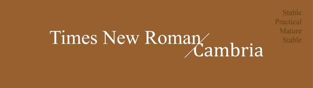
Whereas serif fonts like Times New Roman and Georgia scored highest on traits like stable, practical, mature and formal. There’s also a reason why Microsoft changed their default font from Times New Roman to Cambria. Times New Roman just screams traditional.
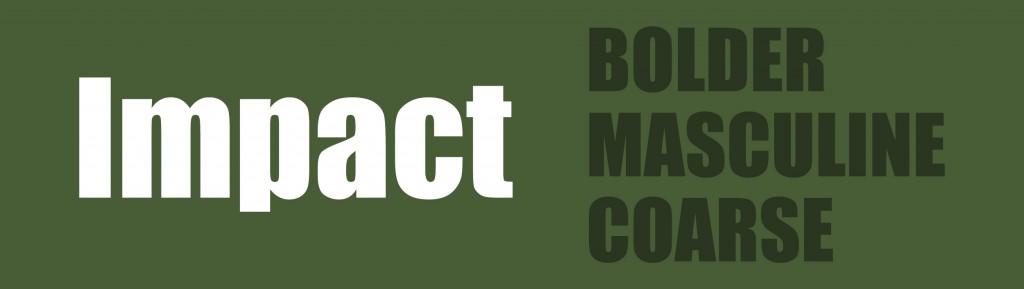
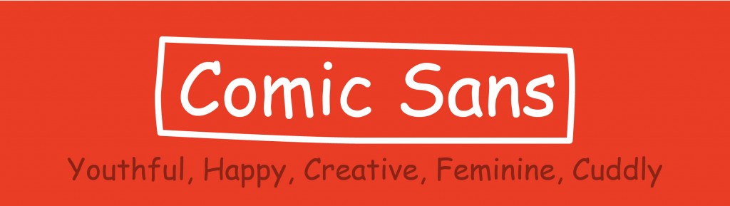
On the other hand, fonts such as Monotype Corsiva and Comic Sans scored the highest for youthful, happy, creative, feminine, casual and cuddly. Monospaced fonts like Courier New were attributed to adjectives like dull, plain, unimaginative and conforming.
Certain personality traits of specific fonts also stood out. For example, you’d rather use Monotype Corsiva to show politeness than use Arial. Georgia and Cambria scored high on practicality but you’d want to avoid Impact as you’re likely to appear rude.
On a more controversial note is the study of handwriting which believes how you use these fonts reflects your OWN personality.
For example, using large fonts or ALL CAPS signifies a more outgoing personality. Or how small fonts or small spacing can suggest a shy, more introverted personality.
Swirling fonts like the Monotype reflect creativity and a sense of releasing. Whereas using Arial may negatively demonstrate an insecure and clingy personality. Courier New on the other hand stereotypes you to belong in the film or writing industry. Consistently selecting Franklin Gothic as a font choice makes you look classy and trustworthy.
Of course, these theories have always been debatable and subject to a lot of factors.
But what does this mean for you?
Because we tend to associate certain fonts with specific personality attributes, this can also affect what fonts you use for different purposes and materials.
For example, I would use Monotype Corsiva for greeting cards but definitely not for business documents where fonts like Cambria is more expected. Likewise, using Comic Sans in children’s books makes it more appealing to kids but not when you use Calibri which is more appropriate for website texts.
This can also affect your own branding. The type of fonts you use for instance in all your logos can determine whether your brand targets the youth or adults. Or even whether your product is sophisticated, elegant or more for the budget conscious.
By understanding how most people associate certain personalities with specific fonts, you can get the most benefits from them by selecting the most appropriate fonts for your presentations in delivering the right mood, impact and message.
Already chosen the right fonts for your presentation? Here’s how to save and embed them correctly:

by 24slides.
What other fonts reflect a certain personality type for you? Let us know through your comments below.
You might also like: How to Install Fonts in PowerPoint