How to Make a Gantt Chart in PowerPoint (Plus Free Templates)

An essential part of project management is ensuring everyone stays organized and on the same page, with clear knowledge of who does what, when, and all the resources involved. One of the most effective tools for this purpose is the Gantt Chart.
In this easy-to-follow guide, we'll show you how to make a Gantt chart in PowerPoint. You’ll master the art of project planning in no time!

We’ll cover the following topics:
- What is a Gantt Chart?
- What is a Gantt chart used for?
- Can I do a Gantt chart on PowerPoint?
- How to Make a Gantt Chart in PowerPoint: Step-by-step
- Option 1: How to Create a Gantt Chart Using a Template in PowerPoint
- Option 2: How to Make a Gantt Chart Using the Table Function in PowerPoint
- Option 3: How to Make a Gantt Chart Using the Chart Function in PowerPoint
- How to Import a Gantt Chart in Excel to PowerPoint
- Gantt Chart in PowerPoint Template [FREE Download]
- Expert Advice: Tips and Tricks for Better Gantt Charts
What is a Gantt Chart?
The Gantt Chart is among the most common tools in project management. It is a chart that shows all of the project’s tasks on a timeline, making it easy for everyone involved to see what needs to be done and when.
Visually, the Gantt Chart has two main axes. The vertical axis shows the list of tasks, and the horizontal axis represents the timeline. This way, each task is represented by a bar, with the bar's length indicating when the task starts and finishes. Here's an example:
Each Gantt chart will look different depending on the project and team involved, but there are some components you should always include:
- Dates: Dates are the primary purpose of Gantt Charts since they serve as project schedules. Therefore, consider each task's approximate start and end dates and reflect them in the chart.
- Tasks and taskbars: If you haven't already, break down your project into smaller tasks and arrange them in the order they need to be completed. Then, represent them as taskbars according to their scheduled dates.
- Dependencies: You can make the Gantt Chart as detailed as necessary. To provide a comprehensive view, include lines that indicate task dependencies. This visually illustrates which tasks must be completed before others can begin.
- Milestones: Gantt chart milestones are significant points within your project's timeline, they show which tasks mean substantial progress.
- Vertical line markers: You can add vertical line markers to indicate your project's current status and the remaining work. This way, everyone involved knows where the project is at.
What is a Gantt chart used for?
Gantt charts are one of the most used tools in project management because they allow you to visualize key aspects clearly and practically. For example, in these charts, you can see:
- The breakdown of a project into smaller tasks
- The dates and duration of each task
- The participants involved in each task
- The way tasks are related to each other
- The project’s progression
Can I do a Gantt chart on PowerPoint?
You certainly can! Although there are many programs available for this purpose, using PowerPoint is a great choice because it's easy to use, works well with other tools, and lets you customize your charts however you want.
Continue reading to learn how to create them!
How to Make a Gantt Chart in PowerPoint: Step-by-step
Making a Gantt Chart in PowerPoint is quite simple. You can create them in four ways: using templates, the table or chart function, or importing the Chart from Excel. Let's take a look at each one of these ways:
Option 1: How to Create a Gantt Chart Using a Template in PowerPoint
Looking for a fast way to create a Gantt Chart? Easy, use a template! At 24Slides, you can choose from many PowerPoint Gantt Chart templates. And the best part is, you can download them for free!
Check out: Gantt Chart in PowerPoint Template [FREE]
Now, let’s check out the step-by-step of editing a Gantt chart in PowerPoint template:
- Sign up for free on Templates by 24Slides to access and download all templates.
- Choose the Gantt chart template that best suits your needs and download it.
- Incorporate all your content in the placeholders, and add your branding elements.
And that's it! You get a professional yet creative Gantt chart. The best part? It was easy and quick to create! Sounds like something you'd enjoy, right? We've gathered the best Gantt chart templates for you. Check them out!
Option 2: How to Make a Gantt Chart Using the Table Function in PowerPoint
Creating a Gantt Chart using the table function in PowerPoint is really easy! You only need to follow these steps:
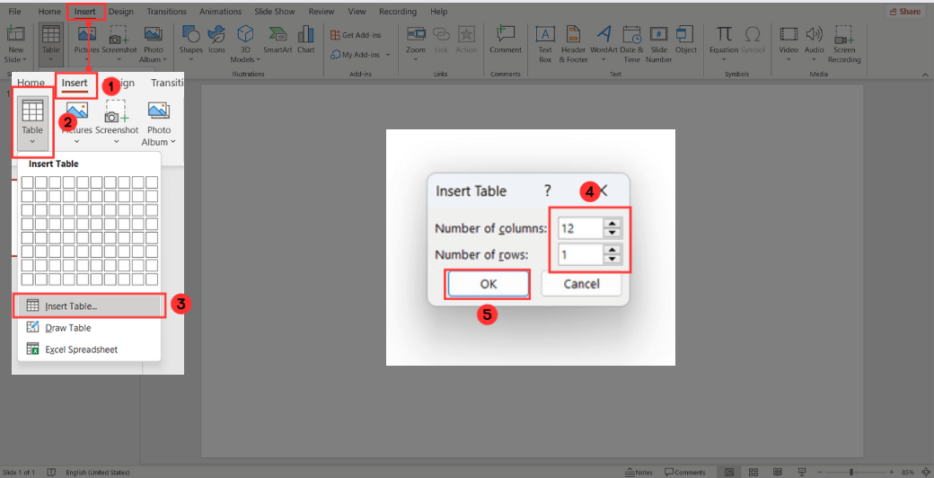
Go to the Insert Tab, click Table, and select Insert Table. When the Insert Table Window opens, set 13 columns (12 for the months and 1 for the tasks) and 1 row. Then, click Ok to insert the table.
Format the chart according to your preferences: color, border thickness, effects, etc.
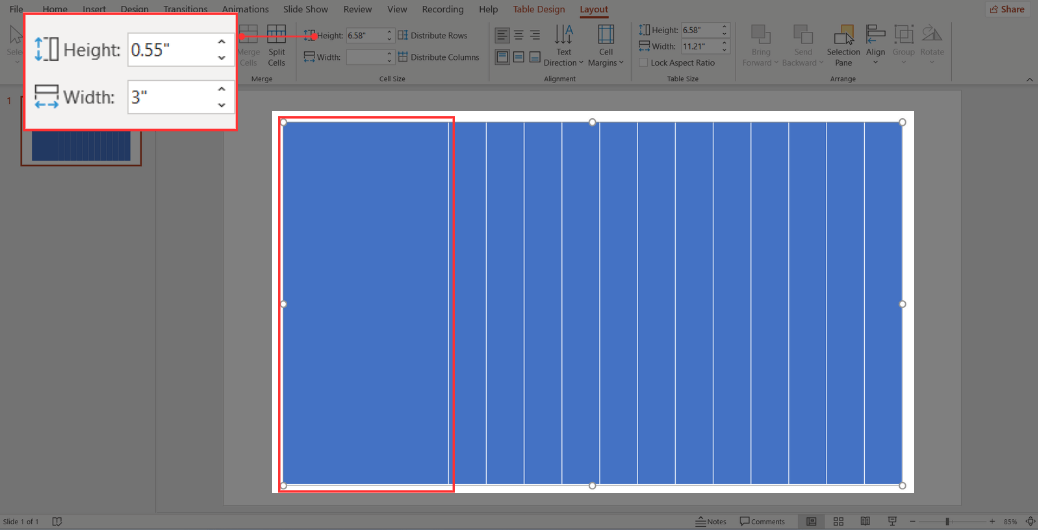
Next, select the Chart and drag the button at the bottom of the Chart downward to increase its height to fill the entire slide.
Then, adjust the width of the first column: Select the first column, go to the Layout tab, and, under Width, increase the value until it appears wide enough for your tasks.
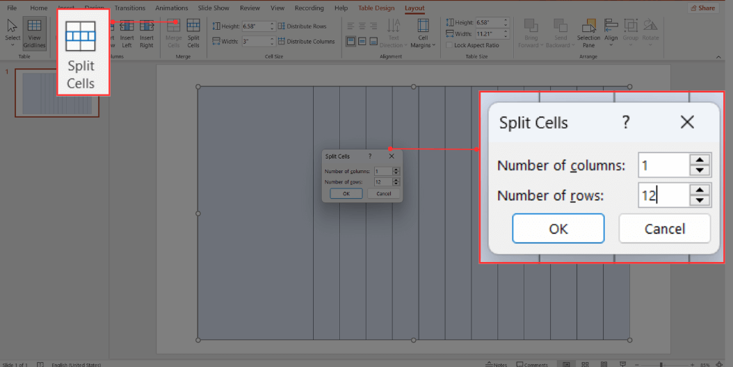
Split the first column into the number of tasks you have. To do this, go to the Layout Tab and select Split Cells. When the Split Cells Window opens, set Number of columns to "1" and Number of rows to match the number of tasks you have. Finally, click Ok.
Now, you can enter your tasks in each row and customize the font.
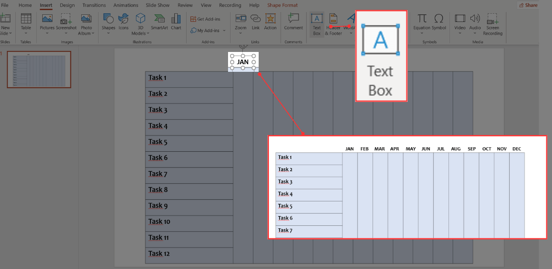
The following step is to add the months at the top of each column. To achieve this, go to Insert, choose Text Box, and type the name of the month, an abbreviation, or a letter to represent it. Adjust them to align neatly above a column.
To replicate this for the rest, you can press Ctrl+D and copy it, writing the name of the months accordingly. It should look like this:
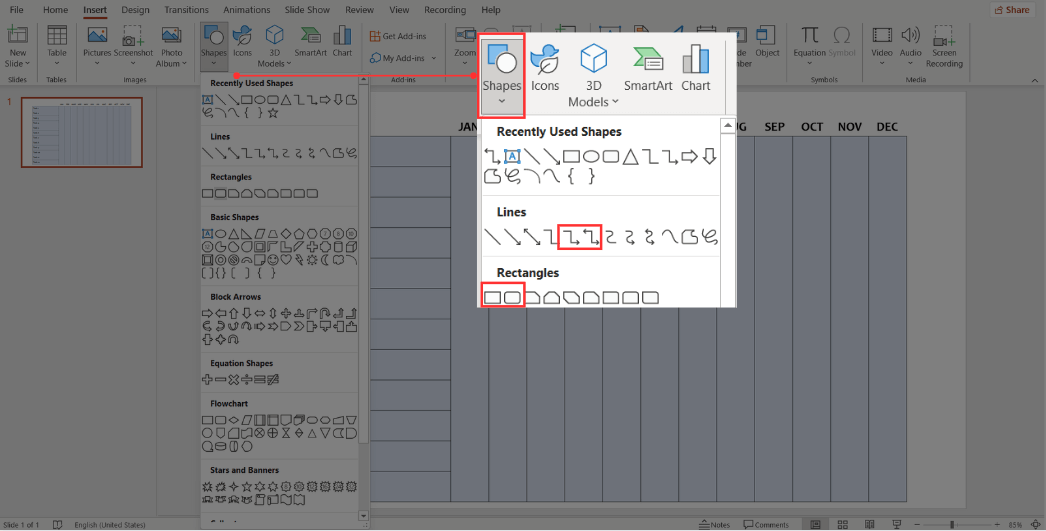
Now, it's time to add the tasks. To do this, go to Insert, Shapes, and choose a Rectangle. Place a rectangle per task based on its duration. Customize it with your preferred color and border.
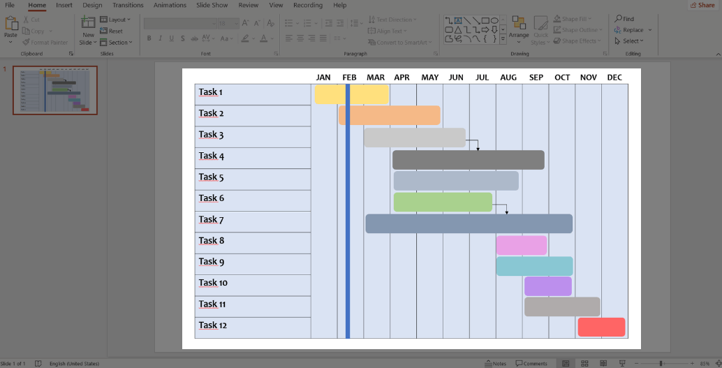
You can also incorporate dependencies between tasks. To do this, go to Insert, Shapes, select your preferred shape from Lines, and place them between activities that depend on one another.
Finally, add a vertical rectangle to indicate the project's progress. And that's it! You now have a Gantt chart created from scratch.
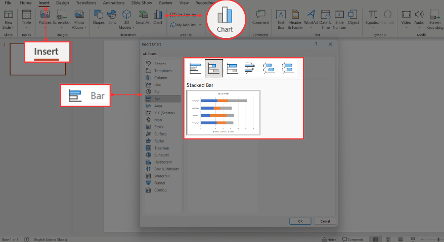
Option 3: How to Make a Gantt Chart Using the Chart Function in PowerPoint
Go to the Insert Tab and click Chart. When the Insert Chart window opens, go to Bar and select Stacked Bar.
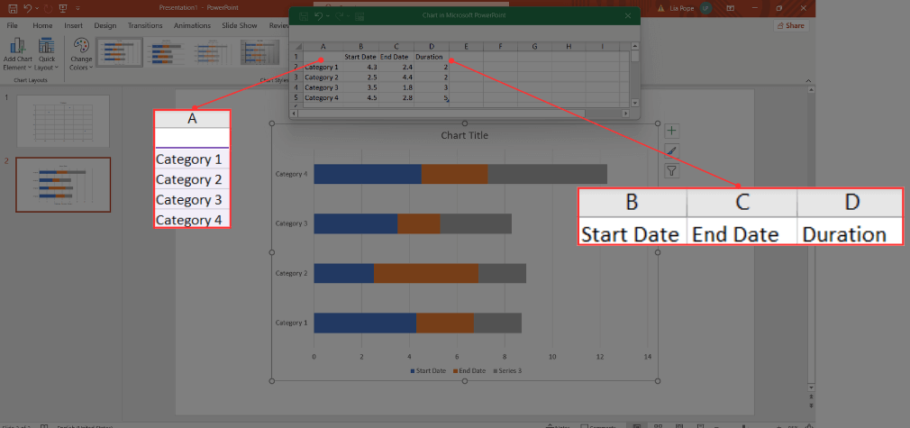
A Stacked Bar will now open in your PowerPoint slide with predetermined data. Also, an Excel window will appear, displaying the data behind the chart.
Now, replace the predefined data in the Excel window with your own. Start by entering your task descriptions in Column A. Keep in mind that they will be organized vertically on the chart, so the first task you enter will appear at the bottom, and the last one you enter will be at the top.
Next, change Column B's title to "Start Date," Column C’s to "End Date," and Column D’s to "Duration.”
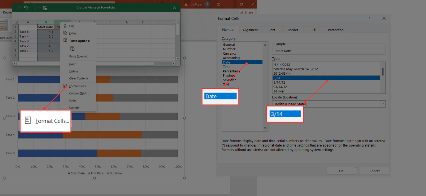
Before entering the actual dates, you need to make sure that the Excel table is in the correct format. To do this, select columns B and C, right-click, and choose Format Cells from the menu.
When the Format Cells window opens, go to Date and choose 3/14 as the Type. To save these changes, click Ok.
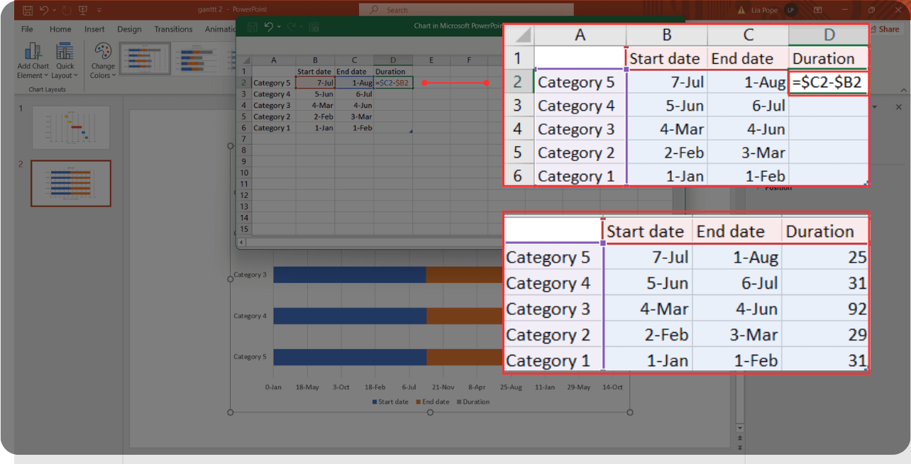
Now, insert the dates for each of your tasks. To calculate their duration, type the formula =$C2-$B2 in cell D2, or where the duration for the first task appears.
Afterward, use your mouse to go to the lower right corner. When the mouse pointer looks like a cross, click and drag so the formula applies to all tasks' duration.
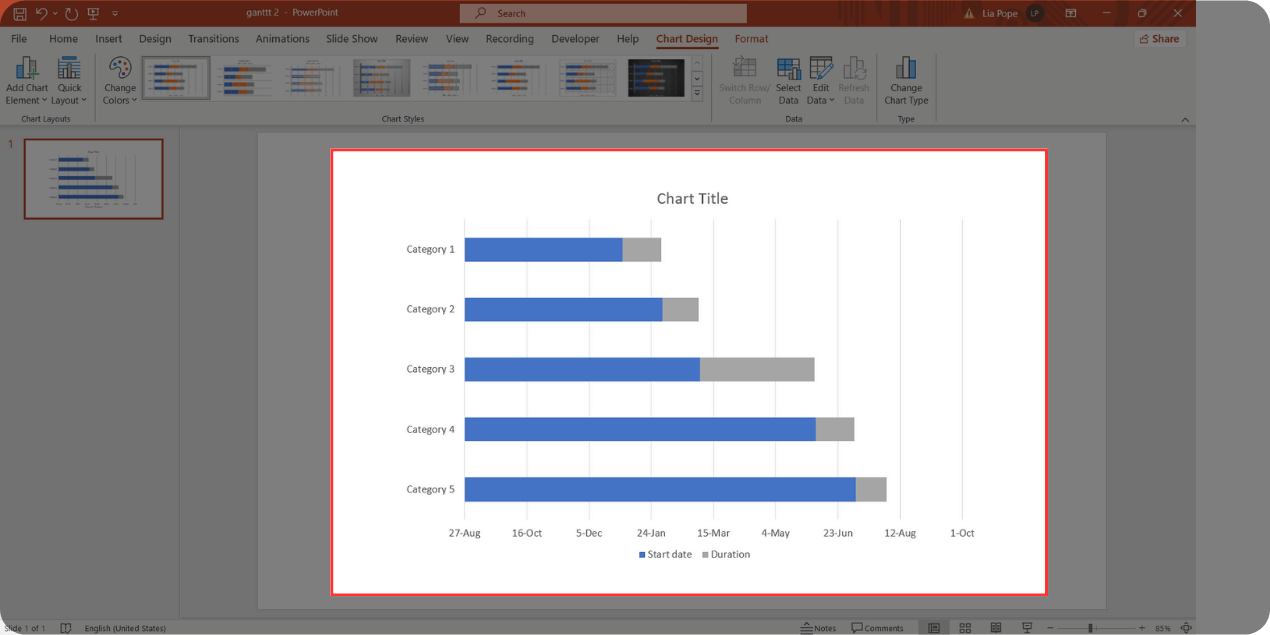
It won't look like a Gantt chart just yet, but we're getting closer. The next step is to select the chart, go to the Filter, uncheck the End date, and then click Apply.
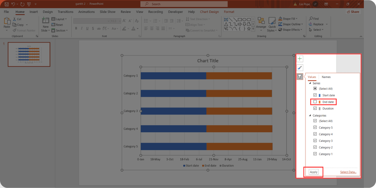
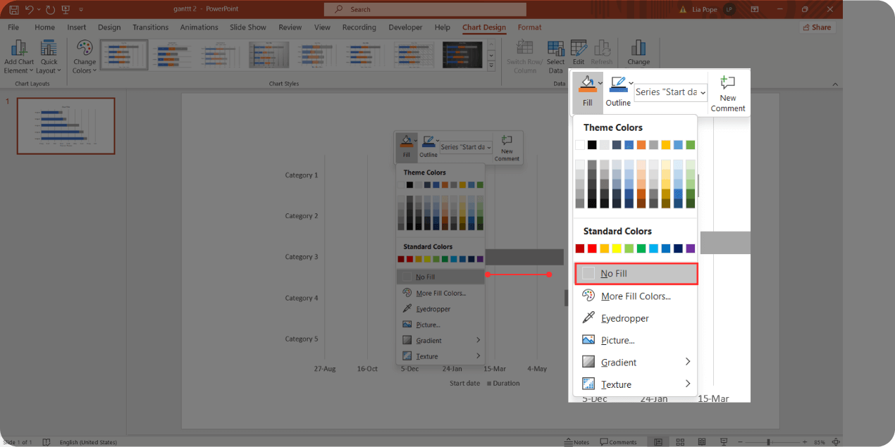
You'll notice the gray bars appearing; those are your tasks. Now, you need to remove the blue bars.
To do this, select the blue bars, right-click, and choose No Fill. You'll be left with only the bars for your tasks.
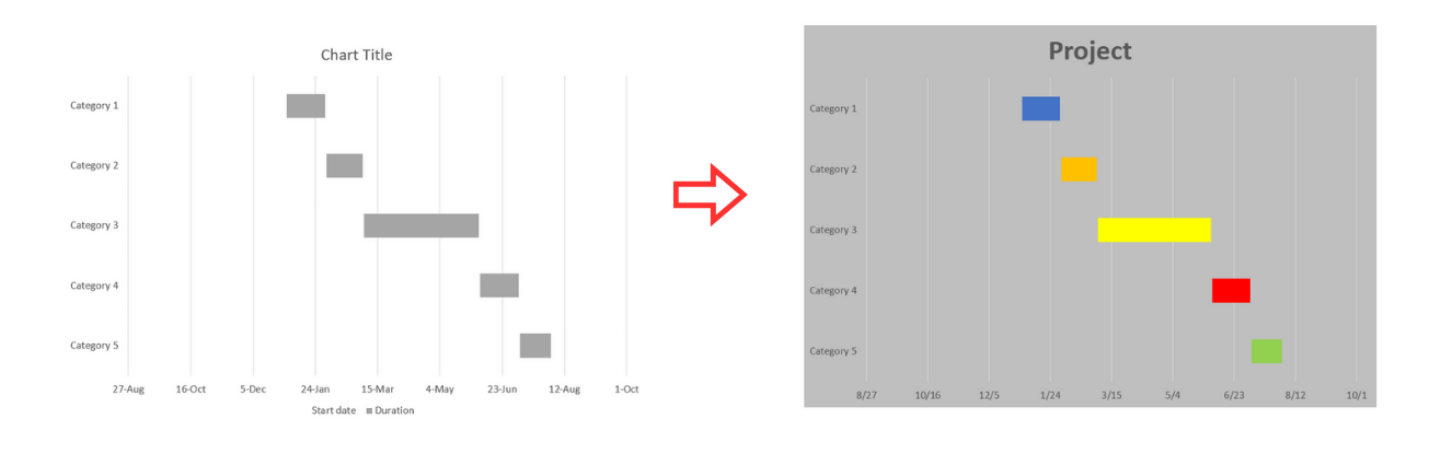
And that's it! Your Gantt chart is ready. You'll see your task descriptions on the y-axis and the dates on the x-axis. The final step is to customize it as you prefer—you can change the bar colors, background, grid, labels, and more.
How to Import a Gantt Chart in Excel to PowerPoint
Importing a Gantt Chart is actually quite simple. Just follow these instructions:
Go to the sheet with your Gantt chart, select it, right-click and choose Copy.
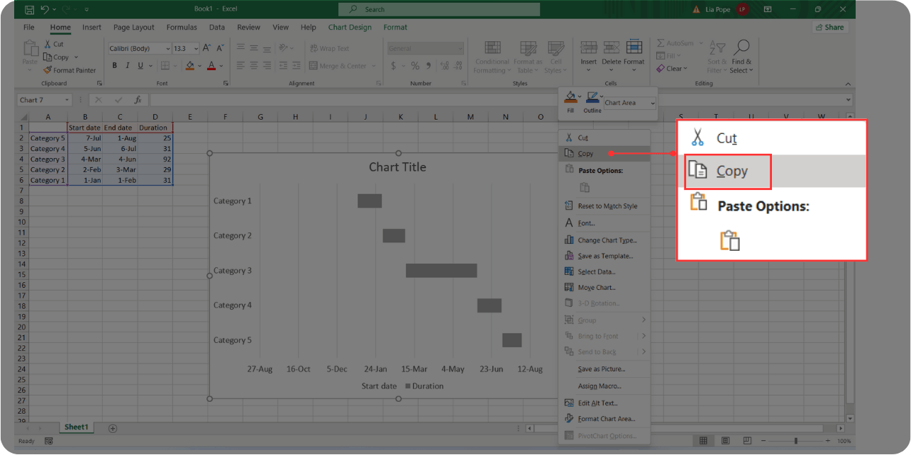
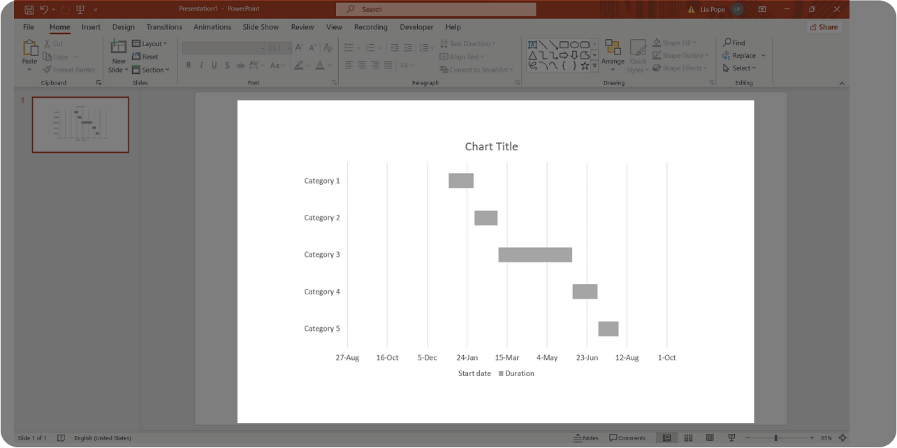
Then, return to your PowerPoint presentation, right-click, and choose Paste. You will see the exact Gantt chart you had in Excel.
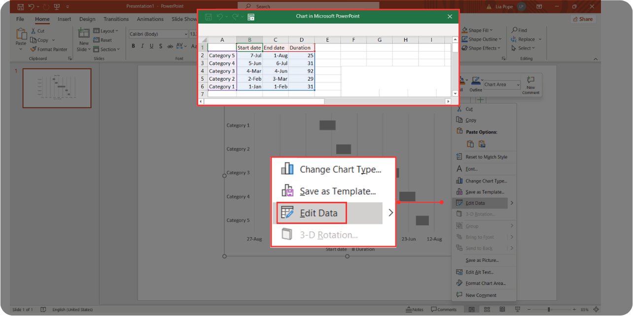
Remember, the information in the Chart is not static. You can still make changes even though you created it in Excel and not PowerPoint. Simply select the Chart, right-click, and choose Edit Data.
A small Excel window will appear on top of your Gantt chart, it will have the same information as the chart's source. You can edit anything there and see it immediately reflected on your Gantt chart.
And that's all! The final step is to customize it as you prefer—you can change the bar colors, background, grid, labels, and more directly from PowerPoint.
Gantt Chart in PowerPoint Template [FREE Download]
Are you looking to create a Gantt Chart in PowerPoint? You already know the step-by-step process if you want to create your own, but we are here to help you save time!
Here are 6 of the best Gantt Chart PowerPoint Templates for your next project. And the best part is, you can download (and customize) them for free!
#1 PowerPoint Gantt Chart Template [FREE]
Check out this Corporate Gantt Chart Template. If you want to use a professional yet creative visual tool, this design could be the perfect fit for your next project.
#2 PowerPoint Gantt Chart Template [FREE]
This Gantt Chart template comes with 3 different slides you can choose from. You can use the Simple Gantt Chart Slide, Project Gantt Chart Slide, or a Progress Gantt Chart Slide to create a visual project schedule and monitor the development of the project tasks over time.
Don’t be misled by their simplicity, remember, you can always customize them as you want!
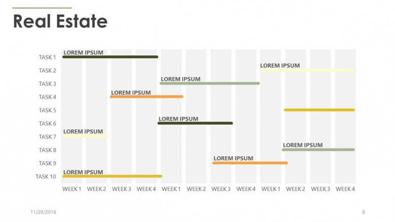
#3 PowerPoint Gantt Chart Template [FREE]
Explore our Real Estate Gantt Chart Template – a powerful and visually appealing tool designed to help you keep track of all your project tasks. This professional yet creatively crafted template is the ideal companion for your next property venture.
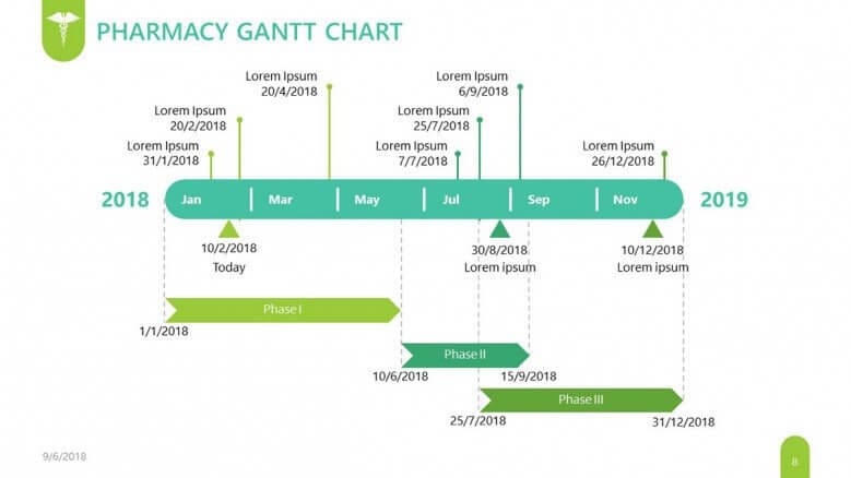
#4 PowerPoint Gantt Chart Template [FREE]
The Pharmaceutical Gantt Chart template is ideal for pharmaceutical representatives, pharmacists, and pharmacy technicians.
Whether managing, overseeing clinical trials, or coordinating regulatory processes, this template provides a comprehensive framework to visualize, organize, and communicate your project's components.
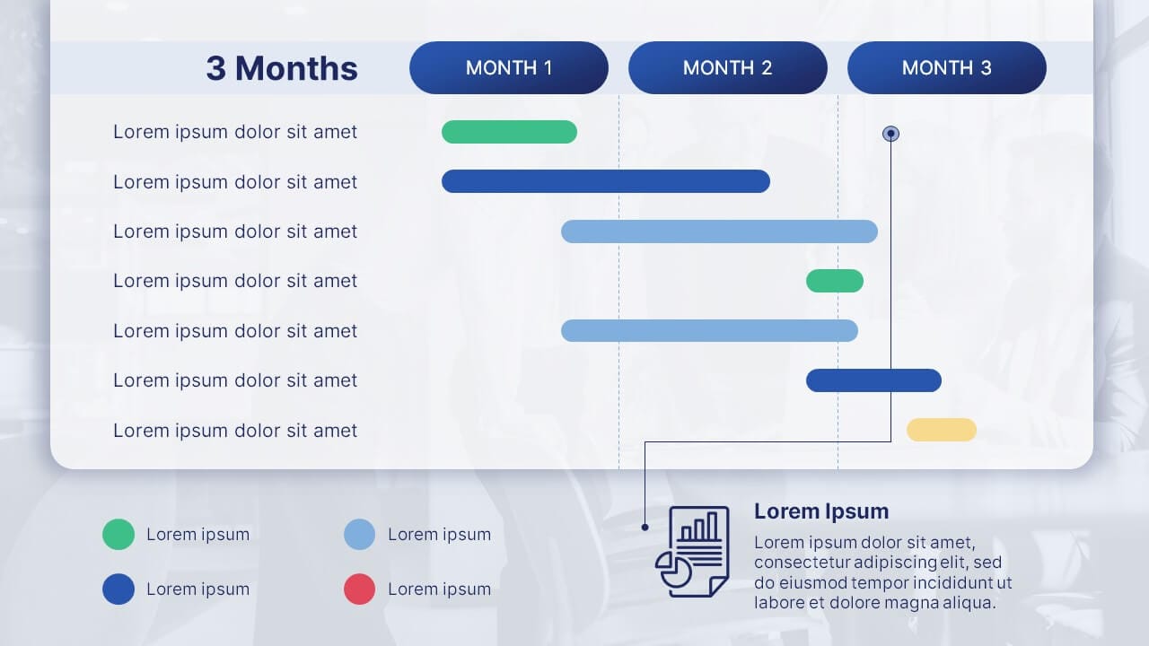
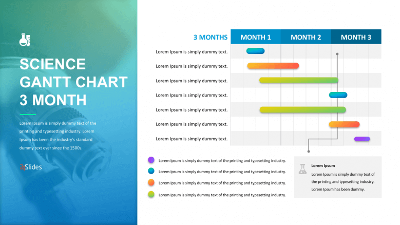
#5 PowerPoint Gantt Chart Template [FREE]
For projects that start and finish within 3 months, you can use this template to describe the most important events within this time period. And that's not all; the horizontal bars are color-coded, and you can add a short description at the bottom center of the slide.
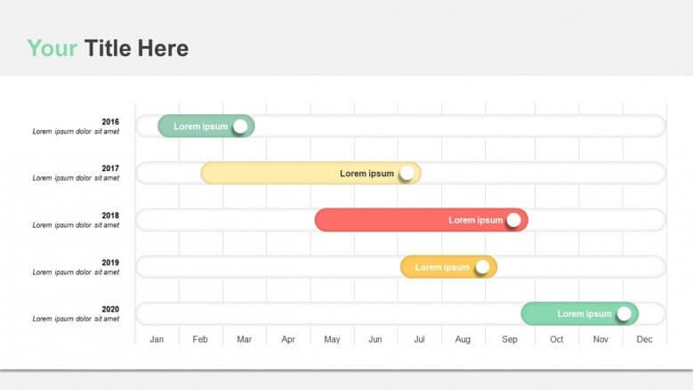
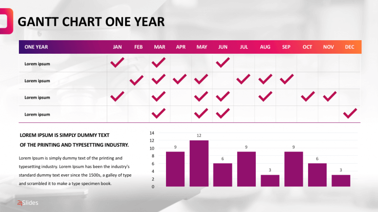
#6 PowerPoint Gantt Chart Template [FREE]
The yearly Gantt chart is suitable when you need to do a lot of planning for an extended period. The Chart will show a comprehensible schedule of when each task is set to start and end. It even includes a bar chart to reflect your results, everything in one slide!
Want to see more? Check out more Free Gantt Chart PowerPoint Templates:

Expert Advice: Tips and Tricks for Better Gantt Charts
Now that you've learned how to create Gantt Charts in PowerPoint, let's see how to get the most out of them. Let's explore some insights from expert designers.
Tip #1: Go step-by-step
Create your Gantt chart only when you have a clear vision of tasks, subtasks, and important deadlines, so you don’t need to redo the entire chart if there are significant changes. I recommend you have a solid idea of key deliverables and an estimated timeline before starting to create one.
Tip #2: Clarity is Key
More than focusing on the visual appeal of the Gantt chart, prioritize clarity. Use symbols or colors that intuitively convey the chart elements, making it easier for team members and stakeholders to understand all the information.
To achieve this, keep it simple and use colors consistently. For instance, if you use different colors for tasks, statuses (to do, in progress, done), departments, or teams, always stick to those colors. Alternatively, include a legend explaining the meanings of colors and symbols in your chart.
Tip # 3: Allow Breathing Space
Considering the abundance of information in a Gantt chart—bars, symbols, visual cues, grids, date lines, indentations for grouping levels—they can be visually overwhelming.
So, it's advisable to use a white background to keep a balance between all the information and the background, ensuring the reader doesn't feel overwhelmed. Remember that this chart should be a useful tool, not one that creates more confusion!
Tip #4: Consider professional design
While this article is incredibly helpful for crafting a Gantt Chart for smaller or internal projects, when it comes to long-term or critical ones, don't leave it to chance—consider seeking professional design assistance.
At 24Slides, our team of skilled designers is ready to assist you. Simply provide them with the necessary information for your chart, share your design preferences, and any other considerations you may have. Prepare to be amazed by the time you save and the outstanding results they deliver!
And, if you’re not convinced yet…We have an irresistible offer for you: Why not try out our services and have your Gantt Chart slide designed for just $1? It's an opportunity to experience the wonders that professional design can make in your presentations. And it gets better: You’ll receive your slide in less than 24 hours!

You might also like