Professional PowerPoint Examples To Upgrade Your Designs

PowerPoint is an amazing tool for businesses of all kinds. Whether it is to pitch a new project, introduce your company to a potential client, or update your team, PowerPoint can help you convey your messages more clearly and effectively. But as helpful as it is, PowerPoint can also be a double-edged sword. Your presentation will heavily influence the image your audience has of you and your business, and a professional PowerPoint design can make or break a presentation. Making it look clean and sharp may not be as easy as it may seem. These professional PowerPoint design examples are perfect to learn how to make an amazing presentation that conveys your business image accurately and impresses your audience.

Why Is It Important To Make Professional-Looking PowerPoint Presentations?
It’s pretty common to leave your PowerPoint presentation to the very last minute. After all, the content of the presentation is the main focus. Working on your research, ideas, and data is the main and foremost work you need to do, and probably what will take more time and effort. However, as important as the content is, the way all this information is presented can also play a vital role in how your message is received.
Despite what people may say, first impressions do matter! Think about it this way: Imagine you’re conducting an interview for a new job position in your company. After picking the ones that fulfill the prerequisites, you ask them to make a presentation about them, their achievements, and why they are the best ones for the job. But the finalists all have great achievements and knowledge that would fit your company. So how do you pick one?
Chances are, you’ll probably pick the one who’s presentation reflects the better the achievements and characteristics that they are telling. One of them may say they’re really hardworking and rigorous. But with a default-blank, all-text presentation, it’s more likely to look as if it has been done last-minute. It might even look lazy, or just not interested enough in the opportunity.
Taking care of how your presentation looks reflects consciousness and care about how your audience views you and your message. It shows that you’re willing to put effort into it and that you’re organized, orderly, and trustworthy. While the facade can not replace the contents of a presentation, it can definitely enhance it, highlight it, and support it.
Death by PowerPoint
Over the last decades, PowerPoint has gained something of a bad reputation. It has been accused of making dumber, lazier audiences, and to hinder learning. “Death by PowerPoint” syndrome has become so common, I’m pretty sure we have all experienced it. Haven’t you ever sat through a 70-slide presentation just begging for it to be over?
The true value of PowerPoint presentations depends completely on how they’re being used. All those “Death by PowerPoint” presentations are probably examples of a PowerPoint replacing the entire presentation, instead of complementing its message. We usually think “PowerPoint presentations, what a bore!”. But what we’re really thinking about is of unprofessional PowerPoint examples.
A professional PowerPoint design means a presentation that enhances its message perfectly. As long as the content is alright, there is no “Death by PowerPoint” in a presentation with a professional design. A professional PowerPoint would not allow 70+ text-filled slides. It would not have an all-blank default design. Professional PowerPoint presentations would not have distracting color combinations and animations that get in the way.
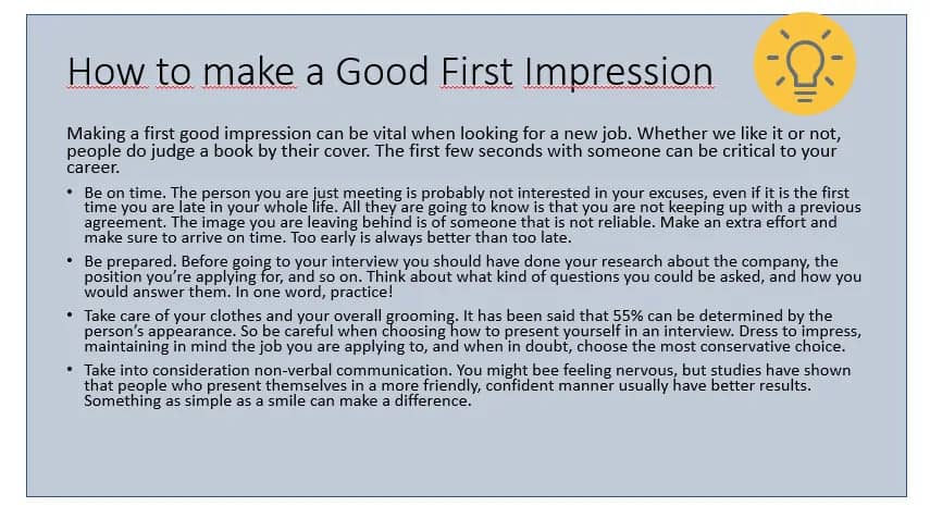
Check out this PowerPoint design example above. Even if it’s very simple, it doesn’t look very professional, does it? Many times we think of professional PowerPoint design as just being sober. But business-like doesn’t have to be boring. PowerPoint can be an excellent tool to convey your business image and vision along with your message.
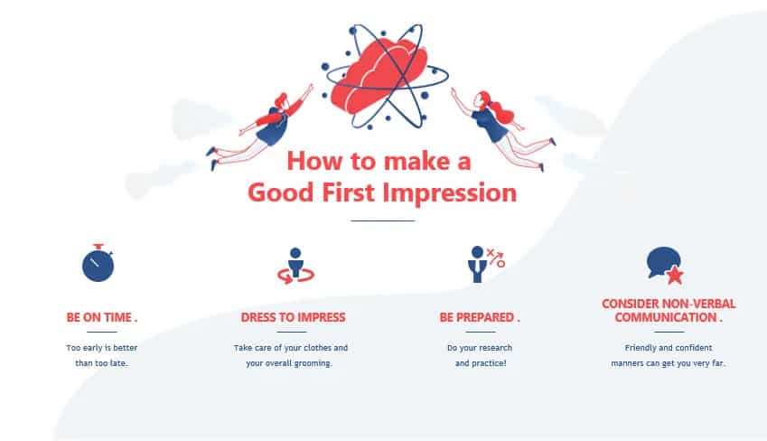
This slide is a much better example of a professional PowerPoint design. It’s straightforward without being boring. Icons help highlight each point. There’s enough text to convey the key ideas and let the speaker elaborate on them. The red and blue color palette is much more useful to catch the audience’s attention than a color block background. And the illustrations of people highlight the theme of social interaction.
Professional PowerPoint Examples
At the end of the day, what “professional PowerPoint design” really means is simply a sharp and clean design that complements your message perfectly. Professional PowerPoint design should provide a visual aid for your audience in a way that helps convey the content without getting in the way of the speaker. But it should also help you showcase your company’s image to your audience.
A good PowerPoint presentation will highlight the key elements of your content. But a professional PowerPoint design will reflect the time and effort you have invested in your product, and convey to your audience your reliability and expertise in the subject.
Even if your presentation is for internal company use only, cleanliness and professionalism still matter. You’re setting an example for your team on what is the quality expected, and how seriously the job must be taken. For example, think about making a project planning presentation. A last-minute, improvised-looking PowerPoint will probably give the impression that the project itself is to be figured out along the way. A professional PowerPoint design, on the other hand, will convey perfectly how serious the matter at hand is, and how much effort and work is expected on it.
What Makes a Professional PowerPoint Design?
So the real question is: What makes a presentation look professional? It’s not as easy as just saying “keep it simple”. As you can see in the slides higher up in this post, even a simple, one-color background can look pretty unprofessional. And a colorful, playful one, can look much better.
In one word, a professional PowerPoint design can be summarized as clean. All the professional PowerPoint examples you see on this list can seem very different from one another. But what they all have in common is that they have a very polished and sharp design.
Professional PowerPoint design is all about attention to detail. From the color palette to the background to the images and icons, all elements must look as if they have been thought through and through. Looking rushed and improvised is an easy way to look unpolished and unprofessional.
Professional PowerPoint design is difficult to define. Since it depends on your presentation topic and the message you’re trying to convey, there is no one-size-fits-them-all. Our designers here at 24Slides work with 3 main styles: Corporate, Creative, and Playful. This way, they make sure that the design fits perfectly the client’s expectations.
You’ll notice that despite the fact that these presentations look very different from one another, they all look very professional and sharp. Hopefully, some of these professional PowerPoint examples will give you a better idea of what “professional presentation design” really means!
Professional PowerPoint Corporate Examples
If you’re looking for a presentation design that conveys how reliable and serious you are, then these professional PowerPoint Corporate examples are just for you. The Corporate style is very business-like and data-oriented.
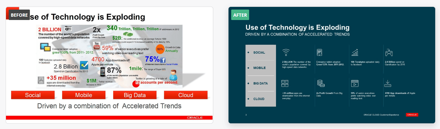
Blue is a color that is usually associated with authority, strength, and dependability. That’s why it is perfect for this presentation’s design. The different tones of greys and blues prevent the slides from looking plain and boring. And at the same time, it helps divide the information into different sectors and topics without having to be explicit about it. If you want to see the complete transformation, here’s the professional PowerPoint example before-and-after Corporate makeover.
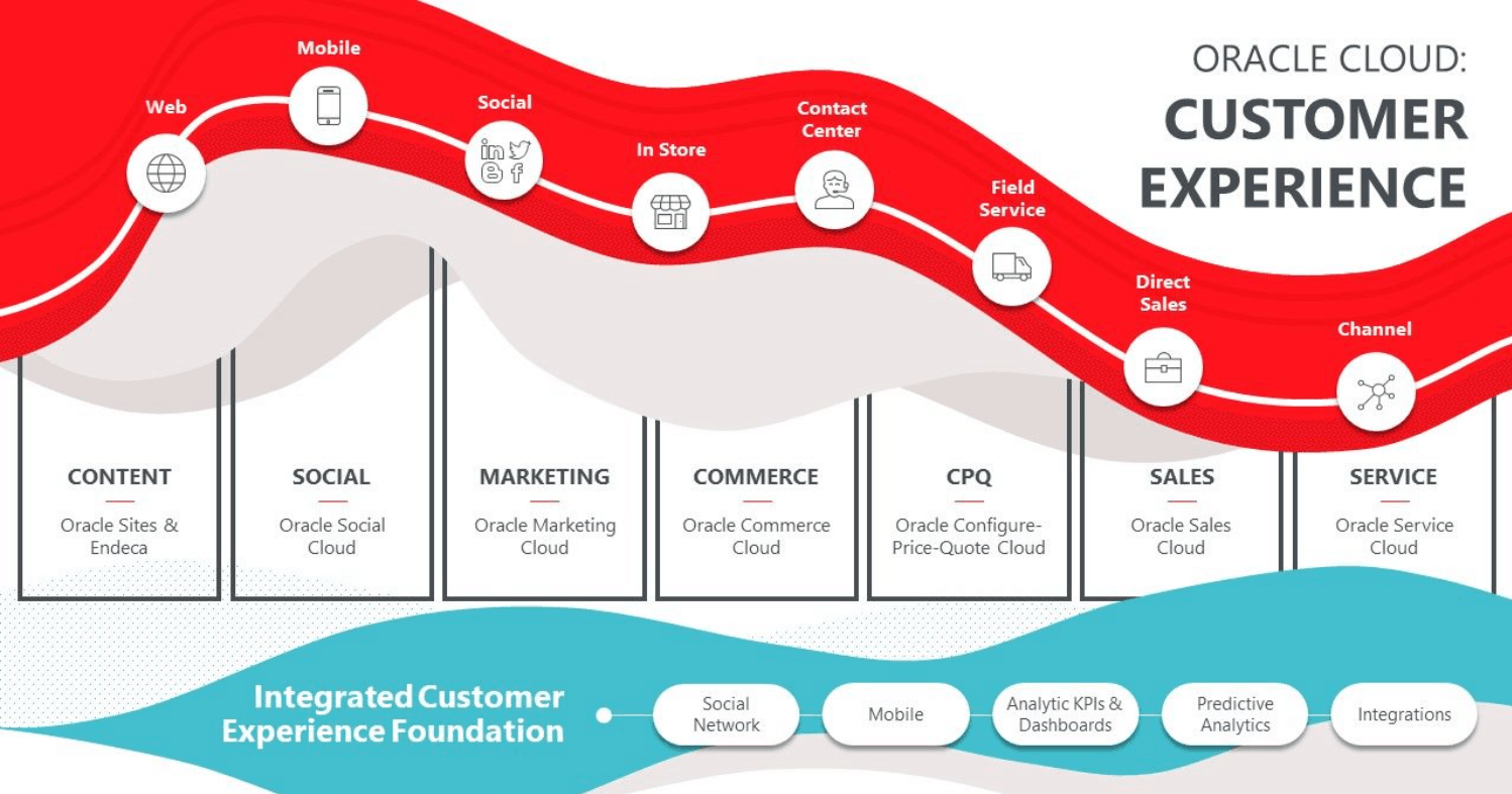
This one is another great professional PowerPoint design example of the Corporate Style. In the before-and-after comparison of Oracle’s presentation, you can see clearly how professional design can completely change the feel of a presentation. The corporate style is more minimalistic and clean, and in this case, it works wonders to make the slides look more polished and less confusing.
Professional PowerPoint Creative Examples
The Creative style is the most popular one when it comes to the requests 24Slides’ designers receive. And it’s no wonder why! As you can see in these professional PowerPoint design examples, Creative is the perfect middle ground between Corporate and Playful. It focuses on having a flexible layout that will make your information as eye catching as possible. In contrast with the Corporate style, the Creative Style is a little more daring with its color palettes. This can be great (as you can see in the following PowerPoint design examples) for representing your brand and giving your presentation more personality.
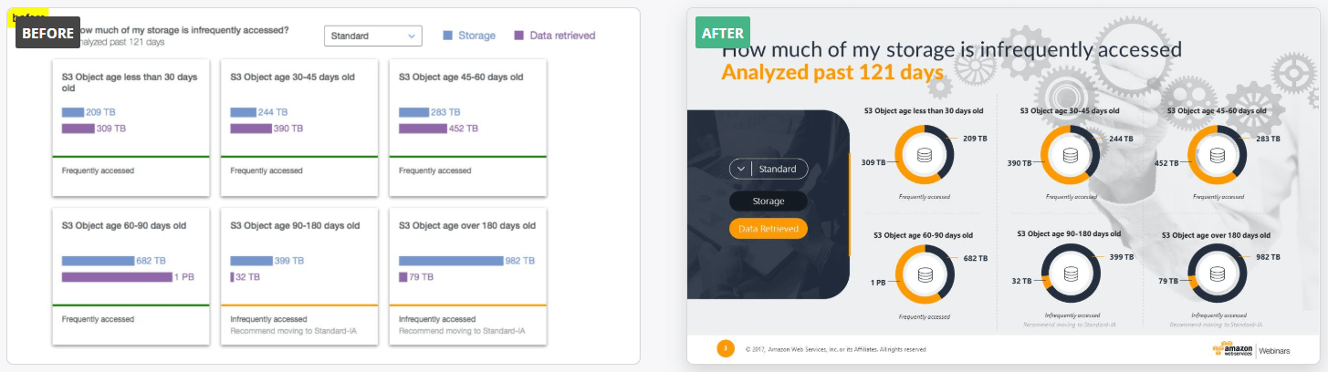
Take this professional PowerPoint example. Since it is an Amazon presentation, the makeover focuses on using colors that represent the brand and the company. Data representation is vital in many business presentations. However, numbers alone are not good enough. The way you present it must also be eye-catching and easily understandable for it to make a real impact. This professional PowerPoint is the perfect example of this. The background design, color palette, and icons make for a much more memorable presentation than the original slide.

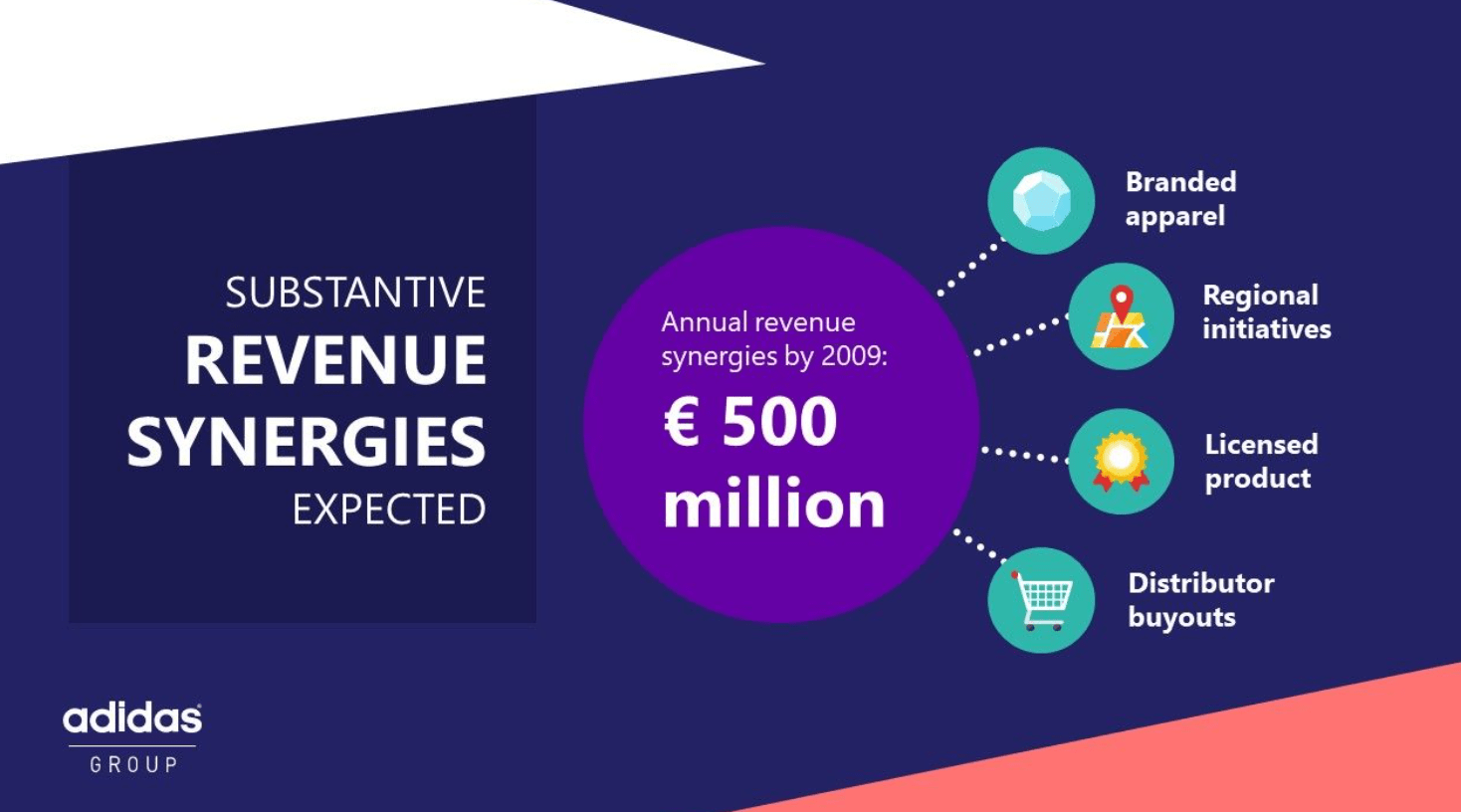
Professional presentation design can make a difference from the very start. Check out the title slide in this Adidas PowerPoint, for example. This company’s color palette can be difficult to work with, as it consists mainly of whites, greys, and black. However, a professional PowerPoint design can still completely transform a presentation and take it to the next level. Its layout incorporates the brand logo and colors, as well as the product. Elements complement perfectly each other, making it look much more interesting than just a title over a generic image. All while still being clear and easy to understand at first glance.
Professional PowerPoint Playful Examples
Despite what people might think, “professional” doesn’t have to mean boring! These Playful presentations are the perfect professional PowerPoint design examples of both polished and fun. As has been said before, it all depends on what kind of message you want to give. When your presentation is over, what image of your company do you want your audience to leave with? If you’re thinking about focusing on creativity, out-of-the-box thinking, or even one-on-one customized service, then the Playful style might be the perfect fit. These professional PowerPoint design examples are ideal to make the audience feel closer to the speaker and part of the presentation.
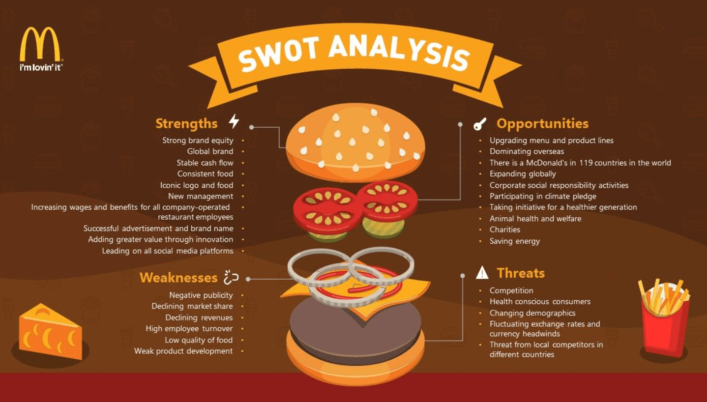
Take this McDonald’s Investors Plan presentation. Since the “Happy Meal” is such an important part of the brand’s identity, it makes sense that their presentations are happy and fun too! This whole professional PowerPoint example is filled with McDonald’s products as part of the presentation’s design. Even if the topic is business-oriented, explaining their situational and SWOT analysis in the form of hamburgers, sodas, and french fries makes for a much more unique and eye-catching presentation.
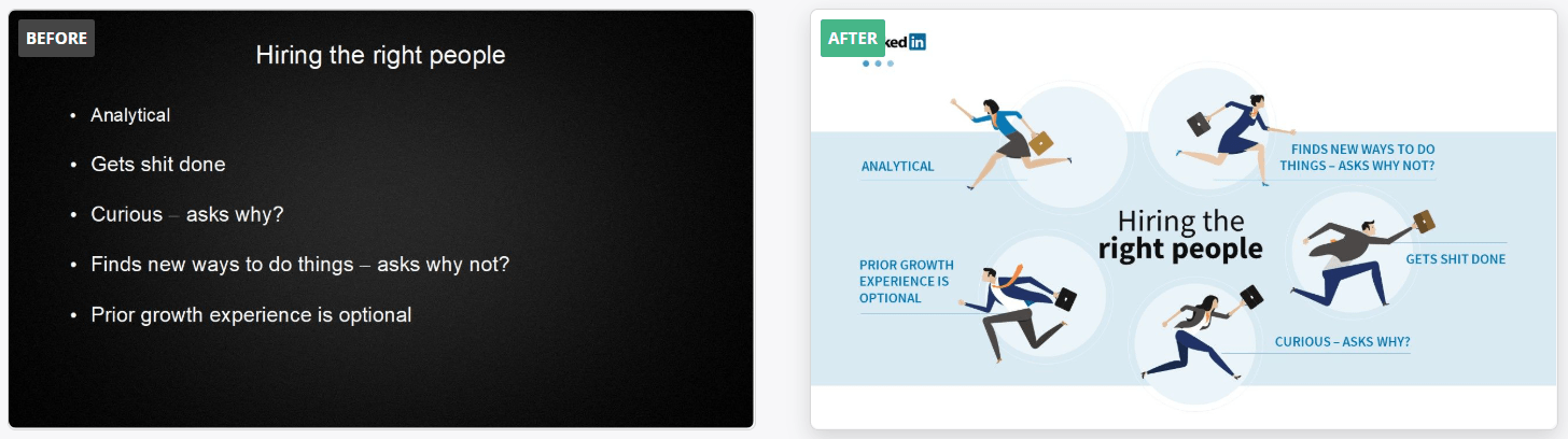
This professional PowerPoint design is another great example of how versatile the Playful style can be. Since Linkedin is all about connecting people, this design is an excellent option for showing it to their audience during the presentation too. The original slide is too serious and boring. On the other hand, this professional design is perfect for not only conveying the same points but also highlighting the feeling of building a team.
If you liked the Corporate, Creative, or Playful PowerPoint designs, here you’ll find more examples of each.
Tips To Make Your PowerPoint Look More like this Professional Examples!
There’s a reason why all these professional PowerPoint design examples look so good: they’re done by professionals! As much as we might all want all our presentations to look like that, chances are we do not have the same design skills that our amazing designers here at 24Slides have.
However, there still are some easy steps you can take in order to make your presentation look a little more like these professional PowerPoint examples. Take into consideration that, just like most things, there’s a learning curve in order to learn how to design amazing presentations.
- Know your company’s image and your message
What do you want your audience to perceive you like? This can be a good guide when thinking about how to design your presentation. Do you want to look reliable? Friendly and approachable? Business-oriented? Get inspiration from the professional PowerPoint examples above and what you feel each can convey.
- Mind your colors
Working with colors can be a little bit tricky if you’re just starting. Too many colors, especially if they don’t complement each other very well, can be very distracting. Or, on the other hand, too little can make your presentation dull and boring. If you’re struggling, working with a neutral color base (like white, grey, or black) is a great start. You can add details in brighter colors, or use your company’s color palette. Be smart when picking your presentation color scheme, as it can really make a difference! Tools like Color Calculator and Paletton can help you get ideas for complementary colors.
- Sometimes less is more
While being professional is not just about being simple, “unclogging” your slides from unnecessary elements can help you achieve a more polished look. Avoid adding too many images or animations that can easily turn into a distraction rather than an aid. A minimalistic design can be a great option for looking professional while still keeping fairly simple!

- Consider customized backgrounds
Backgrounds can make a huge difference when designing your presentation. As you’ve probably seen in the professional PowerPoint examples above, a color-block background is an easy way to look lazy and over-simplistic. Check out these Background templates you can download for free, or use them as inspiration. You can also add transparent pictures as background for your slides. They’re more interesting than having it be just one color, and you can set the transparency so it doesn’t hinder your content.
- Take advantage of PowerPoint tools!
PowerPoint offers an amazing array of design tools. From templates to the Design Ideas tool, there are many tools that can make a difference. It’s all about experimenting and learning what works for you. Here are some tips on how to work better with images in PowerPoint. Little details can go a long way in making your presentation look more professional.
Sometimes it is easier to look out for what not to do in order to achieve a better result. These bad PowerPoint examples will help you take note of all those things that you want to avoid at all costs.
Trust Professional PowerPoint Design
Designing a good PowerPoint presentation takes time and effort. A mentioned before, there’s a learning curve for making your presentations look just like you want them too. At the end of the day, the easiest, most efficient way to achieve a professional PowerPoint design as the examples above is to… Hire professionals!
Outsourcing PowerPoint design is a great option for all those looking for customized presentations. You can save tons of time and achieve better results by just hiring a designer to work on your presentation. Professional PowerPoint designers have all the skills and tricks to take your presentations to the next level. Instead of investing hours in trying to make it on your own, outsourcing presentation design gives you the best possible result.
And professional PowerPoint design can be way cheaper than you might think. Take into consideration all the time and effort taken from your actual work that you would spend on making an outstanding presentation. And chances are, that the results will not be quite what you were expecting, at least the first few times. At the end of the day, outsourcing presentation design is not only the most cost-efficient way to get professional-looking slides. All while still making sure that your presentation looks exactly as you want it to. Don’t believe it? Check this calculator to find out your hidden PowerPoint costs.
24Slides’ designers will be happy to help you upgrade your PowerPoint design and turn your presentations into exactly what you want them to be. You can just pick which style fits your message and company best, and forget about it! Our designers will make sure that you receive the best presentation possible in just 24 hours.
You might also like these articles: