7 Unique Presentation Examples That Will Inspire You

After a while, all PowerPoint presentations look exactly the same, don’t they? Wrong! The way a PowerPoint is designed can really change the feel of the whole presentation. The world is filled with bad PowerPoint presentations. But precisely because of that, a good PowerPoint will stand out even more. Check out these amazingly good presentation examples to get some design ideas for your next PowerPoint.
Why presentations are important
Before we go through the presentation examples, it’s important to talk a little about what makes a PowerPoint presentation really good. It’s a common mistake to think that the design of your PowerPoint is a secondary factor in a presentation. Content and information are definitely vital, but the design also affects the overall way people react to your presentation. Sometimes even more that you could imagine.
Think about it this way: you probably won’t go to an important presentation dressed as if you just got out of bed. If it’s a really important one, you’ll probably even worry about looking your best. You probably won’t think twice about spending a little more time grooming yourself and making sure you look good. And this is because appearances do matter. Whether we like it or not, people unconsciously read many things from the way we present ourselves visually. And these ideas can stick for a long, long time in people’s minds. And, even more, they are built incredibly fast. According to Forbes, first impressions are made in the first 7 seconds of a meeting.
Business presentations are exactly the same. There are many things your audience can read from your presentation design alone. For once, the way your presentation looks will probably give them an impression of how professional you and your business are. A plain, all-white presentation can give the impression that you’re lazy or that you did it last minute. The way a presentation looks can certainly influence how trustworthy you look, or how committed to a project, or how relatable you are.
Characteristics of a good presentation deck
People can read many things from a presentation, and it’s your duty to work on the image you want to project. A bad presentation can make you look unprofessional, yes. But a presentation is also a great opportunity to establish your brand visually and to make sure it stays on your audience’s minds. It’s up to you to take advantage of the possibilities presentations offer you.

It’s definitely easier said than done, though. Making a unique PowerPoint design demands creativity and imagination. So before you check out the presentation examples, look at this short list of design ideas. Hopefully, you could use these as inspiration for your next PowerPoint. They’ll surely take any plain presentation to the next level.
Title slides
You probably have experienced this: You get distracted from a presentation for 5 seconds, and suddenly you have no idea of what the speaker is talking about. You’ve gotten yourself lost, and it’s pretty difficult to get back on track when you don’t even know what new topic you’re talking about. Title slides are a great way to show your audience in what section of your presentation you’re on.
Even if you don’t have title slides for each section, you should certainly have a presentation starter Title slide. This slide is vital because it’ll set the feel for all the rest of the presentation. Just as with yourself, people tend to judge a presentation right from the start. It’s incredibly important that you showcase what you want to showcase (professionalism, relatability, etc.) on your title slide.
You want your audience looking forward for the rest of the presentation, not to feel dread and boredom. Make it eye-catching without going over the top, and make sure the topic is clear. You can check out some of our other presentation examples to see how a high impact first slide is done.
Cohesive color palette
There is no easier way to make your presentation look unprofessional than to go overboard with colors. Even if the speaker isn’t necessarily the one that has designed the PowerPoint presentation, he or she will be automatically connected to it. That is why a “Rainbow” presentation will give the feel that the speaker doesn’t really know what they are doing. Even if the speaker is doing a good job, the picture that will remain in the audience’s minds will be of the PowerPoint presentation. And if this one looks improvised or unprofessional, that will also reflect on their idea of the presenter.

Finding good colors for your presentation can be a tricky task. The overall general rule is to pick colors that complement each other, and that have good contrast. This way, the presentation will not be eye-straining while still being easy to read. The easiest way to apply this is to pick one of the premade color schemes from Microsoft Office.
However, you probably have some extra requirements, like for example to use your brand’s colors. Things like this can make it harder to find a good color palette. There is no easy way to handle colors in a presentation. But the easiest tip is: when in doubt, keep it simple.
If you want to know more about colors and how to use them, you can check out how to pick the right colors for your next presentation.
Data representation
PowerPoint presentations are, above all, a visual aid. That’s why you should take advantage of the visual potential they have. Many business presentations include some kind of data to illustrate a certain point or prove something. For example, growth or sales rates, or consumers per country, and so on. Many presentations’ main sin is that they try to showcase all this data in a written way like it’s a report. It’s one of the easiest ways to bore your audience and make them lose focus.
If you’re saying exactly the same that is written in the PowerPoint, why should they listen to you? You should aim to show something in a different way that will make them understand the things you’re saying easier. For example, if you want to share some percentages concerning some specific aspect of your business, the list of numbers will probably bore pretty quickly your audience. But if you show it visually, in a pie chart for example, your audience will be able to understand it easily.
Captivating visuals
“Captivating visuals” do not mean only photos and pictures. Sure, customized illustrations are great, as you will see in some of our presentation examples. But you don’t need them to create a great presentation. Many people think that it means adding at least one stock picture or something similar to every slide. Truth is, what presentations really need is visuals that complement smartly the information display.
This can be done by many different ways. Illustrations and pictures are a great option for this. They exemplify one or more points, but most important, they break the “all-text” image that is so frustrating for the audience. And to achieve this, illustrations and pictures are not the only way to do so. As has been said before, graphs and charts are a great way to represent data. And these elements also help to break the “all-text” effect. Other great options to do this are to use icons and geometrical. These can help to highlight your points, while still being sober and not very intrusive.
But the most vital thing to consider visually is the layout. The way you organize the information inside a slide can make all the difference between a plain slide and a professional looking one. The more your presentation looks like a textbook, the more difficult it’ll be for your audience to focus in it. Break down your information in smaller parts and see how they can fit into the slide. It’s a difficult thing to learn, but once you see the presentations examples, you’ll see exactly what I’m talking about.
What not to do when designing a presentation
You can also check these bad PowerPoint examples, to know what to avoid. Some times, it can be just as useful to know what not to do! But right now, let’s go through some of the things that can really make a difference in turning your presentation from plain to spectacular.
Presentation Examples
Here you’ll find some amazing presentation examples done by our designers here at 24Slides. Hopefully, these will give you the inspiration you need to make a more unique, eye-catching presentation. Even the plainest, most boring presentation has a solution. It’s just a matter of knowing how to make it really stand out.
In 24Slides, our designers divide their styles into three categories: Corporate, Creative and Playful. This way, customers can pick the style that they feel they fit best with their brand and their presentation. To know more about these 3 styles and to see how they differentiate from each other, you can look out other of our professionally redesigned PowerPoint examples. You will find the original presentation and how it was remade in all 3 of these styles. This way, you can really see the difference between them, and pick the one that fits better your needs!
But for now, let’s go straight to the presentation examples! Here you’ll find some of the best Before-and-After transformations. This way you can really see how much of a difference a well-designed PowerPoint can really make.
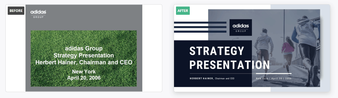
a) Adidas
This presentation was redesigned in a Creative style. This style is in some way the perfect middle between the other two. It’s more serious and business-like than the Playful style, but more flexible and casual than the Corporate one. This Adidas presentation is the perfect example of the Creative style. It showcases all the information in a professional way, but still keeping it visually attractive.
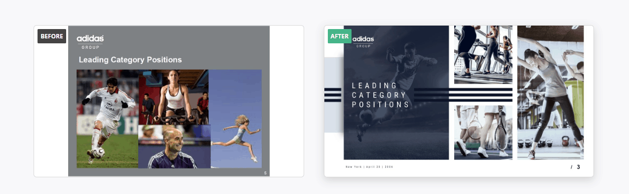
Adidas has a difficult color scheme to work with since it’s a brand that works mainly with blacks, greys, and white. It’s easy to make a boring presentation with that palette, as you can see with the all-grey background of the original presentation. Our designers change it for a more visually striking photo-background. But they kept the background photos at a high transparency percentage to make sure they didn’t hinder the text. They also added the brand logo with the back lines. This slide really shows how a slide layout can really change the feel of a presentation.
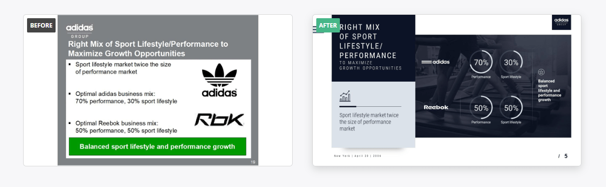
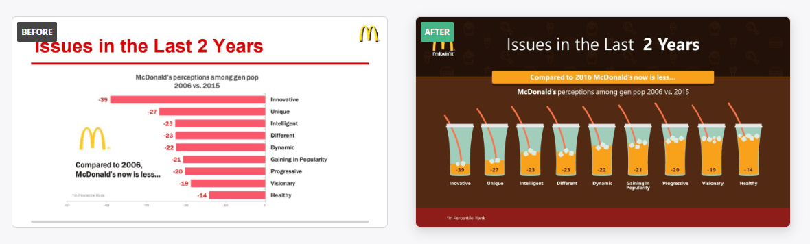
This slide is a perfect example of improving data visualization. Why put everything in written sentences, when you can show it in a much more effective way as a graph?
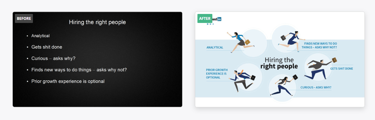
b) Linkedin
The Playful style is my personal favorite. Playful PowerPoint designs are proof that presentations don’t have to be boring or dull. This style is great for catching your audience’s attention. It includes a lot of personalized illustrations that will really make a presentation pop. This style is certainly less serious, but no less professional. You can see the effort that has been put into these slides, and how carefully crafted they are.

Check out the difference between these two slides. While the original one is certainly more serious, it’s the redesigned one that looks like a professional presentation. Dark backgrounds are great start to give a presentation a professional look, but it’s not enough. Anyone can change the background color. This PowerPoint example, despite not having a dark background, looks way more professional. It looks customized and detailed. Our designers took Linkedin colors to make a slide that really represented the brand. The effort put into it it’s what makes it a really unique-looking presentation.
This slide is also a good example of the importance of title slides. If you see the original one, you’ll probably brace yourself for a long and boring presentation. With the fixed one, you give the presentation a whole new feel. The customized illustration reflect perfectly the presentation topic and intrigues you enough to make want to hear more about it.
c) IBM
Finally, we have the Corporate Presentation style. This one is certainly the most serious of all three of them. This is the kind of presentation you want to show your boss to prove how reliable and rigorous you are with your job. It’s a great style for presenting data and cold hard facts.
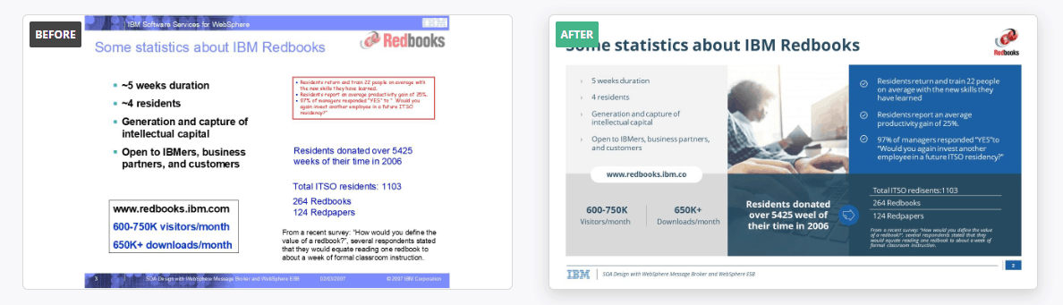
The original presentation had a theme, with the blue lines in the upper and lower sides of the slide. But the use of different colors made it look a little improvised and overall just dated. The new design, on the other hand, looks clean and stylish. Something as simple as adding a visual element, like the central photo, can do a huge difference. Instead of highlighting text with different colors, the designers focused on separating the information in sections and using a monochromatic color scheme. This way, the audience can distinguish easily each part of the slide, while still keeping the design sharp.
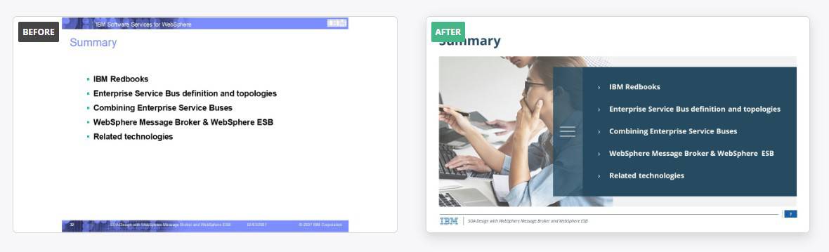
Even something as simple as bullet points change completely when you use a more professional layout!
d) McDonald’s
This MacDonalds’ presentation is an amazing example of what a Playful presentation is all about. Vibrant colors, unique illustrations, and a distinctive layout. If you look at the original SWOT Analysis of this presentation example, it is completely plain and forgettable. But the fixed slide is truly unique. It conveys the information in a way that could not have been done for any other company in the world. It’s original and entertaining while still showcasing all the information needed.
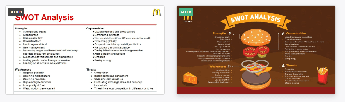
This PowerPoint is also a good example of and amazing use of color. The original presentation was clearly trying to follow the brand’s official color scheme of red and yellow. But in practice, it made the presentation look pretty amateur. Our designers, on the other hand, made a customized color palette that made the presentation look not only professional but unique. They kept the red and yellow tones, but didn’t use them as the main colors. Instead, they created a whole scheme of colors that complimented them, and that allow them to add so much more detail into the presentation.
The customized icons are one of those things that really can make a difference. In the new presentation, you can be sure that the data being shown is from a fast food company. Making sure your presentation reflects your company is more than just pasting a logo in every slide. This presentation is a great example of how to do it right. Every single slide reflects its product in a playful, innovative way.
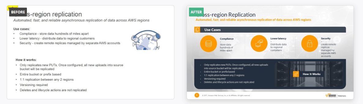
e) Oracle
Oracle’s PowerPoint is another great presentation of example of the creative style. This presentation takes a plan, boring PowerPoint and transforms it into a unique one.
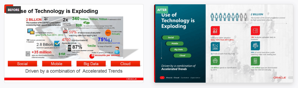
Check out how much a professional layout can change a slide. In the original one, all the element are crammed together. It’s even a little bit uncomfortable to read. There are too many things happening at once. The fixed slide conveys the exact same information, but in a way more organized, professional way. This is a great example of how to showcase data smartly. The designer used all their tools (shapes and colors to make divisions, icons, etc.) to convey the information in a visually attractive way.
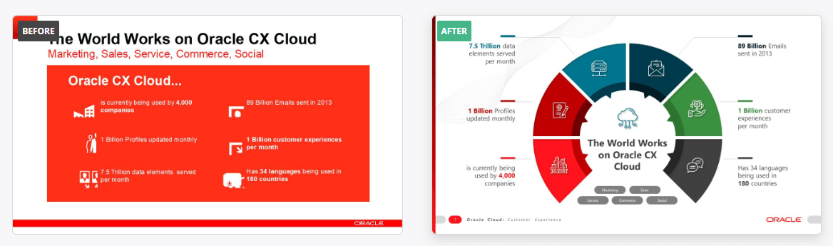
Creative style is all about thinking out of the box, so this slide transformation is a perfect presentation example. While the original slide is not that bad, it’s a little dull. But if you change the layout and add a more interesting color scheme, the slide will look much better!
f) Amazon
Here is another great presentation example of the creative style. Creative is actually the style more in demand by our customers, since it looks both sharp and fun. And this Amazon’s presentation really shows that.
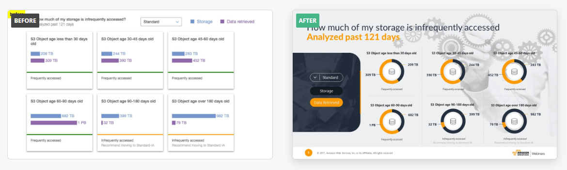
Details do matter. While in the original slide there were graphs, the colors clashes, and it looks pretty cramped. Our designers changed the color palette to reflect the brand, the bar graphs for pie charts and adding a soft-edged caption box. Just with this, the slide looks more cohesive and with an intended design.
This slide is another example that visuals and layout matter. Having slide after slide filled with bullet points becomes boring very quickly. Think about in which other ways you could represent the information, and build your layout accordingly.
g) CISCO
Finally, here’s another presentation example of a corporate style PowerPoint. This serious, straightforward style is ideal when you want a more sober, business-like presentation.
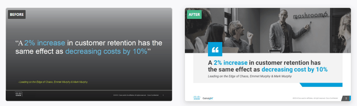
As much as a good minimalist style, less is not always more. The original slide with just a quote looks kind of empty, rather than minimalist. As has been said before, a basic gradient background will not fool anyone into thinking that there was time put into that presentation design. Adding “stunning visuals” don’t necessarily mean having custom icons or vector illustrations. Sometimes something as simple as a complementary picture and some geometrical detail, as in this slide, can really make the message stand out.
Make better presentations
Hopefully this presentation examples will inspire you when you have to do your next PowerPoint. Presentation design takes time and effort, but practice makes perfect. Do not expect a PowerPoint that looks from a professional designer’s portfolio at first try. Design is not something you can learn overnight.
However, if you don’t have the time to spend in learning how to design your own PowerPoints, or you want a really professional finish, you should definitely contact put team of designers here at 24 Slides. Your presentation will be as unique as anyone of these examples, and will reflect perfectly your brand and what you want to convey.
And depending how much time you invest a week in doing PowerPoints, it’ll probably even be more cost-efficient to hire presentation designers. This way you get better presentations that you could have done on your own, and at the same time, save time for your other tasks. So ask yourself: do you really need to learn how to design presentations? Or is it just another task taking time and energy from other more important things to do?

If it’s just taking time away from you, why not let the professionals so what they’ve been trained to do? Here at 24Slides we have incredible designers that will make sure that your presentations is everything you want it to be. You can focus on your tasks at hand, and receive your presentation ready within 24 hours, and more professional-looking than ever.