


We’re uploading new templates every week
We’d like to send you infrequent emails with brief updates to let you know of the latest free templates. Is that okay?

Reset your Password
Please enter the email you registered with and we will send you a link to reset your password!
Check your email!
We’ve just sent you a link to . Please follow instructions from our email.


This template for academic purposes will enable you to create unique presentations. You can easily tailor them to fit any educational institution, such as high schools, colleges, universities and even primary schools. The template is highly professional and the teachers and professors will successfully deliver their knowledge to their students.
The pie chart is great for presenting how each part of the data adds to the whole. It shows numerical proportions and each slice of the pie is proportional to the quantity it represents. They are great for school courses such as math and statistics because many sets of data can be clearly represented. It can be used for each educational level.
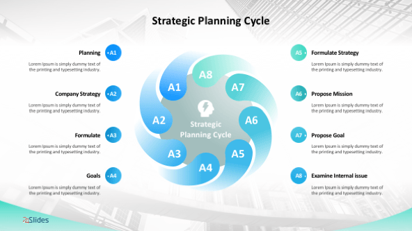
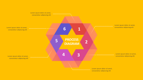
The Process Chart is used to show a progression; a timeline; sequential steps in a task, process, or workflow; or to emphasize movement or direction. The desired text appears inside arrow-shaped hexagons while another text can be additionally added below the arrow shapes.
The bar charts are the most exploited type of graphs nowadays. That’s because they are simple and can easily fit any kind of data. The Clustered Column Chart is used for comparing discrete values across categories. The height of the bars is proportional to the data values that it represents.
Professional template that enables you to create unique presentations for scholar purposes
The template is made to fit every educational institution.
The Pie Chart is great for representing how certain parts of data add to the whole
It is the most suitable for mathematical or statistical purposes.
The Clustered Column Chart will enable you to compare discrete values
The height of the bars is always proportional to the data it represents.


FIND OUT MORE ABOUT OUR CUSTOM DESIGN SERVICES
Check out other similar templates

 69 fully
editable
slides
69 fully
editable
slides


Todd Speranzo
VP of Marketing at Avella
"24Slides helps us get PowerPoints on-brand, and improve overall design in a timeframe that is often “overnight”. Leveraging the time zone change and their deep understanding of PowerPoint, our Marketing team has a partner in 24Slides that allows us to focus purely on slide content, leaving all of the design work to 24Slides."
Gretchen Ponts
Strata Research
"The key to the success with working with 24Slides has been the designers’ ability to revamp basic information on a slide into a dynamic yet clean and clear visual presentation coupled with the speed in which they do so. We do not work in an environment where time is on our side and the visual presentation is everything. In those regards, 24Slides has been invaluable."
Nyah Pham
Novozymes
"After training and testing, 24Slides quickly learnt how to implement our CVI, deliver at a high quality and provide a dedicated design team that always tries to accommodate our wishes in terms of design and deadlines."