5 Bad PowerPoint Examples to Avoid (And How to Redesign Them)

Imagine spending weeks perfecting a brilliant, data-backed strategy, only to lose your audience the exact second you open your presentation deck.
It is a painful boardroom disappointment where your hard work gets completely derailed, not by poor intelligence, but by basic formatting flaws.
We have all sat through these frustrating, bad PowerPoint examples where great ideas die behind unreadable templates.
Your presentation software is an active tool for audience engagement, but corporate teams often treat it as a dumping ground for raw text.
When you force messy designs onto a screen, the psychological cost to your professional authority is heavy:
- Mental Fatigue: Listeners stop listening to you so their brains can decode crowded layouts.
- Vanishing Trust: Visually unpolished or ugly slides make an elite strategy look completely amateur.
- Zero Engagement: Executive stakeholders stop paying attention and quietly check their phones instead.
Learning to spot these common bad presentation examples is the fastest way to rescue your message and own the room.
Deconstructing Bad PPT Examples: The 5 Corporate Design Sins
We have all watched a high-stakes corporate pitch lose its momentum due to poor formatting.
When slide layouts fail, it is usually because they violate how the human brain processes information.
Studying these bad PPT examples reveals a major problem: they run counter to human psychology.
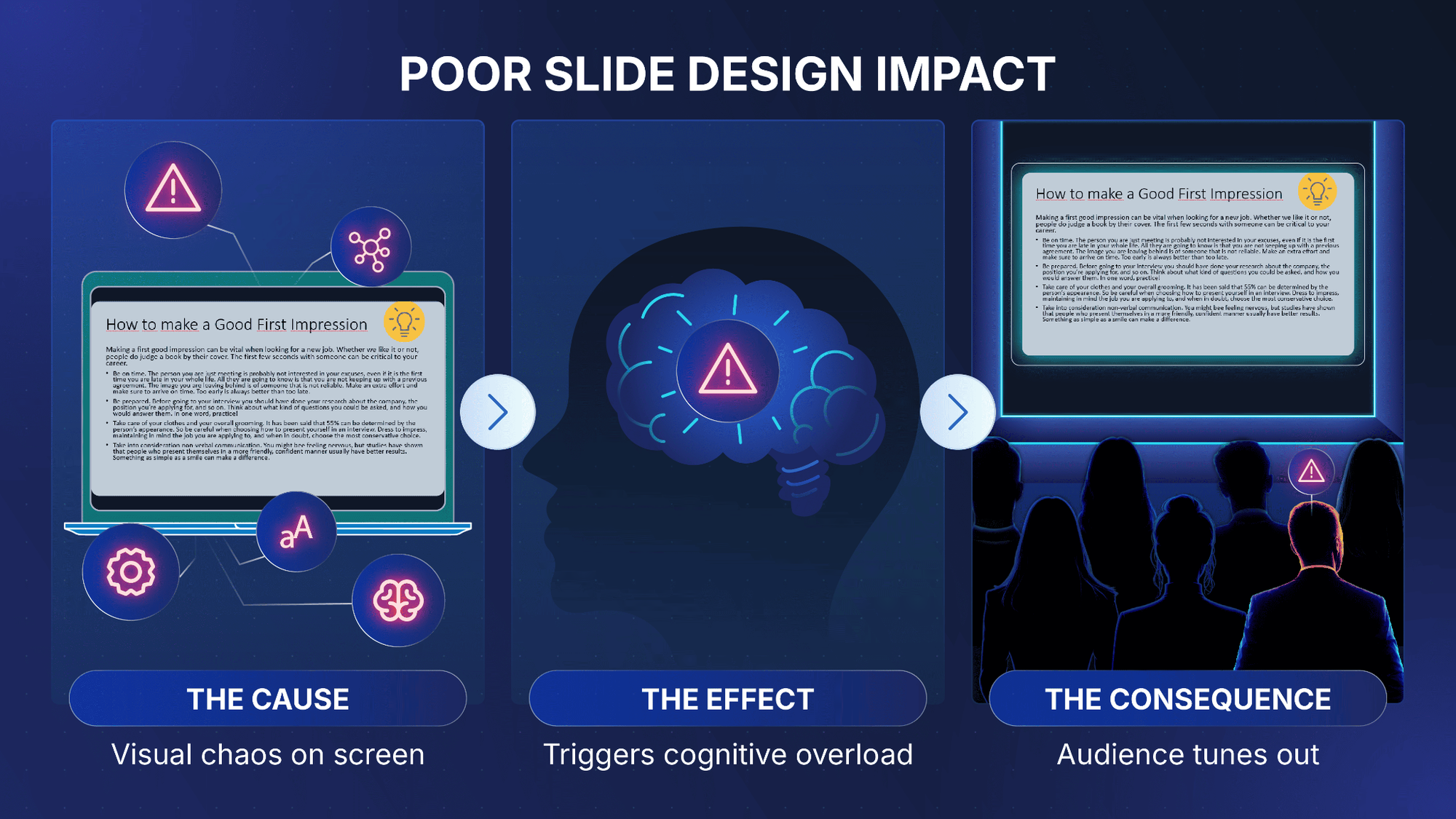
The primary reason for these terrible presentation examples is a concept called cognitive load.
When your slides are cluttered or confusing, your audience experiences immediate mental friction.
In fact, peer-reviewed data published in the National Institutes of Health repository confirms that our working memory has a strictly limited processing capacity.
According to an NCBI study, forcing an audience to read long blocks of text while listening to a speaker triggers an intellectual traffic jam.
The research shows that when a presentation overloads these mental channels, the brain experiences a "split-attention effect" and simply stops absorbing new information.
When your design forces this mental burnout, your audience experiences three immediate issues:
- Divided Attention: The human brain cannot read dense text and process a speaker's voice simultaneously.
- Visual Fatigue: Forcing people to strain their eyes to decode a layout drains their mental energy.
- Information Block: Once cognitive capacity is maxed out, your audience stops absorbing your strategy.
To protect your presentations from these traps, you must build a clean visual hierarchy.
Your slide deck should act as a visual exclamation point, while your voice delivers the core message.
Let’s break down the five specific design flaws that turn normal decks into terrible presentation examples.
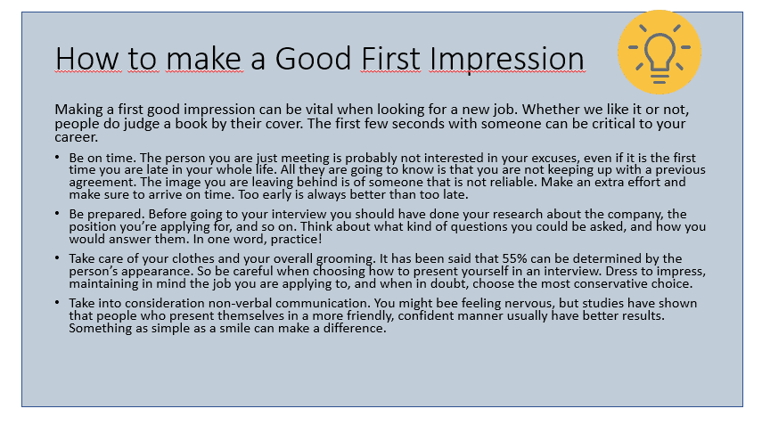
Too Much Text: The Slide Script Dump
Enter the most common boardroom offender: copy-pasting an entire speech directly into a slide layout.
This is the absolute classic bad slides example that instantly kills executive audience engagement.
When you place a word-for-word transcript on a screen, you trigger a direct conflict with human biology.
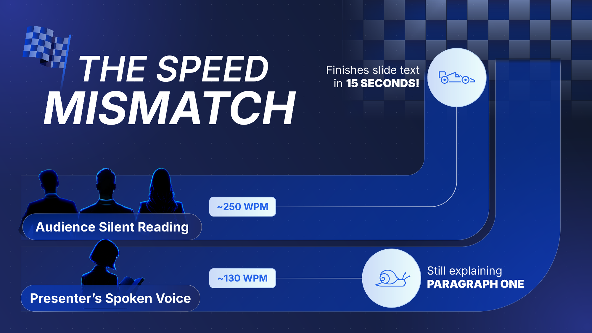
Hard linguistic data backs this processing speed mismatch.
According to an NIH adult reading study, the average professional silently scans text at a rapid baseline of roughly 250 words per minute.
Conversely, standard verbal communication moves much slower.
Benchmarks from The Speaker Lab pacing report show that effective presenters average a controlled pace of 110 to 130 words per minute to preserve clarity.
This massive speed gap creates an immediate cognitive breakdown during your live presentation:
- The Scan-Ahead Drop: Because visual reading is twice as fast as oral delivery, your audience will scan your entire text block within seconds.
- Complete Disengagement: Once stakeholders know exactly what your slide says, they lose the motivation to follow your voice and look down at their phones.
To salvage your presentation's impact, you must establish a strict division of labor between your spoken voice and your screen design.
Adopt these structural adjustments to keep your next corporate presentation clean, engaging, and authoritative:
- The Presenter Notes Vault: Relocate all full paragraphs, text transcripts, and secondary background details into your software's hidden speaker notes panel.
- The Punchy Trigger Rule: Limit on-screen bullet points to short, 3-to-5-word conceptual triggers rather than fully formed, multi-line sentences.
- Visual Substitution: Replace heavy blocks of written descriptions with clean geometric timelines, standalone metric cards, or minimal data charts.
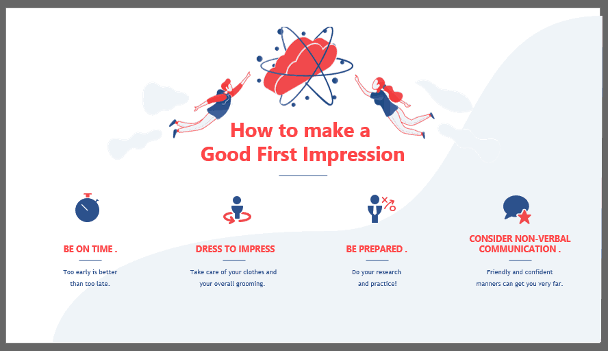
So, how do you avoid lengthy text slides? Think caveman-like speech. Do not, by any means, dump complete paragraphs into your presentation. Some even say to avoid complete sentences, forcing you to focus entirely on the core keywords and critical concepts you want your public to take home. People have a strictly limited capacity for retention, and keeping your layout restricted to these key points makes your insights infinitely easier to digest.
The Animation Circus: Movements That Distract the Room
Many presenters try to fix a boring, text-heavy layout by overloading it with default software motion effects. With over 150 animation options packed into PowerPoint, some decks look like it was their personal goal to try every single one.
They layer on aggressive spins, bouncing characters, and delayed text reveals across every single bullet point. Instead of making a corporate pitch feel dynamic, these distracting PowerPoint animations strip away your professional authority, making your deck look remarkably outdated. When every element on a slide is animated, it becomes exhausting for your audience to watch.
Relying on constant on-screen movement triggers severe slide pacing failures that break the connection between you and your audience for two primary reasons:

- The Presenter Click Trap: Setting up a slide where every single element needs an individual click to appear or disappear is a massive nuisance. It keeps you trapped behind the podium, worried and distracted, trying to remember if you’ve shown all your points or if you accidentally clicked too early.
- Visual Disorientation: Giving away your next slide points too early completely ruins your oral timing. When a swarm of flying objects shifts across the screen, the audience stops focusing on what you are speaking about because their brains are stuck anticipating the next moving point.
Of course, using motion doesn't mean your presentation is instantly awful. Professional designers use them frequently, but the key is automation, running transitions automatically without forcing the presenter to break their delivery flow with constant clicking.
Of course, using animations doesn’t mean your presentation becomes immediately awful. Here at 24Slides, our designers use them often in our free templates. For example, check out this great Project Management Template. It has animations for several elements, but they work automatically, without the need to click. This way, the presenter doesn’t have to distract themselves with it.
To protect your delivery pacing and maintain an elite corporate presentation style, look at animations through a highly disciplined framework:
- The Highlighter Rule: Think of animations strictly as a visual highlighter. It makes zero sense to highlight every single word on a printed page; it becomes messy and annoying. But if you highlight only the main shock value, unexpected metric shifts, or core ideas, it becomes an extremely useful presentation tool.
- The Single-Click Baseline: Completely banish complex multi-click visual builds. If you must use a transition to reveal data, select a subtle 0.5-second "Appear" or "Fade" that brings an entire conceptual block into view at once.
- Strict Focus Direction: Restrict motion effects solely to shifting focus dynamically from topic to topic. For instance, in complex diagrams with multiple intersecting arrows, sequential color-shifting animations can cleanly redirect your audience's attention exactly where you want it to go, preventing confusion. Just remember. When talking about animations, less is always more.
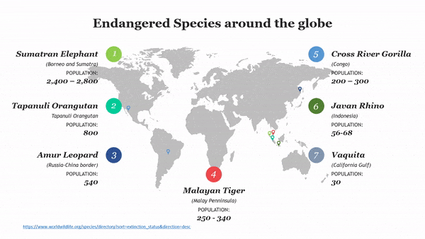
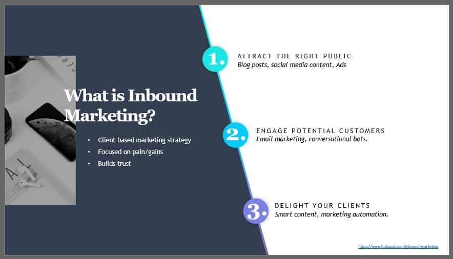
For example, on this slide, the animations shift the focus from topic to topic. Having all these arrows around might be confusing for the public, but with the colors and the arrow shifting, you can redirect your audience’s attention to wherever you like.
Rainbow Presentations: The Low-Contrast Trap
A presentation’s legibility hinges entirely on basic color choices. Yet corporate meeting rooms are regularly subjected to bad PowerPoint slides that look like a rainbow exploded over the layouts, featuring blinding neon palettes or faint, light-gray text layered invisibly over stark white backgrounds.
You don’t need to be an expert in color theory to design a clean, decent-looking presentation asset, but your guiding principle should always be: make it easy to read! Loud, bright background colors like neon orange or lime green look unprofessional and are incredibly unfriendly to the eye.
According to our original presentation design benchmarks, ignoring high color contrast creates major delivery problems across multiple formats:
- The Projector Washout: Standard office conference room projectors are notoriously poor at displaying subtle color shifts. Low-contrast pairings look entirely blank or turn into an unreadable, washed-out screen under bright meeting room lights.
- The Virtual Stream Compression: During online calls over Microsoft Teams or Zoom, harsh video compression alters color output. A bright yellow phrase over a lime green block quickly morphs into a blurry, pixelated smudge.
- The Squint Factor: The second, stakeholders have to lean forward and strain their eyes to decode an unaligned financial chart or bullet point; they experience immediate mental fatigue and detach from your commentary.
To ensure your text stays perfectly legible to human vision, layout designers rely on the W3C Accessibility Standards, which recommend a strict minimum visual contrast ratio of 4.5:1 for standard text blocks.
To keep your next deck sleek, professional, and readable from the back of any room, implement this straightforward contrast and palette framework:
- The Two-Tone Dominance Rule: Stick to absolute color opposites. Layer crisp white or high-visibility cream text elements over dark backgrounds, or sharp black and dark charcoal typography over clean, light gray layouts to guarantee instant scannability.
- The Palette Restraint: Pick a cohesive, premade corporate color palette to ensure your tones don't clash. Limit loud, bright colors strictly to a single accent element, like a single growth metric callout or an informational pointer, rather than using them for standard text sentences.
- The Free Contrast Audit: Before presenting to an executive audience, run your color hex codes through free, industry-trusted grading tools to mathematically verify that your contrast ratios pass the 4.5:1 baseline before you hit save.

Use these highly reputable, free contrast checking tools to audit your layout palette before your next live meeting:
- WebAIM Contrast Checker: A brilliant, no-nonsense tool that lets you plug in your background and foreground hex codes to get an instant pass/fail grade based on official accessibility standards.
- Adobe Color Accessibility Tools: A premium, freemium web tool that analyzes your entire color wheel to flag clashing tones, contrast issues, and color-blind safe combinations.
The Fake Minimalistic: The Trap of Blank Default Layouts
Sometimes, presenters take the saying “less is more” way too far. While overloading your layout with clashing palettes creates an eye-straining mess, turning your deck into a completely blank, unformatted white slab is not the answer either. PowerPoint’s blank default templates are a great place to start your creative process, but they are never meant to be left completely raw for a serious corporate presentation.
When you strip out every single ounce of visual branding, color structure, or graphic hierarchy, you land squarely in the zone of poorly designed, bad PowerPoint slides. Blank presentations are plain boring, and a total lack of effort can be just as distracting to an audience as a chaotic mess of colors.
Sobriety and professionalism are completely different from being lazy or simplistic. Even if you feel you are taking the "safe" route by avoiding design choices altogether, this shortcut almost always backfires against your authority for several key reasons:
- The Predictability Slump: A raw, black-and-white layout that relies exclusively on default bulleted lists becomes instantly predictable. It gives the audience zero visual motivation to keep paying attention, leading directly to the classic "death by PowerPoint" phenomenon.
- The Careless Impression: Forcing stakeholders to stare at unedited default system text can make you look lazy, signaling to the room that you didn't invest any care or preparation time into your own insights. This directly damages how people perceive the overall value of your work.
- The Memory Fade: Without clear color-coded focal points, structured shapes, or minimal graphic anchors, key data points blend into a monolithic wall of gray text, making your entire pitch completely forgettable after the meeting concludes.
Your slides do not need to be violently crammed with bright colors, wild animations, or complex graphics to win over a room. You can keep your presentation incredibly clean and minimal while maintaining an elegant, polished edge:
- The Structural Border Rule: Instead of floating text aimlessly on a vast white void, use clean geometric containers, subtle light gray cards, or structured column divisions to group your key data points into clear visual zones.
- The Monochromatic Anchor: Stick to a high-end minimalist theme by selecting a single, sophisticated brand anchor color (like a deep slate, a rich navy, or a sharp corporate forest green) to highlight only your primary metrics, headers, and essential takeaways.
- The Elegant Template Asset: Elevate your minimal aesthetic effortlessly with a professional, premade template. This ensures your margins, text alignment, and typography look perfectly balanced and intentional rather than completely unedited. Less is more, but only when less is designed with purpose.
This is the slide, redesigned by us. No one can say it isn’t professional, but it’s not boring either. You can check out this Minimalistic Design Template for more inspiration.
Pictures and Fonts: Diagnosing a Text-Heavy PowerPoint
Too much text can be an important factor in the “death by PowerPoint” phenomenon. When faced with a text heavy powerpoint section, a common panic move is trying to force the entire block of copy to fit on the screen by manipulating typography and packing in extra visuals. Presenters regularly shrink font sizes down to microscopic levels or switch to highly condensed, over-stylized fonts.
Your absolute priority must always be your audience’s ease when reading. Selecting narrow fonts like Impact, which has too little letter spacing, is probably not the best choice. Over-stylized fonts can also be a problem, especially those that imitate italics, as they create an immediate visual barrier.

This typographic and layout panic creates an unreadable slide and exposes a fundamental flaw in your presentation strategy for several reasons:
- The Farthest Point Test: In general, your font size should never go below 20 pts. The easiest way to see if your font size is good enough is to go to the farthest point in the room where you’ll be giving your presentation; you should still be able to read it easily from the back wall.
- The Visual Crowding Effect: Forcing stakeholders to squint at tiny 10-point or 12-point characters under bright meeting room lights doesn't make your slide look detailed; it makes it look messy and outdated.
- The Multi-Image Mess: Presenters often think adding more pictures will fix a boring layout. However, too many images can also be distracting to the public, especially if they overlap. Even if images are great for illustrating a point and reducing text, too many of them can make the presentation look outdated.
- The Clipart Distraction: Along with shrinking text blocks, people often toss in low-quality, generic clipart to fill empty gaps. It has been a while since the 2000s, so there is no reason for you to be using Screen Beans or outdated graphics in a serious corporate presentation.
When you find yourself highlighting a massive block of text and frantically tapping the "decrease font size" button just to keep it from spilling off the edge of the layout, stop and step away from the keyboard.
Take this direct, actionable diagnostic truth to heart: If you have to shrink your text to 10 or 12 points just to fit on the screen, you do not have a typography issue; you have a word count problem.
To protect your professional layout and ensure maximum readability across global meeting spaces, implement a strict typographic boundaries rule:
- The 24-Point Baseline: Lock your body copy to a minimum baseline of 24 points, and your headers to 36-40 points. If your text overflows the slide boundaries at this size, it is a definitive structural cue that you need to edit your sentences down or split the ideas across multiple sequential slides.
- The One-Image Standard: Choose your images smartly! When considering several images, ask yourself whether you really need all of them, or whether one can stand in for some of the others. Using a single, high-quality photograph or vector graphic keeps the presentation simple, elegant, and perfectly polished.

Also, avoid clipart! It has been a while since the 2000s, so there is no reason for you to be using Screen Beans.
Reclaiming Authority: Good vs Bad PowerPoint Slides Examples
When a corporate deck relies on chaotic text walls, misaligned shapes, or overwhelming layouts, it quickly falls into the cursed PowerPoint presentations category. These bad PowerPoint presentation examples don't just strain the eyes; they actively diminish your professional authority.
To reclaim control of the room, you must shift your mindset from content dumping to intentional visual structuring. Applying disciplined geometric design principles allows you to easily separate the hallmarks of good vs. bad PowerPoint slide examples.
Three Core Principles for Clean Slide Architecture
Shifting a deck from an amateur look to an executive-level presentation doesn't require complex artistic talent. It relies entirely on keeping your layouts clean, purposeful, and highly structured:
- The 30% to 40% Negative Space Rule: Air is luxury in presentation design. Never fill a screen from edge to edge. By maintaining a strict boundary of at least 30% to 40% negative white space, you give the audience's eyes a place to rest and make the remaining content instantly punchy.
- The Single-Takeaway Metric Focus: Avoid the temptation to stack three different quarterly updates onto a single card. Force each slide to champion exactly one clear takeaway metric or core concept. If you have a second major point, give it its own slide.
- The Structural Diagram Replacement: Long, narrative paragraphs have no place on a visual asset. Replace heavy text blocks with clean, professional diagrams, minimalist structural icons, or crisp geometric timelines that map out processes sequentially.
Ultimately, your slides are not a teleprompter or a data dumping ground. Clean layout structures keep the focus exactly where it belongs: on you, the speaker. Your deck should serve as a minimal visual anchor that validates your spoken insights, rather than a distracting wall of text that forces the audience to read rather than listen to your voice.

Beyond the Screen: Banishing Bad Slide Examples Forever
Mastering corporate presentation design ultimately comes down to understanding a fundamental division of labor: your slides provide immediate visual clarity, while your voice adds strategic depth, context, and perspective.
When you overload your deck with messy text walls, poor contrast, or cluttered graphics, you create poor PowerPoint slides that force your audience to choose between reading the screen and listening to your pitch. By eliminating these bad slide examples and embracing structured layouts, high contrast, and purposeful negative space, you transform your deck from a distracting text document into a powerful asset.

You do not need to spend hours fixing alignment, adjusting margins, or stressing over a cursed PowerPoint presentation. Your time is far too valuable to be wasted on formatting tweaks. Instead of fighting with complex layouts, focus entirely on mastering your narrative and refining your presentation delivery.
Let the professional design team at 24slides handle the visual heavy lifting for you. Our experts will seamlessly transform your raw data and rough drafts into polished, high-end corporate assets that perfectly match your brand identity.
Ready to banish bad presentation design from your meetings forever? Hand off your slides to the 24Slides design experts today and step into your next executive meeting with complete confidence!
If you want more tips on how to become a better presenter, read this article on the 15 most common presentation mistakes you want to avoid.