7 Presentation Design Ideas For Visually-Stunning Slides
Anyone can make PowerPoint, Prezi or Keynote presentations. But it doesn’t mean that everyone can just fire up their software and create visually-stunning presentation designs. I’m even willing to bet that the vast majority of users would just copy and paste some text into their slides, add some images and graphics to ‘spice up’ the presentation, and call it a day. If this is what you’re currently doing, then you’re in luck because you’re going to put a stop to it soon. In this article, you will learn seven practical presentation design ideas to help you create slides you’ll be proud to call your own!
Idea #1 – Identify Your Audience

Caption: Who’s going to be watching your presentation?
Before you start thinking about presentation design ideas, you need to know who your audience is so you can plan accordingly. If you’re presenting to teenagers, then you want to design your slides in a way that would resonate with that age group. If you’re presenting in front of professionals, then you need to design your presentation accordingly. Otherwise, you’ll risk offending your audience for subjecting them to visual torture.
Idea #2 – Outline Your Presentation

Caption: Outline your presentation’s flow
When you’ve figured out your audience, it’s time to outline your presentation. When writing your outline, make sure the hierarchy is clear, and the topics flow easily from one slide to another. You should also only talk about a single topic per slide. For example, for Slide 1, you’ll talk about Topic 1. For Slide 2, you’ll talk about Subtopic 1, and for Slide 3, you’ll cover Subtopic 2, and so on. This method makes it easier for your audience to absorb and understand the topics you’re covering before you handle the presentation design.
Idea #3 – Figure Out Your Color Theme

Caption: What color combination would you like to use?
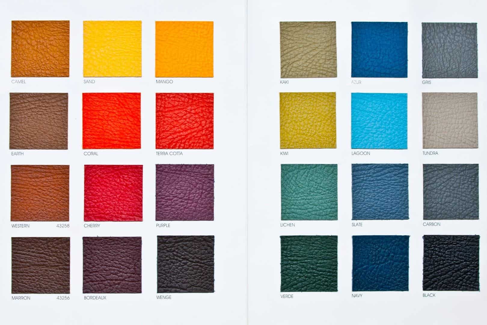
Most design experts will suggest the use of 2-3 colors throughout your entire presentation design. Their advice is to use one color for the foreground, another for the background base, and the third one for accents. Of course, there’s no hard and fast rule on this, but this advice makes sense. After all, you don’t want a kaleidoscope of colors on your slides as it could be very distracting to the message you’re trying to communicate to your audience. If you need ideas on the best color combination to use for your presentation design, check out Adobe Color CC.
You can also keep up with the year’s trend and use Pantone’s color of the year for 2018.
For best results, you should implement the design principle of similarity and contrast. Using similar colors or shades of the same color gives cohesion to your presentation while contrasting colors will catch the eye and make an object stand out.
Idea #4 – Use High Quality and Visually-Striking Images

Caption: A very striking image of the sunset
Images play a huge role in getting your message across. As the saying goes, “A picture paints a thousand words.” If you’ve got the right image on your slide, you don’t need to do a lot of explaining. You can add a two-word or three-word description, and that’s it. Your audience will know exactly what you’re referring to. Buying premium images can eat up your budget pretty fast so here are a few sites where you can use beautiful images for free:
https://www.pexels.com/
https://pixabay.com/
When using images, you might want to consider adding filters for a more consistent look with your presentation’s color theme. PowerPoint has a robust Picture Tools feature which you can use, so you don’t need to open up Photoshop or any other graphics software to edit your photos.
Idea #5 – Use The Right Fonts

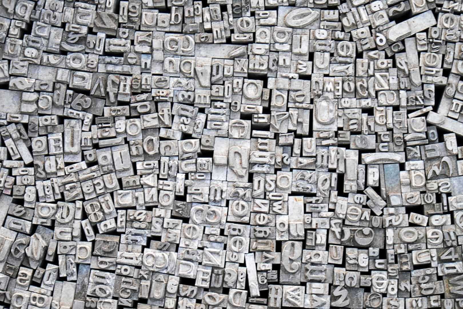
Typography is a very important aspect of presentation design and design in general. Different fonts evoke different emotions – some convey fun, some are best used in serious presentations, some are warm, and so much more. Depending on the message you want to convey, you’ll find plenty of fonts to choose from.
Don’t be overwhelmed when choosing fonts. Sans-serif is usually the font of choice because it’s easier to read. Serif fonts are fine to use as well though it’s usually mostly limited to headings and sub-headings. If you need font ideas, you can use this awesome tool to look for the best font pairs for your presentation: http://fontpair.co.
In addition to choosing the right typeface, you also need to consider the font sizes and the font colors. It’s common sense to use font sizes that are large enough to be read by people at the back of the room. But I’m pretty sure we’ve all sat at presentations where we had to squint or maybe even pull out our pocket telescopes to read the text!
Lastly, font colors should make it easy for you to read the text. Otherwise, there’s just no point in having large fonts if the font color doesn’t make it easy for your audience to read, large font or not.
Idea #6 – Use Vector Icons

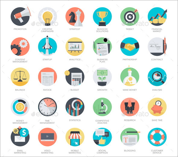
Caption: Sample vector images from Graphic River
Just like images, icons can convey messages without using up too much space on your slides. Icons not only free up space, but they also add to the design especially if you use well-designed icons. It’s also best to use icons from the same icon pack as they would have the same look and feel. It would add consistency to your overall design as well.
You can also make your icons on PowerPoint by merging different shapes together and then grouping them as one icon. If you’re creative, you can create icons in minutes. If you don’t have the time nor an eye for design, simply download free vector icons from places like:
https://www.freepik.com/free-vectors/icons
https://www.iconfinder.com/free_icons
Idea #7 – Use Plenty Of ‘White’ Space

Caption: A great example of a slide with plenty of ‘white’ space (Source)
‘White’ space doesn’t have to be white as you can see in the example image above. It just refers to having well-spaced elements in the slide because as you know, a crowded slide is not pleasing to look at. If there’s too much text, too many icons and images on a single slide, your audience would be confused by the message you’re trying to convey. The design principle “less is more” is very useful in presentations. It not only keeps your presentations simple, but it also allows you to direct your audience’s attention to the section or subject you want them to focus on.
Have You Learned Something New?
With the right combination of design elements, you too can create awesome-looking presentations. Just remember the reason you’re giving out the presentation in the first place – it’s because you’re sharing an important message to your audience. If you follow the tips I’ve written in this article, you’ll be on your way to leaving a lasting impression on your audience!
At 24slides, we’re designing beautiful PowerPoint, Prezi and Keynote presentations using the latest design techniques and loads of creativity. We create professional presentations from scratch and redesign existing ones. Take a look at some examples of our work and let’s get in touch.

