


Great slides, delivered to your inbox
Join thousands of professionals who get our best presentation tips, new templates, and design inspiration from the 24Slides team. Plus, if you ever need a fully custom deck — we’ll be a click away.

Reset your Password
Please enter the email you registered with and we will send you a link to reset your password!
Check your email!
We’ve just sent you a link to . Please follow instructions from our email.


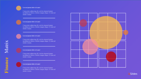
If you want to use a template that will enable you to compare different sets of data, then the Matrix Chart template is the one for you. The Matrix Diagram displays the existence and the strength of a connection between different sets of data. You can adapt it to every department of your company and easily update it to fit the latest data.
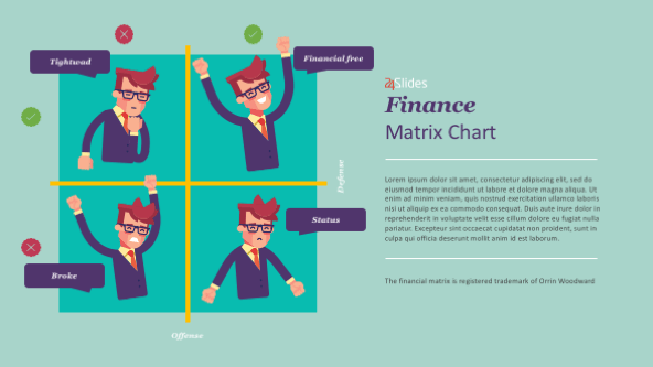
This matrix is designed to help you asses the severity of an event occurring on one axis and the probability of it occurring on the other axis. The horizontal axis represents the probability, while the vertical axis represents the likelihood of the risk occurring. The outcome can take place anywhere in the four quadrants and it can be estimated as ‘low’ or as ‘high’ depending on the two measures.
This matrix is formatted as a table and it is the best for developing a product quality function. You can use it to better capture the needs of your customers or to determine and deploy the product requirements. You can tailor it to fit any company’s needs, regardless of the industry it operates in.
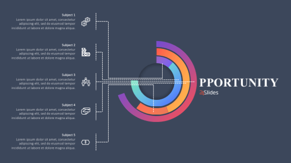
The Basic Matrix Chart is used to show the relationship of components to a whole in the triangles that give the shape to the whole matrix. You can write text inside of the parts of the matrix in order to describe your data. You can also add additional text outside the matrix if you need to provide the audience with a more detailed description.
The Matrix Chart enables you to compare different sets of data
This diagram is used to show the existence and strength of the relationship between the data sets.
The probability and impact matrix chart assesses the severity and the probability of an event occurring
The final outcome can take place anywhere in the four quadrants.
You can use the table-like matrix to develop a better product quality function
You will be able to easily capture the needs of your customers.


FIND OUT MORE ABOUT OUR CUSTOM DESIGN SERVICES
Check out other similar templates

 69 fully
editable
slides
69 fully
editable
slides

Todd Speranzo
VP of Marketing at Avella
"24Slides helps us get PowerPoints on-brand, and improve overall design in a timeframe that is often “overnight”. Leveraging the time zone change and their deep understanding of PowerPoint, our Marketing team has a partner in 24Slides that allows us to focus purely on slide content, leaving all of the design work to 24Slides."
Gretchen Ponts
Strata Research
"The key to the success with working with 24Slides has been the designers’ ability to revamp basic information on a slide into a dynamic yet clean and clear visual presentation coupled with the speed in which they do so. We do not work in an environment where time is on our side and the visual presentation is everything. In those regards, 24Slides has been invaluable."
Nyah Pham
Novozymes
"After training and testing, 24Slides quickly learnt how to implement our CVI, deliver at a high quality and provide a dedicated design team that always tries to accommodate our wishes in terms of design and deadlines."