7 Presentation Styles to Make Your Presentation Shine

Although making a presentation may seem like something easy to do, it actually implies lots of time and effort. It’s not as easy as in just standing in front of a group of people and talking. There is an art in doing a good presentation that captures your audience’s attention and turns a dull topic into something interesting and exciting. Good thing is, you can always improve your presentation techniques. Whether it is for speaking in public or designing better presentations, practice makes perfect. So here there are 9 presentation styles that you can try out to take your skills to new heights.

Presentation Design Styles
You might think that presentation design is a secondary element in a presentation. After all, the speaker’s ability to convey the information is what makes the presentation a success or a fail. While this is true, there is much more than presentation design contributes. The presentation’s design can tell the audience an important message about the business or the speaker. Design can be the difference between an incredible presentation and a terrible one.
Over the years, PowerPoint has gained something of a bad reputation. This is precisely because of bad presentation design. All-white template presentations, too much text on the slides, clashing colors… All of these are presentation design characteristics that can drive the audience into the “Death by PowerPoint” syndrome.
PowerPoint is supposed to be a visual aid to complement your presentation. The problem is, in many cases, the PowerPoint is competing with the speaker, rather than complementing him. Slides with too much text, or even just complete sentences can make the audience feel like they’re going through everything two times. Bullet points can work fine as a summary at the end of a presentation. But when every single slide is filled with bullet points, it is not only boring, but it also spoils your presentation’s intrigue. Your audience will be more focused on reading al the following points that actually listening to what you’re saying about your current topic.
There are many elements that can make your presentation a distraction rather than an aid. Check out these bad PowerPoint examples that you should avoid at all costs. But in any case, a good (or bad) presentation design can really make a difference. These 4 presentation design styles can help you when you’re planning your next presentation.
-Minimalist Presentation Design
Minimalist started as an art movement in the second half of the 20th century. Since then, it has expanded to different areas, like literature, architecture, and even as a lifestyle. So why not use it as a presentation style too?
It’s hard to define minimalism in just a few words, but it can be summarized in the “less is more” philosophy. Usually, we think that the more complex and detailed something is, the more time it has been invested in it, meaning that it is more valuable. Minimalism goes against this idea. This style is all about cleanliness and effectiveness. Why use 5 different words when you can say exactly the same with one?

One of the most basic characteristics is the use of negative space. Sometimes we tend to feel the need to fill every single space with something. It’s not uncommon to feel that, otherwise, it’ll look to “empty” or too “simple”. Minimalism shows us that this is not always true. On the contrary, having just one element that contrasts with the background will help our audience to focus better on it. And even if it looks simple, that it’s its beauty!
Minimalism may look simple, but it’s actually not easy to achieve. It demands that you know clearly what are the most important elements that you have to showcase, and which ones you can dispense of. This is exactly why it’s such a great style for presentations. Not only it helps your audience focus better on what you wish them to, but it also helps you organize and think twice your own presentation while you’re designing it.
-Takahashi Presentation Style
In some way, the Takahashi presentation style is similar to the minimalism. However, it has its own characteristics that make it worth it to talk into more detail about it. It was created by Masayoshi Takahashi, hence its name. His presentation style is based on the idea of having just word-based slides, instead of pictures or graphs. Takahashi presentations usually have few words on each slide, with very big characters, like a headline.
lldecade2012 from masayoshi takahashi
Takahashi even makes his presentations with black text among a white background, to take simplicity to the extreme. He suggests that this way, the audience can understand better and faster. The trick is to ask yourself: if I have to summarize this slide in just one word, what should it be?
Obviously, this presentation style also demands a very specific way to speak in public. Takahashi created this design precisely so people can start focusing more on the presenter, not in the PowerPoint. But the design is a vital part of this style, so it made sense to put it right next to minimalism. Like this last presentation style, Takahashi presentations demand that you think through and through your presentations and what exactly are you trying to convey.
This presentation style demands a lot of confidence in the speaker, but when it works, it works! Are you daring enough to try to make your own Takahashi presentation?
-Colorful/Playful Presentation Styles
On the complete opposite side of minimalism, there is the Colorful presentation style. Sometimes, the key to making a presentation more easy to digest goes through the design style too. You can make a presentation funny and easy-going as a speaker, but if the presentation is all black and white bullet points, it’ll still be difficult to keep the audience’s attention. Having an eye-catching, colorful presentation certainly helps.
Here at 24Slides, our designers work with the style they call “playful”. It’s defined in contraposition to their other two styles, corporate and creative. These last two are more serious and business-like. The Playful style, on the other hand, uses bright colors and customized illustrations to catch the audience’s attention. The “playful” layout is also an essential part of this presentation style. The key is to present the information in new, innovative ways that will make the audience feeling like it’s the first presentation of its kind, instead of “just another boring report”.
Doing a playful presentation may be a little bit hard if you’re not an experienced designer. But you can still add elements of this presentation style, like for example color. Many people are afraid to use colors, thinking it will look unprofessional, or eye-straining. But they are many online tools to make sure your color scheme looks clean, instead of colors clashing with each other. Session College’s Color Calculator, for example, is great to make customized color palettes.
If it proved to be too much effort for you, however, or you just one a presentation with professional illustrations and icons, you can always contact our designers at 24Slides. They’ll be more than happy to help you create a beautiful playful-style presentation (or in any presentation style really).
-Jump and other non-traditional outlines
Want to make a more interactive PowerPoint presentation? One of the main criticisms of PowerPoint is that it’s too linear, too rigid. If you want to go back and forth from different topics, you’ll be forced to go through all the previous slides until you find the one you were looking for. This is one of the main plus points of Prezi. But very few people know you can make something very similar with PowerPoint.
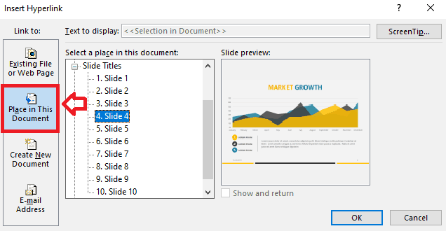
You can jump from a slide to another with the use of internal hyperlinks. All you need to do is to select what you want to be the trigger, and then select the option Insert ribbon > Links > Link. Then, in the “Insert Hyperlink” window that will pop-up, choose the option of “Place in This Document”, and choose your destination slide. It’s not difficult at all when you get the hang of it, though it can be time consuming. It also demands that you have a very good knowledge of your own presentation. You need to know from where slide you can jump to which. But it can certainly give a different look to an otherwise plain presentation.
Another option for designing non-traditional PowerPoint is to use the new features Microsoft Office has added. Zoom and Morph are great features to give your PowerPoint a completely different feel. Add-ins like PowerPointLabs also give you a wide range of options to make your presentations feel less like a PowerPoint and more like an interactive video. These options will certainly keep your audience’s attention!
Presentation styles
Aside from the presentation design styles, there are also certain techniques you can use to improve your skills when talking in public. Speaking in a monotone tone, or speaking too fast or too slow, fidgeting… all these are elements that can affect the audience reacts to your presentation. But really good speakers also make sure that they have a certain tone or “style” when presenting. This gives a unified feel to the whole presentation.
Here I’ve divided presentation styles according to the speaker’s objective. The first thing to do when planning a presentation is to ask yourself: what am I trying to achieve with this presentation? Am I trying to sell something? To inform my audience about a certain topic? Am I trying to inspire them to do something or change something?
Whichever objective you pick, the first and foremost point of all of them is to make your audience care about what you’re talking about. Once you know what exactly you want to accomplish with your presentation, it’s easier to think how to make them care about it. For example, if you’re trying to sell something, you need to make them care about the product. Make your audience care about what they’re losing without it, what could they accomplish with it.
Here you’ll find 3 presentation styles that can help you make your audience care more.
– Storytelling
Storytelling is actually more of a resource than a presentation style. But it’s worth mentioning since it’s such a great way to make your audience care about your presentation. You can mix storytelling with any of the following presentation styles, and it will give them the extra push to really believe in what you’re selling.
Storytelling is great because it invites your audience to empathize with what you’re presenting. Abstract thinking and general facts are difficult for people to relate to. You may say something like “extreme poverty affects almost 10% of the global population”. While this might be shocking, it’s still just a number. With storytelling, you put a face to the cold, hard facts. You present your audience with someone who is experiencing extreme poverty, what does this mean for this person, how do they live. I’ll assure that it will stay in your audience’s minds way longer than just a number.
TED Talks are a great example of this technique. Whether they’re presenting an inspiring case, a new scientific discovery, or a business skill you should have, they are all grounded in personal experiences. This allows the audience to really see how individual lives are impacted and empathize with them. TED Talks also has a great article on why storytelling is such a powerful tool.
If you want to know more about how to incorporate the storytelling technique to your presentations, you should definitely take a look at the 7 essential storytelling techniques for presentations.
– Data/Statistician
There is the preconception that data-driven presentations are always boring. This is certainly true in many cases. After all, hearing a long list of numbers and percentages is not particularly fun. Plus, it’s probably completely useless. Most people won’t remember even one of all those numbers you threw after the presentation has just ended. In this type of presentation, it is important that you showcase what all this data means.
Just like with storytelling, numbers are just numbers. You need to anchor that data in something more concrete. To make your audience care, you need to show what is behind the data, and how it might affect them. Another great technique is to relate their work with the data you’re showing. How did the team’s work impact in these statistics? Giving credit where credit is due is not only fair but also an incredibly useful tool.
In this presentation style, the way you showcase your data is vital. Just talking about the numbers is hard to understand and to process. Graphs, charts, and diagrams are popular because of a reason: they are effective. Seen data in a visual way makes it so much more easy to understand and digest.
– Pecha Kucha
Finally, we have the Pecha Kucha presentation style. While this one is in a way connected to the “storytelling” presentation style, it certainly deserves its own section due to its unique setup. Pecha Kucha is also called the 20×20 presentation. Architects Astrid Klein and Mark Dytham created this presentation style in 2003, and it has gotten a huge following ever since. While this one might not apply to every single presentation out there, it’s a great option to have around.
Pecha Kucha presentations consist of 20 images. Each of these has exactly 20 seconds, and they should transition automatically. This way, the speaker won’t have the temptation of staying in one for too long. Because of all this, Pecha Kucha is a highly visual, concise presentation style. As you can probably imagine, It is a really hard presentation style to use. It demands you know your presentation as the back of your hand, and to know very well what are you planning on saying on each slide. But precisely because of that, if it’s done well, it really works. It combines the charm of casual smalltalk (“pecha kucha” actually means chit-chat after all), with precision and conciseness.
It’s certainly not the presentation style to use for a sales report, but mixed with the storytelling technique, it can work wonders.
Designing presentations is hard work
You may be thinking “This is way too much work”, and it is sadly true. Doing presentations is not easy. It’s up to you to step up your game and improve your speaking abilities so you can connect better with your audience. However, there is one thing we can help you with and that is presentation design. Our team of designers here at 24Slides will make sure your presentation look the best, while you focus on yourself. You can pick whichever presentation style you think will fit best, and the designers will take care of it!