AI vs. Manual Slide Design: What Testing Claude, Gamma, and a Professional Designer Actually Showed (2026)

24Slides tested Claude, Gamma, Canva, and Pitch. While AI creates quick drafts, turning them into boardroom-ready decks can take up to 4 hours, creating a hidden $300 "editing tax" in wasted executive salary.
Search for an AI vs. manual slide design comparison today, and software vendors will tell you: "AI is good enough for 80% of business presentations." But what happens when you trust an algorithm with that critical remaining 20%?
With 13+ years of enterprise experience and over 2 million slides designed, 24Slides put those claims to the test.
In this 2026 reality check, our team stress-tested leading platforms to define exactly where AI tools fit within a professional presentation workflow, quantify the hidden editing costs, and show when human expertise remains indispensable:
TL;DR: The 24Slides Quick Verdict
Vendors claim AI presentation tools require just "1 hour of light editing." Our testing shows a different reality: while AI generates a 10-slide framework in minutes (saving 30% to 40% of initial outline time), non-designers spend hours fixing broken PowerPoint exports, flattened charts, and off-brand formatting.
Quantifying the "Editing Tax": AI Presentation Generation vs. Manual Slide Hours
| TOOL | DRAFT TIME | EDITING TAX (10–12 slides) | PRIMARY CAUSE OF FIXES | VERDICT |
|---|---|---|---|---|
| Claude | 8–20+ mins | 3.0 hrs | Code-locked grid structures; code-to-PPTX export glitches | Strongest narrative logic, but requires manual layout polishing natively in PowerPoint. |
| Gamma | 1–2 mins | 3.5 hrs | PPTX export bug breaks web card layouts and flattens charts | Great for browser viewing, but export bugs force heavy manual chart reconstruction. |
| Canva | 1–2 mins | 4.0 hrs | Text overflows rigid template boxes; charts export as static images | Rich visual assets, but rigid containers demand constant human formatting. |
| Pitch | 2–3 mins | 4.5 hrs | Severe slide-to-slide "visual drift" from isolated slide prompts | Excellent team workspace, but weak generative AI necessitates full manual styling. |
(Note on testing parameters: Benchmarks reflect effort required for boardroom-ready enterprise standards with strict brand compliance, not casual internal team syncs.)
Key Takeaways
• The Editing Tax: AI shifts your workload from creating to fixing—adding 3.0 to 4.5 hours of manual layout and export cleanup in PowerPoint.
• Salary Leakage: At a standard $75/hour executive rate, spending 4 hours fixing AI exports costs $300 in wasted payroll per deck, making manual DIY cleanup far more expensive than delegating to professional designers.
• Narrative vs. Design Layer: AI tools automate basic box placement (the Design Layer), but human designers own narrative pacing, audience empathy, and strategic data storytelling.
• Enterprise Security Moat: Uploading unannounced Q3/Q4 financials to public AI models creates data privacy risks; SOC 2-compliant agencies remain essential for sensitive corporate data.
Here are the topics we'll cover:
- When 24Slides Is NOT the Right Choice
- The Narrative Layer vs. The Design Layer
- Under the Hood: How AI Builds Slides
- The Four Places AI Breaks Down: Context, Brand, Content, Narrative
- The Hidden Cost of AI: Quantifying the "Editing Tax"
- The Real Cost Math: AI Tool + Editing Tax vs. 24Slides Flat-Rate Design
- How 24Slides Actually Uses AI
- Head-to-Head: AI Draft vs. Designer Rebuild on the Same Brief
- AI vs. Manual Slide Design: The Strategic Differences
- The Decision Matrix: When to Use AI vs. When to Hire a Pro
- Will AI Replace Presentation Designers?
- The Bottom Line: See What "Perfected by People" Looks Like
- Frequently Asked Questions (FAQ)
- Created with AI. Perfected by Humans.
When 24Slides Is NOT the Right Choice
Before we dive into the test results, let's be completely transparent: a professional design agency is not always the right answer. We believe in using the right tool for the job.
If you need 50 near-identical slides updated by tomorrow morning with zero brand-compliance review, an AI tool alone is faster and cheaper than any human workflow, including ours.
If your presentation falls into everyday, low-stakes business use cases, you should absolutely use an AI presentation tool and skip the professional designer. Use AI if:
- Your meeting is in 20 minutes: AI is the ultimate cure for the "blank page." If you need a rapid, internal-only draft immediately, an AI generator will beat a human turnaround time every single time.
- You have zero budget: If you need a free or a very low-cost solution, tools like Gamma or Canva are fantastic starting points for first-draft brainstorming.
- Brand compliance doesn't matter: If you are building a casual deck for an internal team sync where strict adherence to your Corporate Visual Identity (CVI) isn't required, AI templates are perfectly fine.
However, if you are presenting an executive board update, pitching high-stakes investors, or speaking at a global conference, relying purely on an automated draft leaves critical gaps in brand compliance and strategic storytelling.
To show you exactly where these tools excel and where they hit their limits, we put the market leaders to the test. Here is how they actually performed.
The Narrative Layer vs. The Design Layer
Before we can conduct a fair AI vs. manual slide design comparison, we have to define what a presentation actually is. Every high-stakes pitch is built on two distinct layers:
- The Design Layer: Formatting boxes, aligning text, selecting typography, and applying color palettes.
- The Narrative Layer: Strategic pacing, audience empathy, data hierarchy, and persuasive storytelling.
Current AI tools handle the Design Layer with speed, but the Narrative Layer still demands human judgment. This boundary isn't unique to presentations; as highlighted in this breakdown of how AI is changing UX and product design, balancing technical automation with human narrative remains a challenge across all creative fields.
This creates a phenomenon we call the "Diagnosis Gap." When a non-designer uses AI, the resulting slide often looks highly polished. But if that presentation fails to connect with the client or secure the funding, it can be hard for the user to pinpoint why.
Bridging this gap requires a trained eye to adapt the visual psychology to the specific room, rather than just applying algorithmic design rules."
Under the Hood: How AI Builds Slides
To understand why AI struggles with the Narrative Layer, you need to understand how it "thinks." In the battle of AI presentation generation vs manual design, AI software generally falls into three architectural categories:
1. "The Injectors" (Template Fillers)
Think of this as a sophisticated "Fill-in-the-Blanks" machine (used by tools like Canva or Microsoft Copilot). Instead of designing a slide from scratch, the AI searches through a massive library of pre-made templates and "injects" your content into them.
- The Technique: The system analyzes the structure of a template (XML). It identifies specific "placeholders"—like a title box or a bullet point list—and uses a Large Language Model (LLM) to generate text that fits precisely into those strict boxes.
- The Advantage: Brand Consistency. If you feed the system your own corporate templates, the AI will only put text where you allow it to. It respects the "walls" of your design.
- The Downside: Rigidity. The AI is just filling forms; it isn't designing. If it generates 5 bullet points but the template only holds 3, the text will awkwardly crush or overflow.
2. "The Liquid Canvas" (Web-Based Builders)
Think of this like a web developer coding a site in real-time. Tools like Gamma abandon the PowerPoint engine entirely, building fluid, scrolling web cards.
- The Technique: These tools abandon the PowerPoint engine entirely. Instead, they build slides using web code (HTML/Canvas). When you type a prompt, an algorithm dynamically calculates a "Liquid Layout." If you add more text, the boxes automatically shrink, expand, or move to make room.
- The Advantage: Instant Polish. The boxes automatically shrink or expand to make room for your text.
- The Downside: The Export Bug. Since these slides are built like websites, exporting them to an editable .pptx file often results in broken layouts and flattened, uneditable charts.
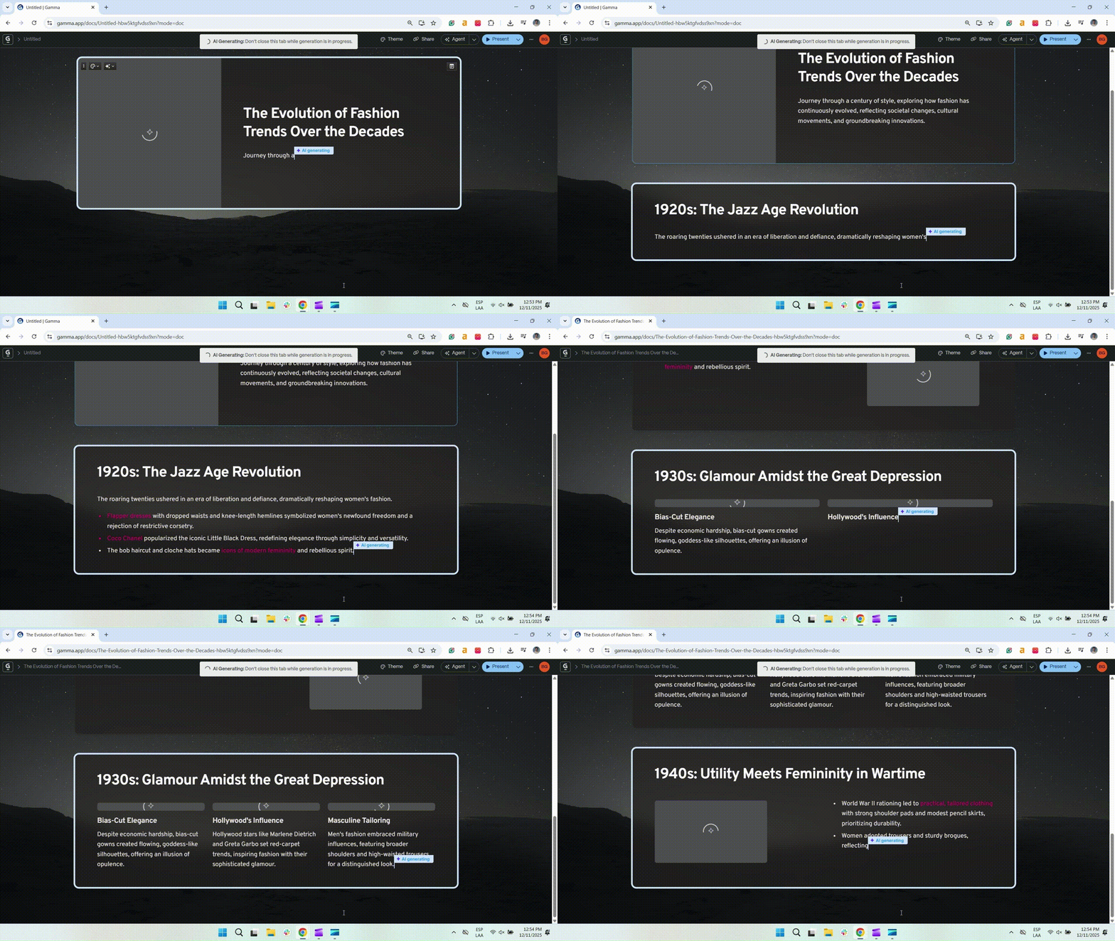
The Liquid Canvas in Action: Unlike the rigid Injector, this engine is built with code. Watch how the layout dynamically calculates space in real-time to ensure the design never breaks. (Source: Gamma)
3. "The Prompt-to-Code Engines" (AI Artifacts)
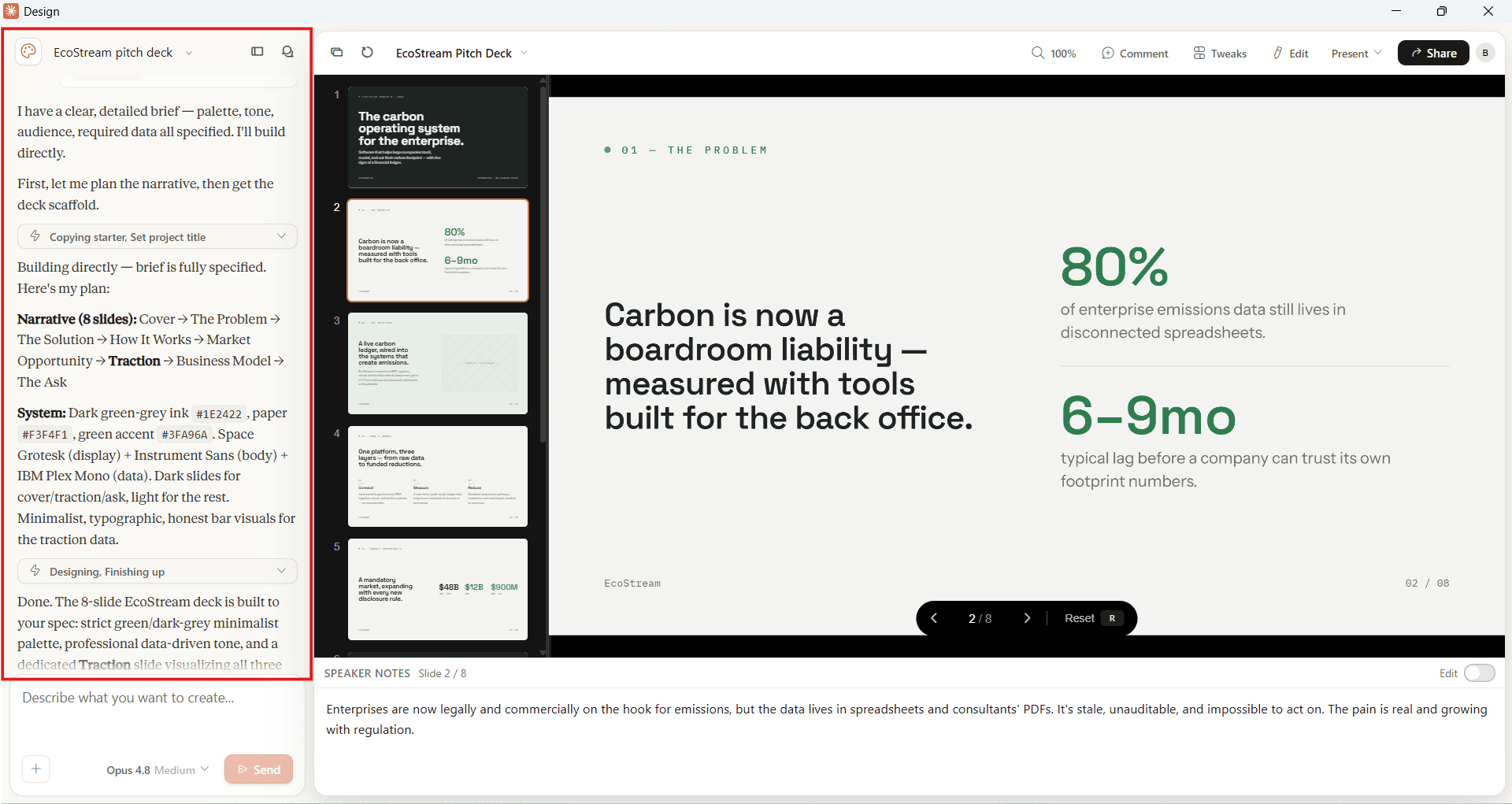
This is the newest frontier, championed by Anthropic’s Claude Design. Instead of using a dedicated presentation interface, Claude actively writes code in the chat window to render a slide deck.
- The Technique: The LLM reads your prompt or uploaded documents and generates raw frontend code (like React components) in a side panel to visually render the presentation in real-time.
- The Advantage: Unmatched reading comprehension. Claude is arguably the smartest "brain" on the market, easily outperforming other tools when it comes to summarizing complex, text-heavy PDFs into logical slide structures.
- The Downside: The Rigid Grid. You cannot freely drag and drop elements. The code locks your text and images into predefined boxes. If you want to move a chart slightly to the left, you are forced to export the file to PowerPoint, where you might find some formatting bugs.
The Four Places AI Breaks Down: Context, Brand, Content, Narrative
While AI is faster at building slides, our ongoing analysis proves it fundamentally struggles with the most important part of presentation design: Contextual Intelligence.
When building the foundational testing framework for our research, 24Slides established a strict baseline from day one:
Looking at the 2026 landscape, the answer is still: Not quite. Because AI sees a presentation as a collection of code and algorithmic rules rather than a strategic asset, it consistently hits a wall in four specific areas:
1. Strategic Blindness (The "Audience" Context)
AI understands data, but it does not understand politics or strategy.
- Tool Tested: Canva Magic Design
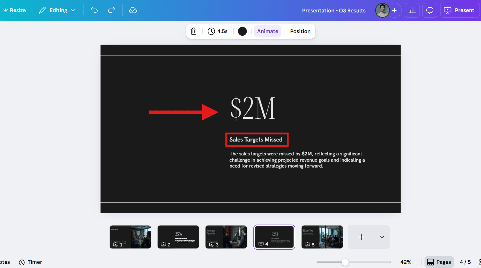
- The Scenario: You need to present poor sales figures to the board of directors.
- The AI Solution: A massive red chart pointing downwards (because that accurately reflects the data). Technically accurate, but strategically disastrous.
- The "Why": AI lacks Visual Empathy. It cannot weigh the "political cost" of a design choice or visually frame a narrative to protect the presenter.
- The Human Solution: A designer creates a "Turnaround Strategy" slide where the sales figures are a smaller, contextual detail, focusing the visual hierarchy on the solution, not the problem.
🚨 Not for: Teams presenting to a named executive audience with known preferences that an AI cannot infer from a prompt.
2. The "Vibe" Trap (The "Brand" Context)
Unless you are using the rigid "Injector" method, AI struggles to respect strict design manuals.
- Tool Tested: Gamma App
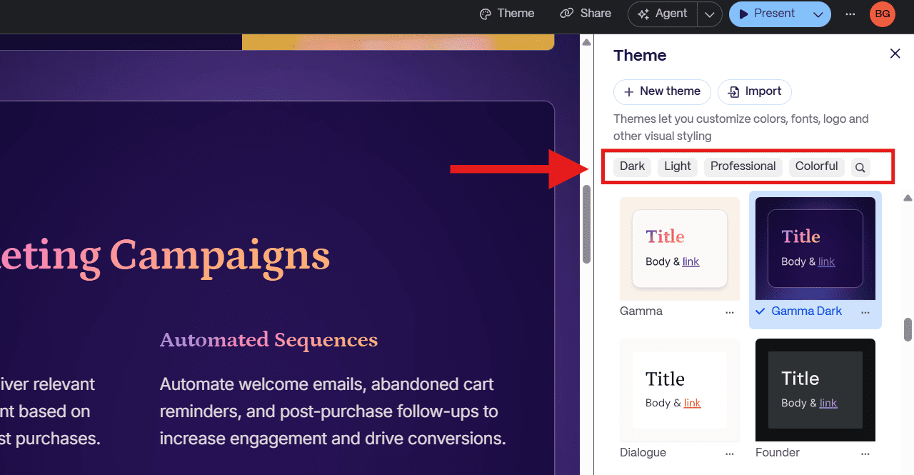
- The Conflict: Our research shows that AI is excellent at "Vibes" (creating a mood like "Cyberpunk" or "Minimalist") but terrible at "Identity" (respecting specific Brand Rules).
- The "Why": Generative models are trained to prioritize aesthetics over rules. If you need a specific "Coca-Cola Red" (#F40009) but the AI thinks a different red looks "prettier" in that specific layout, it will prioritize the pretty version.
- The Result: You get a deck that looks professional but doesn't look like you. It views your logo as decoration, not an identity.
🚨 Not for: Organizations with locked brand guidelines (approved fonts, colors, logo lockups) that require pixel-level compliance.
3. The Template Straitjacket (The "Content" Context)
Have you ever tried to move an image in a generative AI tool, only to realize you can’t place it exactly where you want?
- Tool Tested: Claude Design.
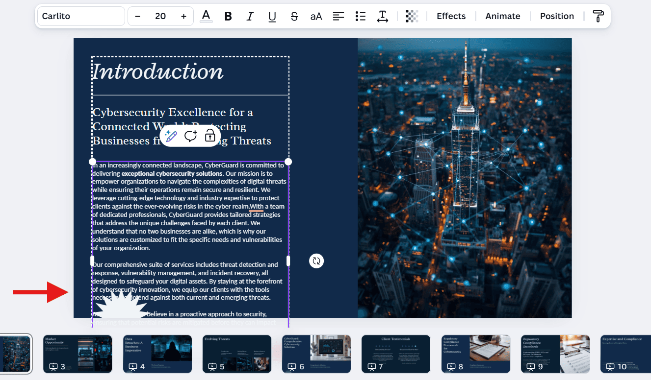
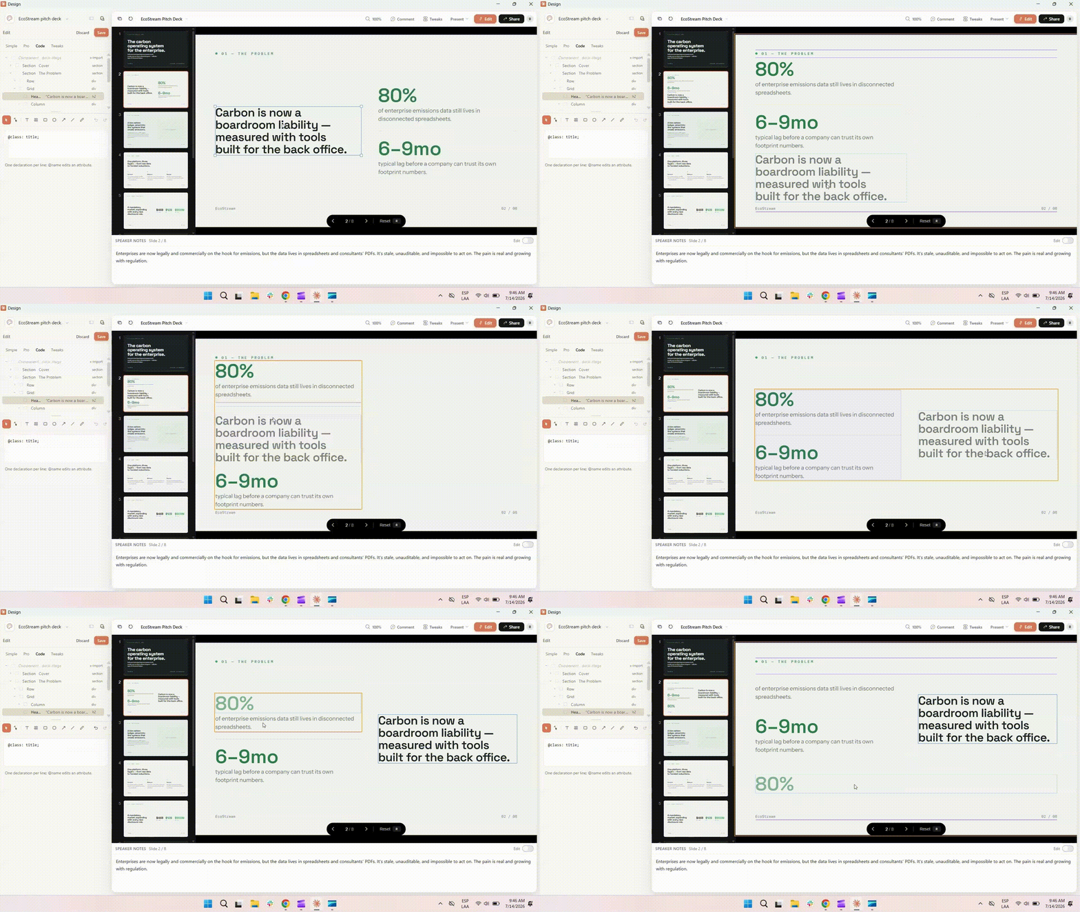
- The Nuance: While traditional slide software allows free movement, the newest wave of AI builders works differently. As seen in the example below, Claude literally generates slides using web code components.
- The Reality: In these tools, it is not "Drag Anywhere"; it is "Drag to Reorder." Your text and images are locked inside rigid, invisible bounding boxes. You cannot overlap an image, angle a graphic, or layer elements behind text for a custom effect. If you want to freely move elements, you are forced to export the file to PowerPoint
- The "Why": These engines use "Relative Positioning." To ensure the generated design never "breaks" on mobile or web, the code strictly prohibits elements from overlapping.
- The Limitation: This creates a creative straitjacket. A human designer creates interest by breaking the grid; layering images, using negative space, and creating depth. These AI algorithms are mathematically prohibited from doing the "messy" work that makes a slide unique.
🚨 Not for: Dense data tables or nested organizational charts that don't fit a pre-built template grid.
4. The Missing "Visual Thread" (The "Narrative" Context)
AI often views each slide as an isolated task rather than a chapter in a story.
- Tool Tested: Pitch
- The Issue: Slide 1 might be minimalist and blue; Slide 2 might be cluttered with a different icon style.
- The "Why": AI generates one slide at a time without a "memory" of the visual rhythm. It struggles to maintain a consistent narrative arc throughout the whole file.
- The Result: The deck feels like a collection of separate ideas. A human designer ensures a "Visual Thread" runs through the deck, so the audience never doubts they are watching one cohesive story.
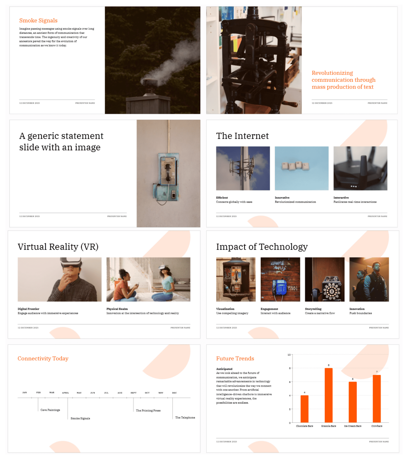
The Inconsistency Test (Generated in Pitch)
- The Prompt: A deck about the "Evolution of Communication."
- The Failure: Look at the visual drift. The earlier slides (like "Smoke Signals") use a minimalist layout with moody, dark nature photography.
- The Glitch: Suddenly, in the later slides (like "VR" and "The Internet"), a pink graphic shape appears in the background, and the image style jumps to bright, studio-lit stock photos.
- The Verdict: The AI treats every slide as a separate task. It forgot the visual rules it set for itself just a few slides earlier.
🚨 Not for: 20+ slide decks that need a consistent visual argument from slide 1 to slide 20.
The Hidden Cost of AI: Quantifying the "Editing Tax"
The loudest argument for automated slide generation is speed. Software vendors actively publish comparison tables claiming that an AI deck only requires 30 to 60 minutes of "light editing." When we compared these raw AI drafts against professional manual slide design, we discovered that this "vendor math" is highly optimistic.
Take Anthropic’s Claude, a prime example of the 2026 AI landscape. It is incredibly smart. It understands context and structures raw data flawlessly. But when a user actually tries to finalize that output for a corporate setting, they immediately hit the Editing Tax.
To quantify this, we sat down with Adimir Sanchez, a member of our Customer Support team. He is an AI "power user" who relies heavily on Claude (Opus 4.8) to convert dense, 50-page university research papers into structured presentations.

(Note: Adimir specifically uses Claude's "General Chat" interface rather than the dedicated "Design" tab. While the Design tab generates slides faster, our testing showed that feeding heavy documents into the General Chat produces superior structural results, despite the massive delay in generation time).
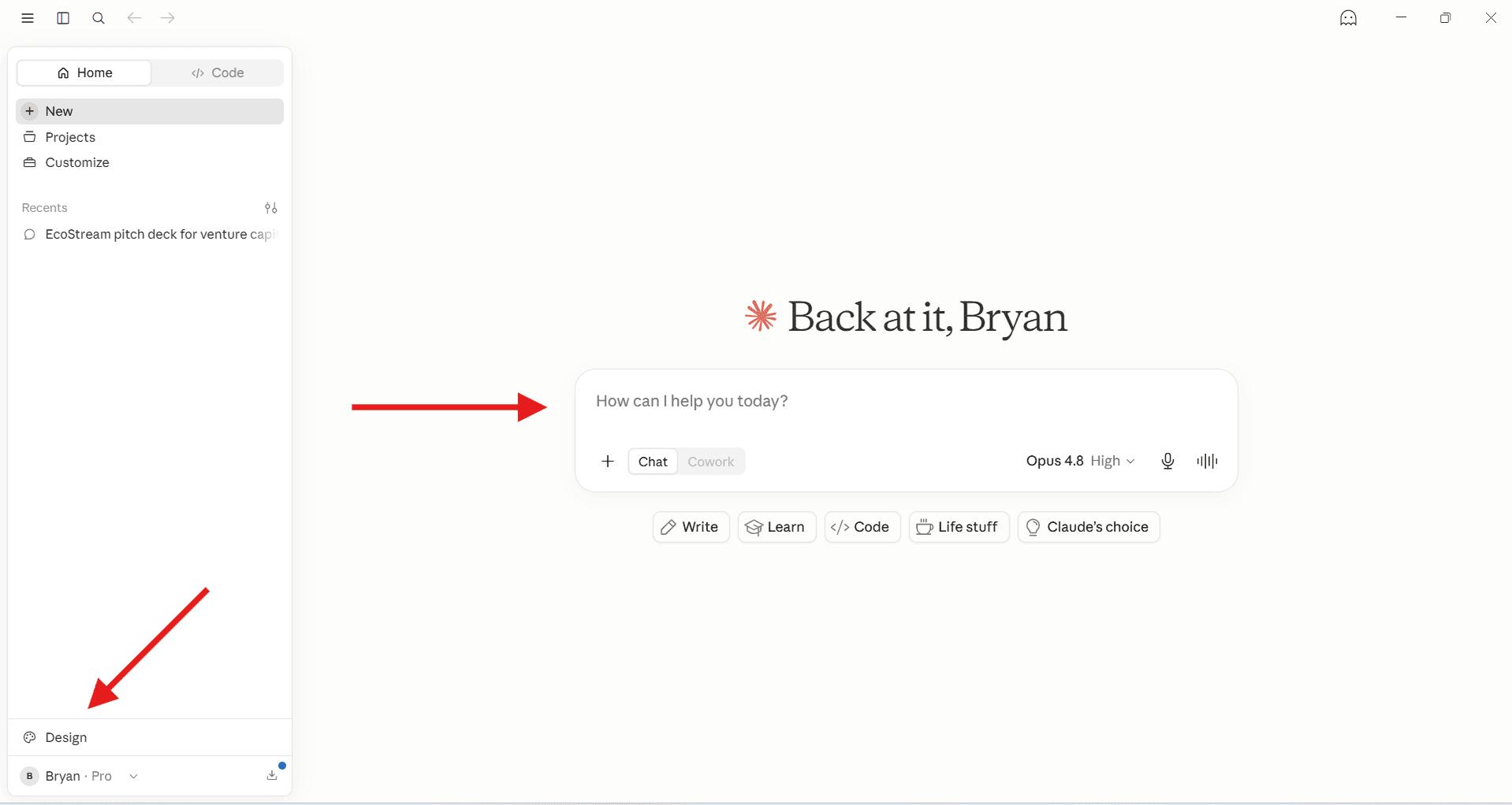
Even with an advanced understanding of how to prompt the AI, replacing manual slide design with automated tools still requires up to 3 hours of cleanup per deck in Claude.
| THE PHASE | THE REALITY |
|---|---|
| The Generation Wait | For a heavy 10-15 slide deck, Claude's General Chat takes roughly 20 to 30 minutes to process documents and generate the initial layout. |
| The Refinement Loop | AI rarely delivers a perfect layout instantly. Adimir spends significant time prompting Claude to tweak structures and tone, requiring heavy user oversight before exporting. |
| The 4-Hour Token Limit | Claude Pro limits reset every 4 hours. Power users stuck in the "refinement loop" burn quotas quickly. Once hit, you must wait 4 hours or export to PowerPoint to finish manually. |
| The 15-Minute Tax |
Because exported .pptx files break easily, Adimir spends an average of 15 minutes per slide (up to 3 hours a deck) fixing overlapping text and alignments natively in PowerPoint.
|
The Real Cost Math: AI Tool + Editing Tax vs. 24Slides Flat-Rate Design
If a mid-level corporate manager (earning a standard loaded rate of $75/hour) spends 4 hours fixing broken PowerPoint exports, that AI presentation didn't just cost a $20 software subscription—it cost the company $300 in wasted executive time.
To understand the true economics of slide design, you have to measure the effective cost per deck, not just the upfront software license.
While AI generates fast initial drafts, turning raw exports into brand-compliant assets requires meticulous cleanup.
Cost Breakdown for a 10-Slide Presentation (Based on a $75/Hour Salary Rate)
| APPROACH | HIDDEN TAX | COST (10 SLIDES) | TURNAROUND | QUALITY |
|---|---|---|---|---|
| DIY AI Tool Alone | 4 Hours (Internal manager time) | $300 (Wasted manager salary) | Immediate (Drains 4 hrs of focus) | Amateur (Visual glitches remain) |
| Freelancer* | 0 Hours | $200 – $450+ | 3 – 6 days (72 – 144 hours) | Inconsistent (Quality depends on freelancer) |
| 24Slides Basic (No Subscription) | 0 Hours | $110 – $160 ($11–$16/slide Fix Up) | 24 – 72 hours |
100% Boardroom- Ready |
(Note: Freelancer pricing and turnaround estimates reflect market benchmarks for vetted professional presentation designers across major platforms like Fiverr Pro and Upwork).
Why the Hybrid Workflow Outperforms DIY AI
Relying entirely on DIY AI platforms creates a clear false economy. Spending $300 in salaried time to manually polish a raw export often yields a patched-together draft that still risks looking amateurish in front of key stakeholders.
While a $300 loss on a single presentation is frustrating, the true impact hits at scale. If a team of 10 professionals each generates just two presentations a month, relying on a DIY AI workflow suddenly costs the organization 80 hours of lost productivity and $6,000 in diverted salary every single month.
At 24Slides, we believe AI is the perfect starting block for beating the blank page, but it shouldn't be your finish line. The smartest corporate workflow is a hybrid approach: use AI to generate the structural outline, then hand that draft to professional designers for the final polish.
By handing off this cleanup, your team reclaims 4 hours of high-value strategic execution time per deck.
How 24Slides Actually Uses AI
Before we dive into the visual case studies, it helps to understand how our agency actually interacts with these tools.
We don't ignore AI; we actively build with it. Our innovation department, The Lab, constantly monitors the shifting AI landscape and develops proprietary tools to augment our 200+ human designers.

For example, our designers don't just type prompts into public platforms. They use an expanding ecosystem of custom tools built entirely in-house, including:
- Brandzilla: A custom PowerPoint add-in that enforces strict brand compliance. It features an AI-powered CVI Assistant for instant color and text formatting, an integrated Icon Browser, and an onboard AI chatbot to help designers quickly brainstorm visual metaphors without leaving the slide.
- The Typo Terminator: A rigorous quality-assurance AI built by The Lab. It instantly cross-references a client's original file against our final PowerPoint deck to catch microscopic typos and content shifts, guaranteeing 100% data accuracy before delivery.
These are just two examples of our growing software suite. By letting algorithms handle the formatting and spell-checking, our human designers are freed up to spend their hours on the strategic storytelling that actually wins deals.
While we use AI to accelerate our internal process, every single presentation goes through a dedicated, brand-trained designer and a rigorous human QA process to ensure the final file is 100% boardroom-ready.
Head-to-Head: AI Draft vs. Designer Rebuild on the Same Brief
Theory is one thing, but boardroom results are what matter. To prove the "Diagnosis Gap" in action, we ran a standardized stress test.
We asked leading AI tools to generate slides based on common, high-stakes business scenarios. Then, we handed those raw AI exports over to our professional presentation designers, Gabriel Morales and Leonardo Acaro, to see what a true strategic rebuild looks like.
Case Study 1: The Clarity Test (Layout & Polish)
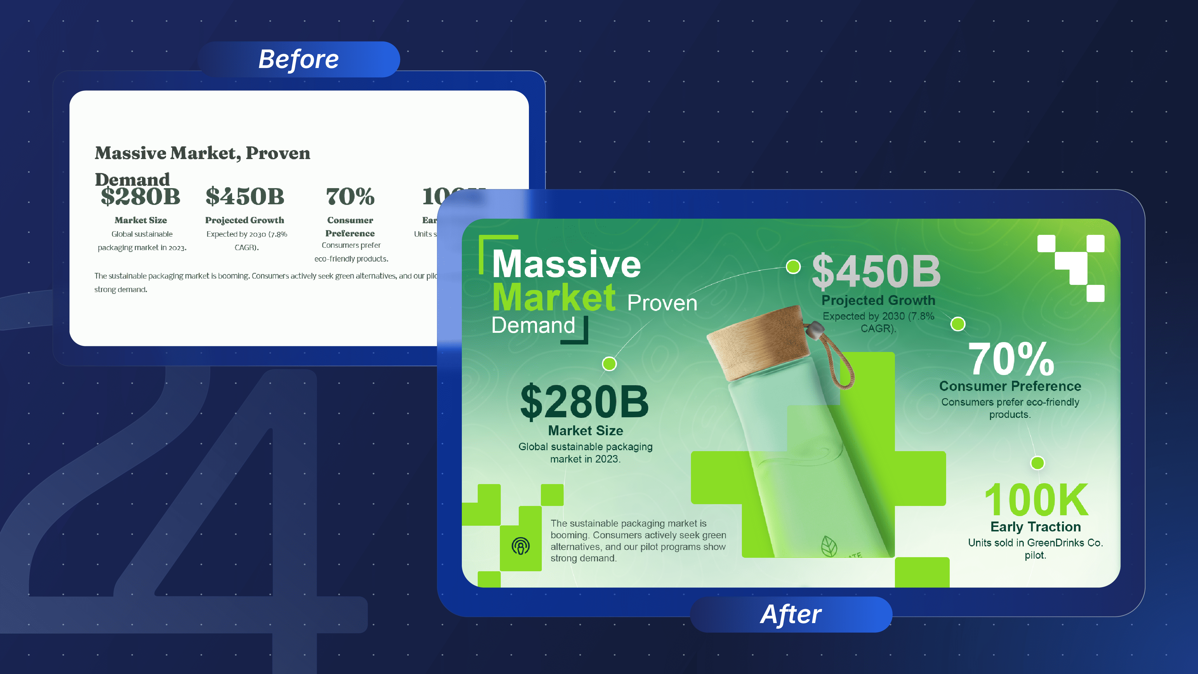
- The AI Result: It looks sterile and "document-like." While the data is there, the AI suffers from "Product Blindness." It lists numbers about the sustainable packaging market but fails to actually show the eco-bottle, leaving the slide feeling abstract and uninspiring.
- The Human Touch: The designer builds the layout around the product. By making the bottle the central "Hero" and connecting the data points to it visually, the slide transforms from a dry report into a compelling brand asset.
Case Study 2: The Focus Test (Data & Strategy)
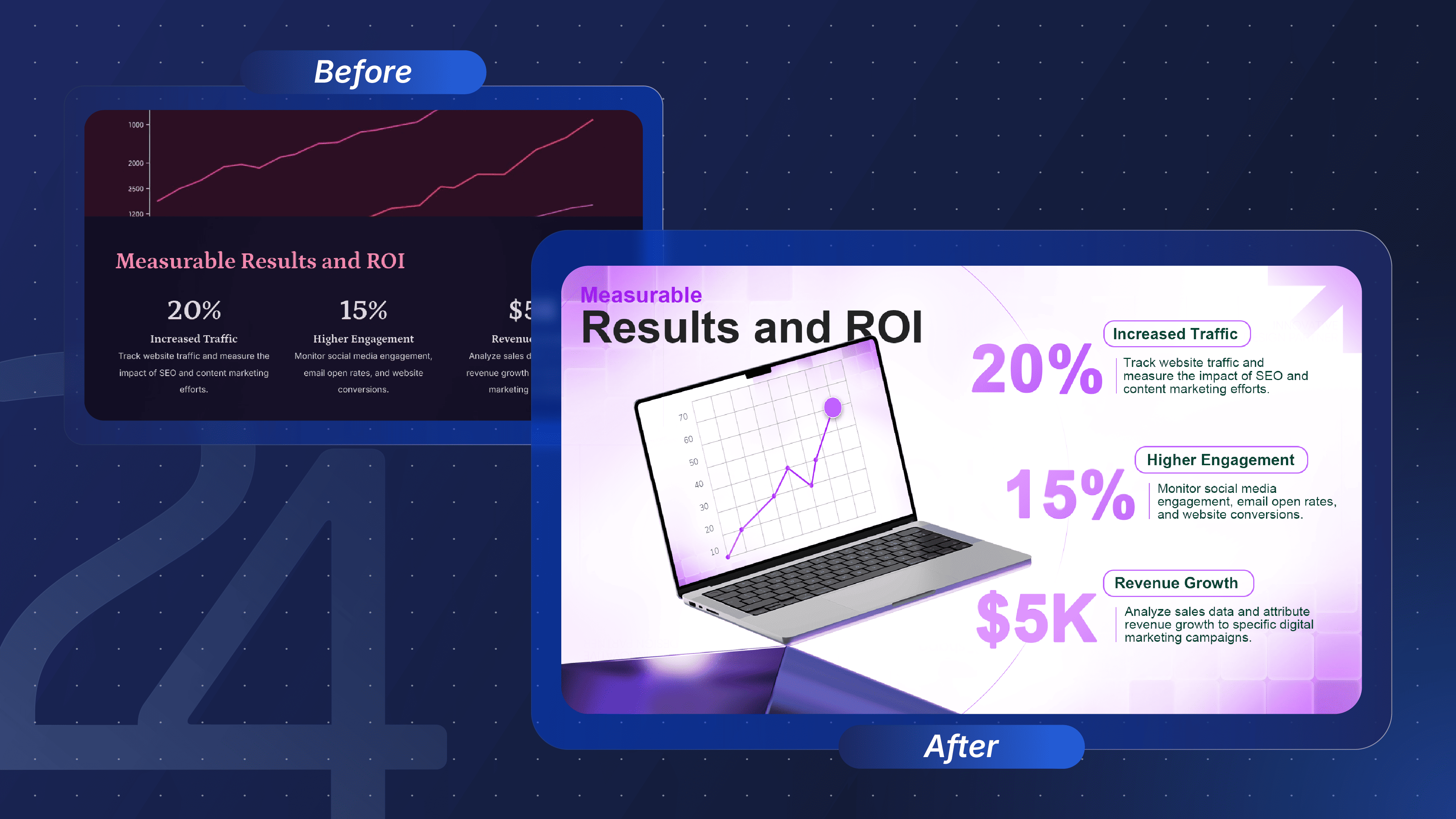
- The AI Result: The "Data Dump." The AI inserts a generic, decorative line chart that has no connection to the actual numbers below. The design is flat and monotone, giving the headline and the metrics equal visual weight, which kills the hierarchy.
- The Human Touch: The designer adds depth and context. By placing the chart inside a 3D laptop, they immediately signal "this is a software platform." They use scale and contrast to make the key metrics pop, guiding the eye instantly to the success story.
Case Study 3: The Communication Test (Hierarchy & Flow)
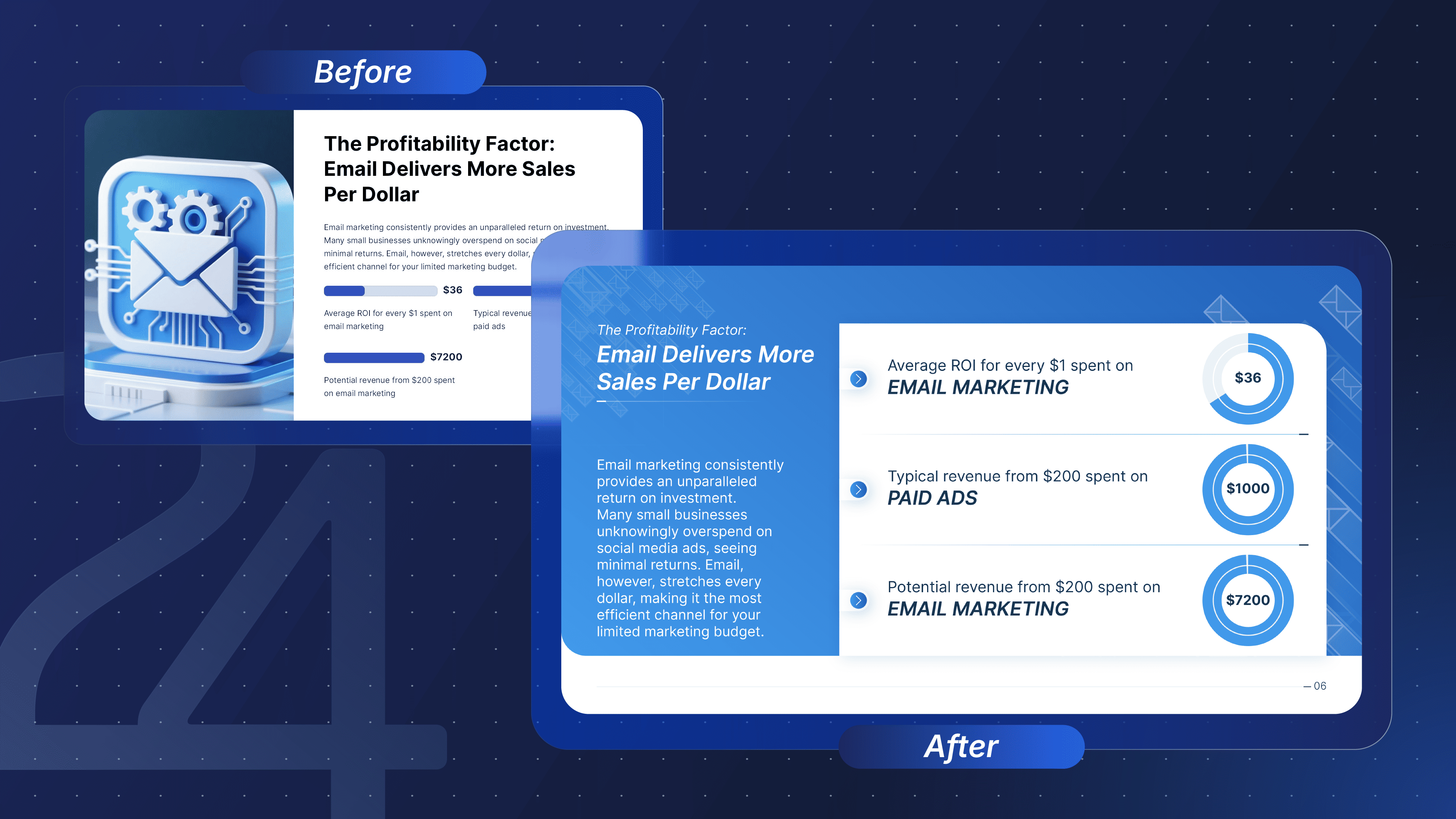
- The AI Result: Misplaced Priorities. The AI used half the slide to a generic 3D icon that adds zero value. As a result, the critical ROI data is compressed into tiny, hard-to-read bars at the bottom. The headline gets lost, and the viewer doesn't know where to look first.
- The Human Touch: Strategic Hierarchy. The designer removes the 3D icon to focus on the facts. They use a layered "card" layout to create depth and structure. By switching to bold circular charts, the comparison between "Email" and "Paid Ads" becomes instant and unmistakable.
Case Study 4: The Identity Test (Brand vs. Template)
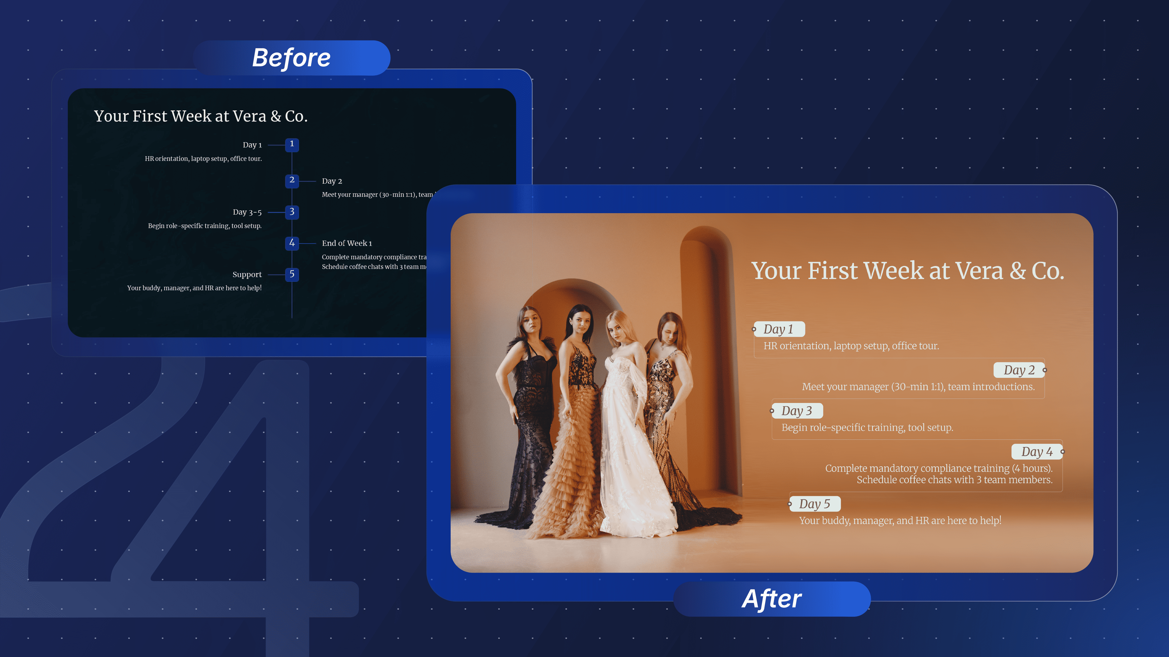
- The AI Result: The "Generic Corporate" Look. The AI prioritized a minimalist structure but missed all personality. The resulting slide is cold, dark, and illegible. It looks more like a legal PDF than a welcome guide for a luxury fashion brand.
- The Human Touch: Brand Immersion. The designer understood the context: High Fashion. By anchoring the timeline with a high-quality editorial image and using elegant typography, the slide not only informs the new hire but also welcomes them into the brand's aesthetic immediately.
AI vs. Manual Slide Design: The Strategic Differences
Looking at the case studies above, the difference is clear. AI is a fantastic producer, but a poor director.
While AI can build the pixels, it misses the strategy. Here is the fundamental gap that algorithms haven't crossed yet:
Visual Hierarchy (Eye Control)
A professional designer knows exactly where the audience's eye will land first. They use size, contrast, and placement to control attention: "First look at the headline, then the key metric, finally the footnote."
- The AI Flaw: AI often "flattens" the design, giving every element equal weight. When everything is big and bold, the viewer gets confused, and the message is lost.
Data Storytelling vs. Data Visualization
There is a massive difference between making a chart and making a point.
- The AI Flaw: AI will dump all available data into a bar chart (Visualization). It treats the data as a math problem to be solved.
- The Human Edge: A designer tells a story with data (Storytelling). They remove the noise, highlight the one bar that matters, and write a conclusion directly onto the chart. This requires critical thinking that AI does not possess.
The Decision Matrix: When to Use AI vs. When to Hire a Pro
We have analyzed the tech, the limitations, and the design output. But when performing an AI tools versus hiring a designer comparison, the right choice ultimately depends on your specific constraints (Speed vs. Strategy).
Instead of a generic pros and cons list, we built this decision matrix into a simple checklist. Find your specific scenario below for an instant verdict:
When to Use AI Presentation Makers
- Last-minute brainstorming sessions: If your meeting is in 20 minutes and you are staring at a blank page, use an AI presentation maker. The algorithm will instantly cure "blank page syndrome" and generate a working outline.
- Internal team syncs and status updates: If your audience is low-stakes and a generic "vibe" or basic color palette is sufficient for the meeting, use an AI presentation maker.
- Simple data reporting: If your presentation only requires basic bullet points, standard text boxes, and native 2D charts, use an AI presentation maker.
When to Hire a Professional Designer
- Investor pitches and board meetings: When the stakes are high, and your slides must utilize emotional visual hierarchy to persuade an executive audience, hire a professional designer.
- Strict corporate brand compliance: If your organization requires pixel-perfect adherence to a Corporate Visual Identity (CVI) manual, hire a professional designer. AI cannot reliably apply specific brand lockups across 20+ slides.
- Complex data storytelling: When you need to translate dense financial PDFs, clinical data, or nested organizational charts into custom infographics, hire a professional designer.
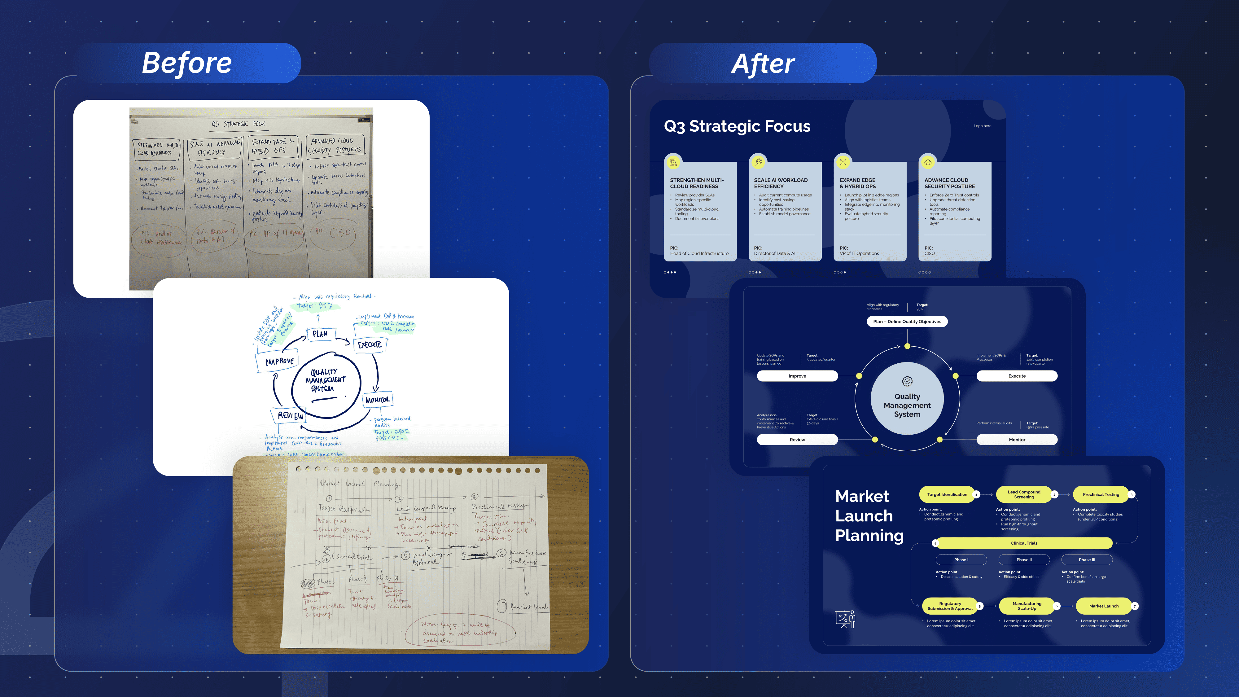
- Fixing messy source material: If you are starting with whiteboard sketches, or you need someone to manually fix a broken, overlapping AI draft, hire a professional designer.
Will AI Replace Presentation Designers?
A common question we hear from clients is: "How do AI tools compare to hiring a designer, and will they eventually replace human experts entirely?"
At 24Slides, we aren't rejecting AI—we actively embrace it to enhance our manual workflows. But we don't rely on third-party estimates to measure its impact; we track it internally.
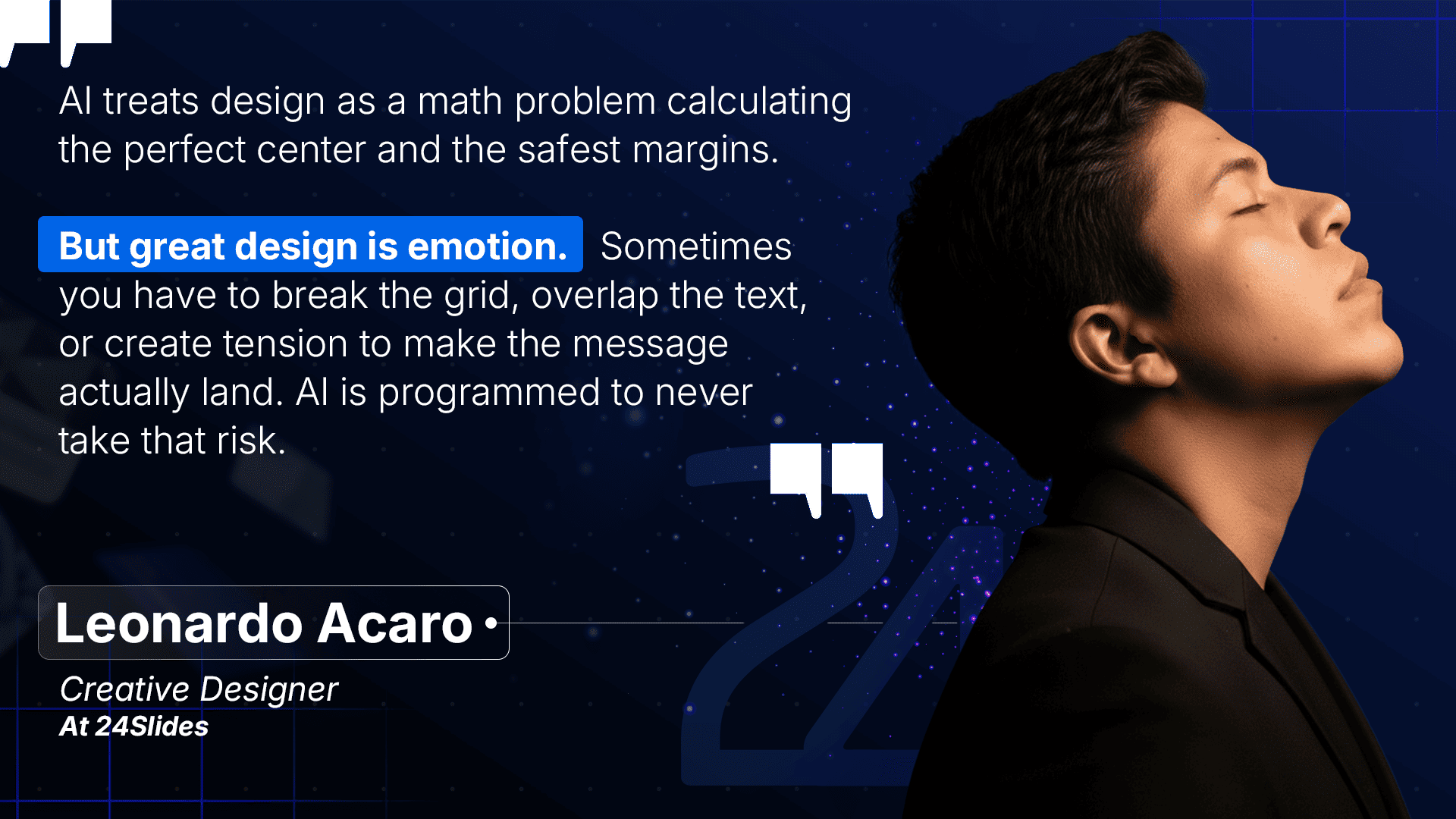
According to our marketing designers, Gabriel Morales and Leonardo Acaro, integrating AI into their daily workflow has increased their design speed by an average of 30%. Rather than wasting time on tedious tasks, they use AI in tasks such as removing image backgrounds, generating custom vectors, and brainstorming structural ideas.
Across our broader design team, this time-saving metric is rapidly increasing thanks to our proprietary, in-house tools. We actively develop our own software to eliminate repetitive formatting:
- Brandzilla: Our custom CVI formatting assistant that instantly applies your exact brand rules.
- The Typo Terminator: An automated QA checker that catches microscopic text errors before delivery.
And these are just two examples. We are continuously developing a wider suite of internal AI tools focused strictly on data compliance, ensuring that client data remains 100% secure and never feeds into public AI models.
As our CEO, Nikolaj Bastiansen, consistently reminds our team: the ultimate goal of adopting new technology is to automate repetitive tasks and eliminate unnecessary workflows. By cutting out the mechanical grunt work, our designers are freed up to focus 100% on delivering the premium, strategic design quality that actually matters.
(Note: Of course, not every presentation requires this level of pixel-perfect precision. If you are just building a quick deck for an internal team sync or want to experiment with automation yourself, we highly encourage it. Check out our guide to the 10 Best AI Presentation Makers to find the right free tool for those everyday tasks!)
The Bottom Line: See What "Perfected by People" Looks Like
To be completely fair, AI has made massive leaps. During our research, tools like Claude Design genuinely surprised us with their ability to synthesize complex data and generate highly logical structures. It is undeniably one of the best "brains" on the market for early drafting.
But a draft is not a final product. To summarize our stance on the AI vs manual slide design comparison, we’ll leave you with this thought from our Founder, Tobias Schelle:
“Think of AI as the most efficient assistant you’ve ever had. Fast, tireless, and great at mechanical tasks, but not the person you send into the boardroom.”
To show you the definitive difference between an automated draft and manual design, we took my polished Gamma AI draft from our recent research report and handed the exported .pptx file over to Gabo and Leo.
They completely dismantled the rigid AI blocks, integrated our true corporate branding, and established a visual flow that commands attention. Here is what happens when human expertise takes over:
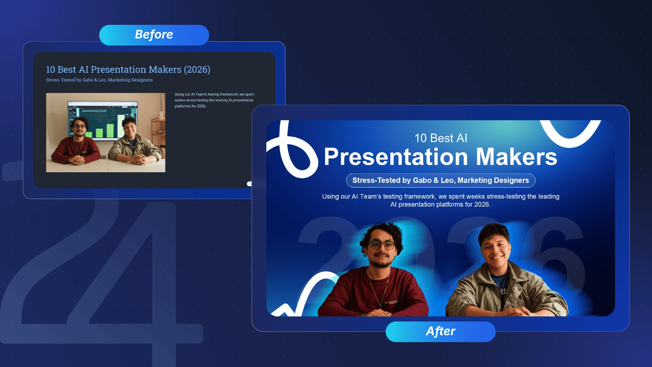
🔍 Compare the presentations yourself:
- View my polished 18-slide Gamma AI draft (The "Before")
- View Gabo & Leo's full 18-slide Pro Redesign in Google Slides (The "After")
(Note: The "Before" link is a manually customized AI draft. In fact, this is exactly the type of structural brief we frequently receive from our enterprise clients today. AI provides a fantastic foundation to organize your thoughts, but as you'll see in the "After" link, our professional designers take it to a completely different level).
While AI continues to evolve, there are three distinct reasons why the professional human touch remains irreplaceable for enterprise teams:
- True Brand DNA: AI simply paints predefined boxes with your hex codes. Human designers expertly balance typography and secondary palettes to make the deck unmistakably yours.
- Breaking the Grid: Algorithms rely on safe, restrictive containers. Professionals know exactly when to overlap elements and build custom illustrations to create visual tension and impact.
- The Narrative Journey: Software organizes data. Humans control emotional pacing and visual cues to turn a static report into a persuasive pitch.
The Enterprise Security Moat
Finally, while AI tools offer speed, they often introduce unacceptable corporate risk. Uploading unannounced Q3 financials, proprietary M&A data, or clinical trial results to a public AI generator is a massive data privacy liability.
At 24Slides, security is a competitive advantage. We support enterprise teams primarily across the Pharmaceutical, Biotech, Consumer Healthcare, and Financial industries, where governance is non-negotiable.
Unlike public AI models, your confidential material is never shared or used to train external algorithms. We operate behind an enterprise-grade security moat:
- Fully SOC 2 Compliant and GDPR Aligned.
- Hosted on ISO 27001-certified infrastructure (via our secure partners at DigitalOcean).
- 100% In-House Presentation Designers: Our team consists entirely of full-time, in-house designers (with absolutely zero outsourced freelancers), all operating under strict mandatory NDAs with data access restricted on a need-to-know basis.
As a proud Certified B-Corp, our commitment to ethical, sustainable business practices is just as rigorous as our data security. This provides enterprise partners with a level of corporate accountability that generic AI tools simply cannot offer.

Frequently Asked Questions (FAQ)
1. How do AI presentation tools compare to traditional slide software?
The main difference is architecture. Traditional software (like PowerPoint) gives you a free-form canvas to put elements exactly where you want them. Modern AI tools often use rigid, web-based blocks that are faster to generate but much harder to manually customize for brand compliance.
2. Are AI presentation tools good enough for non-designers?
Yes, but with a major caveat. If you are looking for the best tools for professional presentations with no design experience, AI platforms provide great "guardrails" to prevent ugly alignment mistakes. However, our testing shows non-designers still spend up to 3 hours manually fixing broken PowerPoint exports and awkward layouts to get the deck client-ready.
3. Can an AI presentation maker replace a professional designer?
Not yet. For low-stakes internal meetings, AI is a fantastic time-saver. But for client-facing pitches, board updates, and high-stakes presentations, AI lacks the contextual intelligence, strategic storytelling, and exact brand compliance that a human professional provides.
4. How does AI presentation software compare to hiring a designer in terms of cost?
While an AI software subscription only costs around $20 a month, it often creates a false economy due to the hidden "Editing Tax." If a manager earning $75/hour wastes 4 hours trying to fix a broken AI export natively in PowerPoint, that deck actually costs the company $320 in lost productivity.
Conversely, using a Pay-As-You-Go service like 24Slides (starting at $110 for a 10-slide Fix Up) is actually cheaper than DIY software while reclaiming your team's strategic focus.
5. What's the difference between AI presentation makers and PowerPoint's built-in Designer tool?
PowerPoint's native Designer tool acts as a layout assistant, suggesting ways to organize images and text already on your slide. Dedicated AI presentation makers (like Claude or Plus AI) are generative—they actively write the content, create the structure, and build the slide from a single text prompt.
6. When should a business skip AI entirely and hire a dedicated design team?
You should skip public AI tools entirely if your presentation involves high-stakes outcomes, strict brand guidelines, or confidential data.
For example, investor pitch decks, M&A proposals, or C-suite board updates require pixel-level adherence to a Corporate Visual Identity (CVI) manual—something AI generators consistently fail to apply. Furthermore, if your slides contain unreleased financial or clinical data, privacy is non-negotiable.
For regulated industries, relying on an NDA-bound, SOC 2 Type II-compliant design agency is mandatory to prevent public AI data leaks.
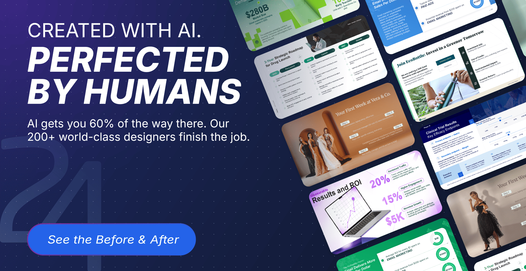
Created with AI. Perfected by Humans.
For the vast majority of your day-to-day internal updates, weekly syncs, and casual reports, an AI presentation maker is more than enough to get the job done. We highly encourage you to use them to save your team time.
But presentations are not a one-size-fits-all medium. When you reach those crucial, high-stakes moments, the investor pitches, the executive board updates, and the global conferences, "good enough" becomes a liability.
In a world where anyone can generate a generic AI deck in seconds, a bespoke, brand-aligned design is your competitive edge.
That is where we come in. Our 100% in-house designers take it across the finish line by combining B Corp ethical standards with guaranteed standard 24-hour delivery (and a priority 10-hour turnaround for Pro and Premium clients).
Click below to explore our Before & After gallery and see exactly how our team transforms AI drafts into boardroom-ready masterpieces.
📚 Explore Our In-Depth AI Presentation Reviews
Want to dive deeper into the tools we analyzed? Explore our hands-on reviews, comparisons, and step-by-step guides: