How to Format Complex KPI Slides in PowerPoint: A Step-by-Step Data Reduction Guide

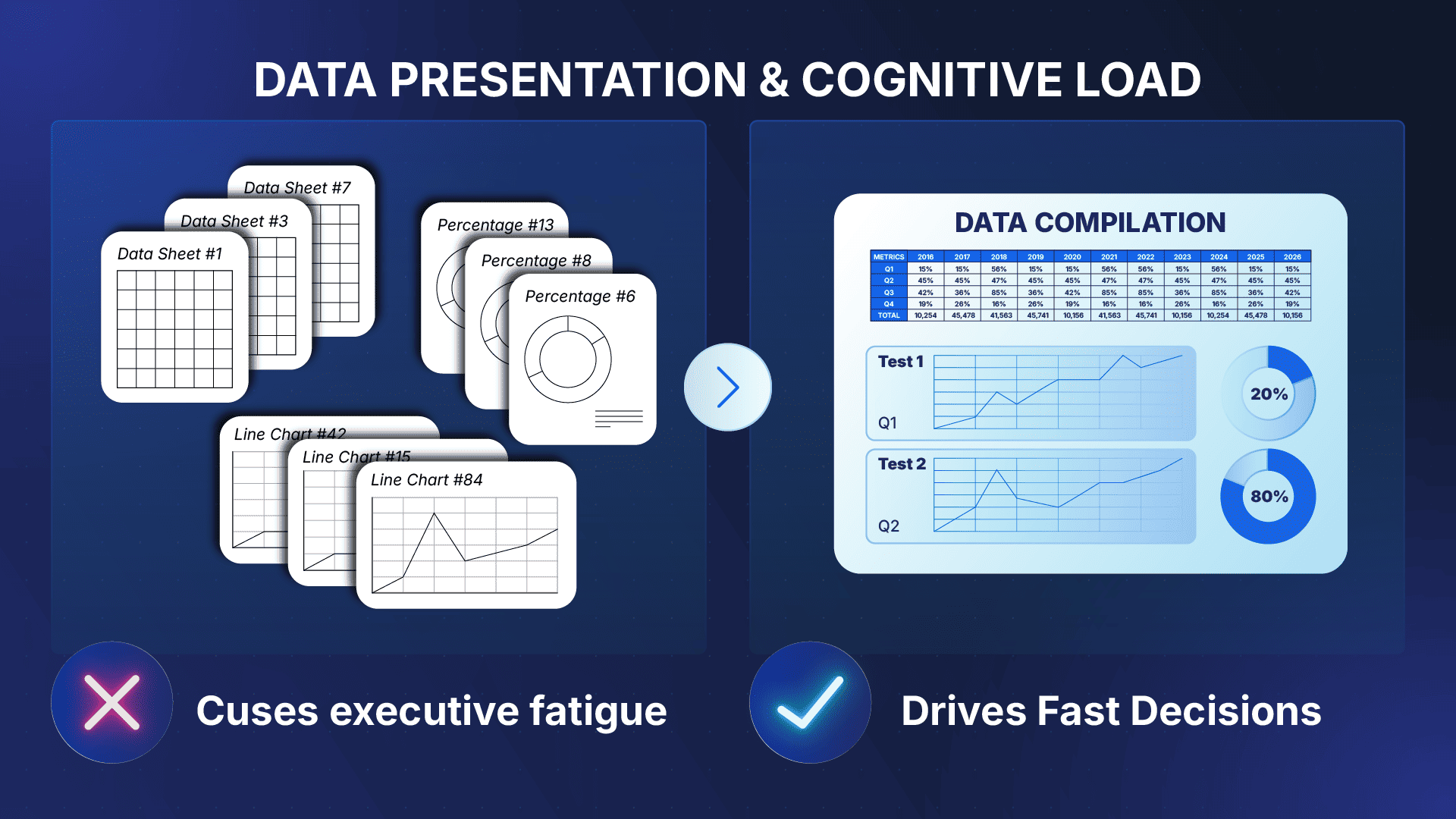
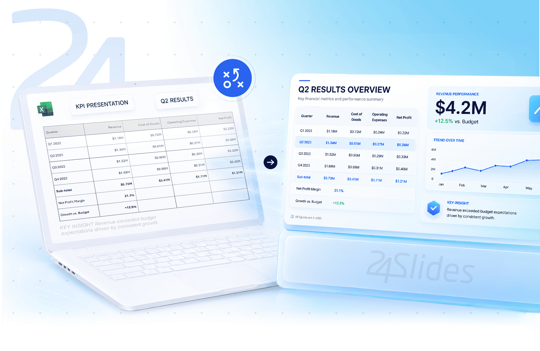
We’ve all been there: you copy a massive, multi-column Excel tracking sheet and paste it directly onto a blank slide. The result is an instant disaster, a chaotic wall of numbers that causes immediate cognitive fatigue for any executive looking at it.
When your leadership team is forced to squint at an unformatted data dump, they spend their energy decoding the slide rather than making strategic decisions.
The good news? The best way to present complex data isn’t to delete important numbers, but to structure them beautifully. This article is completely different from a generic guide on choosing standard pie charts or bar graphs.
Instead, this is a technical manual that teaches you how to use native PowerPoint formatting controls to build clean visual containment fields for a high-density data reduction PPT presentation.
TL;DR:
What is data reduction in design?
In professional reporting, data reduction refers to ways of presenting the data by abstracting dense, multi-column metrics down to their highest-value conclusions. The goal is to ensure that complex data should be presented easily interpreted at a single glance.
To master a professional complex data presentation, we must shift our design approach from basic formatting to intentional user interface layout:
- Stop relying on automated chart wizards: Standard PowerPoint charts often waste vast amounts of spatial real estate with bloated margins and unformatted labels.
- Build spatial containment fields: Use native shapes to group relevant performance metrics together, creating clean visual zones for the eye to follow.
- Control your white space: Proper cell padding and structural margin limits are what separate a chaotic data dump from an elite executive report.
For a foundational look at choosing the right graph types, see our guide on data visualization best practices in PowerPoint.
Data Reduction Presentation Techniques: The Executive Design Philosophy
When dealing with elite corporate reporting, the secret to how to present complex data doesn't lie in decorative decorations. It lies in strict, intentional spatial engineering.
To prevent your metrics from floating aimlessly on a blank white slide canvas, you must master two fundamental data reduction presentation techniques: Visual Containment and Data Layering.
The Technical Concept of Visual Containment
Visual containment means using native geometric shapes to create structural background "containers" for your figures. Instead of dropping raw text boxes onto a slide, you map out distinct content zones:
- Group Related Variables: Enclose a primary KPI, its percentage variance, and its historical trend indicator inside a single background shape.
- Anchor the Executive's Eye: Containers act as borders, signaling to the brain exactly where one data cluster ends and the next begins.
- Eliminate Canvas Float: Giving numbers a subtle, defined boundary blocks the chaotic "floating text" look that ruins amateur slides.
The Rule of Data Layering
Corporate presenters often fail because they try to show their work, their formulas, and their conclusions all on the same vector canvas. Executive design requires strict data layering.
Your primary layout should host exclusively final, aggregated metrics. Pushing secondary background context, extensive baseline tracking sheets, and source formulas down to an appendix block creates a seamless reporting flow.
By applying these structural parameters, you seamlessly implement the highest industry best practices for presenting complex data insights without overwhelming your board.
How to Build a PowerPoint Layout Grid for Metrics
To understand how to structure high-density slides without creating a cluttered mess, you must establish a structural geometric blueprint before adding text or shapes.
By utilizing PowerPoint's native alignment engine, you build a consistent framework that anchors your metric containers with clean visual symmetry. Follow these step-by-step instructions to create a premium PowerPoint layout grid for metrics:
- Step 1: Clear the Canvas. Open a new presentation window. Right-click the empty slide canvas, hover over Layout, and select a completely blank slide template to clear away all default title and subtitle text placeholders.
- Step 2: Initialize the Alignment Engine Right-click the blank canvas, hover over Grid and Guides, and click Guides and Gridlines to ensure both options are checked. This action instantly overlays PowerPoint’s native alignment lines and dotted matrices directly onto your workspace.
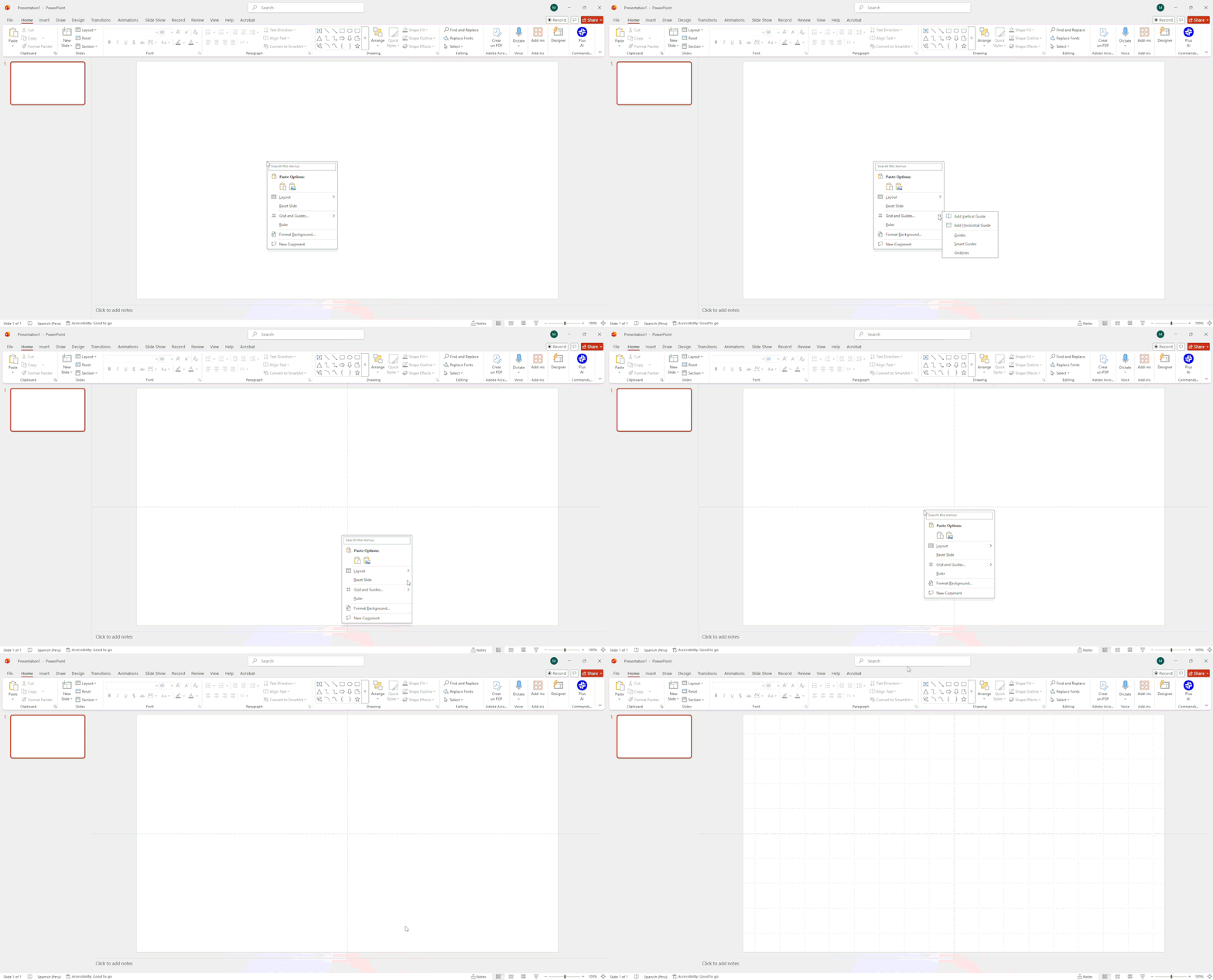
- Step 3: Establish Outer Frame Boundaries Right-click the canvas again, hover over Grid and Guides, and select Add Vertical Guide or Add Horizontal Guide. Drag these lines outward toward the edges of your slide to create a uniform outer page margin perimeter completely around your widescreen canvas.
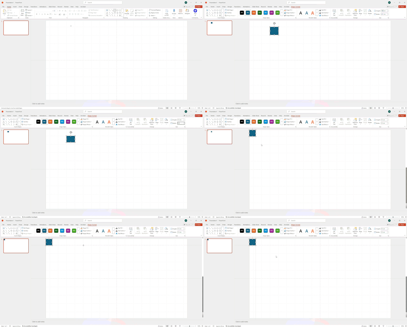
- Step 4: Subdivide into Symmetric Metric Row Layouts (The 24Slides Pro Method). Instead of wasting time calculating complex coordinates manually, adopt the insider trick used by our design team at 24Slides:
- Draw a small, temporary vector shape, such as a 1.5cm x 1.5cm square, to use as a physical layout spacing block.
- Right-click the canvas and choose Add Vertical Guide or Add Horizontal Guide (or hold Ctrl while dragging an existing line to duplicate it), then snap the guide directly to the edge of your reference square.
- Move the square to the next position to replicate your margins and guarantee flawless padding across 4-column, 3-column, or 2-column configurations.
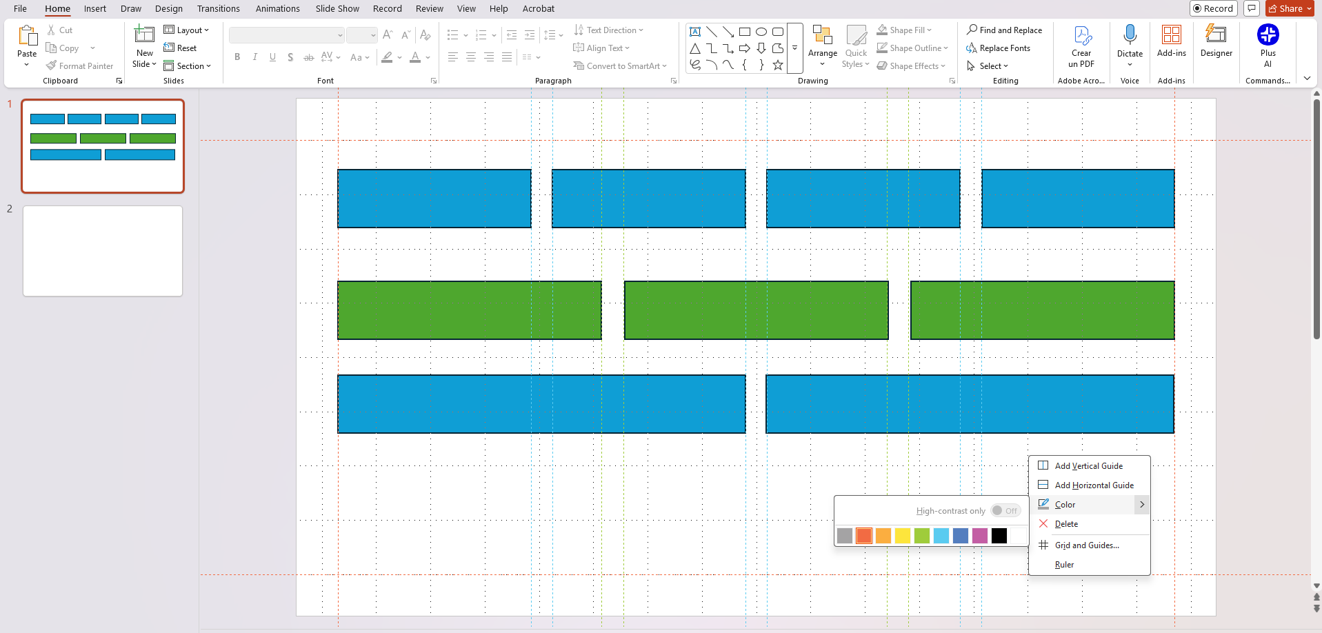
- Step 5: Color-Code Your Layout Matrix If your canvas starts getting crowded with multiple layout tracks, such as a complex matrix featuring balanced horizontal spacing columns and cleanly stacked vertical row channels, you can visually separate them. Right-click any guide, hover over Color, and assign distinct colors to separate your outer margins from your internal structural blocks.
Executive Dashboard PowerPoint Tutorial: Building Board-Ready Layouts
To master board ready slide design step by step, you must transition from theoretical frameworks to precise tool mechanics. Executive presentation decks demand strict structural uniformity, which you can easily achieve by controlling shape variables, border weights, and specific hex codes.
By mapping out these complex data presentation layouts PPT, you will learn how to present complex data visualization using clean, native PowerPoint elements that ensure absolute readability for senior leadership.
Layout 1: The Metric Card Grid (Operational Tracking)
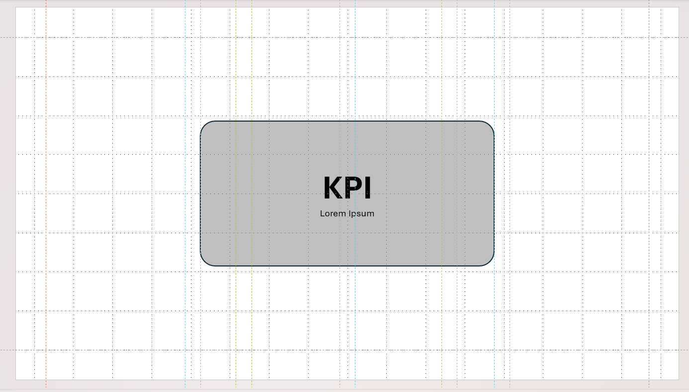
This structure is ideal for presenting complex data visually across multiple ongoing performance metrics. It packages individual performance variables into clean, isolated structural cards.
- Step 1: Go to Insert > Shapes and select the Rounded Rectangle. Draw your container box directly over your layout grid.
- Step 2: Right-click the shape and open the Format Shape panel. Set the Fill to a solid light background color (e.g., #F4F5F7 or a soft off-white) and change the Line to a solid, thin 1pt muted grey to establish a clean boundary.
- Step 3: Under the shape's Text Options, open the layout parameters and adjust the internal text box margins to apply exactly 0.3 inches of padding on all sides (Left, Right, Top, Bottom). This prevents text from awkwardly hugging the borders.
- Step 4: Enforce a strict micro-typographical hierarchy: Set your primary, high-value KPI number to 40pt Bold, and place the supporting trend or descriptor text directly beneath it at 11pt Regular Muted.
Layout 2: The Quadrant Executive Summary Grid (Strategic Overview)
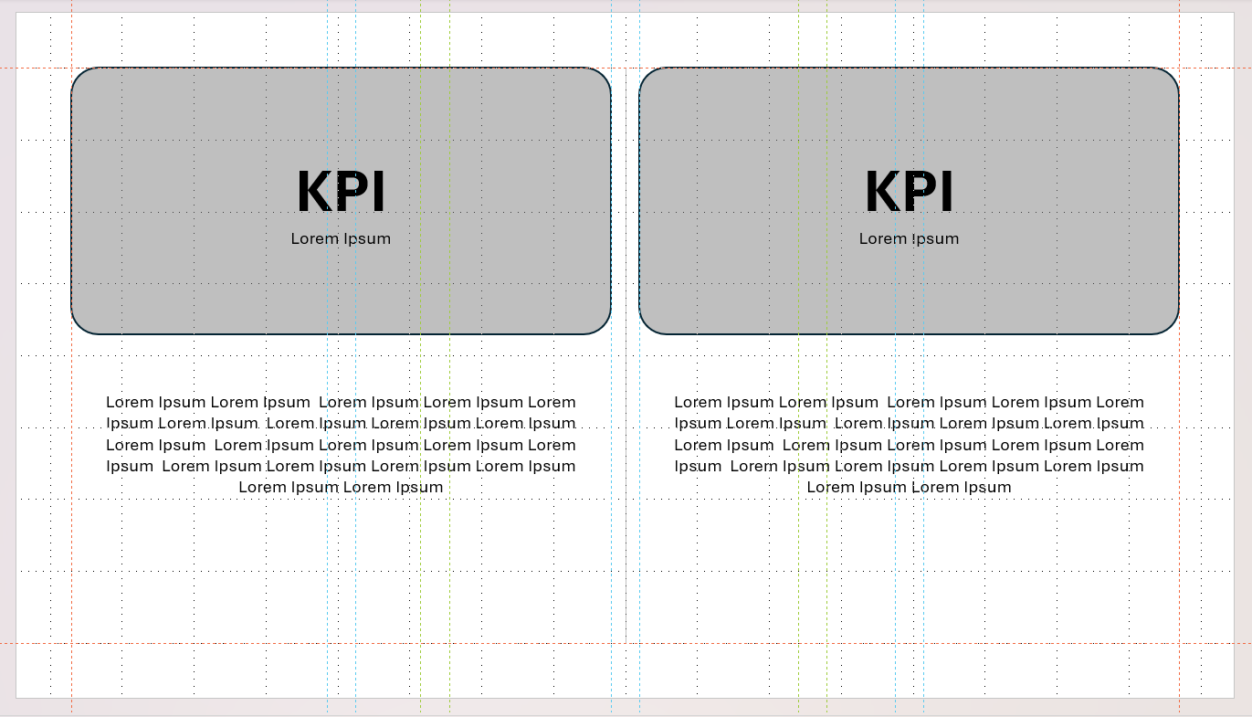
This layout divides your presentation canvas into four distinct, highly structured quadrants, offering a comprehensive high-level summary on a single widescreen surface.
- Step 1: Using the grid layout system built in the previous section, subdivide your slide canvas into four equal quadrangular operational zones.
- Step 2: Draw thin, elegant 0.75pt solid line rules between the quadrants to act as subtle visual separators without creating unnecessary noise.
- Step 3: Dedicate the upper two quadrants exclusively to primary quantitative performance data, such as high-level core KPI blocks or clean line graphs tracking key targets.
- Step 4: Dedicate the lower two quadrants directly to text-based variance callouts, strategic explanations, and qualitative context to explain the data above.
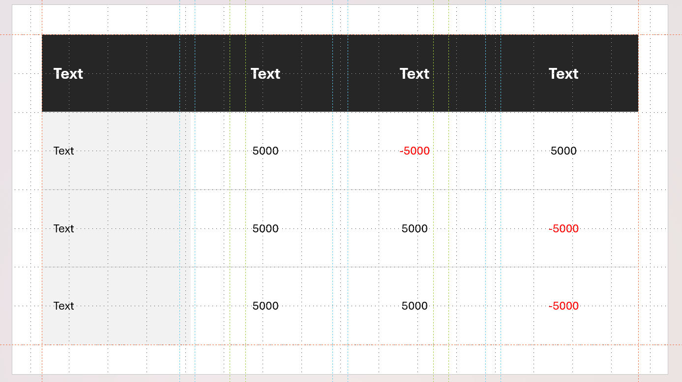
Layout 3: The Dense Financial Table
When a dataset requires a formal table structure, you must strip away PowerPoint's heavy default styling to reveal the core operational values clearly.
- Step 1: Go to Insert > Table and draw your required metric matrix.
- Step 2: Select the table, open the Table Design tab, uncheck Banded Rows, and clear out all default dark colored backgrounds until you are left with a clean, raw wireframe canvas.
- Step 3: Highlight all table cells, navigate to the Table Layout tab, and manually increase the cell height to add breathing room and vertical padding above and below your numbers.
- Step 4: Apply professional accounting alignment rules: manually left-align all text labels, but right-align all financial metrics and numerical values so decimal places and commas line up vertically.
- Step 5: Enhance scannability by formatting all negative numbers or missed targets to bold red text or enclosing them in standard parenthetical syntax ($5,000) to instantly clear up historical comparison paths.
Frequently Asked Questions: Formatting Complex PowerPoint Data
How do you format high density data on a single PowerPoint slide?
Use background container wrappers and tight sizing scales to segment information groups cleanly. According to data layout research by the Nielsen Norman Group, distinct size contrast accelerates visual extraction. Place high-density metrics into dedicated bounding cards, pairing an ultra-bold 36pt headline metric directly above a 10pt muted gray label to establish immediate reading order.
What are some creative ways to present complex data visually without standard charts?
Organize data using modular content matrices, horizontal KPI cards, and vector variance indicators. Research from the Interaction Design Foundation demonstrates that brains automatically group elements that share an enclosed border. Build native shape containers to stack performance data, and use small Red-Amber-Green (RAG) vector dots to show status change without adding noise.
How do you design an executive dashboard layout in PowerPoint?
Enforce mathematical uniformity across the canvas by locking grid coordinates and shape text padding. As detailed in interface framework guides by Smashing Magazine, structured layout grids are foundational to reducing cognitive visual noise. Toggle alignment grids (Alt + F9) to map out equal columns, and adjust internal text box margins to a minimum of 0.3 inches.
What is the rule for data reduction in board-ready slide design?
Display core aggregated variables on the main canvas, and shift raw calculations to an appendix. According to data processing frameworks from Laws of UX, working memory fails when forced to parse un-chunked data dumps. Protect executive focus by dedicating primary slides to high-level strategic conclusions while archiving deep multi-row baseline tables.
Download Free Board Ready Slide Templates for PowerPoint
If you don't want to spend your afternoon manually calculating coordinate points, setting up guide grids, and adjusting shape properties from scratch, you can skip the setup entirely.
Our team has already done the heavy lifting for you. You can instantly access professional, pre-formatted dashboard frameworks that are completely engineered for heavy data environments.
Skip the Math, Start Designing Instantly
Every layout asset in our premium library is pre-configured with a strict geometric matrix, flawless alignment parameters, and a pre-set typographic hierarchy.
Take control of your next reporting deck by utilizing an elite foundation designed by corporate layout specialists. Click the link below to browse our free layouts and unlock our entire curated database collection:
Check out our free templates for presenting data
Need Expert Help Formatting Your Corporate KPI Decks?
Our Perspective on High-Density Data Layouts
At 24Slides, we believe that dense corporate datasets shouldn't lead to slide clutter. True boardroom-ready layout engineering isn't about hiding complex variables, it’s about using invisible grid architecture, deliberate visual padding, and structured metric containers to organize data cleanly. When you respect cognitive processing limits, even the most data-heavy executive dashboard can look balanced, professional, and effortless to read.
Why Trust 24Slides?
With over 10 years of experience and deep expertise in professional slide architecture, 24Slides has spent a decade solving the corporate data density problem. We don’t just design presentations; we engineer high-performance visual communication tools for the world's leading enterprise brands.
Our professional presentation design services are held to elite industry rating criteria, evaluated heavily on:
- Visual Precision: Enforcing absolute layout alignment, mathematical spacing ratios, and rigorous grid coordinates.
- Cognitive Efficiency: Formatting information structures to dramatically reduce data processing time for your viewers.
- Brand Fidelity: Seamlessly integrating complex enterprise typography hierarchies and corporate hex color palettes.
To help you navigate the right production model for your business before diving in, explore our expert breakdown guides:
- Pros and Cons of Today's In-House Design Teams – Discover how modern internal design units struggle or succeed with rapid presentation scaling.
- The Cost of an In-House Design Team vs. a Design Agency – Review the raw overhead and financial metrics behind recruitment versus outsourced agency partnerships.
- Choosing a Presentation Design Agency – Utilize our structured evaluation framework to vet and select a specialized presentation vendor that fits your workflow.
Outsource Your Executive Decks to the Masters
Why spend your valuable nights wrestling with manual shape coordinates, column widths, and font pairings? Let our team handle the heavy layout lifting for you.
Get custom, boardroom-grade presentation layouts designed by our elite team with a blazing-fast 24-hour turnaround. Explore the 24Slides Plans Today and transform your complex data dumps into undeniable corporate victories.