Mastering the Art of Presenting Data in PowerPoint

Presenting data in PowerPoint is easy. However, making it visually appealing and effective takes more time and effort. It’s not hard to bore your audience with the same old data presentation formats. So, there is one simple golden rule: Make it not boring.
When used correctly, data can add weight, authority, and punch to your message. It should support and highlight your ideas, making a concept come to life. But this begs the question: How to present data in PowerPoint?
After talking to our 200+ expert presentation designers, I compiled information about their best-kept secrets to presenting data in PowerPoint.
Below, I’ll show our designers' favorite ways to add data visualization for global customers and their expert tips for making your data shine. Read ahead and master the art of data visualization in PowerPoint!

Feel free to explore sections to find what's most useful!
- How to present data in PowerPoint: a step-by-step guide
- Creative ways to present data in PowerPoint
- Tips for data visualization
- Seeking to optimize your presentations? – 24Slides designers have got you covered!
How to present data in PowePoint: a step-by-step guide
How you present your data can make or break your presentation. It can make it stand out and stick with your audience, or make it fall flat from the go.
It’s not enough to just copy and paste your data into a presentation slide. Luckily, PowerPoint has many smart data visualization tools! You only need to put in your numbers, and PowerPoint will work it up for you.
Follow these steps, and I guarantee your presentations will level up!
1. Collect your data
First things first, and that is to have all your information ready. Especially for long business presentations, there can be a lot of information to consider when working on your slides. Having it all organized and ready to use will make the whole process much easier to go through.
Consider where your data comes from, whether from research, surveys, or databases. Make sure your data is accurate, up-to-date, and relevant to your presentation topic.
Your goal will be to create clear conclusions based on your data and highlight trends.

2. Know your audience
Knowing who your audience is and the one thing you want them to get from your data is vital. If you don’t have any idea where to start, you can begin with these key questions:
- What impact do you want your data to make on them?
- Is the subject of your presentation familiar to them?
- Are they fellow sales professionals?
- Are they interested in the relationships in the data you’re presenting?
By answering these, you'll be able to clearly understand the purpose of your data. As a storyteller, you want to capture your audience’s attention.
3. Choose a data visualization option
One key to data visualization in PowerPoint is being aware of your choices and picking the best one for your needs. This depends on the type of data you’re trying to showcase and your story.
When showcasing growth over time, you won’t use a spider chart but a line chart. If you show percentages, a circle graph will probably work better than a timeline. As you can see, knowing how to work with charts, graphs, and tables can level up your presentation.
Later, we’ll review some of the most common tools for data visualization in PowerPoint. This will include what these graphs and charts are best for and how to make the most of each. So read ahead for more information about how to present data in PowerPoint!
4. Be creative!
PowerPoint can assist with creating graphs and charts, but it's up to you to perfect them. Take into account that PowerPoint has many options. So, don't be afraid to think outside the box when presenting your data.
To enhance your presentation design, try out different color schemes, fonts, and layouts. Add images, icons, and visual elements to highlight your ideas.
If this sounds complicated to you, there's no need to worry. At the end of this article, you’ll find some easy tips for upgrading your data visualization design!
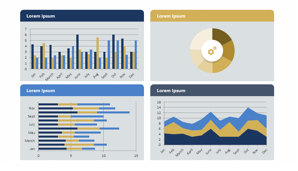
Creative ways to present data in PowerPoint
At this point, you might wonder: what is the best way to present data in PowerPoint? Well, let me tell you: it's all about charts. To accomplish a polished presentation, you must use charts instead of words. When visualizing quantitative data, a picture is worth a thousand words.
Based on +10 years of expertise, we've identified key chart types and creative ways to work with them. Let's delve into each one!
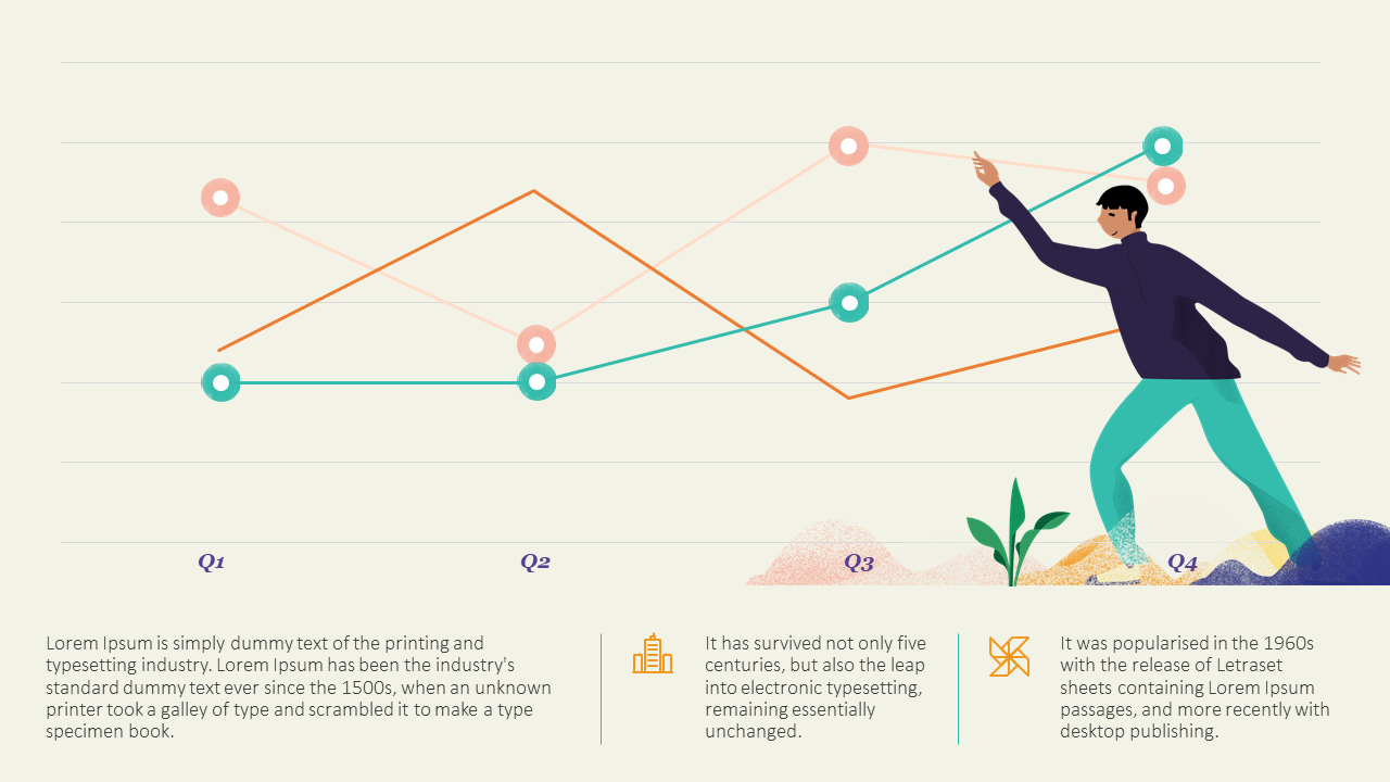
Line Charts
Line charts are a classic, which can make them boring. However, if done correctly, they can be striking and effective. But where does their popularity come from? Here's the answer: Line charts work great to show changes over time.
Another critical difference is that line charts are accumulative. For example, you can join them to a column chart to show different data at a glance. They allow data visualization effectively, making it easier to figure out.
To make the most of them, mastering how to work with line charts is essential. But there is good news: you will have a lot of freedom to customize them!
Download our Free Line Chart Template here.
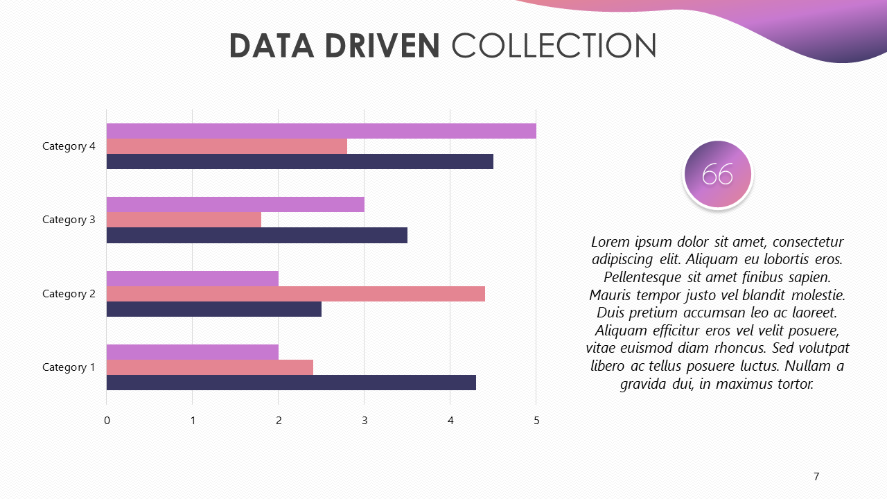
Bar and column charts
Bar and column charts are another classic choice. Again, they are simple and great for comparing different categories. They organize them around two axes: one shows numbers, and the other shows what we want to compare.
But when should you use a bar chart or a column chart? A bar chart is better when comparing different categories and having long labels. A column chart, on the other hand, is better if you have a few categories and want to show changes over time.
You also have the waterfall option, which is perfect for highlighting the difference between gains and losses. It also adds a dynamic touch to your presentation!
Unsure how to implement these charts? Here's how to add a bar or a column chart in PowerPoint.
Download our Bar and Column Chart Template here.
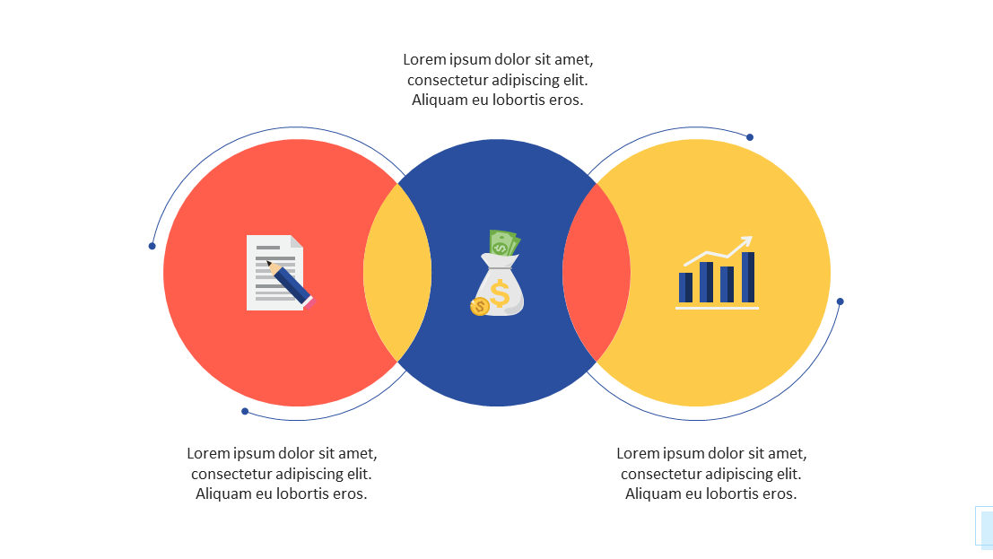
Venn diagram
Venn diagrams are definitely something to consider when discussing data visualization—even if its focus is not quantitative data! Venn diagrams are best for showcasing similarities and differences between two (or more) categories or products.
By using overlapping circles, you can quickly and easily see common features between separate ideas. The shared space of the circles shows what is the same between the groups. However, items in the outer parts of each circle show what isn’t a common trait.
They make complex relationships easy to understand. Now, you only need to know how to create a Venn diagram in PowerPoint—quite simple!
Download our Free Venn Diagram Template here.
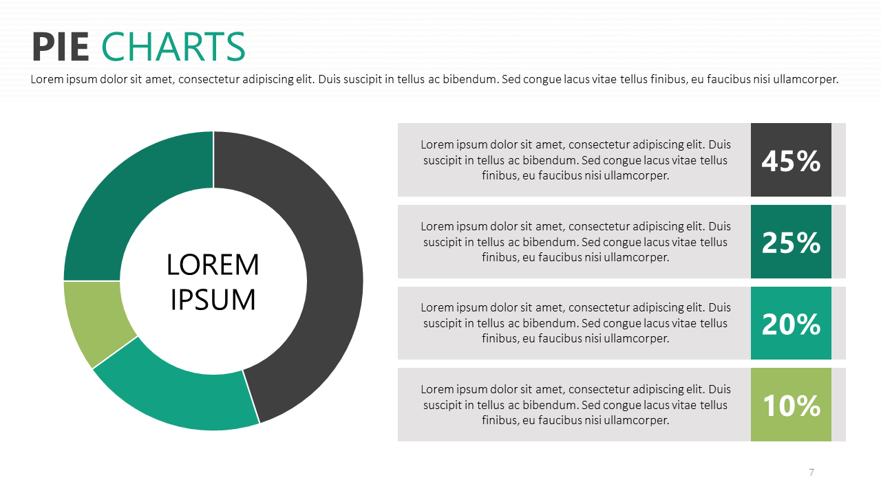
Pie Charts
Pie charts are a great way to show different percentages of a whole. They immediately identify the largest and smallest values. This means that they are great options for drawing attention to differences between one group and another.
However, many people misuse pie charts by overpacking them. As a rule, keep the chart to six or fewer sections. That way, the data is striking, not confusing. Then, make the pie chart your own with small, individual details and designs.
Once again, the powerful presentation of data is in simplicity.
Are you considering incorporating it into your presentation? Here’s how to easily add a pie chart in PowerPoint.
Download our Free Pie Chart Template here.
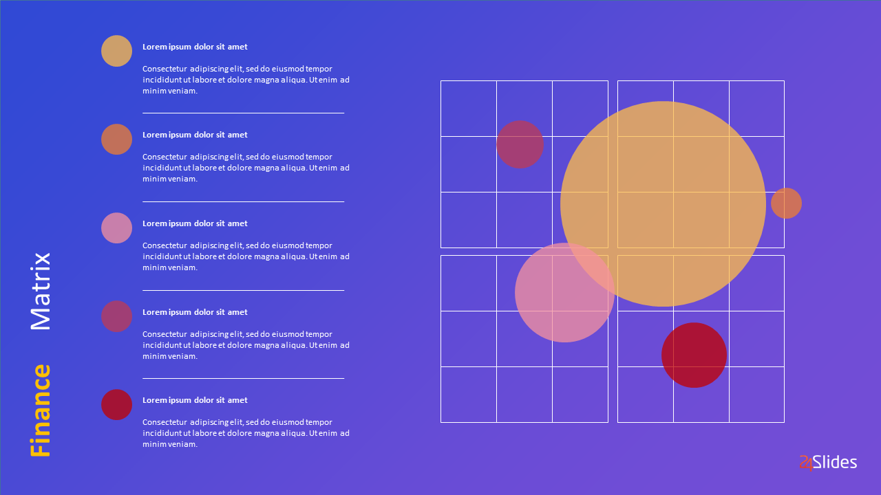
Bubble Charts
Bubble charts playfully present data in an incredibly visual way. But, what makes them so unique? It's easy: they show different values through varying circle sizes.
Squeezed together, the circles also show a holistic viewpoint. Bigger bubbles catch the eye, while small bubbles illustrate how the data breaks down into smaller values. ¿The result? A presentation of data in a visual form.
It can be one of the most graphic ways to represent the spending distribution. For example, you can instantly see your biggest costs or notice how important finances are getting lost in a sea of bubbles. This quick analysis can be incredibly handy.
Download our Free Bubble Chart Template here.
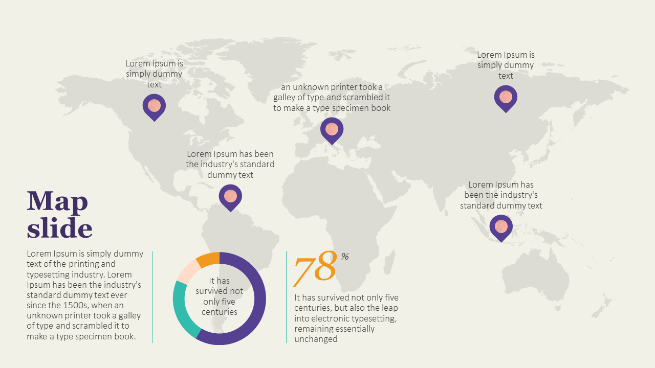
World Maps
Maps are the go-to solution for presenting geographic information. They help put data in a real-world context. You usually take a blank map and use color for the important areas.
Blocks, circles, or shading represent value. Knowing where certain data is can be crucial. A consistent color scheme makes it easy to show how valuable each section is.
They also work great when paired with other forms of data visualization. For example, you can use pie charts to provide information about offices in different cities around the world or bar charts to compare revenue in different locations.
Download our Free World Map Template here.
Timelines
If you want to display chronological data, you must use a timeline. It’s the most effective and space-efficient way to show time passage.
They make it easy for your audience to understand the sequence of events with clear and concise visuals.
You can use timelines to show your company’s history or significant events that impacted your business. Like maps, you can easily mix them with other types of data visuals. This characteristic allows you to create engaging presentations that tell a comprehensive story.
At this point, it's a matter of understanding how to add a timeline correctly in PowerPoint. Spoiler: it's incredibly easy.

Download our Free Timeline Chart Template here.
Flowcharts
Flowcharts, like timelines, represent a succession of events. The main difference is that timelines have determined start and finish points and specific dates. Flowcharts, on the other hand, show the passing from one step to the next.
They are great for showing processes and info that need to be in a specific order. They can also help you communicate cause-and-effect information in a visually engaging way.
Their best feature is that (unlike timelines) they can also be circular, meaning this is a recurrent process. All you need now is to become familiar with creating a flowchart in PowerPoint.

Download our Free Flowchart Template here.
5 Tips for data visualization in PowerPoint
Knowing how to present data in PowerPoint presentations is not hard, but it takes time to master it. After all, practice makes perfect!
I've gathered insights from our 200+ expert designers, and here are the top five tips they suggest for enhancing your data presentations!
1. Keep it simple
Don’t overload your audience with information. Let the data speak for itself. If you write text below a chart, keep it minimalist and highlight the key figures. The important thing in a presentation is displaying data in a clear and digestible way.
This becomes even more critical in highly regulated industries like pharma, where clinical trial data must be both accurate and cognitively accessible. If you work with medical data, explore our guide to clinical trial data visualization and reducing cognitive load in pharma presentations.
Put all the heavy facts and figures in a report, but never on a PowerPoint slide.
You can even avoid charts altogether to keep it as simple as possible. And don't get me wrong. We've already covered that charts are the way to go for presenting data in PowerPoint, but there are a few exceptions.
This begs the question: when shouldn't you use charts in PowerPoint? The answer is quite short. If your data is simple or doesn't add much value to your presentation, you might want to skip using charts.
If you are dealing with high-density data, read our step-by-step tutorial on how to format complex KPI slides in PowerPoint using data reduction frameworks.
2. Be original
One of the best ways to make your data impactful is originality. Take time to think about how you could present information uniquely. Think of a whole new concept and play around with it. Even if it’s not yet perfect, people will appreciate the effort to be original.
Experiment with creative ways to present your data, adding storytelling techniques, unique design elements, or interactive features. This approach can make the data more appealing and captivating for your audience.
You can even mix up how to present data in PowerPoint. Instead of just one format, consider using two different types of data presentation on a single slide. For instance, try placing a bar chart on the left and a pie chart showcasing different data on the right.
3. Focus on your brand
Keeping your presentation on-brand can genuinely make you stand out from the crowd! Even if you just focus on your brand’s color scheme, it will make your presentation look more polished and professional.
Have fun experimenting with data visualization tools to ensure they match your company’s products and services. What makes you different from others?
Add your brand's style into your visualization to ensure brand consistency and recognition. Use colors, fonts, and logos aligned with your company's image.
You can even make a presentation that more subtly reflects your brand. Think of what values you want to associate with your company and how you can display these in your presentation design.
4. Highlight key information
Not distracting your audience nicely brings us to our third point: Highlight key information. Being detailed and informative is important, but grabbing and keeping the audience's attention is crucial.
Presenting numbers in PowerPoint can be difficult, but it doesn’t must be. Make your audience listen to the bigger message of your words, not just the exact details. All the smaller particulars can be confirmed later.
Your listeners don’t want to know the facts and figures to the nearest decimal. They want the whole number, which is easy to spot and understand.
The meaning of the number is more important than its numerical value. Is it high or low? Positive or negative? Good or bad for business? These are the questions to which you want the answers to be clear.
Using colors is an excellent way to work with this. Colors are also a great visual tool to showcase contrast. For example, when you're working on a graph to display your revenue, you can showcase expenses in red and earnings in green. This kind of color-coding will make your data visualization clear from first sight!
5. Use Templates!
Presentation templates can be your best friend when you want to present data effectively in PowerPoint.
They offer pre-designed layouts and styles that can ensure consistency throughout your presentation. Templates allow you to adjust colors, fonts, and layouts to match your branding or personal preferences.
Microsoft Office has its own library of templates, but you can also find some pretty amazing ones online. Take some extra time to search and pick one that truly fits your needs and brand.
The good news? Our Templates by 24Slides platform has hundreds of PowerPoint chart templates, all completely free for you to use. You can even download different templates and mix and match slides to make the perfect deck. All are entirely editable, so you can add your own data and forget about design.
If you liked the look of some examples in this article, you might be in luck! Most are part of these, and you can also find them on our Templates platform.
Seeking to optimize your presentations? – 24Slides designers have got you covered!
In this article, I've shown why knowing how to present data efficiently in PowerPoint is crucial. Data visualization tools are a must to ensure your message is clear and that it sticks with your audience.
However, achieving results that really stand out could be a huge challenge for beginners. So, If you want to save time and effort on the learning curve of presenting data in PowerPoint, you can always trust professionals!
With 10+ years of experience and more than 200 designers worldwide, we are the world’s largest presentation design company across the globe.
24Slides' professional PowerPoint designers work with businesses worldwide, helping them transform their presentations from ‘okay’ to ‘spectacular.’ With each presentation, we're crafting a powerful tool to captivate audiences and convey messages effectively.
Boost your team’s productivity with the 24Slides Pro Plan, which includes a 10-hour turnaround, dedicated support, and special rates. Explore Pro now!

Looking to boost your PowerPoint game? Check out this content:
- Clinical Trial Data Visualization: Reducing Cognitive Load in Pharma Presentations
- 20+ Free PowerPoint and Google Slides Templates for Data Presentations
- PowerPoint 101: The Ultimate Guide for Beginners
- How to Create the Perfect B2B Sales Presentation
- The Cost of PowerPoint Presentations: Discover the hidden expenses you might overlook!