How to Use Icons to Make Amazing PowerPoint Presentations

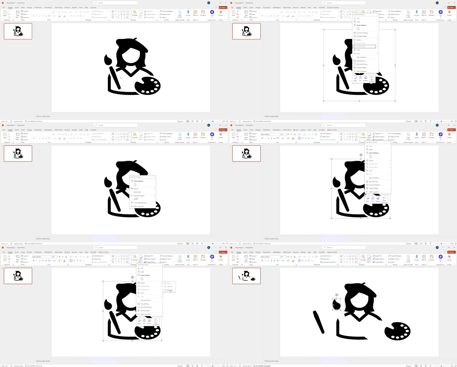
Ditch the 40-slide terms-of-service text wall. Strategic PowerPoint icons create instant visual anchors that C-suite audiences digest in just 13 milliseconds. Whether you use native Office graphics or external SVGs, unlock ultimate customization by right-clicking your asset, selecting Convert to Shape, and pressing Ctrl+Shift+G to edit individual vector paths.
To keep your deck looking agency-fresh, avoid rookie traps like mixing line and filled styles, oversizing graphics, or eyeballing alignment. DIY vectors are great for routine internal syncs, but when high-stakes pitch decks require flawless brand alignment, leave the pixel-policing to dedicated designers so you can focus on the pitch.
Topic Overview
Let’s face it: nobody wants to stare at a 40-slide deck that looks like a dense terms-of-service agreement.
Learning how to use icons in PowerPoint is the ultimate shortcut to rescue your audience from visual fatigue. A single, well-placed PowerPoint icon transforms confusing walls of copy into punchy, scannable visual anchors.
Picking the right icons to use in PowerPoint, like a profile icon for team layouts, a tools icon for technical specs, or a person-to-person icon for sales workflows, adds instant polish.
Mastering these small graphics in PowerPoint makes your deck look professionally designed in seconds.
Ready to stop guessing where every setting lives? Here is how to find, customize, and align every icon in PowerPoint like a pro.
How to Insert an Icon in PowerPoint (Quick Answer)
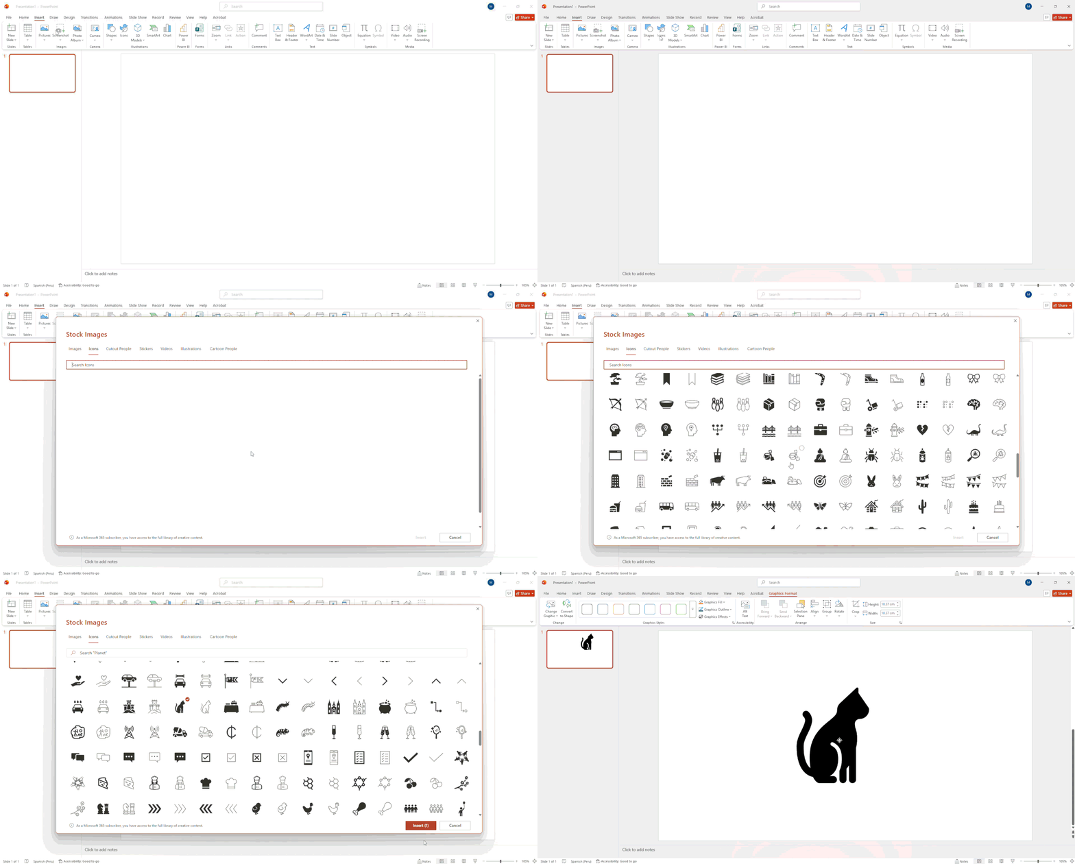
Need a quick visual fix? To drop an icon in PowerPoint, head to the Insert tab, find the Illustrations group, click Icons, pick your favorite graphic, and hit Insert. Done in three seconds flat.
Here is the pro secret competitor guides skip: PowerPoint inserts these graphics as SVG (Scalable Vector Graphic) files. Translation? They are pure vector math wizardry, not flat images. You can blow up a PowerPoint icon to billboard size, swap its colors, or split it into separate shapes without suffering from crusty, pixelated edges.
A quick sanity check on software age: according to Microsoft, this built-in library is exclusive to PowerPoint for Microsoft 365 and PowerPoint 2019 or newer. If you are stranded on legacy builds like PowerPoint 2016, that button won't exist; you will have to import external files or grab third-party free icons for PowerPoint instead.
Now that you know where the magic button lives, let’s style these icons for PPT so they look like sleek, custom agency assets rather than sad clip-art relics.
Why Icons Improve PowerPoint Slides
When an executive opens your deck, they aren't reading line-by-line; they are scanning. Adding a strategic icon for PowerPoint replaces dense text blocks with instant visual cues so your audience can process slide concepts in as little as 13 milliseconds.
Here is how smartly placed icons transform your slides from exhausting to effortlessly scannable:
- Fast Recognition at a Glance: Pairing a familiar search icon or website icon with a header leverages standard visual shorthand. According to the Nielsen Norman Group, standard, well-designed icons are recognized instantly because people have seen and used them before.
- Saves Valuable Slide Real Estate: Icons are compact visual shorthand. Swapping verbose sub-headers for clean PowerPoint symbols saves space, creating cleaner layouts and much-needed whitespace on executive decks.
- Universal Cross-Cultural Appeal: Clean icons for PowerPoint presentations transcend language barriers and jargon, helping international teams and global board members digest your message without translation friction.
- Elevates Aesthetic Appeal: Beyond functionality, well-crafted icons make dense corporate data visually pleasing, keeping C-suite focus locked on your pitch rather than their phones.
For investor roadshows and board meetings, slide scan-time is everything. Modernizing your slides with clean visual shorthand respects your audience's time and keeps their focus right where it belongs.
3 Ways to Insert Icons in PowerPoint
Whether you need a quick built-in vector or a fully custom visual tailored to your brand guidelines, here are three reliable ways to get icons onto your slides.
Method 1: PowerPoint's Built-In Icon Library
Microsoft packs thousands of native vector assets directly into Office, neatly organized into categories like People, Technology, Arrows, Nature, etc.
To use the native library, follow these simple steps:
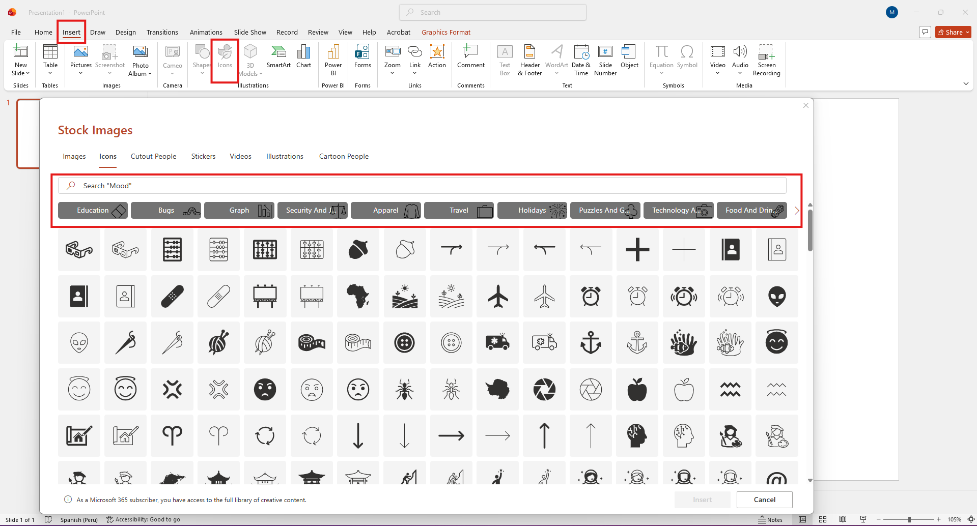
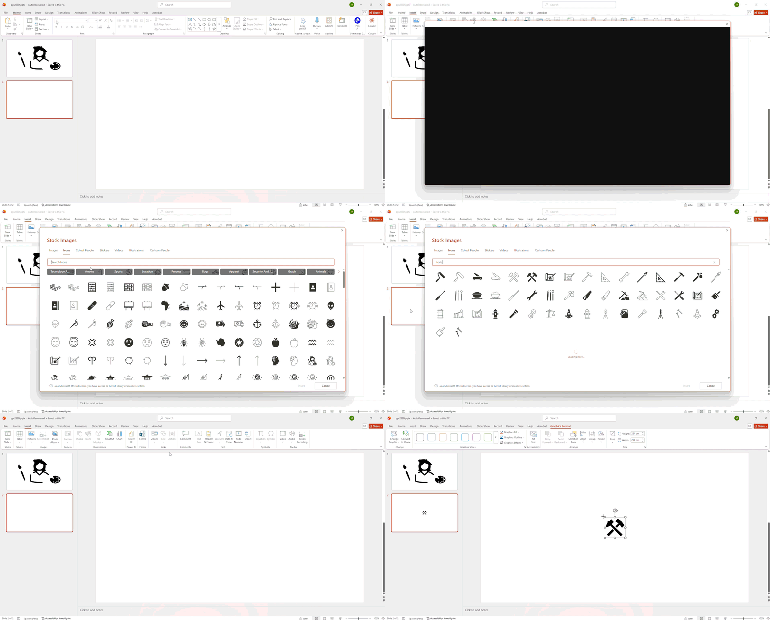
- Open your slide and click the Insert tab on the top ribbon.
- Locate the Illustrations group and click Icons.
- Use the top search bar (e.g., search for a profile icon or tools icon) or browse by category.
- Click your chosen icon, or multi-select several icons for PowerPoint presentations at once, and click Insert.
It drops scalable vector graphics right onto your canvas, giving you instant access to clean visuals without leaving your deck.
Method 2: Free and Premium External Icon Libraries
When the default library feels a bit too familiar, third-party sites offer endless specialty styles. Here are four top-tier platforms and how their licensing works:
- Flaticon: Massive variety of line art and flat styles. Available free with creator attribution, or via paid Premium for unlimited downloads without attribution.
- The Noun Project: The gold standard for minimalist, diverse iconography. Offers free downloads with attribution, or a paid subscription for royalty-free access.
- Font Awesome: A developer favorite packed with open-source vector glyphs and brand logos, featuring extensive free open-source tiers.
- Iconfinder: A flexible marketplace featuring millions of vector graphics, easily filterable by commercial license and price (free vs. paid).
The Workflow: Download your chosen graphic as an SVG (for total recoloring freedom) or a high-res PNG. Then navigate to Insert > Pictures > This Device to place the file on your slide, just like any other picture in PowerPoint presentation layouts.
Method 3: Custom Icons Designed for Your Brand
Stock libraries are great, but they often fall short when you need specialized diagrams, complex product metaphors, or graphics that strictly match your corporate visual identity.
When off-the-shelf graphics look mismatched, custom design is the ultimate solution. This is where 24Slides provides a powerful alternative to DIY hunting. Instead of spending hours tweaking vector paths or settling for generic clip art, you can hand off your rough sketches to professional designers who craft custom, boardroom-ready graphics in PowerPoint.
Whether you need a quick one-off slide refresh or ongoing subscription support with a dedicated brand-trained team, you get custom visual assets backed by 24-hour standard turnarounds and rigorous quality control. It is the fastest way to maintain enterprise-grade brand consistency across every deck your team presents.
How to Customize Icon Color, Size, and Shape
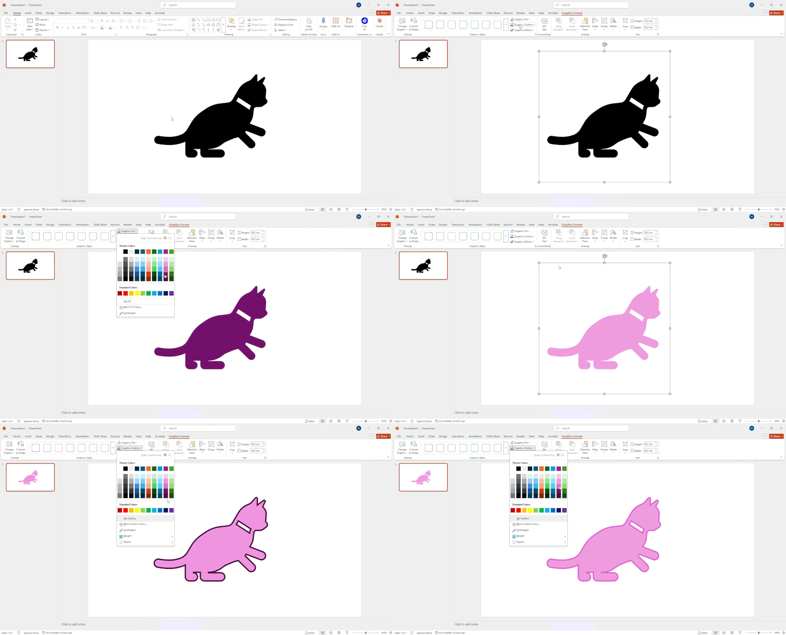
Once you drop an icon in PowerPoint, customizing it to match your brand palette takes about three clicks. Selecting your graphic unveils the context-aware Graphic Format tab on the top ribbon.
Here is how to adjust the basics in seconds:
- Change Colors: Click Graphic Fill to apply your brand's exact hex color code.
- Add Borders: Use Graphic Outline to add clean strokes, adjust line weight, or create dashed borders.
- Resize Proportionally: Drag any corner handle while holding the Shift key to lock the aspect ratio, preventing your crisp vector from stretching out of shape.
The Secret Power Move: Convert to Shape & Ungroup
Want to turn a basic monochrome PowerPoint icon into a multi-colored masterpiece? Because these assets are vectors, you can break them down into individually editable sub-shapes using this simple trick:
- Right-click your graphic and select Convert to Shape.
- Click Yes when PowerPoint prompts you to convert it into a Microsoft Office drawing object.
- Press Ctrl+Shift+G on Windows (or Cmd+Shift+G on Mac) to ungroup the element.
Just like that, your single graphic dissolves into individual vector paths. Now you can delete unwanted lines, recolor separate sections of a multi-part person to person icon, or pull individual pieces out of a tools icon. It is the easiest way to transform default icons in PPT into bespoke corporate graphics without opening Illustrator.
Icon Sourcing Comparison: Cost, License, and Editability
Hunting for the perfect icon for PowerPoint often turns into a wild chase through confusing licensing terms and pixelated downloads. Balancing editability, licensing rules, and brand consistency comes down to knowing where to look and what each platform actually delivers.
Choosing the Right Sourcing Strategy
If you are putting together an internal team update on a tight deadline, sticking with built-in visuals or downloading free icons for PowerPoint from Font Awesome gets the job done without costing a dime.
However, when preparing critical icons for PowerPoint presentations, such as investor pitch decks, C-suite roadshows, or major client proposals, off-the-shelf vector files often backfire. Mismatched stroke weights, clashing visual styles, and off-brand colors quickly give away a budget "copy-and-paste" build.
For enterprise decks where visual alignment directly drives audience trust, moving beyond generic stock graphics to custom-crafted elements ensures your entire presentation looks seamlessly branded, fully editable, and boardroom-ready.
5 Icon Design Mistakes to Avoid in PowerPoint
Knowing how to use icons in PowerPoint is only half the battle; knowing what not to do keeps your deck out of the slide-design hall of shame. Avoid these five visual sins to ensure your slides look like a polished agency masterpiece rather than a chaotic Frankenstein draft:
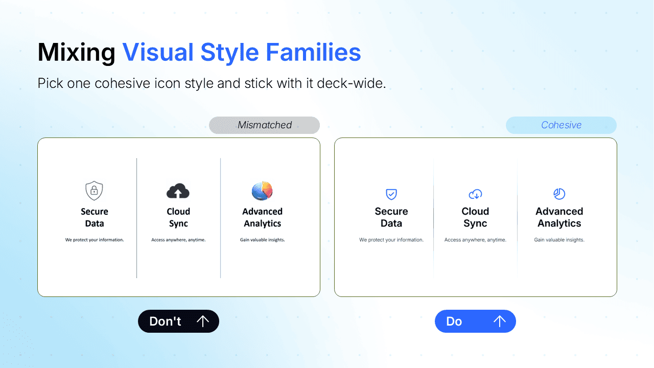
1. Mixing Style Families: Combining thin line-art graphics with heavy, solid flat shapes creates instant visual whiplash. If you choose a sleek outline icon for Microsoft PowerPoint slides, don't drop a chunky, filled profile icon right next to it. Pick one visual aesthetic and stick with it, deck-wide.
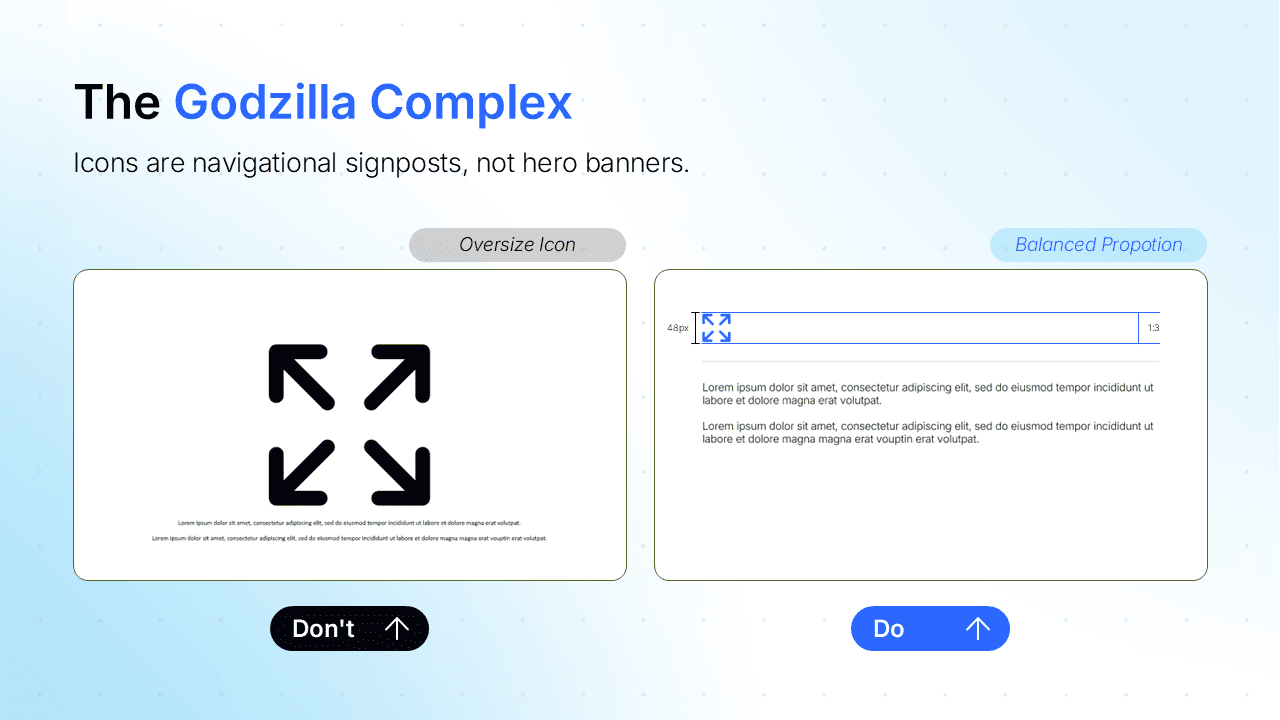
2. The Godzilla Complex (Oversizing): Icons are helpful visual signposts, not giant hero banners. Enlarging a PowerPoint icon until it dwarfs your headline text unbalances the layout and subtly whispers, "I ran out of content for this empty white space." Keep icons smaller than your headers so they guide the eye rather than crush it.
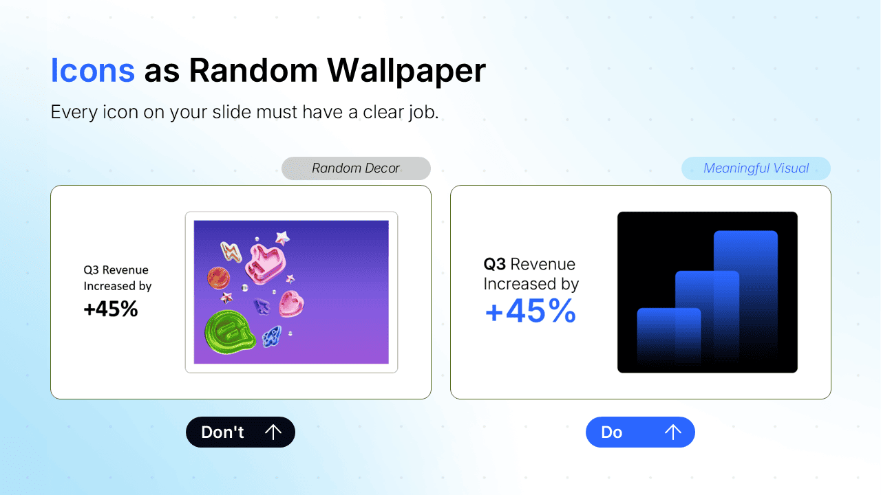
3. Using Icons as Random Wallpaper: Every single icon in PPT layouts needs a clear job. Dropping a random book icon next to a bullet point about quarterly profits just because the corner felt lonely confuses your audience. If an icon for PowerPoint doesn't reinforce your copy, kick it off the slide.
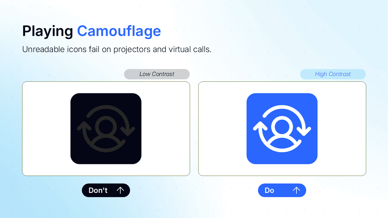
4. Playing Camouflage with Contrast: Slapping a dark slate icon for PowerPoint onto a dark gray container card renders it completely invisible, especially when projected on dim meeting room screens or compressed over video calls. Give your icons for PPT punchy, high-contrast color fills so they pop effortlessly.
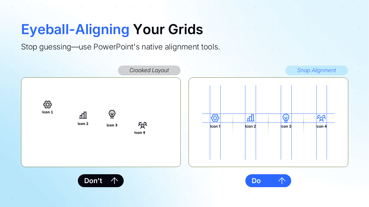
5. Eyeball-Aligning Your Grids: Guessing icon placement by sight is a one-way ticket to crooked, sloppy layouts. Placing PowerPoint symbols "roughly in the center" leaves jittery gaps that drive visual perfectionists crazy. Use PowerPoint’s built-in Align Top and Distribute Horizontally tools so your icons for PowerPoint presentations snap into pixel-perfect harmony.
When DIY Icons Are Enough (and When They're Not)
Let’s be completely transparent: you do not always need a professional design agency to drop an icon in PowerPoint.
If you are building a quick 5-slide internal status update, a Friday team sync, or an informal draft deck, DIY is 100% the right call. Grabbing default assets from Office or pulling third-party free icons for PowerPoint from sites like Flaticon gets the job done fast without costing a dime. Hiring a design team for a routine internal update is total overkill. Save your budget!
The math changes when the stakes shift. The DIY approach falls apart when your deck is:
- Client- or Investor-Facing: Pitching C-suite buyers or venture funds requires flawless polish. Generic clip-art visual metaphors can make an enterprise pitch look budget.
- Tied to Strict Corporate Brand Guides: Stock libraries rarely match your company's exact brand line weights, fill styles, or secondary accent palettes.
- Scaling Across Dozens of Complex Slides: Aligning, recoloring, and styling individual graphics in PowerPoint across a 40-slide presentation turns into an exhausting late-night time sink.
Match your visual strategy to the room. Use default icons to use in PowerPoint for everyday internal updates, and hand off high-stakes decks to dedicated designers when you need to make an undeniable impression.

FAQ: Common Icon Questions in PowerPoint
Why are icons not showing up in PowerPoint?
Native PowerPoint icons require a Microsoft 365 subscription or PowerPoint 2019 (or newer) connected to the internet. If the button is grayed out, check your Office version under File > Account, verify your internet connection, or check with your IT administrator to ensure organizational security policies haven't blocked online graphics in PowerPoint.
Where can I find icons for PowerPoint?
You can access thousands of native vector graphics directly inside PowerPoint via Insert > Icons. For broader variety, external platforms like Flaticon, The Noun Project, and Font Awesome offer free icons for PowerPoint in downloadable SVG or PNG formats. For boardroom decks needing exact brand alignment, 24Slides provides custom-designed icon sets.
What are the five types of icons?
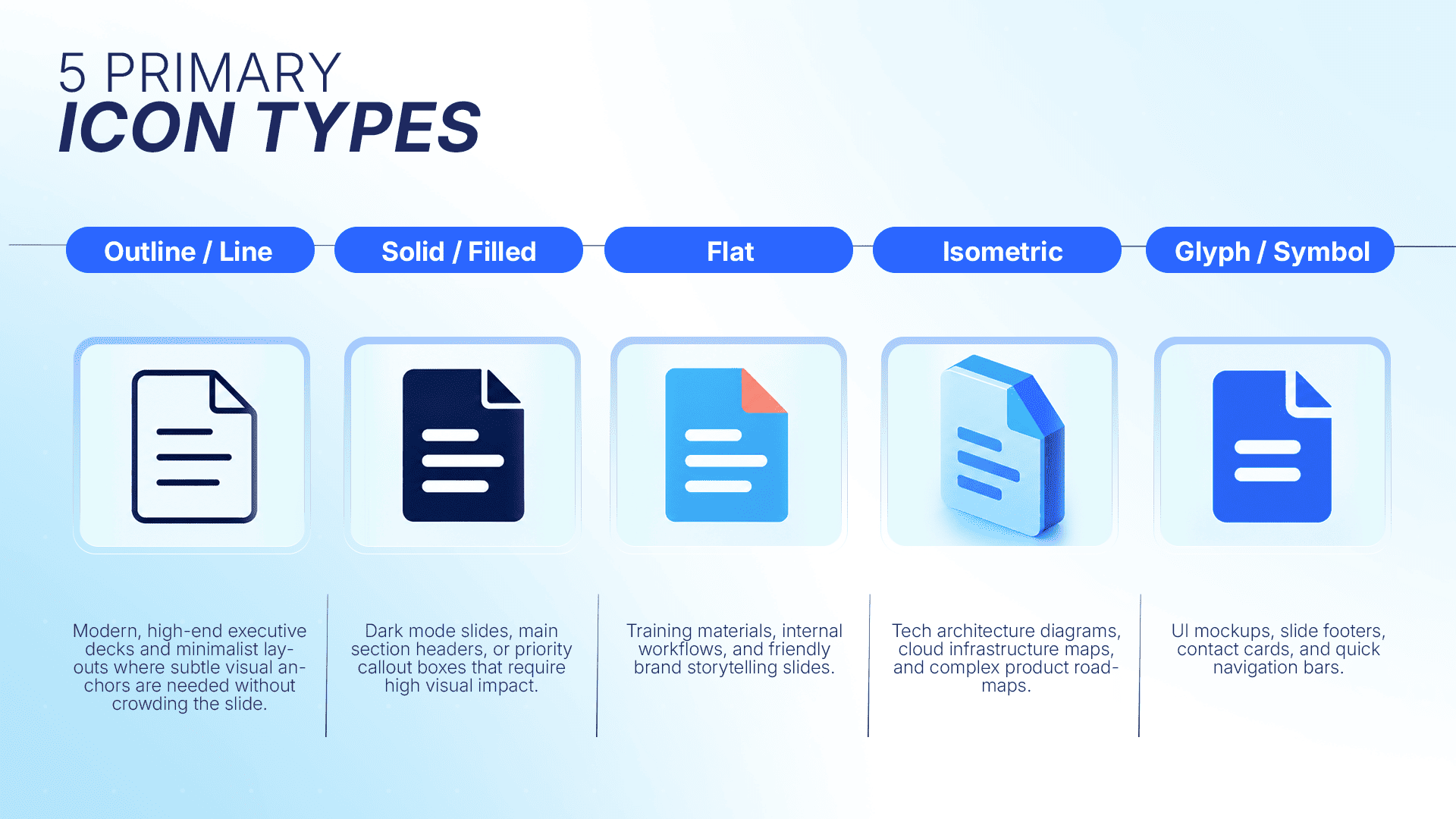
The five primary types of icons for PPT presentations are:
- Outline/Line Icons: Minimalist stroke-based vector designs.
- Solid/Filled Icons: High-visibility, solid-color graphics.
- Flat Icons: Two-dimensional graphics using simple color blocks.
- Isometric Icons: 3D-angled vector graphics that add visual depth.
- Glyphs/Symbols: Universal functional shorthand, like a search icon or website icon.
How do I insert icons into my presentation?
To use built-in PowerPoint symbols, go to Insert > Icons, type a keyword in the search bar (such as "tools icon"), select your asset, and click Insert. For downloaded SVG files, select Insert > Pictures > This Device to place the graphic directly onto your slide canvas.
Can I get custom icons designed to match my company's brand guidelines?
Yes. While stock libraries offer generic visuals, professional design services like 24Slides craft custom icons for PowerPoint presentations tailored strictly to your company’s brand guidelines. Designers match your exact corporate color hex codes, line weights, and visual style to eliminate mismatched stock graphics across your deck.
Next Step: Icons That Match Your Brand, Every Time
Look at you, you’ve officially mastered how to use icons in PowerPoint! You know how to recolor, resize, and pull off the Convert to Shape ungroup trick like a seasoned pro. For quick Friday team updates, you’re fully equipped to build sleek, scannable slides all on your own.
But when you’re staring down a 40-slide pitch deck for the C-suite? Playing pixel-police on dozens of mismatched icons in PPT layouts is a fast track to design burnout.
That’s where 24Slides steps in to turn presentation design into your secret superpower. Instead of playing freelancer roulette with anonymous production lines, you get a dedicated, brand-trained design team that learns your visual identity inside and out. Backed by enterprise-grade security, dedicated project managers, and a standard 24-hour turnaround, we deliver boardroom-ready graphics in PowerPoint that strictly respect your brand guidelines and your sleep schedule.
Ready to stop wrestling with vector paths? Hand off your deck to 24Slides today and let your dedicated team turn your rough drafts into icons for PowerPoint presentations that genuinely pop!