7 Branded Presentation Examples From McDonald's, Adidas, IBM and More

Creating presentations is harder than it looks. It’s common to run out of ideas or inspiration to design something solid and memorable for your audience.
If you feel like your slides are missing that extra spark, you’re in the right place. Today we’ll show you great presentation examples that will undoubtedly elevate your work.
Let’s get started!
What Makes a Presentation "Branded" (Quick Answer)
A branded presentation doesn’t just look like the brand; it communicates like the brand.
True brand alignment means applying a company's core visual identity system, including strict logo usage rules, proprietary typography, custom iconography, and the exact color palette, consistently across every single slide of your slide deck.
When done right, your presentation acts as an extension of your brand guidelines, reinforcing trust and instant recognition with external stakeholders.
McDonald's Presentation Example: Playful Illustration and Visual Storytelling
What does this deck get right?
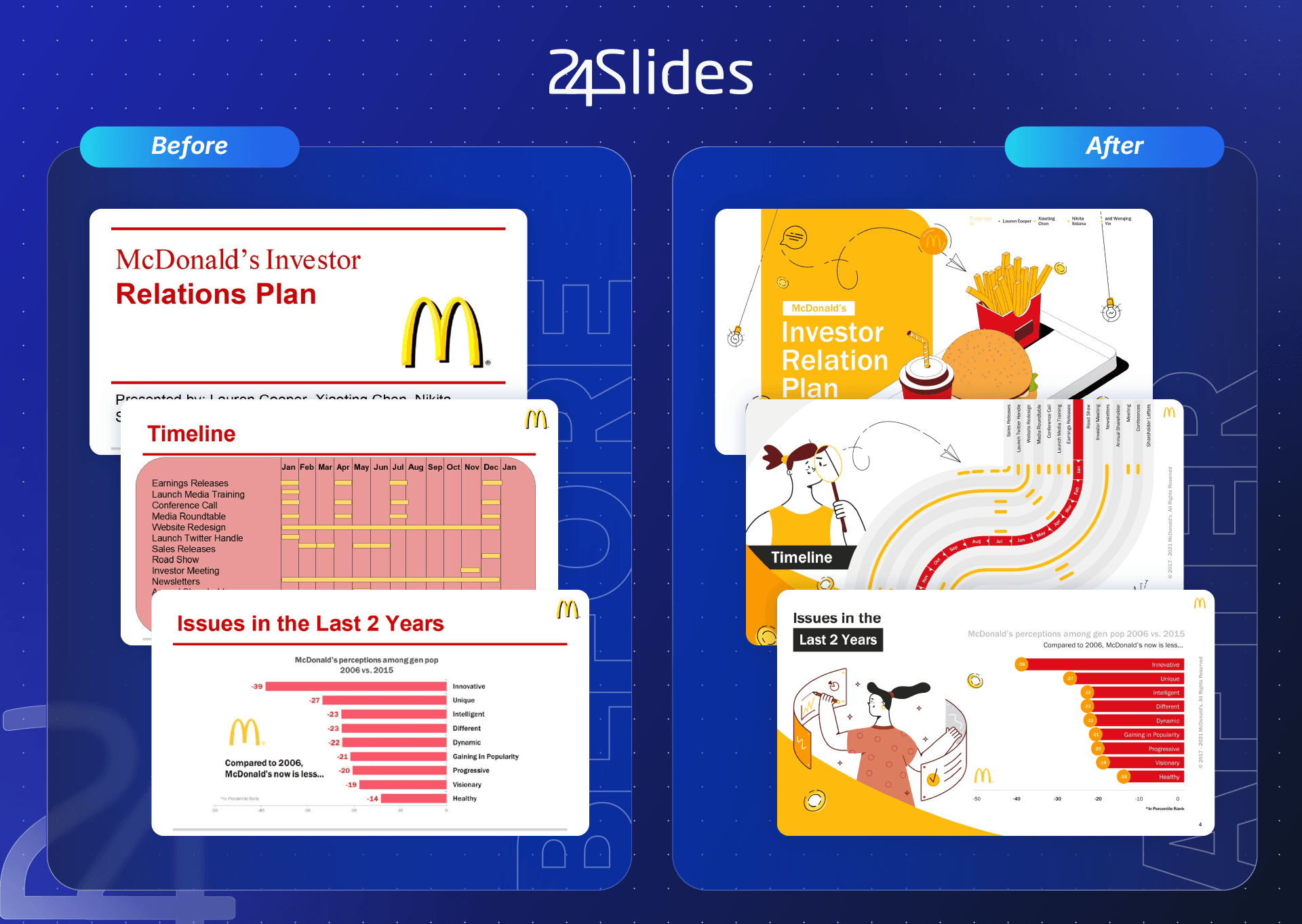
This McDonald’s-inspired presentation shows how a well-known brand can make a corporate topic feel more approachable through playful visual storytelling. Instead of relying entirely on charts, text, or basic business layouts, the rebranded deck incorporates illustrations, character-based visuals, and dynamic compositions to create a more engaging experience.
The design remains strongly connected to the McDonald’s brand through its recognizable red and yellow color palette, Golden Arches iconography, and food-related visual cues. These elements provide immediate brand recognition while allowing the individual slides to vary in composition. The result is a deck that feels cohesive without making every slide look identical.
What could be adapted for other industries?
The approach can work particularly well for brands that want to communicate complex information in a more human and approachable way.
A healthcare company, for example, could use illustrated characters to explain patient journeys, while a technology company could apply a similar visual language to simplify technical concepts.
The key is not to copy McDonald’s visual style, but to translate the principle of playful storytelling into your brand’s visual identity. This makes your presentations memorable while remaining recognizable and consistent.
Adidas Presentation Example: Dynamic Movement and Athletic Imagery
What does this deck get right?
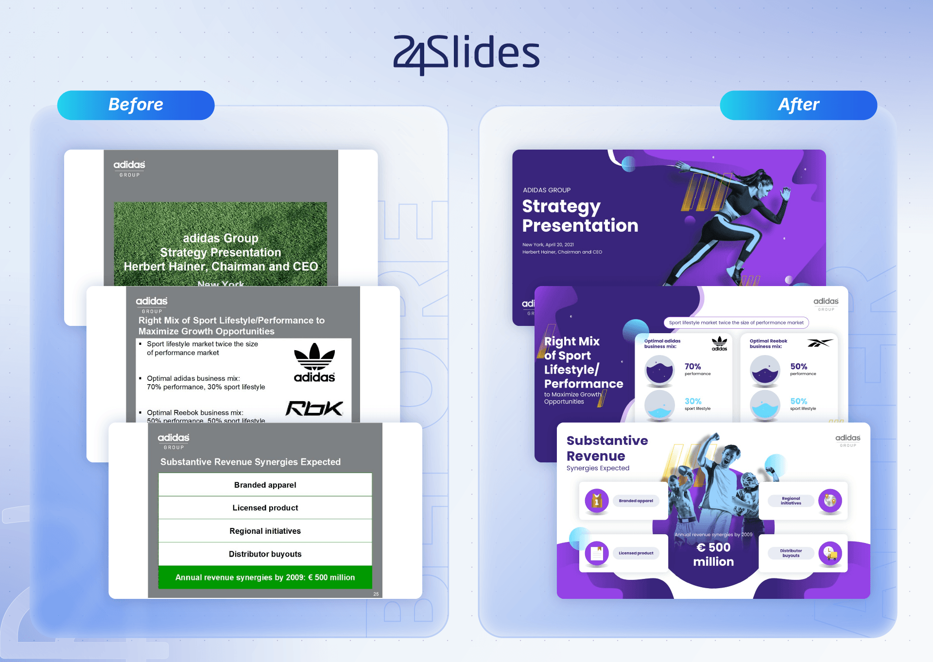
In these Adidas-inspired slides, our team crafted a business presentation where visual elements inspire constant movement. This PowerPoint presentation example uses striking, high-impact imagery and smart layouts that make heavy content feel effortless to digest.
Athletic brands excel at using visuals to connect with their audience's emotions, and this stands out as one of the best corporate presentation examples to prove it.
What could be adapted for other industries?
This playful, high-energy style can easily be adapted for entertainment industries like gaming or music, making it an ideal design approach for creative agencies.
A standout graphic resource used in this branded deck is the content box. It's a simple tool, but it nails the job of organizing information cleanly and professionally. Use it whenever you can!
While we’ve highlighted specific industries, feel free to draw inspiration from this aesthetic for whatever presentation goal you’re tackling.
LinkedIn Presentation Example: Data-Led Slides for a B2B Audience
What does this deck get right?
LinkedIn remains one of the most vital networking platforms out there; if not the most important one.
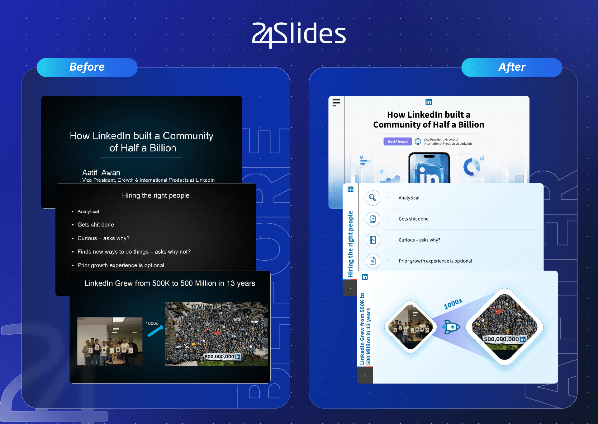
In this presentation, our team brought LinkedIn’s visual identity to life, integrating its exact color palette and typography. Through unique graphics and visuals, this presentation example turns cold statistics into easy-to-digest stories.
The smart use of icons helps structure the information cleanly, acting as a handy visual guide while you present.
What could be adapted for other industries?
This presentation deck features concise key-point layouts, proving you don't need heavy text blocks: just a punchy, clear mention of each core finding or subtopic.
While designed with a B2B audience in mind, these adaptable diagrams fit seamlessly into any industry, serving as a solid blueprint for your future decks.
IBM Presentation Example: System-Driven Design for Enterprise Communication
What does this deck get right?
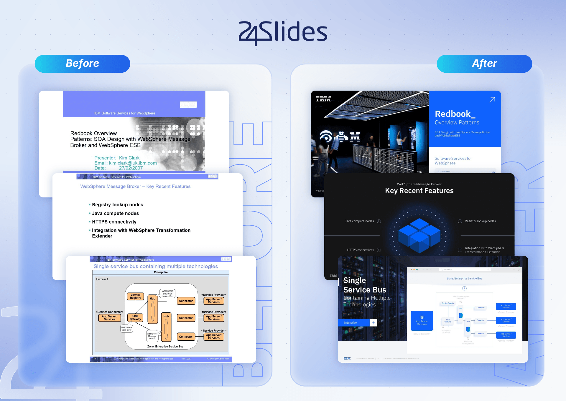
This IBM-inspired presentation strikes a well-balanced chord: it’s sober, creative, and rooted in total visual consistency.
Given the tech context, system diagrams and mockups take center stage. The brand's signature blue acts as a powerful visual anchor, backed by professional photography, dark backgrounds, and clean graphic assets.
Crisp typography and a clear hierarchy make even data-heavy slides exceptionally easy to read. The result is a design system that oozes professionalism and technical depth without feeling cluttered.
What could be adapted for other industries?
Even though the core technical content belongs to IBM, these structural design patterns are universally adaptable to any sector.
For instance, clean columnar layouts help establish visual hierarchy when explaining services or specs in finance, healthcare, or engineering. Meanwhile, mockups and infographics can easily be repurposed to showcase any product.
Oracle Presentation Example: Creative Software Slides
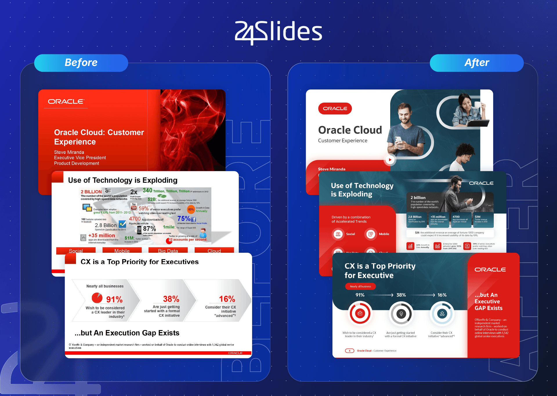
What does this deck get right?
This branded presentation masters the balance between cool and warm color tones. Our team restructured dense information into clean blocks and structured cards, letting viewers scan and process key concepts effortlessly.
Additionally, well-placed photography complements the content, giving this Oracle slide deck a much more dynamic feel.
What could be adapted for other industries?
The design pattern of split cards and blocks fits right into sectors like banking, real estate, or strategic consulting, where you need to break down complex market trends with elegance.
Slides packed with numeric data can inspire your next performance report or corporate dashboard across any industry looking to present KPIs persuasively.
Amazon Presentation Example: Dark & Elegant Storytelling
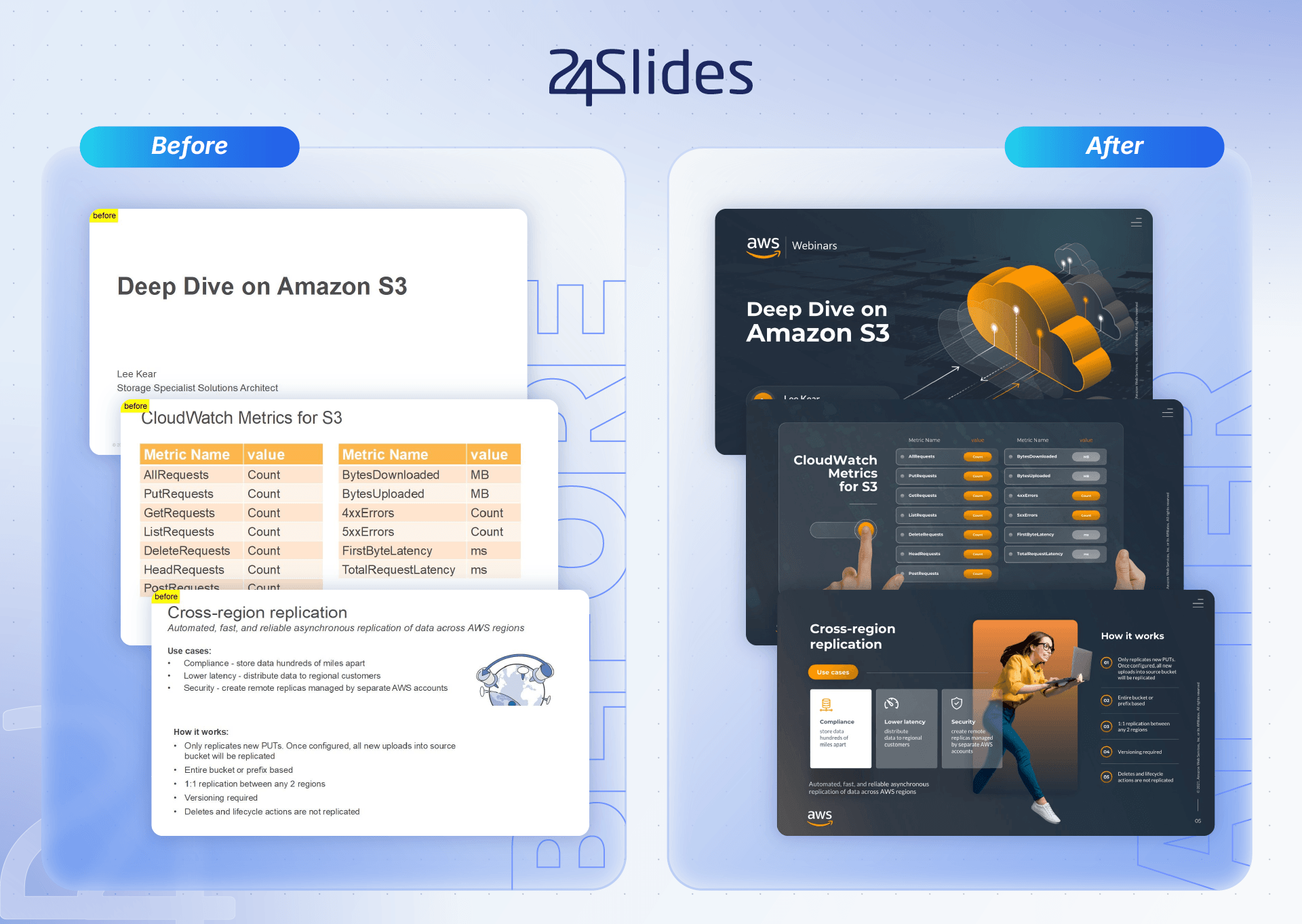
What does this deck get right?
In this Amazon presentation example, dense technical data is organized into micro-cards that cleanly map out massive product or service catalogs.
Raw metrics and infrastructure specs are translated into an intuitive visual system powered by vector icons and clean, sophisticated layout placeholders.
What could be adapted for other industries?
The minimalist style of this slide deck fits smoothly into any business review or monthly report.
Specifically, structured card layouts adapt exceptionally well to industrial, pharmaceutical, or tech sectors that regularly deal with complex manuals and heavy specifications for their clients.
CISCO Presentation Example: Playful Customer Lifetime Value Slides
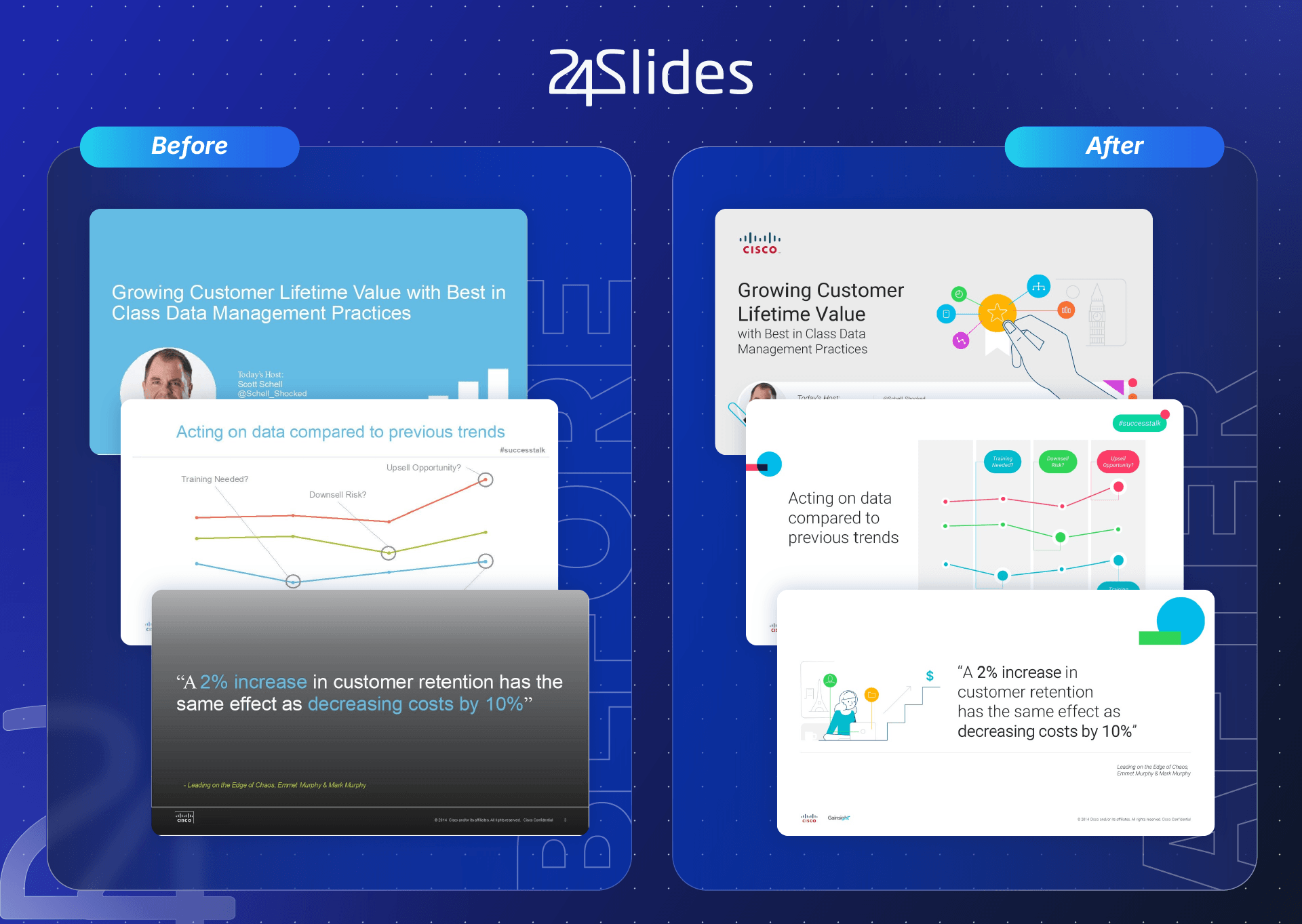
What does this deck get right?
In this Cisco-inspired deck, our team leaned into vibrant colors combined with a minimalist, playful vibe.
By leveraging friendly vector illustrations and custom graphic elements, the design humanizes the brand, turning dry data into something accessible and memorable.
What could be adapted for other industries?
This playful design style works wonders for education, healthcare, and fintech brands.
The pattern of spotlighting key quotes, metrics, or business benefits through a clean, uncluttered layout is universally effective for startup pitch decks and commercial presentations across any niche.
See Our Magic: How 24Slides’ Redraw Treatment Bring Your Design Ideas to Life?
Do you have an idea for a presentation but aren't quite sure how to communicate it?
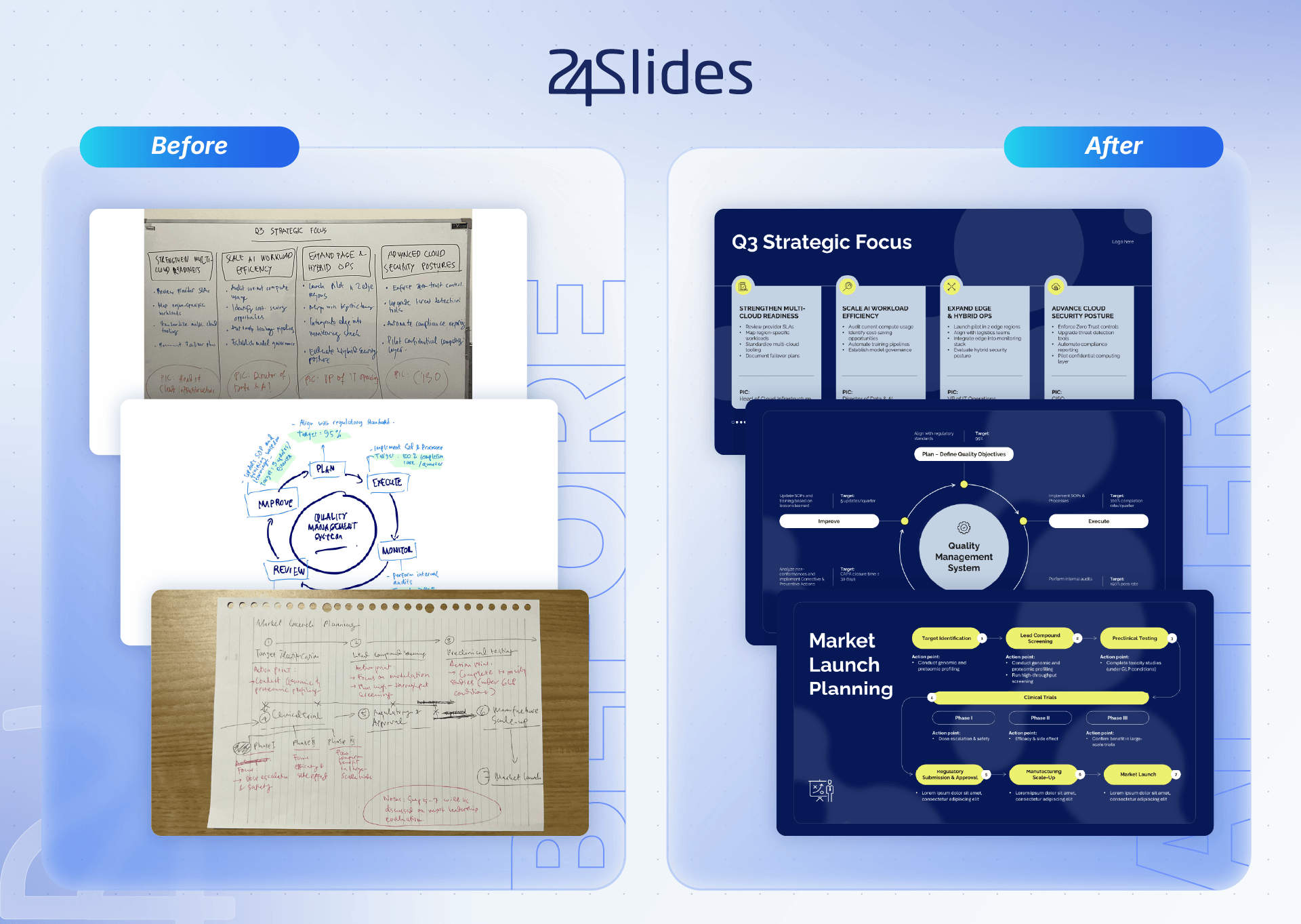
At 24Slides, we turn your rough drafts, sketches, or messy notes into professional, fully editable slides that are ready to impress.
Whether you have a hand-drawn layout, or an outdated deck, our designers will recreate it, elevate its visual quality, and adapt it seamlessly to your brand identity.
See our work in action:
24Slides’ Service: Discover Our Design Treatments
At 24Slides, we know you have diverse needs when it comes to your design projects, which is why we offer different types of treatments.
Explore them here!
24Slides’ Service: Fix Up vs. Redesign vs. Redraw
| Feature / Aspect | Fix Up | Redesign | Redraw |
|---|---|---|---|
| Main Focus | Tidy up slide appearance, format correctly, and ensure consistent alignment, colors, and fonts. | Transform slides for maximum impact with deep visual and structural enhancements. | Recreate non-editable content (sketches, old graphics, charts) into clean, editable slide elements. |
| Design & Structure Changes | No major design elements added (no icons, illustrations, photos, or heavy layout changes). | Includes deep layout changes, content visualization, and custom background templates. | Focuses on recreating and enhancing existing static or hand-drawn content. |
| Illustrations & Visuals | No new illustrations are created; works with existing elements adapted to your brand guidelines. | Includes custom illustrations created to complement the text on the slide. | Turns rough sketches, drawings, or old charts into polished, editable images, graphs, or charts. |
| Price | $10 - $19 | $25 - $49 | $40 - $79 |
🆓 Our Pro service is currently launching, so we’re giving you a free month. Discover all the details here.
When a Branded Presentation Redesign is Not the Right Move?
Time is one of the most valuable assets in business, which means you don't always need to outsource your slide redesigns.
Let’s see some situations:
- For quick internal-only decks: If you just need a straightforward deck for internal alignment with no external audience, a full branded redesign is overkill.
- Before defining your visual identity: If your organization has no documented visual identity system (brand book, CVI, style guide) yet, it's best to start with brand guideline development before commissioning a fully branded deck.
- When content is still constantly shifting: If your core message, data, or script are still undergoing heavy last-minute changes, wait until the content is locked down before investing in a design overhaul.
A Few Questions to Master Your Slides! (FAQ)
What is a brand strategy?
A brand strategy is the intentional roadmap that defines who you are, why you exist, and how you show up in the world.
While your logo, colors, and fonts are the clothes your brand wears, your brand strategy is your personality, values, and long-term promise. Without it, a business is just a product; with it, a business becomes a recognizable, trusted experience.
What is a branded presentation?
A branded presentation is a professional slide deck seamlessly aligned with your corporate identity guidelines.
Far more than a mere combination of logos and color palettes, it is a strategic tool designed to communicate consistency and credibility. In a branded deck, every detail is intentional.
Why are branded presentations important?
Branded presentations are important because they build trust with your audience.
The best company presentation examples show how well-designed slides reinforce your brand credibility and help your audience stay engaged longer.
What are the characteristics of a good presentation?
A good presentation combines clarity, design, and storytelling. The best corporate presentations usually share these elements:
- Impactful opening slides: A strong first impression sets the tone for the entire corporate presentation. This can also be introduced with an icebreaker or an engaging question.
- Consistent color palette: Your visual identity should be coherent across all touchpoints with your customer, including, of course, your slide decks.
- Effective data visualization: Large amounts of data can overwhelm anyone, but a well-structured presentation can make this information more digestible.
- Memorable visuals: A branded presentation uses images and visual elements to reinforce key ideas. The point isn’t to overload, but rather to use simple but effective visuals that make a difference.
- Clear structure: As you saw before, our presentation examples divide content into easy-to-follow sections, avoiding visual saturation. This approach is essential for creating high-impact presentations!
What is the 10/20/30 rule for presentations?
The 10/20/30 rule for presentations was popularized by venture capitalist Guy Kawasaki to combat boring, text-heavy pitches. This rule states that a slide deck should contain a maximum of 10 slides, last no longer than 20 minutes, and use a font size of at least 30 points. This rule was created to focus on their core message, and leave plenty of time for a real conversation.
Much like the famous Pecha Kucha format (which strictly uses 20 slides for 20 seconds each), the 10/20/30 rule shares the same core philosophy: limiting slides and time forces simplicity, clarity, and engagement, preventing presenters from hiding behind walls of text and making every single word count.
Build Your Branded Presentation With a Dedicated Design Team
At 24Slides, we act as your always-on design partner for heavy enterprise workloads.
We give your organization reliable, brand-trained support to turn important content into clear, credible, and on-brand communications in just hours. All without burning out your internal teams.
We aren't a template library, a random freelance marketplace, or a traditional project-based agency. Instead, we are a fully managed design service powered by specialists, built specifically for ongoing, business-critical demands.
With us, your next business presentation can be as memorable as the best company presentation examples we shared at the beginning of this blog.
Try our service and enjoy the future of design.

Want to keep leveling up your decks? Download our templates here: