PowerPoint Charts, Graphs, & Tables Made Easy | Tips & Tricks

In today's digital world, effective communication is key, especially in presentations. After all, in a world saturated with information, the power to express your message clearly and impactfully can make all the difference.
We know that conveying complex information can be challenging, but guess what? It doesn't have to be! After discussing this with our 200+ expert presentation designers, I've gathered their best practices and strategies to create this comprehensive guide.
Below, you will find expert tips and tricks for making, customizing, and presenting PowerPoint charts, graphs, and tables. Stay with us!

Today, we'll explore the following topics:
- PowerPoint Charts and Graphs
- Tables in PowerPoint
- Free PowerPoint charts, graphs, and tables templates
- Ready to enhance your presentations? Our team at 24Slides is here to help!
PowerPoint Charts and Graphs
If you are thinking of adding tables to your PowerPoint presentation, let me first show you two other great options: charts and graphs.
Charts and graphs stand out for making complex information easy to read at a glance. They’re ideal for identifying trends, representing patterns, and making decisions easier. In addition, charts and graphs capture the audience's attention.
You have many types to choose from, and we'll go over the most important ones later. In the meantime, here are some examples:
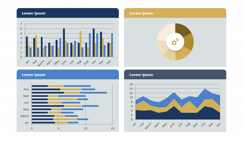
Undoubtedly, one of the best ways to take your presentations to the next level.
But you may have a question in mind: What is the difference between a chart and a graph in PowerPoint? Charts refer to any visual representation of data, whether graphical or non-graphical (such as tables). Graphs, on the other hand, refer specifically to the graphical representation of data (such as bar charts).
In other words, all graphs are charts, but not all charts are graphs.
People often confuse these terms in PowerPoint, but they actually refer to different visual elements.
How to Make a Chart in PowerPoint?
First, go to the Insert tab. Then, click on Chart and select your favorite chart type. Finally, enter your data or copy it from somewhere else. Simple!
Here you have the detailed step-by-step instructions:
- Select the slide where you want to add the chart. Choose the Insert tab, then select the Illustrations group's Chart option.
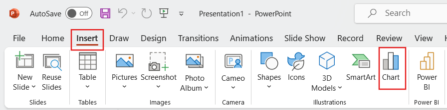
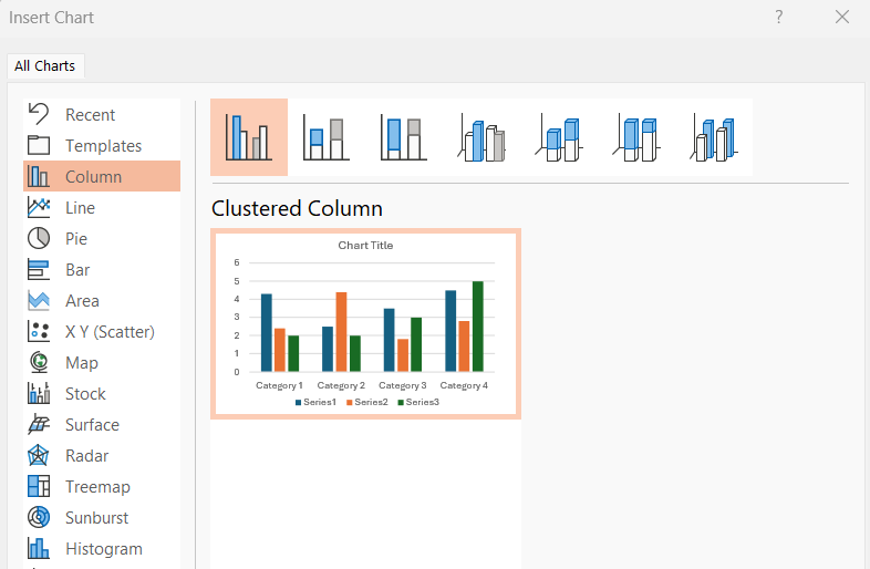
- A dialog box for inserting charts will appear. Choose a category on the left, then double-click the chart you want on the right.
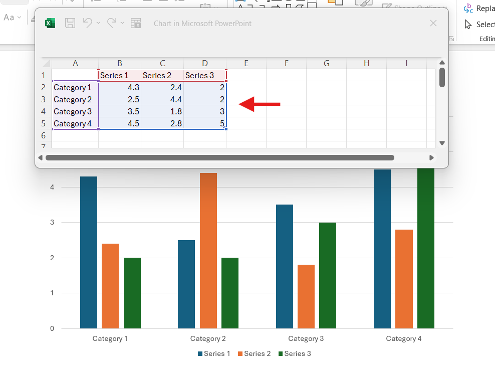
- When inserted, the chart appears alongside a spreadsheet. Here, you have to replace the placeholder data with your own details.
To edit your chart's content, use the selection handles in the spreadsheet to add or remove data.
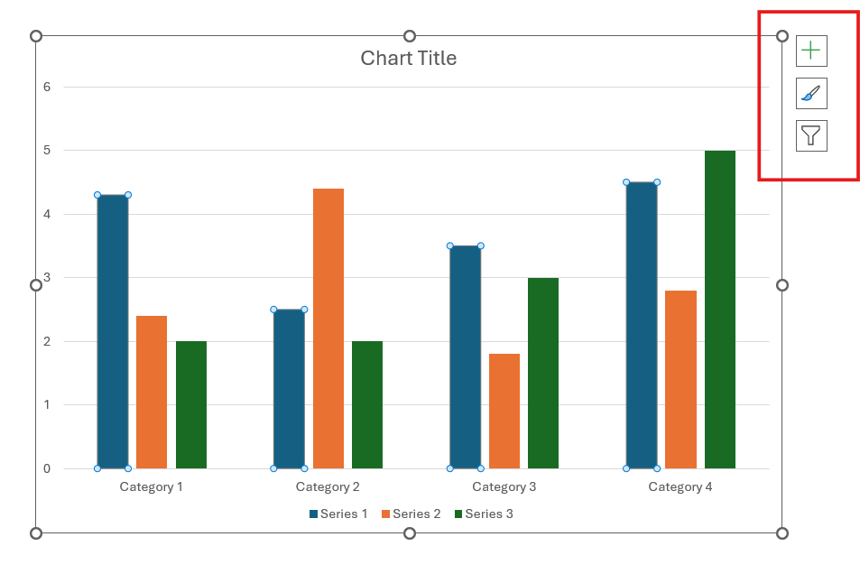
- When inserting a chart, you will see small buttons on the upper right side of the chart.
Format using the Chart Elements button. Click on “+” to tweak the chart title, data labels, and more. Use the Chart Styles button (brush) to change the chart's color or style. Finally, the Chart Filters button (funnel) will show or hide data from your chart.
Customizing Charts in PowerPoint
We already know about the power of PowerPoint charts, but we still have one more step to take: customizing them.
- Edit data: You can modify data directly in PowerPoint. Just double-click on the chart to open the associated Excel spreadsheet. Here, you can add, delete, or edit data. If you want to do it like a pro, check out how to Link or Embed an Excel File in PowerPoint.
- Change the design: Go to the design tab. Here, you can add or remove elements such as titles, captions, labels, etc.
- Change color and style: Select the format tab. In this section, you will find options to change the chart's color and style. You can even make individual changes.
- Add shape effects: Go to the format tab and unleash your creativity. You can add shadows, reflections, and 3D effects.
And there you have it; now you know how to customize your PowerPoint Chart. If you are looking for more inspiration, take a look at our detailed Flowchart and Gantt Chart articles.
Chart vs table
Is a chart better than a table?
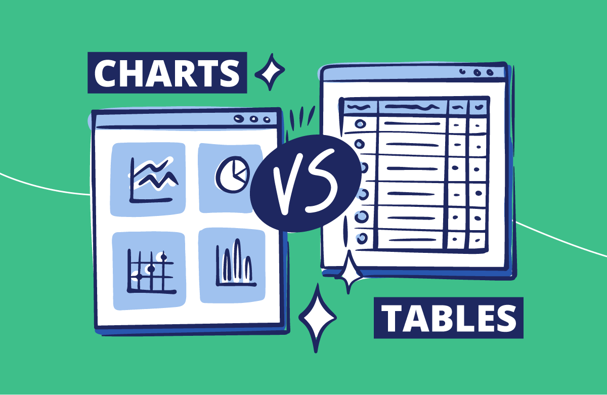
We already know the importance of using tables in PowerPoint presentations. However, you may have a question in mind: are charts better than tables? The short answer is: it depends.
First off, think about what type of data you are dealing with and, most importantly, what message you are trying to get across.
Charts are great for showing trends, making comparisons, and connecting data points. They’re also visually appealing. Conversely, tables could be your perfect selection for numerical data and comprehensive details.
The most important types of charts in PPT and which one is best for you
We have checked out why adding visuals is a game-changer for your presentations. However, which one is best for your needs?
Based on our more than 10 years of expertise and creating around 17,500 slides per month, these are the charts most requested by our customers. Let's explore each one!
“Columns, bars, lines, and pie charts are top picks for clients because they're more descriptive and easier to get for the audience.” Briana/ Design Manager
Column Chart
Ideal for making comparisons. You can represent data in an attractive and clear way. It’s also a great option for showing changes over time. Here, you can emphasize the difference in quantities.
Imagine you're tracking sales for a store. If you have many categories of sales data and need to compare them, a column chart could be just what you need.
Download our Free Column Chart Template here.
Bar Chart
Like the column chart, the bar chart can simplify complex information quickly, especially when comparing data. But, the horizontal layout might influence how people see things, potentially altering how they understand your data. Keep this in mind!
When you have long category labels or many categories, choose a bar chart instead of a column chart. Horizontal bars are easier to read and take up less space in the presentation.
Download our Free Bar Chart Template here.
Line Graph
The top choice for showing trends over time. You can even combine it with other charts. For example, you can add them to a column chart to display different data at a glance. This makes it easier for viewers to understand complex information.
But how to make a line graph in PowerPoint? First, click on the Insert tab. Then, click on Graph and select Line Graph. That's it—it's as simple as that.
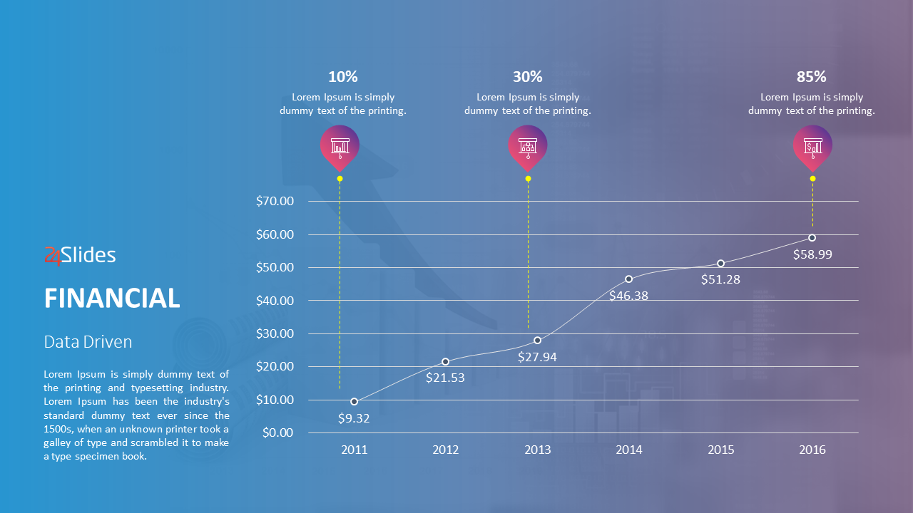
Download our Free Line Chart Template here.
Pie Chart
The best for showing proportions. Not only is it easy to understand, but you will also be able to illustrate percentages or parts of a whole.
Pie charts are easy to create, you need to figure out the percentages or proportions of each data category. But remember, keep the chart to six or fewer sections. This maintains data impact, avoiding confusion.
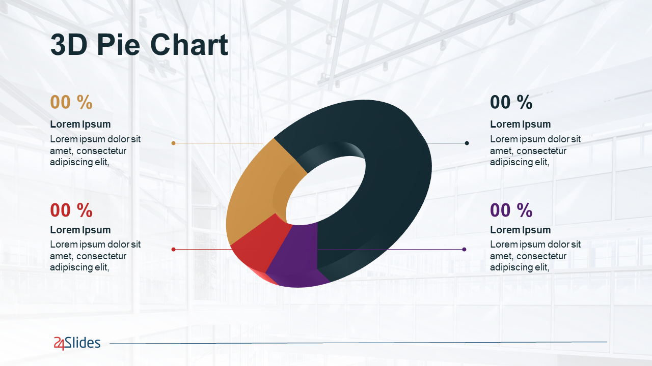
Download our Free Pie Chart Template here.
How to Use Charts and Graphs Effectively?
We already know how to use PowerPoint charts, graphs, and tables, but we want to go one step further. Here are the best tips for making effective PowerPoint presentations.
- Choose the right type of chart. Choose graphics that best suit your data. For example, use column or bar charts to compare categories, line charts to show trends over time, and pie charts to display parts of a whole.
- Be selective. Avoid using too much information, eliminate irrelevant details, and keep it simple. By focusing on the most important data points, you enhance the clarity of the information for your audience.
- Pay attention to color. When presenting data, keep in mind the consistency of the colors and make sure essential information stands out. Avoid using too many colors here, as this can be distracting.
- Add context. Make your titles clear and descriptive. Labels should also serve as a guide for viewers to understand everything easily. This could mean explaining trends, defining terms, or just describing where the data comes from.
- Consistency. Use the same style and format for your graphics and data. Ensure brand consistency in a presentation is key. This creates a professional and polished visual presentation.
- Be creative. Try unique ways to showcase your data, like infographics or custom graphics. For example, you can use a bar chart to compare categories and a line chart to show the trend over time.
Pro Tip: Creating a PowerPoint infographic is one of the most creative ways to present data. They provide a visually engaging and easy-to-follow format for presenting complex information. Briana/ Design Manager
Tables in PowerPoint
PowerPoint tables help organize and display data in a structured way for presentations. They’re made up of rows and columns containing text, numerical data, or other information.
Tables are awesome for showing comparisons, summarizing information, sharing research findings, and planning. Because of all that, they are a top choice for visualizing financial or statistical data. They’re incredibly versatile and practical!
All you need to do is put the right labels on, and reading should be a breeze. Believe us, your audience will appreciate it. Do you want to present data in detail and make comparisons? Then, this is your best option.
People have been using PowerPoint tables for a long time. Why? That's simple: they’re easy to read.
Here's an example:
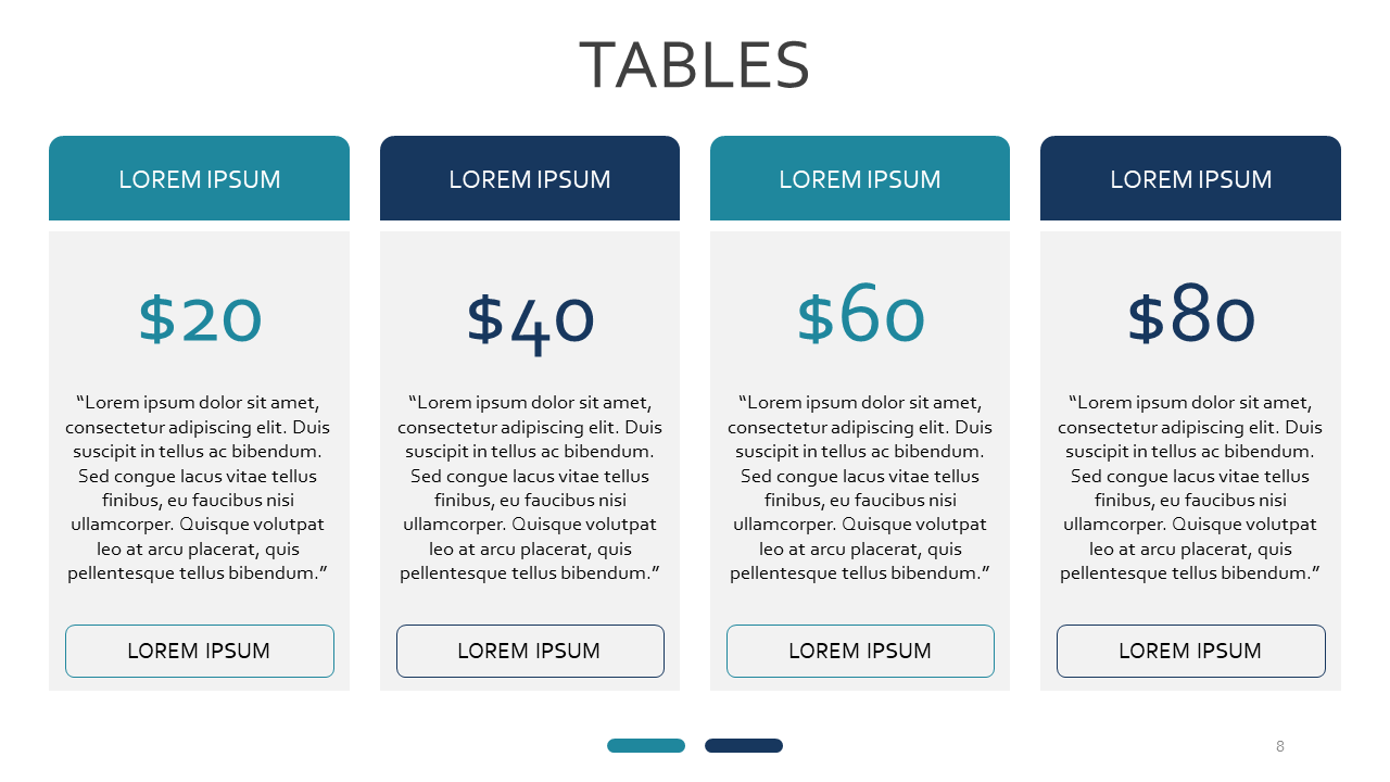
Download our Free Table Template here.
How to Make a Table in PowerPoint?
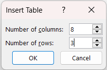
Inserting tables in PowerPoint is quite simple. Just click on Insert and then on Table. Next, just drag the mouse down to choose the number of rows and columns you need.
Here's an example:
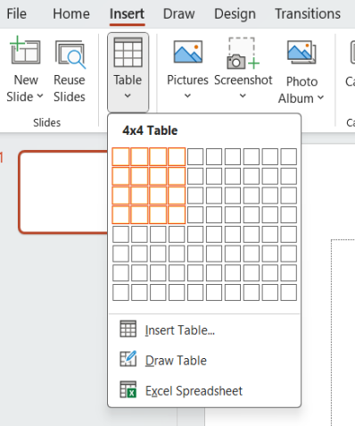
Should you require a bigger table? You can manually select the values for the columns and rows.
Customizing tables in PowerPoint
Now that we know how to create a table in PowerPoint, let's customize it. But first, let's learn how to add rows and columns in PowerPoint.
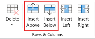
- How to add a row to a table in PowerPoint?
Click on a cell in the existing table. Go to the Layout tab in the ribbon and select Insert. Select Insert Rows Above or Insert Rows Below, depending on where you want to add the new row.
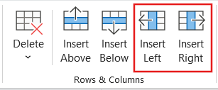
- How to add a column to a table in PowerPoint?
Click on an adjacent cell in the table. Go to the Layout tab in the ribbon and then select Insert. Choose either Insert Columns Left or Insert Columns Right, depending on where you want to add the new column.
Now that you have the structure of your table ready, let's give it some styling:
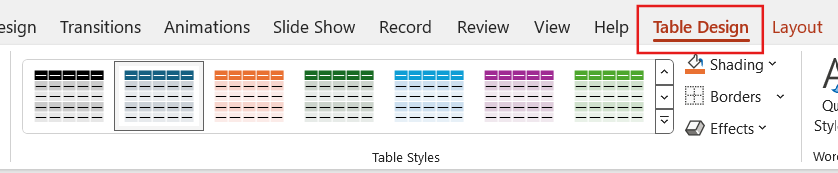
- Applying style in your table presentation
To edit your tables, first select a cell. Then, click on the Design tab to pick the style you like best. Finally, click on the drop-down arrow to see the complete Table Styles gallery.
Here's an example:
That's it. Now you know how to use tables in PowerPoint.
How to Use Tables Effectively?
Tables are powerful tools for presenting data in a structured format. They can enhance clarity, facilitate comparisons, and convey complex information.
However, when you don't use them correctly, they can have the opposite effect, making the information flat and boring. So here are golden rules to help you:
Keep it simple
Don't overload your table with too much information. Focus on the most important information to keep it clear and easy to read. Remember, the powerful presentation of data is in simplicity.
Consider whether gridlines are necessary for your table. Removing them can make your board look cleaner and more professional.
Although many don't mention it, choosing the right words is vital. The more you can say of the same idea in fewer words, the better. Avoid using words or connectors that add nothing to the message.
Highlight key data points
Make your table pop using bold, italics, or fun colors to highlight important data or headings. This will make the table easier to read.
Consider adding shades for alternate rows to make your table easier to read. Make the shadow subtle, to avoid distraction from the data itself.
You can use color to emphasize backgrounds or text. No matter which method you opt for to add contrast, remember that “less is more” when creating an effective table.
Consistency
Consistency is crucial in tables, as it is in graphics. Ensure that the font style, size, and color are the same across the entire table. This helps maintain visual harmony.
Align your text and numbers properly so they're easier to read and give your table a polished look. If you will use decimals, think about aligning them to facilitate comparisons.
Free PowerPoint charts, graphs, and tables templates
In this article, we have explored the benefits of incorporating visuals like charts, graphs, and presentation tables in PowerPoint. We also know how to add them and ensure they look good.
Just remember to pick the right chart and keep your presentations consistent.
And as I said at the beginning, conveying complex information doesn't have to be challenging! Our Templates by 24Slides platform has hundreds of free PowerPoint charts, graphs, and table templates.
You can download and combine different templates to create a shiny PowerPoint Presentation. All the examples in this article are fully customizable, allowing you to insert your data without worrying about design. Enjoy them!
Ready to enhance your presentations? Our team at 24Slides is here to help!
Knowing how to use PowerPoint charts, graphs, and tables can make the difference between a successful presentation and a failed one. However, mastering the art of presenting data takes more time and effort.
The good news? You can always trust professionals to do the heavy work, allowing you to focus on improving your product or service — what really matters to your business.
With an average satisfaction score of 4.8 out of 5 from over 1.3 million redesigned slides, it's safe to say we're incredibly proud of the product we deliver.
We're the world's largest presentation design company.
Not only will you receive an attractive presentation, but we will create one that fits your brand's visual guidelines. Most importantly, it will help emphasize your message and engage your audience.

Ready to elevate your PowerPoint presentations? Explore this content!
- PowerPoint 101: The Ultimate Guide for Beginners
- Mastering the Art of Presenting Data in PowerPoint
- The Ultimate Brand Identity Presentation Guide [FREE PPT Template]
- 7 Essential Storytelling Techniques for your Business Presentation
- The Cost of PowerPoint Presentations: Discover the hidden expenses you might overlook!