Presentation Design Trends 2026: 8 Ideas for Modern Slides
Quick Summary
- Presentation design trends in 2026 favor clean, high-contrast layouts and expressive visuals over crowded bullet walls.
- Modern slides leverage dark mode accents, bold geometric typography, and intentional interactive elements.
- Visual trends should always serve your story; apply them only when they clarify complex ideas for your audience.
Let’s be honest: nobody has ever sat through a 50-slide deck of dense, unformatted text blocks and thought, “Gosh, I really hope this meeting runs long.”
Slide design moves fast. What felt slick and polished a couple of seasons ago can quickly start feeling like a dusty template from a bygone era. Keeping up with presentation design trends in 2026 isn't about slapping flashy animations on every chart just because you can; it’s about knowing how to make high-stakes communication feel clear, human, and genuinely engaging.
Whether you are scouting fresh presentation slide design trends to elevate an upcoming investor pitch, exploring modern presentation design trends to revamp your team’s quarterly playbooks, or figuring out where to get presentation templates that don't look like generic stock placeholders, staying ahead of the curve pays off. Mastering modern presentation design ensures your core message lands cleanly every single time, without forcing your audience to decode cluttered visual noise.
Here are the top 8 trends reshaping presentation design this year and how to use them to keep your decks crisp, credible, and effortlessly on-brand.
Presentation Design Trends 2026 to Watch
Keeping up with slide design isn't about chasing visual fads. It's about smart visual shifts that make your content effortless to digest and fun to look at.
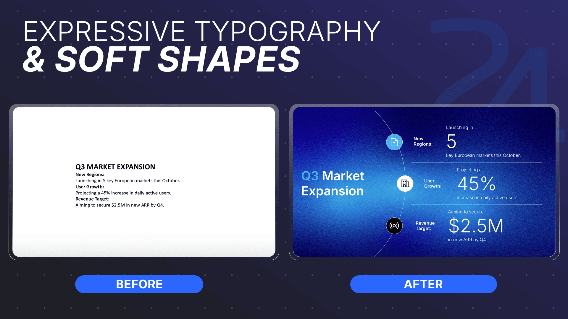
Expressive Typography & Soft Geometric Forms
Say goodbye to shy 12-point fonts and rigid, boxy shapes. Modern decks are embracing bold visual personality to keep readers engaged.
- Bold Geometric Headers: Large, punchy typography grabs instant attention and sets a clear reading hierarchy.
- Rounded Container Cards: Grouping content into soft, rounded blocks creates clean visual boundaries on the canvas.
- Goodbye Text Walls: Physical background cards keep complex ideas organized so slides never feel cluttered.
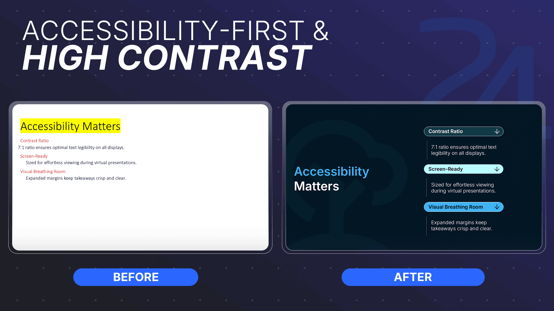
Accessibility-First Hierarchy & High-Contrast Design
High-impact design means ensuring everyone on the Zoom call can read your slides without squinting.
- Punchy Contrast: Low-contrast gray text on lighter gray backdrops is officially out.
- Generous Whitespace: Giving elements room to breathe keeps your core takeaways front and center.
- Verified Readability: According to the W3C Web Accessibility Initiative: maintaining sufficient contrast between text and its background ensures critical visual information remains legible across different screen environments and lighting conditions.
AI-Assisted, Human-Led Presentation Workflows
AI can generate quick slide drafts in seconds, but software still lacks design judgment, brand understanding, and real-world nuance.
- Tech-Driven Speed: Smart tools handle initial slide layouts, raw drafts, and quick data summaries.
- Human-Led Storytelling: Expert presentation designers refine the narrative arc and enforce strict brand consistency.
- Reliable Quality: Combining AI speed with human oversight guarantees polished, business-critical output every time.
Curious which generators are actually worth your time? Check out our honest ranking of the best AI presentation tools in 2026 to see how the top platforms stack up!
Structured Data Storytelling & Purposeful Motion
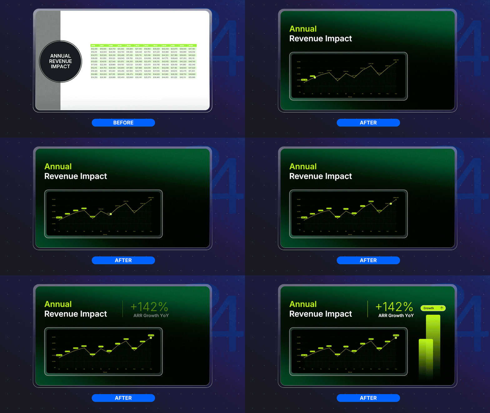
Dumping a massive 12-column spreadsheet onto a slide is a guaranteed recipe for blank stares.
- Focused Highlights: Isolate the single metric that matters most instead of crowding the screen with raw data.
- Guided Eyelines: Use subtle, intentional fades to draw immediate attention to key growth trends or focal points.
- Functional Animation: According to the Nielsen Norman Group: visual motion should always serve a functional purpose by directing user focus to key element changes rather than acting as decorative fluff.
Want to build decks faster? Check out our step-by-step guide on speeding up your PowerPoint design workflow.

Turn Broad 2026 Design Trends Into Business Slides
It’s easy to look at modern presentation design trends in 2026 and think, “That looks cool, but my CFO is going to hate it.”
There is a massive gap between flashy design forecasts on creative portfolios and actual, boardroom-ready business slides. Applying these broad directions to your sales decks and pitch presentations requires matching the visual flair to your meeting's context.
When the stakes are high, always prioritize extreme clarity over sheer novelty. Here is how you can apply these trends to executive decks without losing your corporate credibility.
Check out our complete breakdown on how to design custom slides for business presentations without losing your brand identity or sanity.
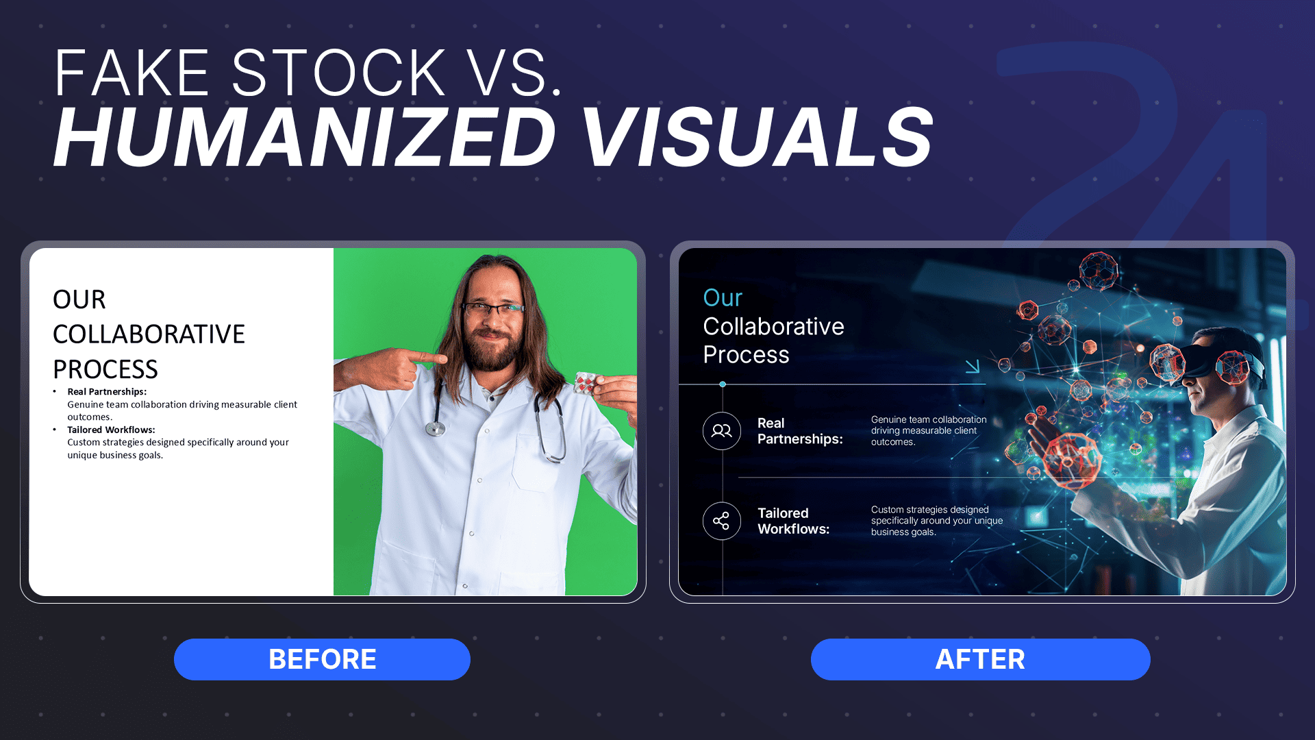
Use Expressive Typography Without Losing Readability
You want your typography to make a bold statement, not give your audience a reading migraine.
Use Humanized Visuals in Brand Storytelling
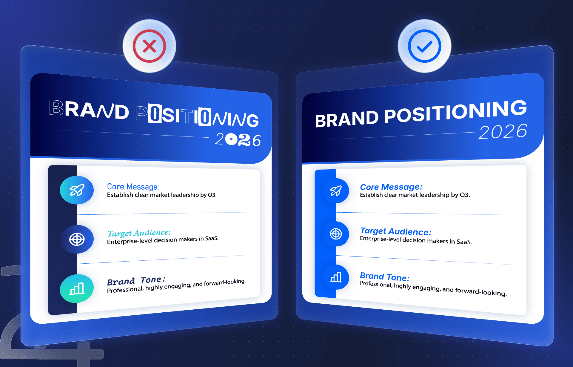
Corporate stock photos of folks in suits pointing at floating holograms are officially dead and buried.
- Authentic Imagery: Feature real team members and actual customers instead of staged, plastic-looking models.
- Template Traps: If you are searching for where to get presentation templates, prioritize platforms that leave room for authentic, human-centric photo layouts.
- Custom Art for Complex Ideas: Swap generic clip art for custom illustrations when explaining abstract workflows or software architecture.
- Visual Consistency: Apply a uniform photo filter or border treatment so every image feels like it belongs in the same brand universe.
Use Dark Mode and Dynamic Color Strategically
Dark mode isn't just a setting on your smartphone anymore; it is a major pillar of presentation slide design trends 2026.
- Screen-First Backdrops: Use dark, cinematic backgrounds to reduce eye strain during virtual calls and screen-heavy presentations.
- Purposeful Accents: Reserve your brightest, most dynamic brand colors strictly for highlighting hierarchy and emphasis.
- Mandatory Contrast Checks: Always test your color pairings to guarantee they meet accessibility standards before presenting to a crowd.
Ditch plain white backdrops and learn how to create a modern PowerPoint background that elevates your content without distracting your audience.
Make Data Slides Clearer With Narrative Structure
Mastering modern presentation design means turning your data into a compelling story, rather than just a confusing eye-chart.
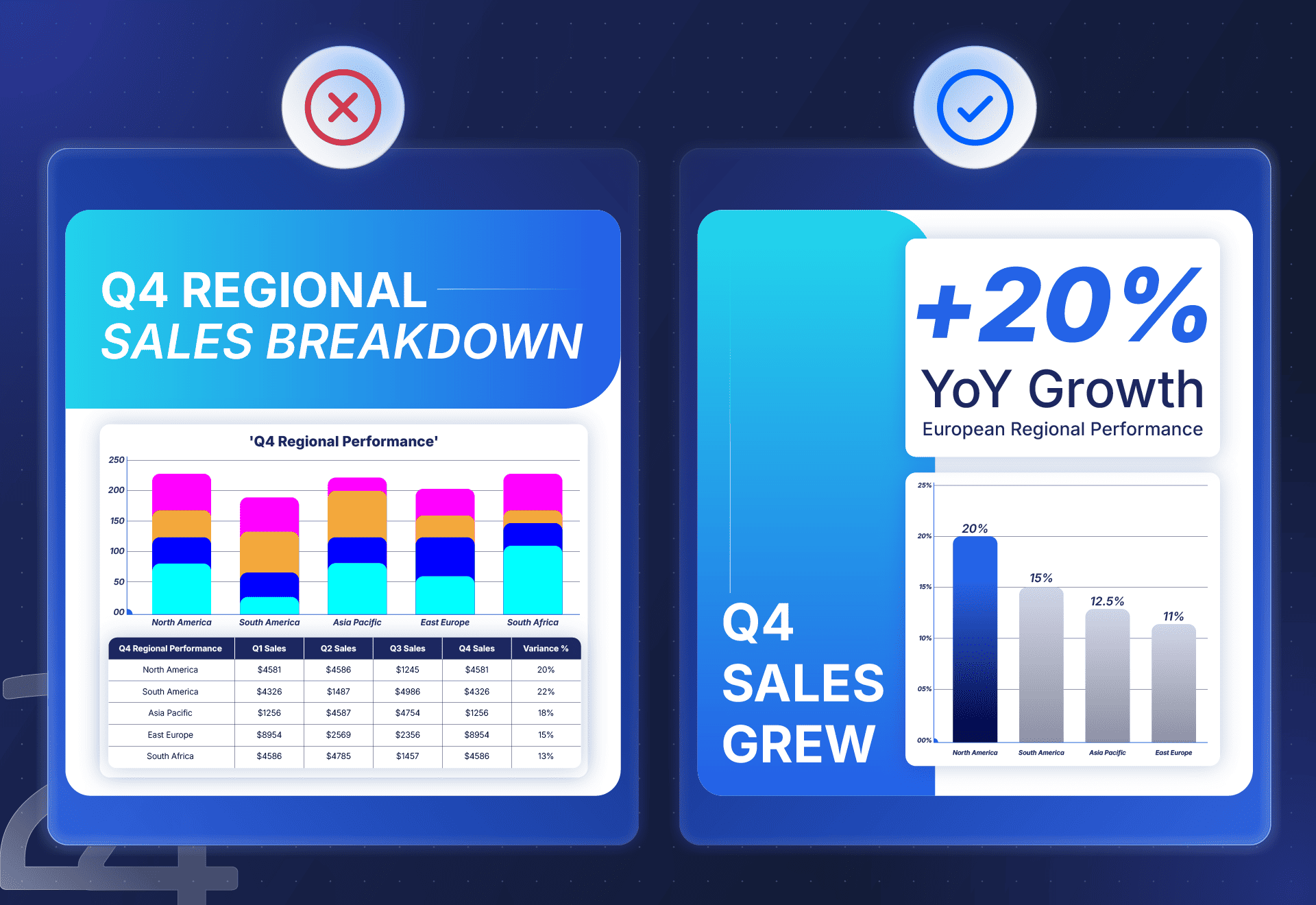
- Takeaway-Led Titles: Ditch boring titles like "Q4 Sales" and replace them with the actual conclusion (e.g., "Q4 Sales Grew 20% in Europe").
- Single-Insight Focus: Highlight exactly one important insight per visual so your audience never has to guess what matters.
- Visual Comparisons: Replace raw, dense tables with simplified graphics that instantly show the contrast between key metrics.
Need a quick visual upgrade? Check out these free modern PowerPoint presentation templates that don't look like generic stock placeholders.
Frequently Asked Questions
Got questions about upgrading your slides? We've got quick, zero-fluff answers to keep your deck looking sharp.
What are the trends in presentation design for 2026?
The biggest presentation design trends 2026 focus on visual clarity and storytelling over decorative fluff.
- Expressive Typography: Bold geometric headers paired with ultra-clean body text for instant reading hierarchy.
- Structured Container Cards: Soft, rounded blocks that group content and eliminate text walls.
- Purposeful Motion: Subtle, functional animations designed to direct eyes to key metrics.
What are the major design trends for 2026?
Major modern presentation design trends 2026 prioritize human connection and smart efficiency.
- Human-Centered Visuals: Replacing generic stock photos with real team imagery and custom illustrations.
- Soft Geometric Shapes: Ditching rigid, sharp boxes in favor of smooth, floating canvas cards.
- AI-Assisted Workflows: Leveraging AI for initial outlines while relying on human design experts for story polish.
What are the trending graphic design styles for 2026?
Trending graphic styles lean toward clean dimensionality and screen-first flexibility.
- Dimensional Layouts: Soft background shadows and layered cards that lift off the slide canvas.
- High-Contrast Systems: Dark mode accents and vibrant focal points built for virtual meetings.
- Unified Visual Themes: Maintaining one consistent photo filter and graphic treatment across your full deck.
What is the 5 5 5 rule for slides?
The 5 5 5 rule is a classic formatting guideline to keep your slides brief and easy to scan:
- 5 Words Per Line: Keep bullet points punchy and direct.
- 5 Lines Per Slide: Avoid overcrowding a single canvas with text.
- 5 Text Slides Max: Never run more than five text-heavy slides in a row without inserting a visual break.
What is the 7 7 7 rule for presentations?
The 7 7 7 rule offers a slightly more flexible alternative for complex business topics:
- 7 Lines Per Slide: Cap your total text lines at seven.
- 7 Words Per Line: Limit each bullet point to a maximum of seven words.
- 7 Text Slides in Sequence: Avoid exceeding seven consecutive text slides before switching to a chart, photo, or video.
Scale Your Presentation Design Without the Slide-by-Slide Stress
Keeping up with presentation design trends 2026 is one thing, but spending your Sunday night manually tweaking rounded container margins across 40 slides? That is a whole different story.
When high-stakes deadlines are looming, you shouldn't have to choose between speed, brand consistency, and your own sanity. That’s where 24Slides steps in to handle the visual heavy lifting for you.
- Managed Quality & Workflows: Every deck goes through structured project management and rigorous quality control so your slides arrive clean, polished, and on-brand.
- Flexible Design Options: Choose a pay-per-slide design for quick one-off decks, or upgrade to a dedicated, brand-trained team subscription for ongoing team needs.
- Lightning-Fast Turnarounds: Meet urgent deadlines with standard 24-hour delivery or priority 10-hour rush options.
- Enterprise-Ready & Secure: Our controlled workflows, full-time employee model, and secure platform protect your confidential, business-critical presentations.
- Built to Scale with You: Start with a single pitch deck or expand across your entire organization without reinventing your operating model every time.
Ready to reclaim your evenings and turn your everyday slides into high-impact visual stories?
Discover How 24Slides Can Support Your Team and see how easy managed presentation design can be!
You might also like these articles: