Learn to Pick and Create Custom PowerPoint Color Schemes!

Picking your PowerPoint presentation color palette is no easy task! You must look for a color combination that complements each other and calls attention to the presentation’s content without being distracting. Picking a color scheme for your PowerPoint presentation is an art, and takes practice and design knowledge. Luckily, there are many online resources that will help you create and pick your next PowerPoint color palette.
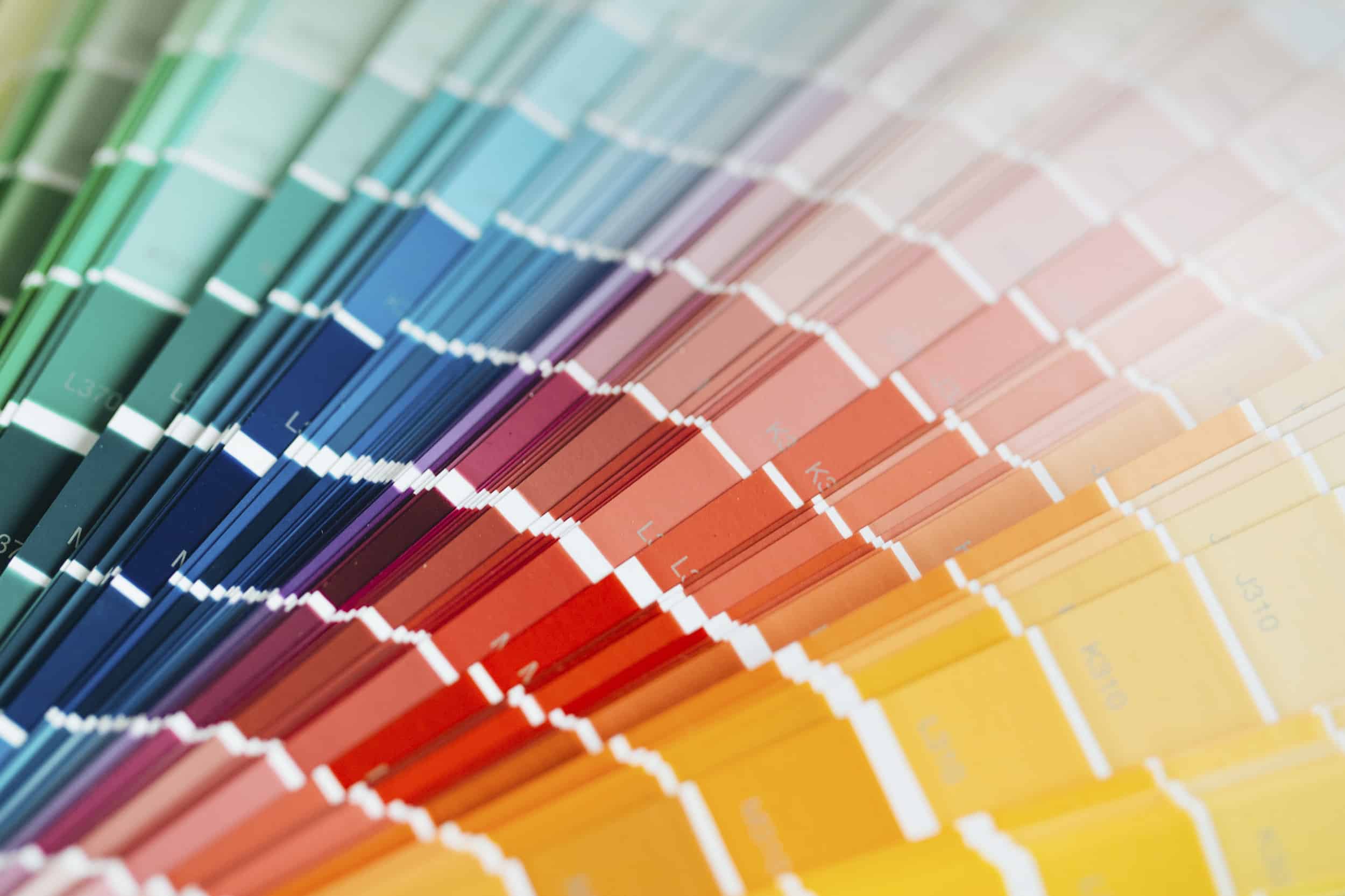
PowerPoint offers some pre-made color palettes you can use when making your presentations. However, it’s difficult to come up with a color scheme on your own when you already have a base color on your mind, or you need something that will go well with your brand’s color scheme.
Quick Color Theory
Using colors is both a science and an art. Professional designers spend their whole careers learning how to best harmonize colors and to create specific visual effects for their audience. However, there are still some quick color theory tips everyone can learn and use.
First things first! The color wheel is your best friend when it comes to picking color schemes for your PowerPoint presentation. The color wheel was first invented by Isaac Newton and has been a basic design tool for centuries. Just like its name says, it organizes color hues around a circle in a way that shows the relationship between primary, secondary, and tertiary colors.
The color wheel is an outstanding tool to consider because it’s an easy way to pick colors that will work well together. For example, colors that are next to each other will make your presentation look harmonious. If you want to create a high-contrast, eye-catching PowerPoint color scheme, then you might want to consider using colors that are on opposite ends of the color wheel.
If this sounds too complicated, don’t worry! Luckily, nowadays there are dozens of different color palette generators. You’ll be able to choose a base color, and it’ll automatically generate a harmonious color scheme for your PowerPoint presentation.
Colors vs Hues
You can mix the colors of the color wheel to create a practically unlimited amount of colors. That’s why professional designers prefer to distinguish between the terms ‘color’ and ‘hue’.
Color is an umbrella or general term that encompasses every hue, tint, tone, or shade we see. Hue, on the other hand, refers to primary, secondary, or tertiary colors. Hue is the ‘family’ to which a specific color belongs to. This essentially means there are 12 hues out of millions of colors.
For example, the color pastel pink’s hue is red. This means that red is the ‘color family’ from which this color comes from. Learning to recognize a color’s hue can help you recreate the color at a later time and easily find colors that are a good match for it.
Tint, Tone, and Shade: What’s the Difference?
Hues form the base of any color mixture out there. The only exception would be black, white, and gray – these are simply referred to as colors and not as hues. Mixing any of these with any other color will help you create different tints, tones, and shades out of a color.
- Tint – when you add white to any hue, the resulting color is called a tint. It’s a paler version of the original hue, and are also called ‘pastel’ colors. Depending on the amount of white added, a tint can range from a slightly pale version of the original color all the way to almost white (negligible amount of base color).
- Tone – when you add gray to any color, the resulting color is called a tone. Gray is a 50-50 mixture of black and white and is considered a neutral color. When added to any color, it tones down the intensity and brightness of the original color.
- Shade – when you add black to any color, the resulting color is called a shade. A shade is the exact opposite of a tint as it turns the original color darker (instead of lighter). A shade can range from slightly darker all the way to almost black.
Warm and Cool Colors
When talking about color theory, it’s important to distinguish between warm and cool colors. For practical purposes, you can divide the color wheel between these two groups:
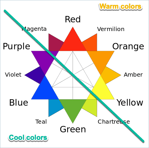
Warm colors: Magenta, Red, Vermilion, Orange, Amber, Yellow
Cool colors: Purple, Violet, Blue, Teal, Green, Chartreuse
I know that’s quite a list to remember, so here’s a rule of thumb about these two groups. Red, orange and yellow hues, tints, tones, and shades all fall under the WARM category. Purple, blue and green and all their corresponding tints, tones, and shades are all COOL colors.
Warm colors are usually vibrant and are great for conveying joy and energy. Cool colors, on the other side, are more calming, relaxing colors. Deciding on what side of the spectrum you want your presentation color scheme to fall under can do wonders to help you upgrade your slide design.
6 basic tips to work with color in your PowerPoint presentations
The right color scheme can make your presentation a smashing success while the wrong colors can, well, smash it (and your credibility) to pieces. To design a presentation slide deck that looks clean and professional, using the right color scheme is vital.
Hopefully, these 6 practical tips will help you pick more easily a great color scheme for your next presentation!
1. Don’t play it by ear!
Stick to a single color palette. Picking colors at random is a sure way to make a presentation that looks a little bit off. Color palettes are ways to group different colors that are proven to work. For example, monochromatic, complementary, and analogous color palettes.
Go to the next section to learn more about these different types of color palettes and how to apply them to your presentations.
2. Keep in simple
Unless you’re an experienced designer, you want to keep your color scheme simple. Just because you’ve got millions of colors to choose from doesn’t mean you should overthink it.
For beginners, a monochromatic color scheme is a good starting point. You simply can’t go wrong with this scheme because all possible color combinations are going to look good together on your slides. You’re basically just working off of one color and just using various tints, tones, or shades to make your slides look easy on the eyes.
For more advanced designers (who don’t consider themselves experts yet), a maximum of 4 colors is recommended. It will not be easy balancing 4 different colors that most likely belong to both warm and cool color categories. So, you’ve got your job cut out for you. A good rule of thumb to remember is to select a dominant color and just use the rest as supporting or accent colors.
3. Use the tools at your disposal!
You don’t need to do everything on your own. There are hundreds of online resources you can use to make your design process easier, and so goes for working with colors! Online color scheme generators are great if you’re not confident enough in your abilities to create one on your own.
You just have to pick a color, a type of color scheme, and you’ll immediately get other colors that will work well with it. In the next section, you’ll find some of my personal favorites color scheme generators and how to work with each of them.
Also, when working on PowerPoint presentation design, the eyedropper tool is your best friend. When your cursor turns into an eyedropper, just click on the color you want to use and PowerPoint will automatically change the color for you. It’ll not only make your life easier, but it’ll also help you guarantee that you are always working with the right colors.
4. Make sure you’re working with high contrast
Contrast is important in presentation slides. It is a must that your audience is able to read whatever is on your slides. You need to use a color scheme that will make your content stand out. Don’t use light colors for text if your presentations also have a light or white background.
Another word of caution: complementary colors do provide good contrast, but you don’t want to use these in text-based slides. Complementary colors are great for using them in different elements. However, since they belong to opposite extremes in the color wheel, overlapping them can be very grating to the eye! If you want to use bright, complementary colors, a neutral-color background like white, black, or grey will usually be the best option.
5. Follow the 60-30-10 rule
I’ve mentioned earlier in this article that when using 3 or more colors, you want to use 1 main color and the others as secondary or accent colors. Here’s a guideline most designers follow when they use 3 colors:
60% main color – commonly used as background color
30% secondary color – commonly used as shape fill
10% accent color – commonly used in text, borders, and outlines
Note that this is just a guideline. It doesn’t mean you need to strictly follow the 60-30-10 rule, but it’s a good idea nevertheless. If you’re using 4 or more colors, you can follow the same guideline, that is, use the main color in a large percentage of your slides and balance the rest of the colors.
6. Take your business and audience into account
Finally, there’s one last thing to remember when working with colors in presentations. And that is to focus on your brand! Business presentations are in many ways your introduction card for your audience. It’s the first thing your potential clients and investors will see of you and your company, and it’s an excellent opportunity to make an impression. Keeping your presentation on-brand and making sure it follows your brand identity guidelines is always a great idea.
Your PowerPoint presentation slide design can convey much more than what you might imagine. Take an extra time to ask yourself: What’s your company’s mission and vision? What ideas and values do you want your audience to connect with your brand? Bright warm colors are best for conveying things like creativity, joy, and youthfulness. Cool colors, like blue, black and gray, will rather make your presentation look more sober, sleek, and elegant!
A final tip: You might also want to take into account who your audience is. You want to use colors that will resonate with their beliefs and their values. If you’re trying to persuade a group of highly successful businessmen, you don’t want to use a cartoony shade of yellow as they may not take you seriously. Likewise, you don’t want to use colors you think looks great, but may actually have a more sinister meaning to your audience. Say, for example, the color purple. It may be associated with wealth in many countries, but in Thailand and Brazil, purple represents death or mourning.
Making PowerPoint Color Palettes: 5 proven examples that work!
The first step is to pick what kind of color scheme you want for your PowerPoint presentation. Color schemes, or color palettes, are colors that have been grouped together as they work very well for graphic design. There are certain techniques to guarantee that two colors work well together. For example, choosing from exact opposites in the color wheel.
Here you’ll find 5 proven color schemes that will work every time, plus examples on how to use them in your PowerPoint presentation!
#1. Monochromatic PowerPoint Color Scheme
Monochromatic color palettes are easy to use because you use a single color hue. The only thing you need to do is to pick a base color (for example, blue) and add keep adding white, grey, or black in order to change it. Adding white will create different tints of blue. If you add grey, then you’ll get different kinds of tones. And if you add black, you’ll be creating different shades of your picked color.
Using a monochromatic color scheme in your PowerPoint is very easy. All the tints, tones, and shades will naturally work well with each other since they all come from the same color hue.
#2. Complementary PowerPoint Color Palette
If you’re looking for a high-contrast PowerPoint color scheme, then a complementary palette might be the one for you! Complementary colors are those that lay on exact opposite extremes of the color wheel. Each color has its exact opposite. For example, red and green, or blue and orange. These are colors that work well together, even if at first glance they have nothing in common.
Many brands use complementary colors because they make for bright and lively combinations, great to catch your audience’s attention from the get-go. However, complementary colors are best used in moderation. If you pick a color for a background, and its complementary pair for text, it’s probably going to be too bright and distracting. But complementary colors work great for details over a neutral background to give life and energy to your presentation.
#3. Analogous PowerPoint Color Scheme
If you want a colorful PowerPoint color scheme, but a complementary palette is too bright and bold for your tastes, analogous colors are the way to go! An analogous color scheme consists of three colors that are one next to each other in the color wheel. This makes for a really balanced and harmonious color scheme. PowerPoint presentations with this kind of color palette will probably look very relaxed and easy in the eyes.
#4. Triadic PowerPoint Color Palette
If you draw an equilateral triangle in a color wheel, the combination you’ll get is a triadic color scheme. This type of combination is great for lively combinations that are not as hard in the abrasive as a complementary one. A perfect example of this is the Burger King logo!
If you wish to use this kind of color scheme in PowerPoint, is best to pick one as your main color. Then you can use the other 2 triadic colors for details and extra elements to make them pop.
#5. Tetradic PowerPoint Color Palette
Finally, a tetradic color scheme is another bold and vibrant option. Is perfect for colorful presentations, and to highlight your creative and playful side. You’ll get a tetradic color palette by drawing a rectangle on your color wheel. Just like with the triadic color schemes for PowerPoint presentations, is better is you pick just once color as your main one, and keep the other as support.
3 Amazing Free PowerPoint Color Schemes Generators
There are many different online tools for creating color combinations. Here you’ll find some of the most popular ones that are also completely free and available online. All of these are perfect for creating an amazing PowerPoint color scheme that will fit your tastes and needs.
1. Adobe Color Wheel
This color scheme generator is amazing if you need various color options! According to your color base and setting preferences, it’ll offer you a 5 color-palette for your PowerPoint presentation. So if, for example, you pick a triadic color scheme, you’ll get 2 extra options that are still aligned with it.
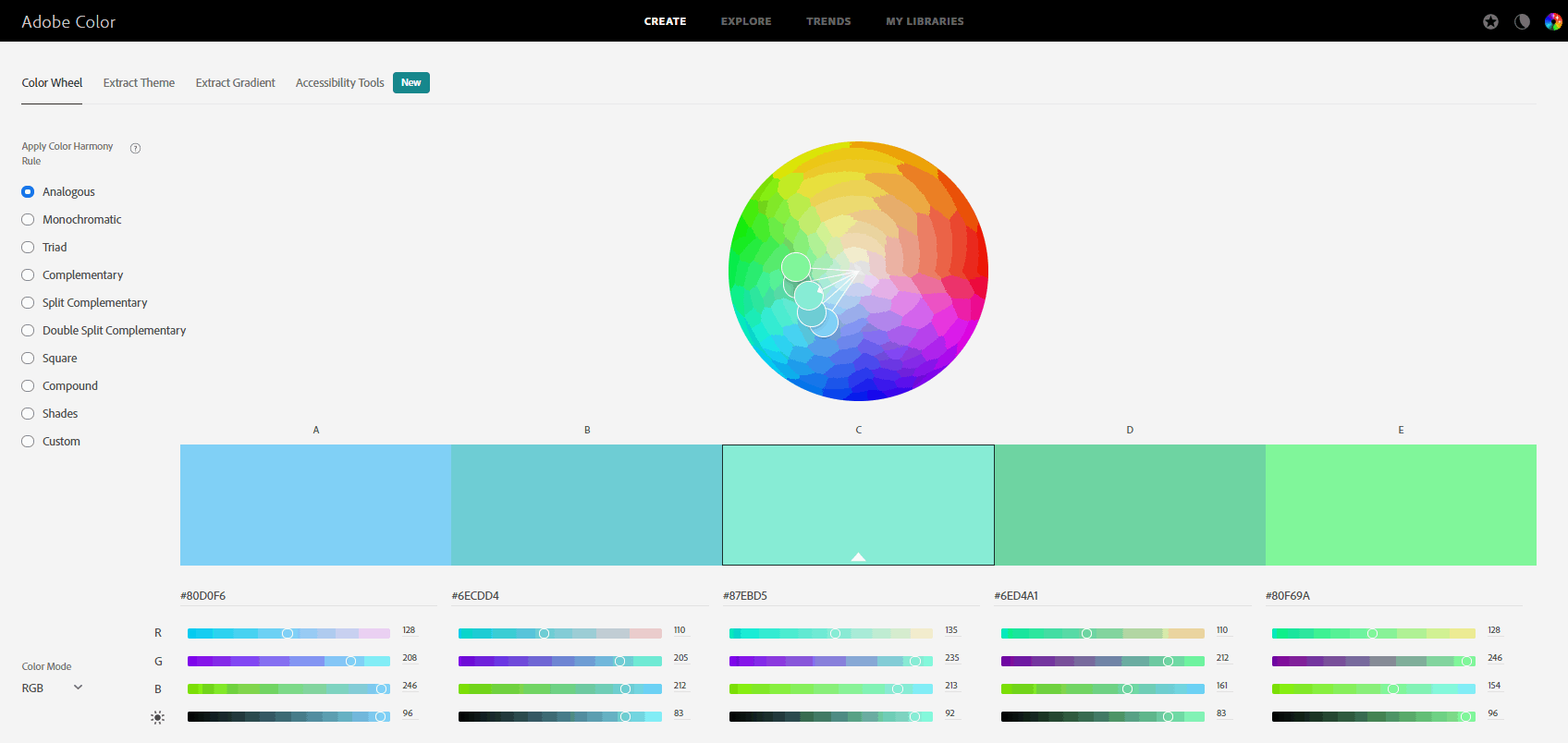
It’s perfect for creating PowerPoint color schemes, as it’s very easy to use. You just need to manually drag the pointer within the color wheel until you find your base color of choice. On the left side, you’ll find all the color scheme options. And below the color wheel, you have the option to change the color codes (see next section). If you know the color code of your color base, you can also add it manually!
2. Paletton
Paletton is another great option for creating PowerPoint color schemes for your next presentation. Just like Adobe’s Color Wheel, you just need to drag the pointer across the color wheel to pick your base color. The best thing about Paletton is that it has a double color wheel. The outer color wheel has all the traditional color hues. And the inner one will allow you to pick more neatly the specific tint, grey, or shade you want of that color. It’s truly a lifesaver when looking for PowerPoint color schemes!
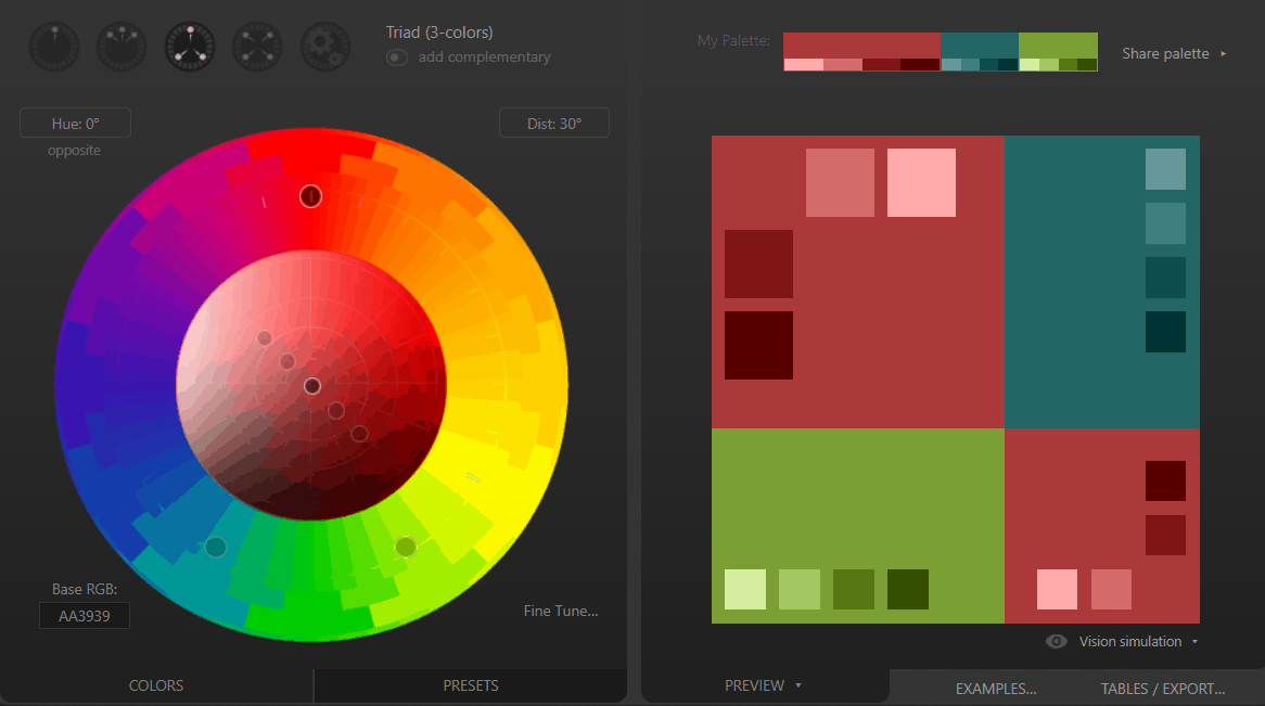
Above the color wheel, you’ll find the options for monochromatic, analogous, triadic, and tetradic palettes. To get the codes to use your color scheme in PowerPoint, there is the Tables/Export option. This will give you the color names in both Hex and RGB codes. If you already know the base color you’ll be using, you can add it manually in Hex code in the lower left side of the color wheel.
3. Coolors
This one doesn’t have a color wheel, but it’s still a very interesting option for creating PowerPoint color schemes. This website creates random color palettes, which is great is you don’t have something specific in mind. The Generate button will automatically give you amazing color schemes, according to your determine settings. You can change between these (monochromatic, analogous, complementary, etc.) in the More option > Generate method. You can also pick the Explore option to see popular and trendy palettes!
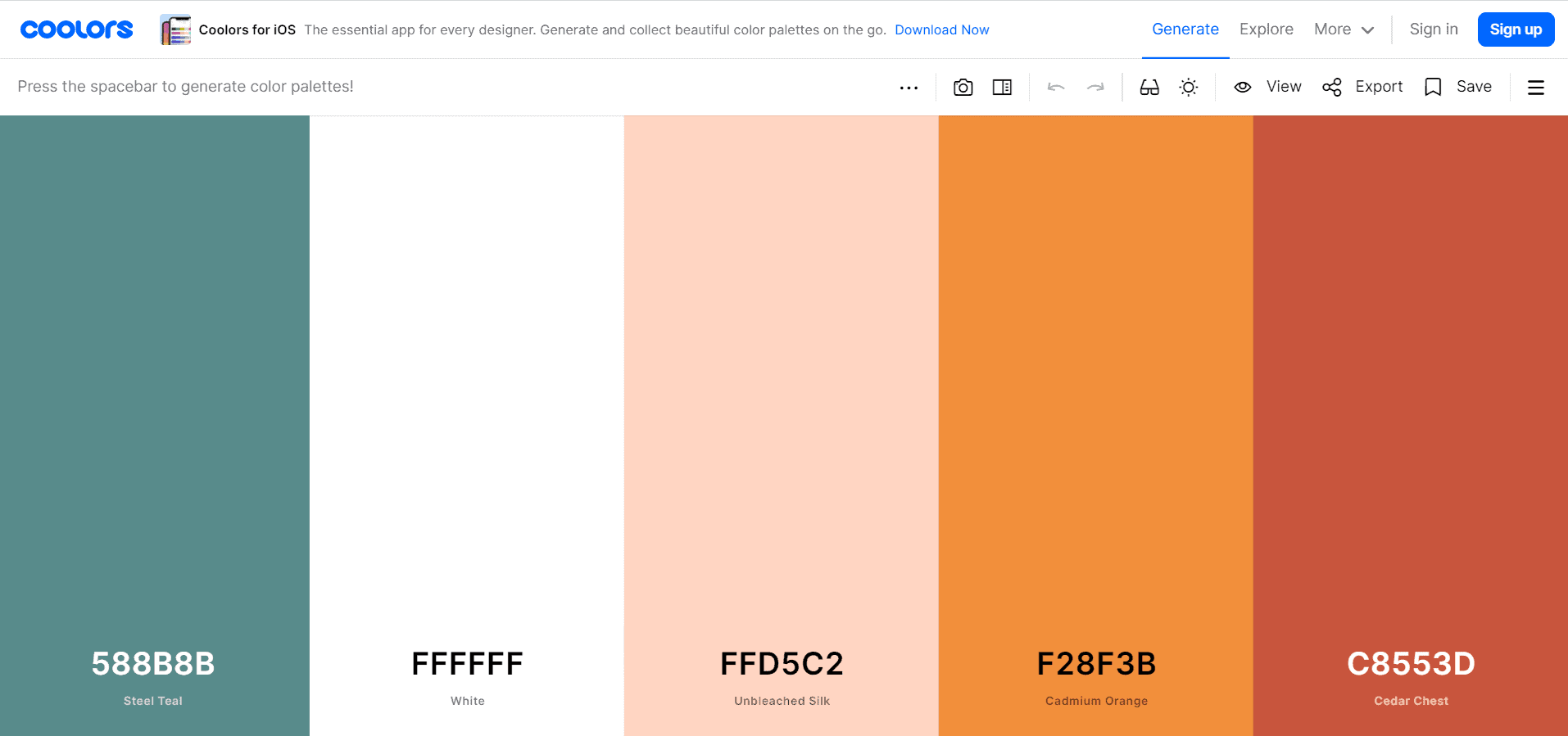
But more importantly, the best feature Coolors offers is that you can create a color palette from a photo. Pick the camera option to upload or search for any image you like. Once it’s uploaded, click on the image’s colors to create your own customized palette!
You can also copy the hex code of your palette directly into your clipboard, which makes it really easy to use for creating a PowerPoint color scheme!
How to add a Customized PowerPoint Color Palette
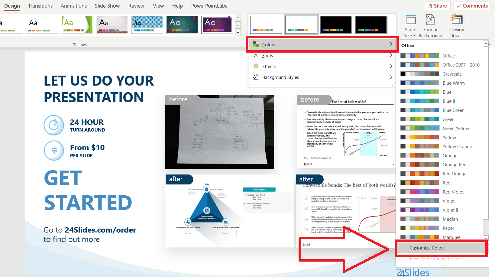
Great! Now you have your perfect palette. But you have to add it as a PowerPoint color scheme. This might seem complicated at first, but it’s actually pretty easy, and once you’ve done, the color theme will be there, ready for you to use. This way, you won’t have to worry about looking color by color afterward!

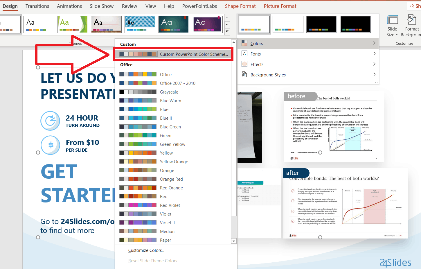
Go to the Design ribbon > Variants section > More. Hover over Colors and you’ll get all the default PowerPoint color themes. Go to the end and click the Customize colors…options.
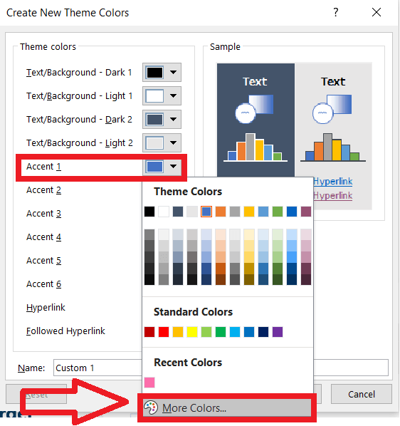
A “Create New Theme Colors” Window will appear. This is where you create your customized PowerPoint color scheme! Add all the colors you need to the Accent categories by clicking on each one’s arrow and selecting the More colors… option.
In the new “Colors” window you’ll get, add the color code of the PowerPoint color scheme you’ve come with thanks to the generators. For example, this beautiful rose-tones color palette from Coolors.

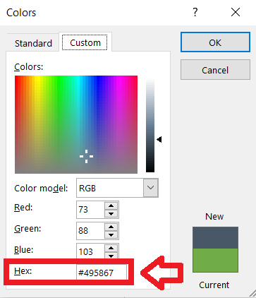
Once you copy-and-paste the hex code of each color into each accent category, you just need to name your custom PowerPoint color scheme! Save it, and next time you open the Colors option in the Design tab, you’ll see your custom-made PowerPoint color palettes.
Custom PowerPoint Design
Hopefully, these color scheme generators and quick tutorials will help you to do better and more personalized PowerPoint presentations. Design can be pretty tricky, so using a color palette can definitely make your life a little easier.
PowerPoint presentations play a huge role in what your audience’s first impression of you is going to be. You can use your PowerPoint design to convey a specific message or highlight your brand’s image. A good PowerPoint can help you not only as a visual aid for your information, but also to showcase creativity, professionalism, playfulness, trustworthiness, and so on!
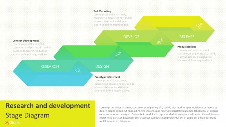
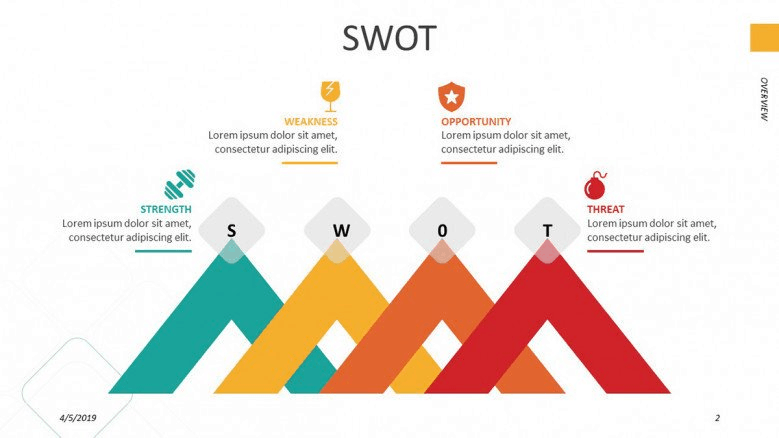
However, making a good PowerPoint presentation takes time and effort. Just look at all these steps in order to get a nice, custom PowerPoint color scheme. If you want to forget about everything PowerPoint and still get amazing results, check out our professional PowerPoint design service! Our designers here at 24Slides will make sure that you receive a presentation that will impress your audience, showcases your information, and conveys your brand essence.
Don’t believe it? You can try it for just $1. Send our designers any slide you want, and you can be sure you’ll receive back a complete masterpiece!