How to Make a Scatter Plot in PowerPoint (PPT Templates Included)
When creating business presentations, it's crucial to present data in clear and engaging ways to convey your message effectively. The key is to use visual tools, such as charts and graphs.
Today, we will discuss one of the most powerful tools at your disposal, the scatter plot. With our user-friendly guide, you will quickly learn how to Make a Scatter Plot in PowerPoint. So, let's get started!

- Let’s Start With the Basics: What is a Scatter Plot (XY Graph)?
- When to use a Scatter Plot?
- How to Make a Scatter Plot in PowerPoint
- How to Create a Scatter Plot in PowerPoint: Step-by-Step
- Take it to the Next Level: PowerPoint Scatter Plot Multiple Series
- Elevate Your Design: Animated Scatter Plot PowerPoint
- Check Out This Shortcut Creating an XY Scatter Plot: Use Templates
- Looking for a Scatter Plot Template? Check out Some of the Best!
- Expert Insights to Design Make an XY Chart in PowerPoint
Lets Start With the Basics: What is a Scatter Plot?
A scatter plot (also called an XY graph or scatter diagram) is a data visualization tool that shows the relationship between two variables. You can use a scatter plot to see one variable's impact on another, revealing correlations, patterns, or trends.
Visually, it consists of a grid where each data point is represented as a dot or marker, with one variable on the x-axis and the other on the y-axis. It can include only dots or dots and lines connecting them. Here's an example:
When to use a Scatter Plot?
The scatter plot is actually one of the most versatile data visualization tools. It can be used for many different purposes, from market analysis to customer behavior and product performance. But there are certain situations where they are especially beneficial:
- When working with two variables that are inherently linked: Consider the relationship between training hours and productivity; it makes sense to pair these two variables together and see if more training hours actually lead to more productivity.
- To see if there's a relationship between two variables: Let's say you want to investigate if there is a relationship between website traffic versus conversion rate in e-commerce. A scatter plot will allow you to visually assess whether a correlation really exists.
- When your independent variable has multiple values for your dependent variable. For instance, when evaluating product price versus sales volume, you could be looking at different prices and how they affect the number of products you sell. A scattergraph would help you verify that in a simple and clear way.
There are also some situations where it wouldn’t be advisable to use this type of graph:
- When you’re working with two variables that definitely have no relationship with one another.
- When you have an extensive data set. This can clutter your graph and make the information less clear, having the opposite effect of what is intended.
How to Make a Scatter Plot in PowerPoint
Making a Scatter Plot in PowerPoint is extremely easy! In this section, we will teach you how to create them step-by-step, even if you have multiple series. Plus, we’ll show you how to really make them stand out with animations, and we’ll even share a shortcut so you can start creating the most captivating data visualization tools in no time!
How to Create a Scatter Plot in PowerPoint: Step-by-Step
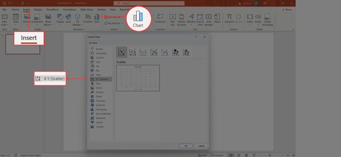
Go to the Insert tab and click Chart. From the different charts available, select X Y (Scatter) to create a scatter plot. Now, select the specific scatter plot style you need: it could have markers only, markers with connecting lines, or even 3D bubble markers.
Once you selected the one of your preference, press Ok to insert the graph into your slide.
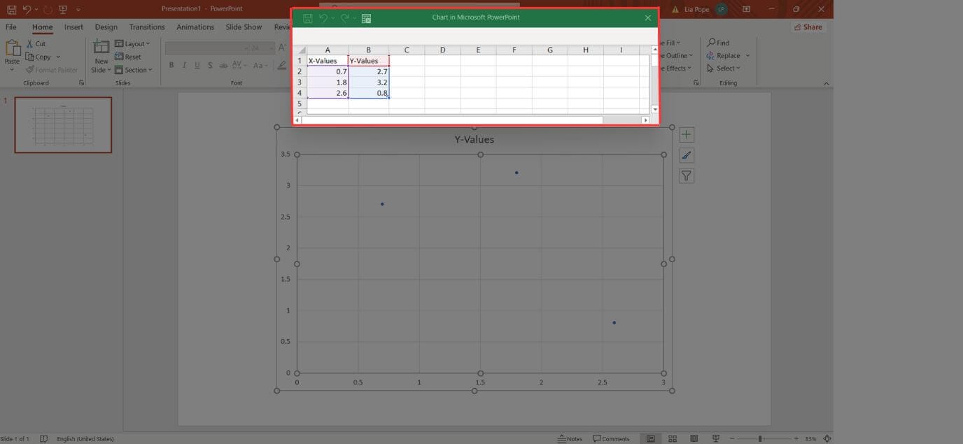
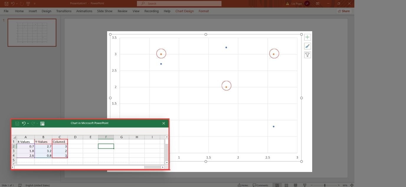
The scatter plot will now appear in your PowerPoint slide, showcasing predetermined data. Also, an Excel window will open, displaying the data source behind the scatter plot.
In the Excel window, you can put in your own numbers, formulas, and labels. Any changes you make there will immediately show up on the scatter plot. When you're done editing, just close the Excel window.
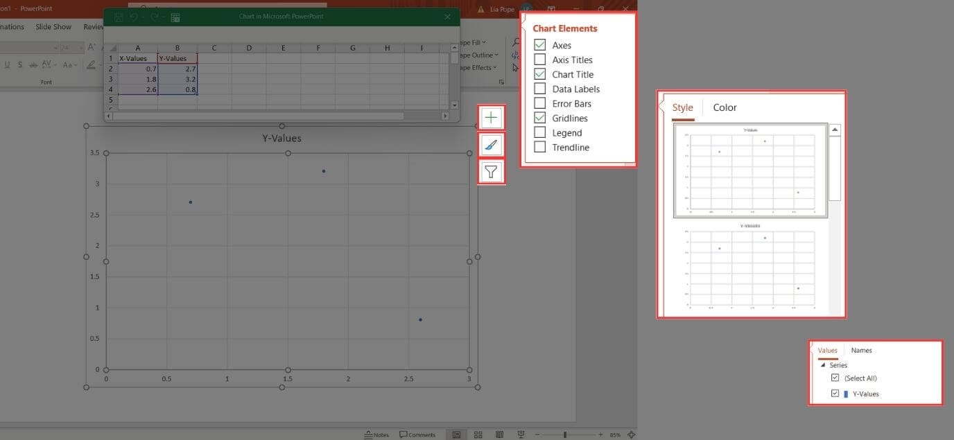
Finally, remember to personalize your scatter plot. You can adjust the font style, color scheme, and other visual elements to match your branding or preference. And don't forget about the three tools on the right-hand side of your chart:
- The plus sign lets you add chart elements like axis titles, gridlines, or a legend to enhance your scatter plot.
- The paintbrush icon allows you to change your scatter plot's style and color scheme.
- The funnel symbol facilitates data filtering, sorting, and adjusting data series settings.
Take it to the Next Level: PowerPoint Scatter Plot Multiple Series
Go to the Insert tab and click Chart. From the different charts available, select X Y (Scatter) to create a scatter plot, and select the specific scatter plot style you need.
The chart will now appear in your PowerPoint slide, showcasing predetermined data. Also, an Excel window will open, displaying the data source behind the plot. It will showcase predetermined data in 2 columns and 4 lines.
You can customize the plot by putting your own numbers, formulas, and labels. To include multiple series, simply add the additional data in a third column alongside the existing ones.
You'll notice that it immediately appears on the graph. Now, you only need to change the Title and/or Labels to more appropriately express your chart’s information.
Your chart will look like this:
Elevate Your Design: Animated Scatter Plot PowerPoint
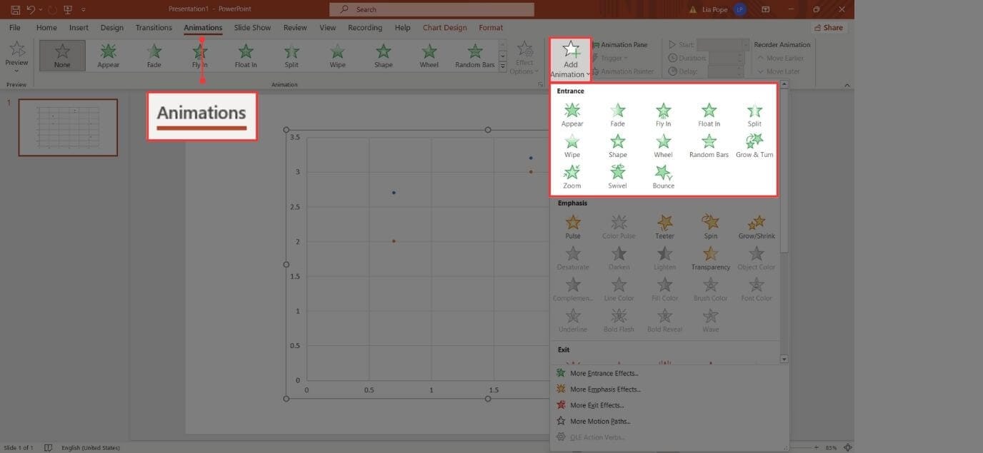
Let’s take a look at how to add animations to your Scatter Plot:
Click on your chart and select the Animations Tab. Select Add Animations, and choose the type of animation you want. Pro tip: try the Entrance animations for a creative, but still subtle and professional effect.
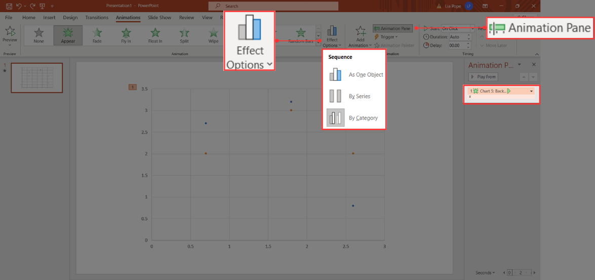
This way, the whole chart will appear with the animation you selected. However, it's best if each category or marker appears one after the other. To make that happen, go to the Animation Pane, select Effect Options, and pick By Series or By Category.
You’ll be able to see a dropdown menu appear in the Animation Pane:
Click on the dropdown menu. You’ll be able to click each element individually and choose how they will appear. Select one element, then go to Start and select how you’d like it to appear: when clicked or automatically after the previous one.
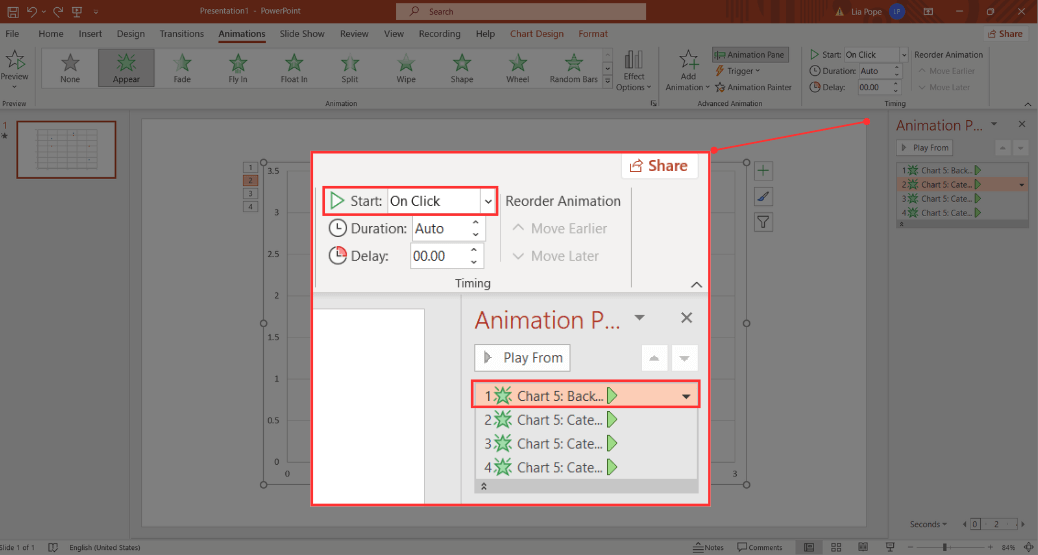
And that's it! Now, you can watch the presentation as a slideshow to see your animations in action!
Check Out This Shortcut Creating an XY Scatter Plot: Use Templates
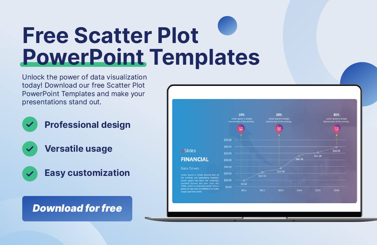
Looking to create a scatter plot in an easy and fast way? Look no further, with our 24Slides Scatter Plot PowerPoint templates, you will make the most incredible data slides in no time. And….you can download them for free!
Take a look: 24Slides Scatter Plot PowerPoint Template Free Download
The benefits of Templates by 24Slides?
- You get access to a library full of amazing templates: Corporate and business templates, data slides, organization charts, and so much more!
- They are easily customizable: You can tailor them however you want, write your own content, put your brand's colors, and add any other branding elements.
- They are created by professionals: It is well-established that design significantly impacts both our audience and the business itself. With our expertly designed templates, we guarantee a seamless, professional, and creative outcome.
Does this sound like something you need? Visit Templates by 24Slides and let us help you create an outstanding scatter plot diagram today!
Looking for a Scatter Plot Template? Check out Some of the Best!
Check out our Scatter Plot Templates:
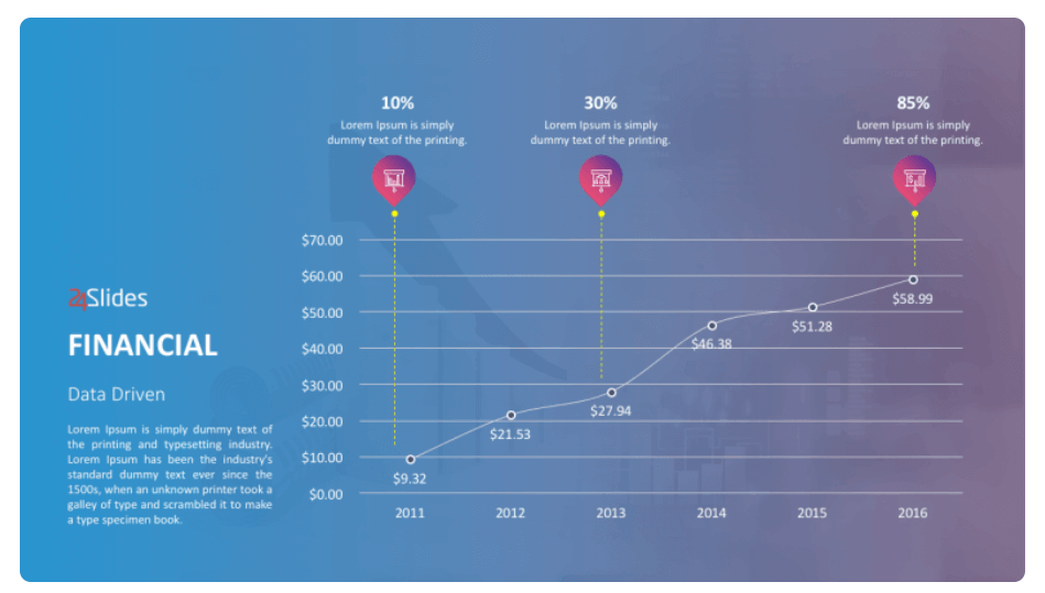
FREE Scatter Plot PowerPoint Template #1
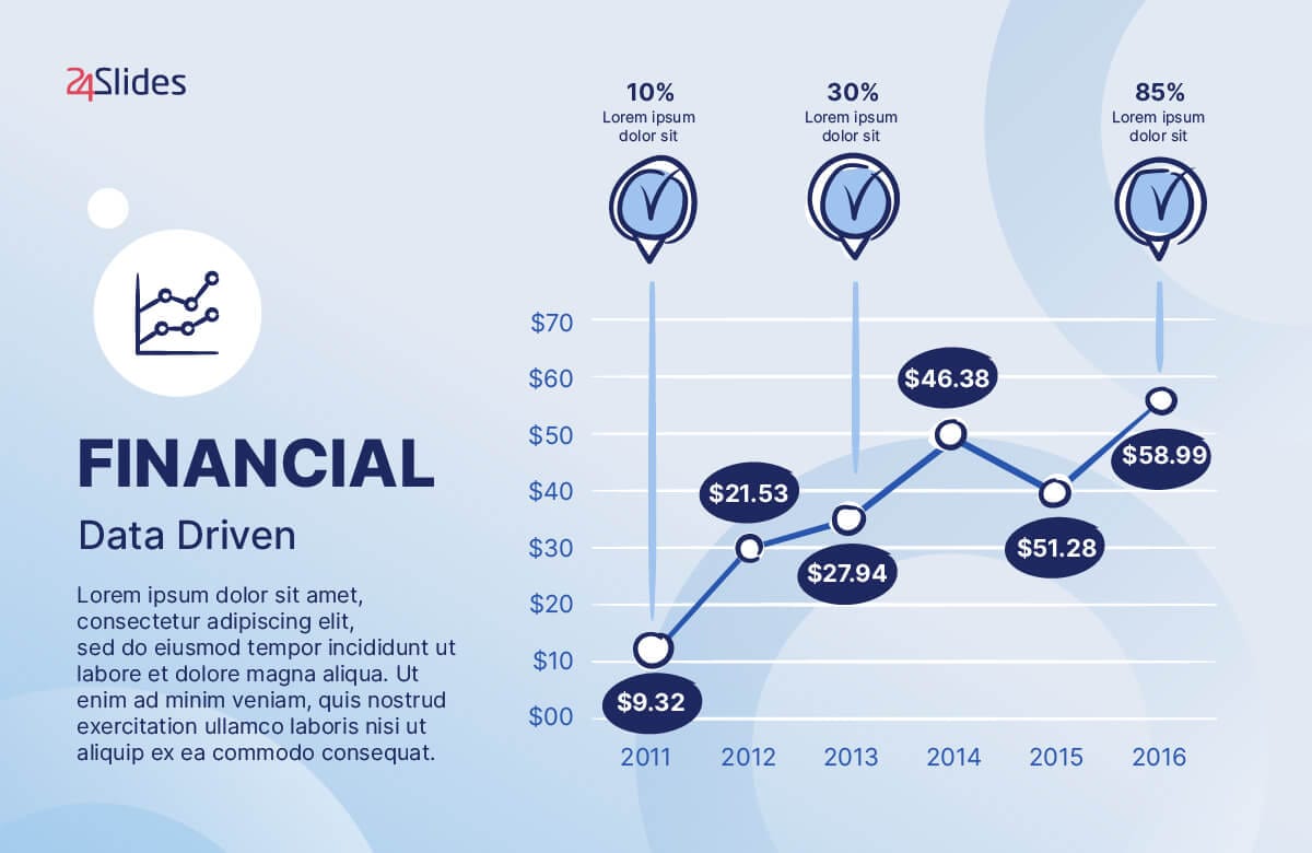
Check out this Financial Data Driven PowerPoint Template. If you’re looking for a professional yet creative and visually appealing design, this might be the one for you!
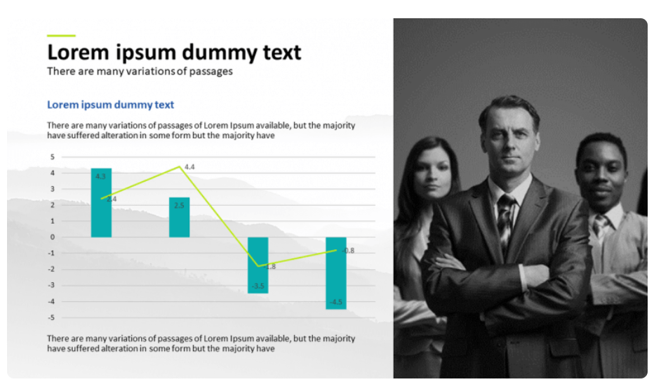
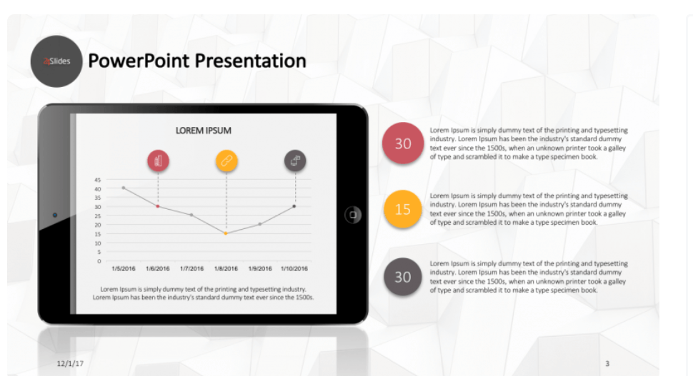
FREE Scatter Plot Template for PowerPoint #2
Looking for a practical solution? This template allows you to achieve two goals at once, acting as both a scatter plot and a waterfall chart. This graphic will help you display your total number across a period of time, as well as the change in your total number.
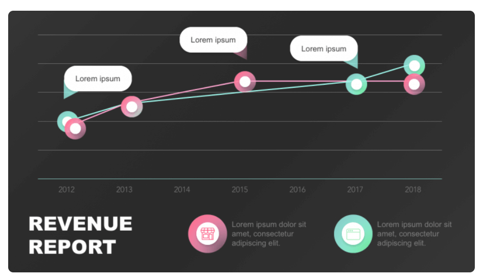
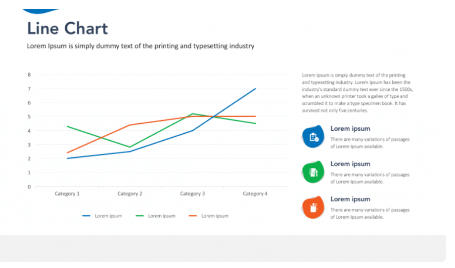
FREE Scatter Plot PowerPoint Template #3
Interested in comparing year-over-year data? Take a look at this contemporary Revenue Report Line Chart Slide, which you can use for various purposes. As always, you can download it for free and make any changes you desire to customize it to your needs.
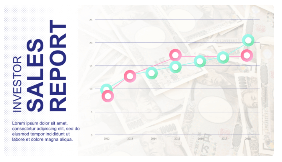
FREE Scatter Plot Template for PowerPoint #4
If you’d like to show your sales figures with a visual aid, our sales report template is for you. It will allow you to show the sales figures through a scatter with lines chart. By using it, you’ll create a clear understanding of the sales figures over a period of time.
FREE Scatter Plot Template for PowerPoint #5
This creative PowerPoint set is perfect for any business related to mobile technologies. You can use this scatter graph to present your overall performance, sales, or anything you need. Use this PPT template now!
FREE Scatter Plot Template for PowerPoint #6
Take a look at this corporate scatter plot template! It has 20 unique corporate presentation slides to help you create the most fantastic business presentation. Remember that you can easily customize its color, font and add all your branding elements.
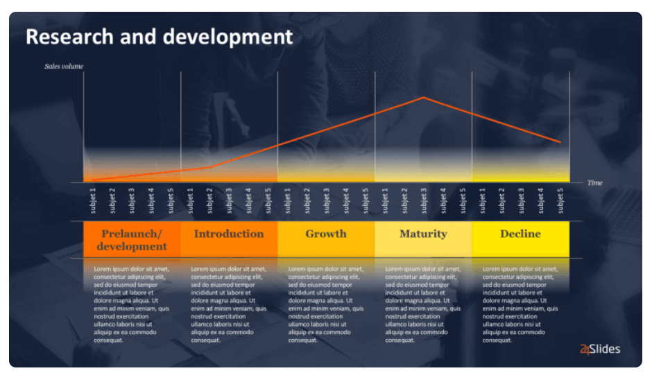
FREE Scatter Plot Template for PowerPoint #7
This PowerPoint template will help you present your research! With its clear yet visually appealing design, you can easily highlight your research staff. And with its easily editable slides, you can customize the template to fit your specific needs. Download this template now!
Check out more Scatter Plot PowerPoint Templates:

Expert Insights to Design Make an XY Chart in PowerPoint
You already know how to create Scatter Plots, but now it’s time to make them truly amazing! Check out what our expert designers say:
Insight #1: Use clear colors and text
Consider where your presentation will be read, and make sure your chart's elements can be seen and differentiated. Clarity is vital, especially for data visualization tools, so avoid excessive adornments that will create visual clutter or add more confusion.
Remember that using charts effectively is key. Keep your presentation simple and consistent.
Insight #2: Consider when to use (or not use) a Scatter Plot
Although a scatter plot is a versatile tool, it's essential to make informed decisions about when to use it and when not to. Avoid using a scatter plot when you have very few or too many data points.
If you have too few points, any patterns that appear could show up by chance, not because there really is a trend. On the other hand, too many data points will overlap and prevent your audience from seeing clearly, creating more confusion.
Insight #3: Consider professional design
Data presentation is a big deal for any business, especially when you want to impress prospects or customers. So…don't take chances with crucial presentations; let design experts handle them!
Designers at 24Slides are here to help. Just provide them with your data and let them create your masterpiece. You'll be impressed by the outcomes and how much time you'll save!
And, if you’re not convinced yet…We have an irresistible offer for you: Why not try out our services and have your scatter plot slide designed for just $1? It's an opportunity to experience the wonders that professional design can make in your presentations.