How to Make a Good Presentation: Structure, Design, and Delivery in One Guide

A successful corporate presentation relies on a balanced execution across a fundamental three-part framework. First, Structure (Narrative Flow) logically organizes your ideas so the audience absorbs the main message effortlessly. Second, Design (Visual Clarity) ensures your slides are instantly scannable to reduce mental fatigue. Finally, Delivery (Speaker Connection) builds a genuine connection through deliberate vocal pacing, open body language, and strong stage presence.
Presenting a deck is one of the most common tasks in our professional lives, yet it carries its own unique complexity. To deliver a winning deck, your strategy must begin long before you design your first slide.
A good presentation seamlessly blends three core elements: a clear structure that logically guides your audience, visually clean and scannable slides, and an engaging delivery style that commands the room. Most presentations do not fail due to public speaking anxiety, but rather due to text-heavy slides and a weak narrative. Fortunately, both can be solved well in advance.
This comprehensive guide breaks down all three layers step by step: how to structure your core message, how to design slides that support your narrative, and how to deliver your pitch with unshakeable confidence.
TL;DR: Content Summary
- What Makes a Good Presentation? (The Three-Part Framework): A good presentation rests on three basic parts. First, a clear order for your ideas. Second, a design that is easy to see and read. Third, the way you speak and move in front of the crowd. If one part fails, the whole message loses its power.
- How to Structure a Good Presentation?: Before making your slides, you must know who will listen to you. Then, order your ideas like a story with a start, a problem, and a fix. Start with a phrase or fact that grabs their attention right away. At the end, make it very clear what you want people to do next.
- How to Make a Presentation Look Good?: Design is not just for looks; it helps people learn quickly. Use strong colors and stick to just two font types. You should also make your headers large to guide their eyes, line things up neatly, and leave empty space so the crowd does not get tired.
- How to Give a Good Presentation?: In order to deliver a winning presentation, look right into the eyes of the people in the room and keep your arms open. As you speak, change the speed of your voice and pause briefly so people have time to think about what you say. Finally, when it's time to end, listen closely to their questions and respond briefly and clearly.
- Presentation Design Mistakes That Undermine Good Content: The worst error you can make is filling your slides with too much text, which tires the mind of the crowd and makes them stop listening. Another common mistake is using too many font types or keeping all your text the exact same size. When you do this, your work looks messy, and no one will know what matters most.
- What is Death by PowerPoint and How Do You Avoid It?: This bad habit happens when you put too much text on the slide and just read it out loud, which leaves the crowd very bored. To fix this and keep their focus, delete the extra words and use clear charts instead. By showing just one idea at a time, you guide the people to look at you rather than the screen.
What Makes a Good Presentation? (The Three-Part Framework)
A great corporate presentation doesn't rely on innate stage talent or complex slide animations.
According to our senior designers, a good presentation relies on a balanced execution across three fundamental pillars:
- Structure (Narrative Flow): The logical sequence of your ideas. It dictates how information is organized so your audience grasps your main message effortlessly.
- Design (Visual Clarity): The graphic execution of your deck. It ensures slide content is instantly scannable, drastically reducing audience mental fatigue.
- Delivery (Speaker Connection): The verbal and physical execution. It builds genuine rapport with your audience through deliberate vocal pacing, open body language, and stage presence.
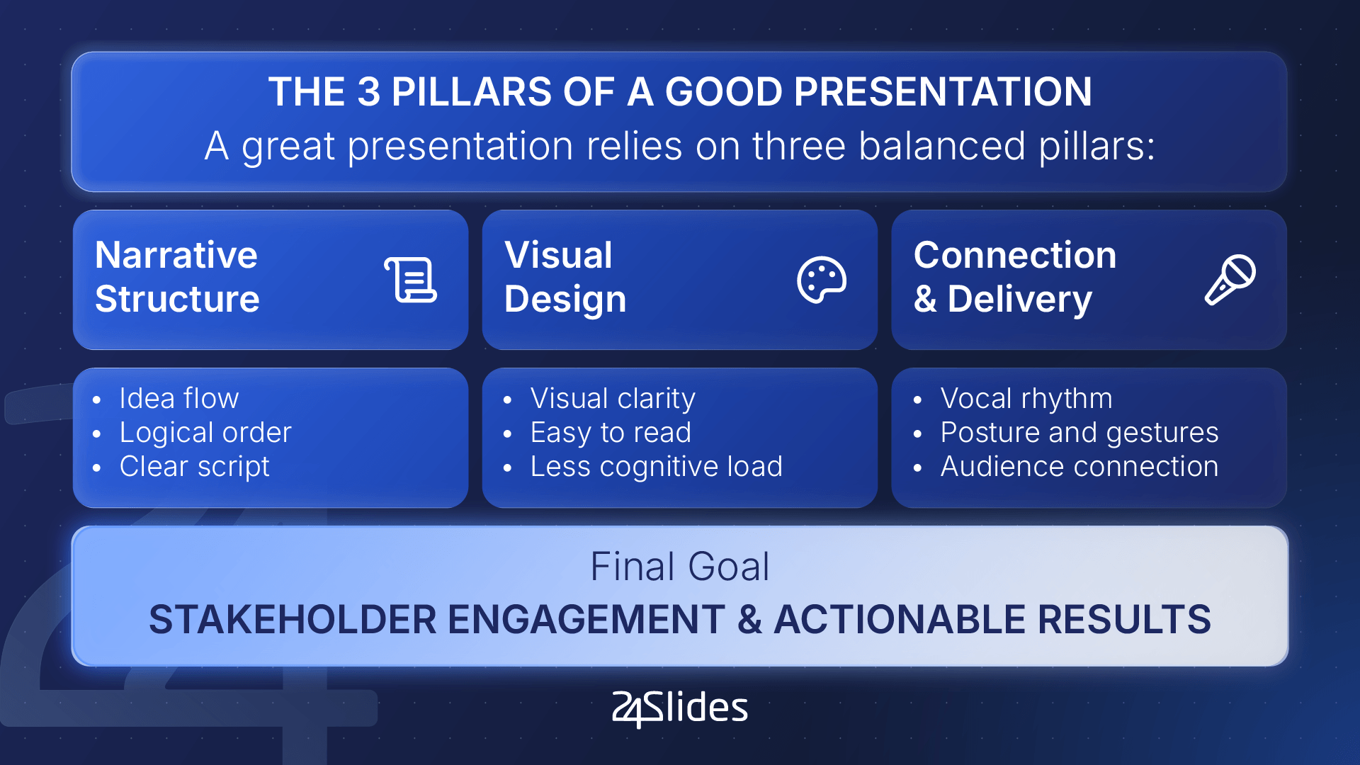
If any of these pillars falter, the overall impact collapses: flawless slides lose their power when paired with a flat, monotonous delivery, while a brilliant speech loses technical credibility when backed by cluttered, unreadable slides.
How Do You Know If a Presentation is Good?
You know you’ve delivered a good presentation if your audience can confidently answer these three questions after the session:
- Could they follow the main thread of the talk without getting distracted?
- Do they remember the core idea and key takeaways hours after the meeting?
- Do they feel motivated and clear enough to take the requested next action?
To evaluate the efficiency of your deck before walking into the room, a globally accepted executive benchmark is Guy Kawasaki’s 10-20-30 Rule: an ideal presentation deck should not exceed 10 slides, should take no more than 20 minutes to deliver, and should use a minimum font size of 30 pt.
The Qualities of an Effective Presentation
High-impact business presentations share five essential qualities:
- One idea per slide: Every slide focuses on communicating a single core concept or data point.
- Smooth logical sequence: Transitions between slides build a continuous narrative arc rather than a random collection of isolated facts.
- Highly readable visuals: Intuitive charts, large fonts, and high color contrast make immediate scanning effortless.
- Consistent visual identity: Typography, color palettes, grid alignment, and iconography remain cohesive across every slide.
- A clear Call to Action (CTA): The audience understands precisely what decision or next step they need to take at the end.
Clarifying Your Presentation Purpose is Key
Defining the strategic intent of your deck from day one is critical, as your primary goal dictates how to structure your information.
In today's corporate landscape, we can categorize decks into two main types: informative and persuasive.
Not sure which format fits your needs? Let's take a look!
Presentations That Inform vs. Presentations That Persuade
| ATTRIBUTE | INFORMATIVE PRESENTATION | PERSUASIVE PRESENTATION |
|---|---|---|
| Primary Goal | Share knowledge, track project metrics, or present updates. | Drive a commercial decision, investment, or strategic pivot. |
| Content Focus | Hard data, contextual analysis, and verifiable facts. | Storytelling, pain point resolution, and future ROI. |
| Success Metric | Accurate comprehension of the topic. | Pitch approval or adoption of the proposed change. |
One Design Partner
From infographics and reports to full marketing collateral, built on demand.
How to Structure a Good Presentation?
Remember the three-pillar framework we covered above? Here is how to structure a good presentation without missing a beat:
1. Analyze Your Audience Before Building Your Presentation
Before designing your very first slide, it's essential to conduct a quick audience audit. Crafting a message without knowing who is receiving it is the single biggest cause of audience disengagement.
Ask yourself these three alignment questions before writing your script:
- Who are the decision-makers? Identify whether your audience consists of C-level executives (who require executive summaries and financial ROI) or technical teams (who prefer operational workflows and granular details).
- What is their prior knowledge level? If the room lacks background context, eliminate technical jargon and complex corporate buzzwords.
- What core problem are they trying to solve? Structure your content to directly address your target audience's immediate pain points.
2. Plan Your Script Like a Story
Once you know your audience, the next step toward a good presentation is organizing your ideas into a narrative framework.
People rarely remember isolated data points; they remember stories. Applying a narrative arc to your script maintains high engagement and gives every slide a distinct purpose.
Break your script down into three fundamental acts:
- The Current Context (The Starting Point): Describe the current state of your audience or market. Build immediate alignment by showing that you understand their reality and current challenges.
- The Conflict or Pain Point (The Complication): Highlight the core problem, the risks of inaction, or current operational inefficiencies. This creates strategic tension.
- The Resolution (Your Value Proposition): Demonstrate how your idea, product, or project resolves that conflict and transforms their current state into a more efficient or profitable future.
3. Start Your Presentation Effectively
The first 30 seconds of your presentation dictate the room's attention span for the remainder of the session. Avoid rambling, technical apologies, or long-winded personal introductions.
Here are four powerful hook techniques to engage your audience right away:
- A provocative question: "Did you know that 80% of digital transformation projects fail due to a lack of internal alignment?"
- A striking statistic: "Last year, we lost 120 hours of productivity per employee due to manual workflows."
- A short story (Storytelling): "In 2018, one of our largest clients came within inches of canceling their contract over a simple communication gap..."
- A bold statement: "The way we market this product today will be completely obsolete within the next 12 months."
4. End Your Presentation Memorably
The conclusion of your talk carries the highest rate of memory retention (also known as 'the recency effect'). Because of this, the ending of a good presentation must be designed to lock in your core message.
- Summarize your central takeaway: Reiterate your primary message in a single, punchy sentence.
- Define clear next steps (CTA): Specify the exact action you want your audience to take next.
- Avoid ending solely on a blank Q&A slide: Keep your strategic summary or contact information visible on screen during the Q&A round. The final image left on screen should reinforce your value proposition, not fade into a plain white screen reading "Questions?"
How to Make a Presentation Look Good?
Professional visual design isn't about decorating slides; it's about making information effortless to process at first glance.
We sat down with presentation experts from our team to gather five essential design principles for your creative workflow:
1. High Contrast is Non-Negotiable
Always use dark text on light backgrounds or white text on dark backgrounds. Avoid placing body text over complex or busy background images.
Our design team notes that pastel shades or low-contrast colors can become practically invisible when projected in meeting rooms.
2. Master Visual Hierarchy
When all text is set to the same size, your audience doesn't know where to look first. Use a large font size for main headers and a smaller size for body text (18-24 pt minimum).
It is also recommended to use Bold to highlight key terms and Regular weight for secondary text.
3. Limit Your Deck to Two Fonts Maximum
Mixing too many font families creates visual chaos. Cap your entire presentation at two font families: one strong font for headings and one clean, readable font for body copy.
4. Align Every Element to a Grid
Free-placing text boxes and images "by eye" makes a deck look unpolished. Ensure all content blocks, photos, and icons align with clean grid lines and maintain consistent margins.
5. Give Content Room to Breathe with Whitespace
When designing slides, empty space isn't "wasted" space; it provides visual relief and draws attention to what actually matters.
Our senior designers strongly advise against overcrowding elements or filling every corner of the slide.
How to Give a Good Presentation?
Finally, a good presentation is incomplete without smooth delivery.
Here are actionable tips to ensure your delivery leaves a lasting impression:
1. Master Direct Eye Contact
Hold direct eye contact with one person for 3 to 5 seconds before smoothly shifting to another section of the room to build genuine rapport.
2. Vary Your Speaking Pace
Modulate your speaking speed based on the message's importance to emphasize core concepts and avoid a monotonous tone.
3. Use Purposeful Pauses
Insert deliberate 2-second pauses before and after key metrics or insights to give your audience time to absorb the information.
4. Maintain Open Body Language
Keep your hands visible above waist level, avoid crossing your arms, and move intentionally across the stage to project authority and confidence.
5. Read and Adapt to the Room
Continuously read audience reactions and adjust your pace. If you spot signs of disengagement, it's best to encourage direct interaction.
6. Master the Q&A Session
How you manage Q&A defines your technical authority and composure. Follow this simple 4 steps:
- Practice active listening without interrupting.
- Rephrase the question out loud for the entire room.
- Respond concisely (30 to 60 seconds maximum).
- Confirm with the asker whether your response adequately addressed their question.

Presentation Design Mistakes That Undermine Good Content
| DESIGN MISTAKE | IMPACT ON THE AUDIENCE | 10-MINUTE QUICK FIX |
|---|---|---|
| Text Overload | Triggers cognitive fatigue and distracts from the speaker's voice. | Cut text that can be delivered orally; keep only core keywords on screen. |
| Inconsistent Typography | Projects messy formatting and a lack of polish. | Standardize the deck using a maximum of 2 brand font families. |
| Lack of Visual Hierarchy | The audience doesn't know where to direct their visual attention first. | Increase header size to 36–44 pt and bold key metrics. |
Mistake #1: Text Overload
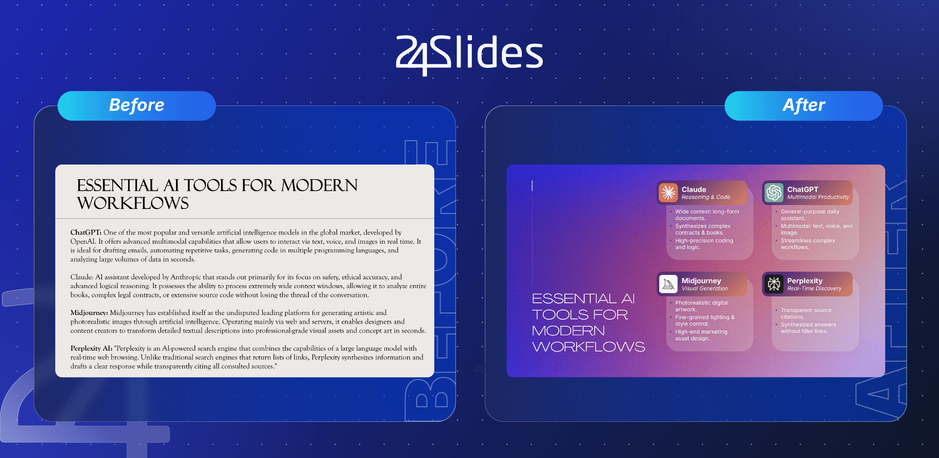
The most common beginner mistake is pasting long paragraphs onto slides under the false assumption that "more is better."
However, delivering a memorable presentation requires choosing high-impact keywords that stick in your audience's top-of-mind memory.
Here is an example of how good design can transform the impact of a slide:
Mistake #2: Inconsistent Typography
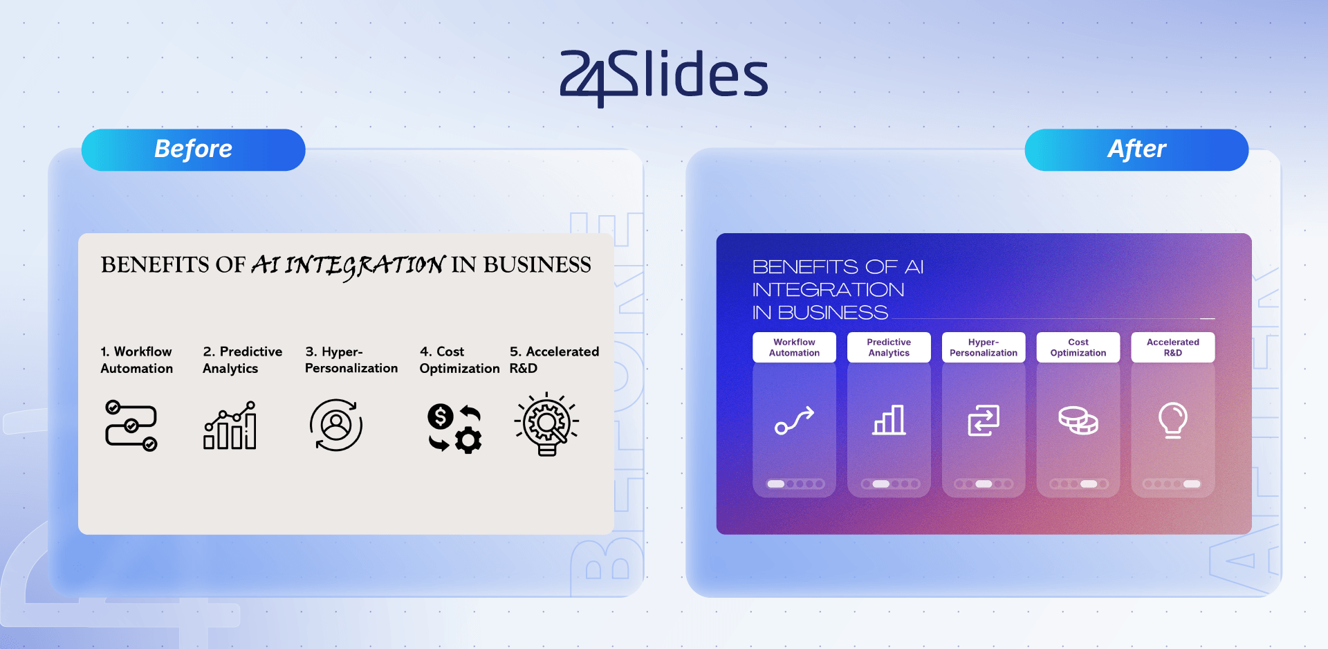
Using more than two font families across your deck damages your brand's professional image.
Our design team recommends sticking to a maximum of two fonts. Ideally, these should be pulled directly from your brand guidelines to maintain visual consistency across every customer touchpoint.
Let's see an example made by our design specialists:
Mistake #3: Lack of Visual Hierarchy
An advanced technique for creating top-tier presentations is intentionally adjusting the sizes of elements on your slides.
For small to medium meeting rooms, we recommend a minimum header size of 36 pt, whereas large conference halls call for 44 pt headers or larger. Subtitles and body copy should be noticeably smaller to maintain clear contrast.
Just like with text, scale your images or infographics based on what you want the audience to prioritize visually. Using bold formatting for key phrases is another effective tactic to guide eye movement across the slide.
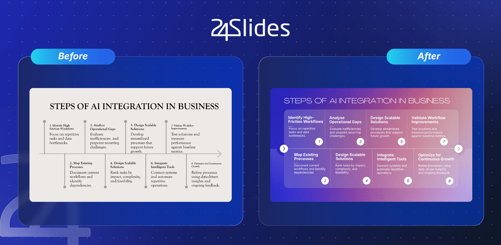
As you can see, even with a flawless script, visual design errors can undercut your message. That’s where presentation design specialists step in: turning complex ideas into clear, high-impact slides.
To explore more common mistakes, check out our guide on Bad PowerPoint examples you should avoid.
What is Death by PowerPoint and How Do You Avoid It?
Death by PowerPoint is a widespread corporate phenomenon in which a presentation relies on text-heavy slides that the speaker simply reads aloud, leaving the audience bored and fatigued.
How do you eliminate this phenomenon to ensure a good presentation? Follow these four strategic steps:
- Trim non-essential text: Remove complex details and keep only the critical takeaways on screen. This prevents cognitive overload and keeps your audience focused on what you are saying.
- Increase visual elements: Replace blocks of continuous text with clean diagrams, comparison tables, or clear data visualizer layouts.
- Focus each slide on a single core idea: If you need to explain three points, break them across three distinct slides. The natural pause between slide transitions allows you to make direct eye contact and emphasize your next point.
- Partner with presentation experts: If design isn't your thing, don't stress! You can always leverage a professional presentation design team. This allows you to focus exclusively on refining your script, organizing your ideas, and delivering a winning pitch.
Presentation Count.
Get reliable, brand-trained design capacity whenever you need it.
Never let internal bottlenecks ruin a high-stakes pitch.
Frequently Asked Questions (FAQ)
1. What is the 10-20-30 rule for presentations?
The 10-20-30 rule, created by Guy Kawasaki, is a practical design framework that limits decks to no more than 10 slides, keeps total delivery under 20 minutes, and mandates a minimum font size of 30 pt. This strategic constraint forces presenters to eliminate unnecessary background noise and focus strictly on core ideas.
2. How many slides should a good presentation have?
For a standard 10 to 15-minute business presentation, a deck of 10 to 15 slides is the recommended benchmark. However, the exact slide count is secondary to content distribution; each slide must communicate a single, isolated core idea to maintain clarity and prevent visual fatigue.
3. How much text should a slide have?
According to Mayer’s Cognitive Load Theory, reading dense text while listening creates mental fatigue. Apply the 5x5 Rule: limit slides to a maximum of 5 bullet points with 5 to 6 words per line. Slides must serve as visual anchors and thematic support rather than a word-for-word reading script for the presenter.
4. What makes a presentation visually appealing?
Visual credibility relies on four essential principles: consistent typography, high contrast between text and background, generous white space, and high-quality visuals instead of stock filler. Clutter, excessive text, and small font sizes are the fastest ways to lose authority and disengage your audience during a crucial pitch.
5. Should you use templates or design from scratch?
Pre-made templates are ideal for weekly team updates, internal reports, or quick solutions requiring brand consistency. However, custom executive design is recommended for board meetings, investor rounds, or sales pitches. For high-impact meetings where visual quality affects brand perception, utilizing a professional service like 24Slides accelerates development with executive-level design standards.
6. How do you make a Google Slides presentation look professional?
To make Google Slides executive-ready, use a unified master template, restrict your document to a maximum of two font families, align content using built-in layout grids instead of manually placing text boxes, and trim the overall slide count to include only what is essential for supporting your core argument.
7. What is the difference between a good presentation and a bad one?
A good presentation features one clear concept per slide, follows a logical narrative arc building to a conclusion, and relies on a speaker who actively engages the room. Conversely, a bad presentation combines text-heavy slides, fragmented messaging, and an unprepared speaker who reads paragraphs line by line directly from the screen.
8. How do you start a presentation without being nervous?
Public speaking anxiety is a natural physical reaction. Reframe adrenaline into energy by practicing out loud at least twice or arriving early to get comfortable with the room. Physical anxiety decreases significantly within 90 seconds, while rehearsing aloud builds essential muscle memory for smooth delivery.
9. How do you connect with your audience while presenting?
Building a connection with your audience relies on stage presence and strategic storytelling. Combine continuous eye contact with corporate narrative frameworks like Problem-Complication-Solution to keep stakeholders actively engaged in your proposal. For an in-depth breakdown of structured business narratives, review our guide on 8 essential storytelling techniques for your business presentation.
10. What to do if you lose your place mid-presentation?
If you freeze mid-talk, maintain composure by pausing and taking a 3-second breath; silence always feels longer to you than to the audience. Glance at your slide title to anchor your central concept, then resume smoothly using a transition bridge such as "The main point to remember here is...".
To stay up to date, review this content: