How to Make a Scatter Plot in Google Slides (Templates Included)
Today, we will discuss one of the most powerful data visualization tools, the scatter plot (also called an XY graph or scatter diagram). Whether you're a business professional, a student, or anyone looking to make data-driven presentations, scatter plots are definitely an invaluable asset in your toolkit.
We will teach you step-by-step how to make a Scatter Plot in Google Slides. But that's not all – we've also included some amazing scatter plot templates (for FREE!) and some of our expert designers' best tips and tricks. Ready to impress your audience? Let's dive in!
We’ll go over the following topics:
- Can you make a scatter plot in Google Slides?
- How do you make a scatter plot on Google Slides? Check out the step-by-step
- First Step: Create a Scatter Plot in Google Sheets
- Next Step: How to Insert a Scatter Plot in Google Slides
- Easiest way to create an XY Scatter Plot in Google Slides: Use Templates
- Check Out Some of The Best Scatter Plot Google Slides Templates
- Expert Tips to Design an XY Chart in Google Slides
- Transform Your Vision into Data Masterpieces – Start Here!
Can you make a scatter plot in Google Slides?
In short: Yes and no. You can't create a Scatter Plot in Google Slides directly. But you definitely can insert a Scatter Plot from Google Sheets, where you can make and customize it however you like. Keep reading to find out how to do this.
How do you make a scatter plot on Google Slides? Check out the step-by-step
Making a Scatter Plot in Google Slides is surprisingly easy! You have a couple of options: you can create them from scratch using the built-in charts function, or you can use templates. Let’s take a look at each one of these methods.
We'll begin by creating them from scratch. However, as mentioned earlier, there's a previous step involved - working with Google Sheets before moving on to Google Slides. Let's get started!
First Step: Create a Scatter Plot in Google Sheets
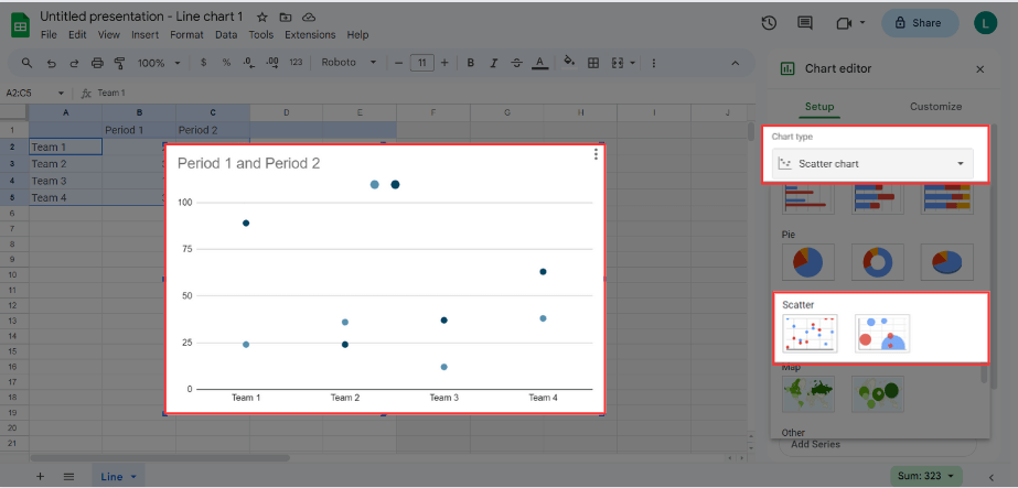
First, create a new sheet and enter your data. Now, select your data, go to the Insert tab, and click Chart.
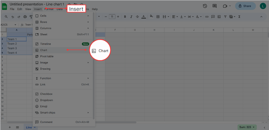
You'll see a column chart automatically appear. In the Chart Editor, click the Chart Type dropdown menu and choose Scatter. It can be a regular one or a bubble chart for a 3D effect.
Now, you can customize your chart. In the Chart Editor, select the Customize tab.
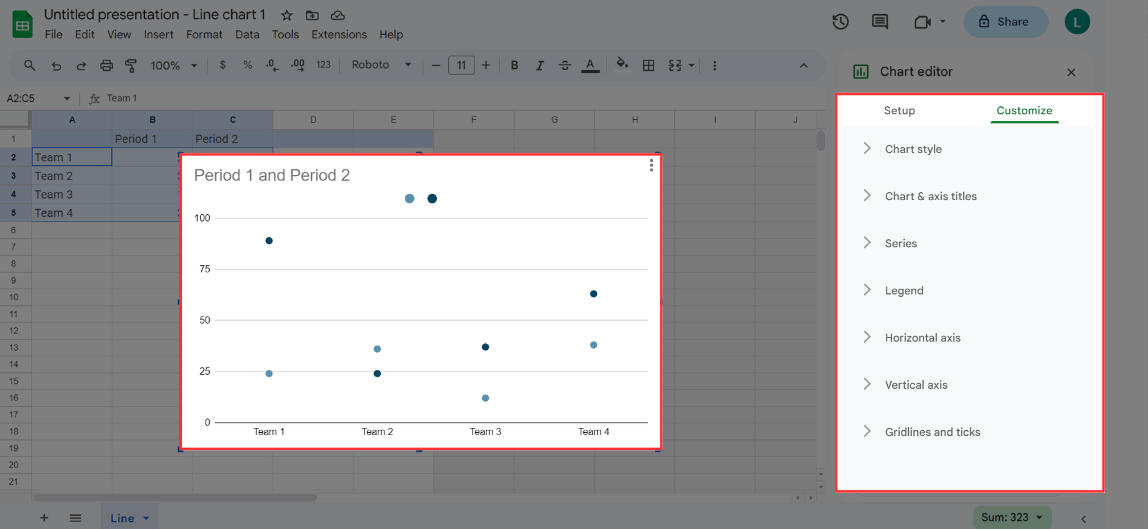
In this tab, you can adjust:
- Chart Style: This feature lets you modify the background color, font, and add a border color.
- Chart and Axis Titles: Here, you can add or edit the chart title, subtitle, horizontal axis title, and vertical axis title. It also allows you to adjust the title’s font, text size, color, and format.
- Series: For a visual effect, you can also change the point size and shape. If you have multiple data series, they can be customized differently from one another. You can also add error bars, data labels, and trendlines.
- Legend: This allows you to insert or delete the legend and customize its font size, format, and color.
- Horizontal Axis: You can make adjustments to the horizontal axis, by customizing its label font, size, format, and color. You can also reverse the label’s order and rotate them.
- Vertical Axis: Similar to the horizontal axis, this feature lets you adjust label font, size, format, and color. Also, you can choose minimum and maximum values and select different number formats.
- Gridlines and Ticks: This allows you to add gridlines and ticks, and to customize them.
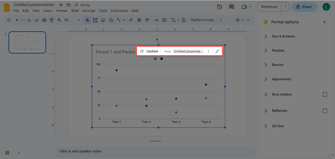
Almost done! You’ve created your scatter plot. The next step is to insert it into your Google Slides presentation.
Next Step: How to Insert a Scatter Plot in Google Slides
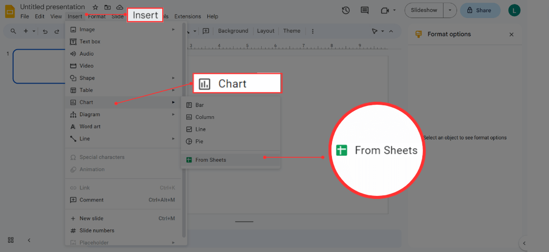
First, create a Google Slides Presentation. Go to the Insert tab, select Chart and choose From Sheets.
Next, look for the chart you created. You can do this by searching in your drive or pasting the file's URL. Once you've found it, select it and click Import.
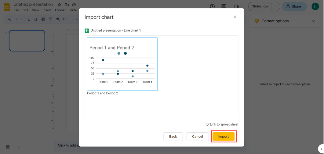
And that's all! Now, you'll be able to see your chart. Remember, this chart is still linked to the spreadsheet where you created it. So, if you want to make any changes, just update your spreadsheet, and in Google Slides, select Update. You will see the changes reflected in Google Slides.
Easiest way to create an XY Scatter Plot in Google Slides: Use Templates
You already know how to create a scatter plot from scratch. However, there's a much easier and faster way to create them, guaranteeing a seamless, creative, and professional outcome.
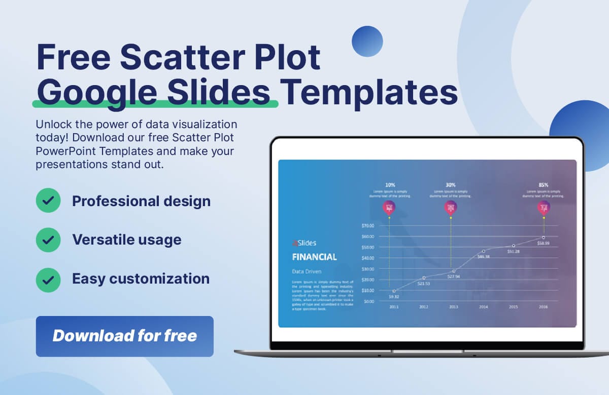
Do you know what we're talking about? That’s right, templates, and we have amazing (and FREE) ones for you. Download them now!
Take a look: 24Slides Scatter Plot Google Slides Template Free Download

We present Templates by 24Slides!!
A library full of amazing templates, ranging from corporate to data slides, and much more! You can customize them easily and straightforwardly. And what’s best, they have been created by expert designers, so they will definitely guarantee an INCREDIBLE outcome. Download your scatter plot template today and get ready to impress your audience!
So, let’s see how to create a scatter plot in Google Slides using templates:
- Sign up for free on Templates by 24Slides to access and download all templates.
- Choose the scatter plot design template that best suits your needs. We already selected the best ones for you here.
- Download the template, open the presentation, and click on the funnel slide.
- Click on a text box to select the existing text, then type in your content. Repeat this step until you have written all your content.
- Make any other changes: Add your branding or any other design elements.
And you're done!
Check Out Some of The Best Scatter Plot Google Slides Templates
Ready to create fantastic scatter plots? Here are 5 of the best scatter plot Templates for your next project. And what’s best, you can download them for free!
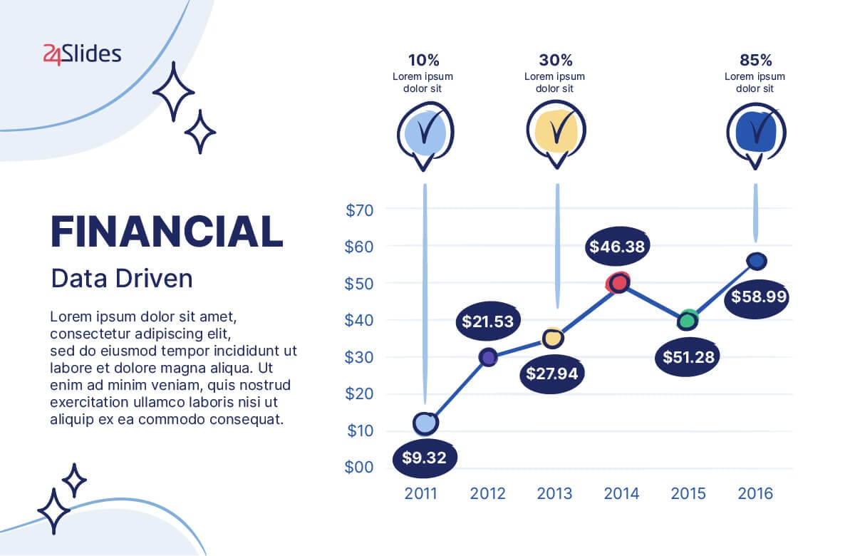
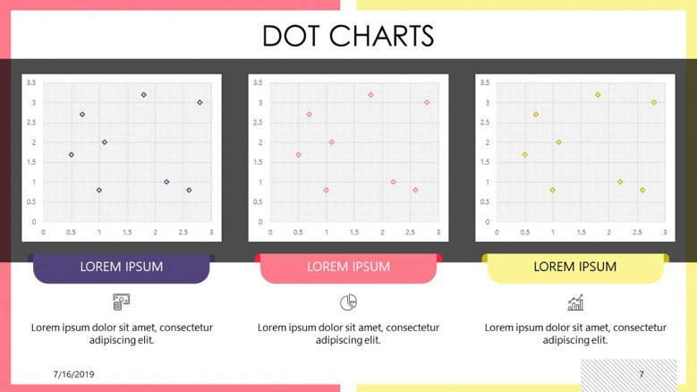
FREE Scatter Plot Google Slides Template #1
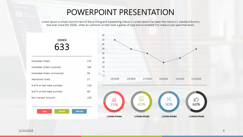
This deck makes it incredibly easy to compare one chart with others, allowing you to effectively analyze and contrast your data. This slide is the perfect solution whether you need to visualize data for sales, market research, and much more. Download it now!
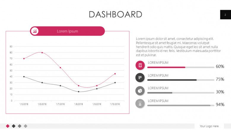
FREE Scatter Plot Google Slides Template #2
This creative and visually appealing Google Slides template is perfect for marketing teams who need to present quantitative information. If you want to keep it simple and professional but still show that you care about your image, employ this template now!
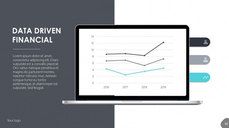
FREE Scatter Plot Google Slides Template #3
This versatile Google Slides design is perfect for financial, sales, or marketing data. It easily allows you to compare three different variables. This Google Slides template is a great way to organize and display your financial data in a straightforward format. Download it for free today!
FREE Scatter Plot Google Slides Template #4
If you’d like to track your business progress over time, make notes of important events, and monitor changes, this template is for you! Download it for free, and adapt it to your needs: change its colors, typography, content, and more!
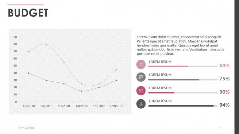
FREE Scatter Plot Google Slides Template #5
Check out this budget scatter plot presentation as a starting point for fantastic marketing initiatives! This design could be the perfect fit if you're looking for a professional, data-driven, yet creative presentation.
Expert Tips to Design an XY Chart in Google Slides
Now, we'll share some valuable advice from our expert in-house designers on data visualization tools. Let's see what they're recommending:
Tip #1: Clarity and simplicity are essential
The main goal of any data visualization tool, like a scatter plot, is to communicate the message clearly to your audience, so keep your design simple and uncluttered. Remember you don't need to include everything; you can always share additional information in your speech or have backup slides for more technical data.
Tip #2: Create for an audience
Consider different design elements when you are creating your slides. For example, use visual hierarchy techniques to guide the viewer's eye to the most essential elements. Also, ensure that the colors you use are consistent with your overall design and accessible to all viewers.
Tip #3: Know when not to use a Scatter Plot
There are certain situations where scatter plots are not the best tool to use. For example, when you’re working with two variables that have no relationship with one another.
Also, when you have an extensive data set. This can actually do more harm than good, because it can clutter your graph and make the information less clear, having the opposite effect of what is intended.
Transform Your Vision into Data Masterpieces: Start Here!
Creating data presentations can be a challenging task, and we understand the importance of delivering quality content for your business. So, why not shift your focus entirely to your valuable content and let us handle the design work for you?
Our team of 24Slides designers is well-equipped to assist you in transforming your data presentations into works of art. Simply send us your blank slides, and within 24 hours, you'll receive a complete makeover that will take your presentation to the next level.

You might also like
- Expert Tips for Creating Charts, Diagrams, and Tables in Google Slides
- How to Create a Funnel Diagram in Google Slides (+ FREE Templates)
- How to Make a Timeline in Google Slides? Guide for beginners
- How to Create a Flowchart in Google Slides
- 20 Free PowerPoint and Google Slides Templates for Data Presentations