Creating a Radial Chart in PowerPoint: A Step-by-Step Tutorial

Creating visually appealing presentations is key to engaging your audience. Luckily, PowerPoint offers many tools to convey your message effectively. Today, let's explore one of these tools: the radial chart.
Radial charts stand out for their originality and unique visual appeal compared to other charts. The cool rounded format not only captures the audience's attention but also leaves a lasting impact.
Ready to level up your data presentation game? Follow this step-by-step tutorial to create a radial chart in PowerPoint and present your data like a pro!

Today, we'll cover the following topics:
- What is a Radial Chart?
- Donut chart vs. Radial Bar chart vs. Pie chart
- How to make a Radial Chart in PowerPoint
- Free PPT Radial Chart Templates
- Looking for more effective presentations? 24Slides is the answer
What is a Radial Chart?
A radial chart displays data in a circular layout, starting from the center. This means it can take many shapes. According to Tableau's blog, there are two common types of radial charts: donut and sunburst charts.
A donut chart is a pie chart with a hole in the middle. On the other hand, a sunburst chart shows connections across multiple levels of categories.
Another common chart you'll find when searching online for radial charts is the radial bar chart. A great way to compare categories with circular bars instead of the classic horizontal bars.
Although all these charts look similar, each has unique features that make them better for different data types.
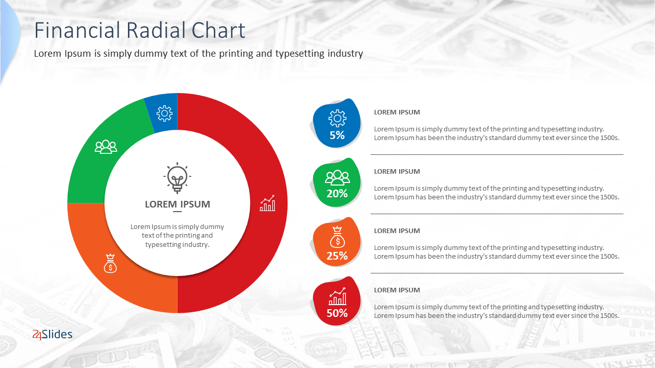
The next section will review the differences between the most common radial charts. In the meantime, here's a classic radial chart example: a donut chart.
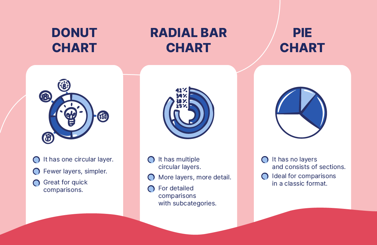
Donut chart vs. Radial Bar chart vs. Pie chart
I’ve already defined that a radial chart can take many shapes. But, among so many options, which one should I choose?
To help you, I’ll differentiate between the main types of radial charts: donut chart, radial bar chart, and pie chart. Are they really the same? The short answer is... not exactly.
After researching and consulting with our expert designer, Carmen Navarrete, these are the differences:
A donut chart has one layer of information, which is helpful for simple comparisons. A radial bar chart, on the other hand, has multiple layers for detailed comparisons with subcategories. In contrast, a pie chart has no layers and consists of sections.
While they might seem similar, it's key to remember that they're not the same technically. This visual comparison will be helpful to you:
How to make a Radial Chart in PowerPoint
We already know what a radial chart is and the differences between its types. So, let's create a radial chart from scratch in PowerPoint. Let's walk through the easiest way to do it, step by step.
This chart overlays a pie chart and a donut chart. This allows for comparing two sets of proportions or displaying additional information in a compact and visually appealing manner.
Making the outer body of your radial chart
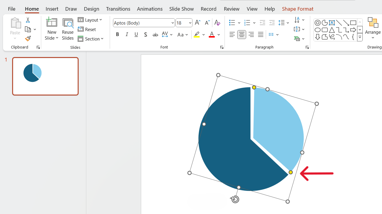
Add a partial circle
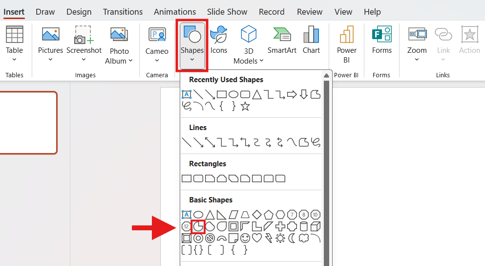
- Choose the slide for the radial chart and go to the Insert tab.
- Next, click on Shapes > Basic shapes > Partial Circle.
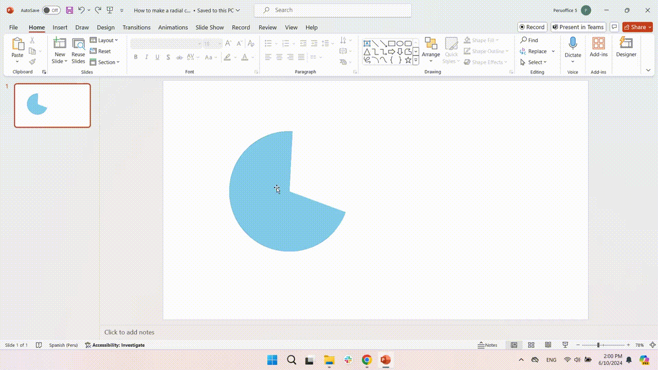
- Click and drag to draw the pie. Holding Shift to keep its proportions.
- To change the style, go to Shape Fill and pick your favorite color.
For a minimalist look, remove the borders by selecting "No Border" in the Shape Outline options.
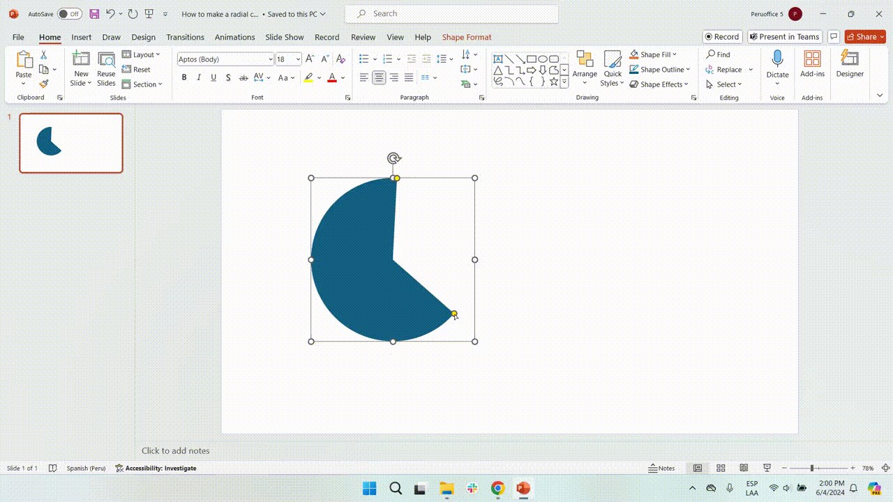
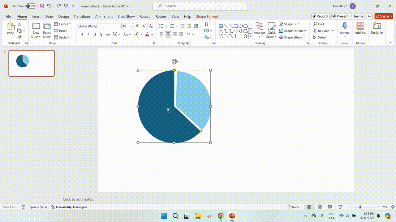
Adjust the size of the pie chart
- Click the shape to resize your pie chart, and a selection box with dots will appear.
- Select and drag any of the yellow dots to adjust the size of your shape.
Duplicate the pie chart
- After resizing the shape, copy and paste it (Ctrl C + Ctrl V or Cmd C + Cmd V on a Mac).
- Next, place the duplicate over the original and use the red guidelines to align them correctly.
Change the color and rotate the duplicate chart
- To differentiate it, click on it and navigate to the Shape Format tab. Choose Shape Fill and select a specific color.
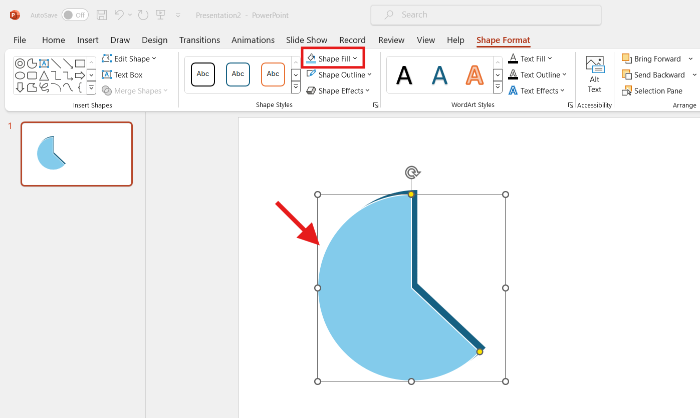
- Once you have both pie charts lined up, click the rounded arrow at the top. Next, rotate the duplicate pie chart.
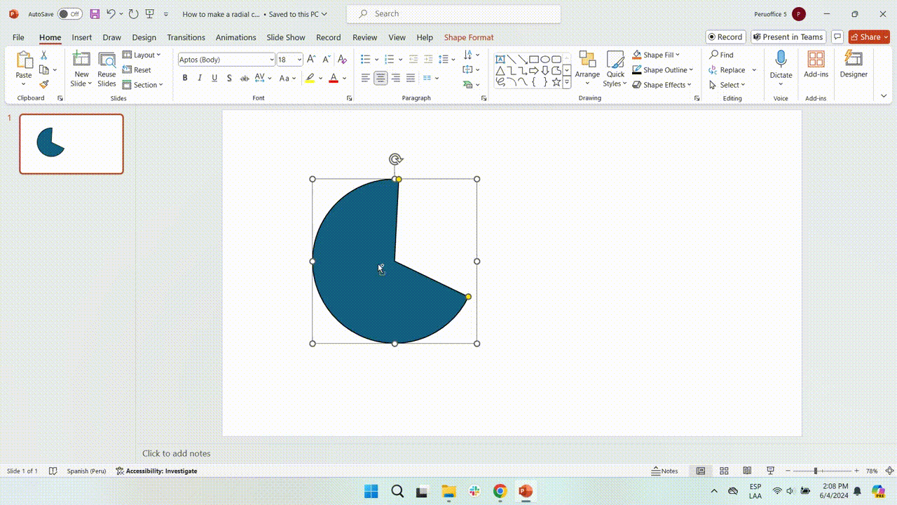
Resize the duplicate chart
- Move the copied radial chart away from the original. Use the white handles to resize it so that it looks like a piece of pie with some space.
- Resize the smaller piece by dragging the yellow dot until the radial lines are parallel. Make sure both charts are aligned.
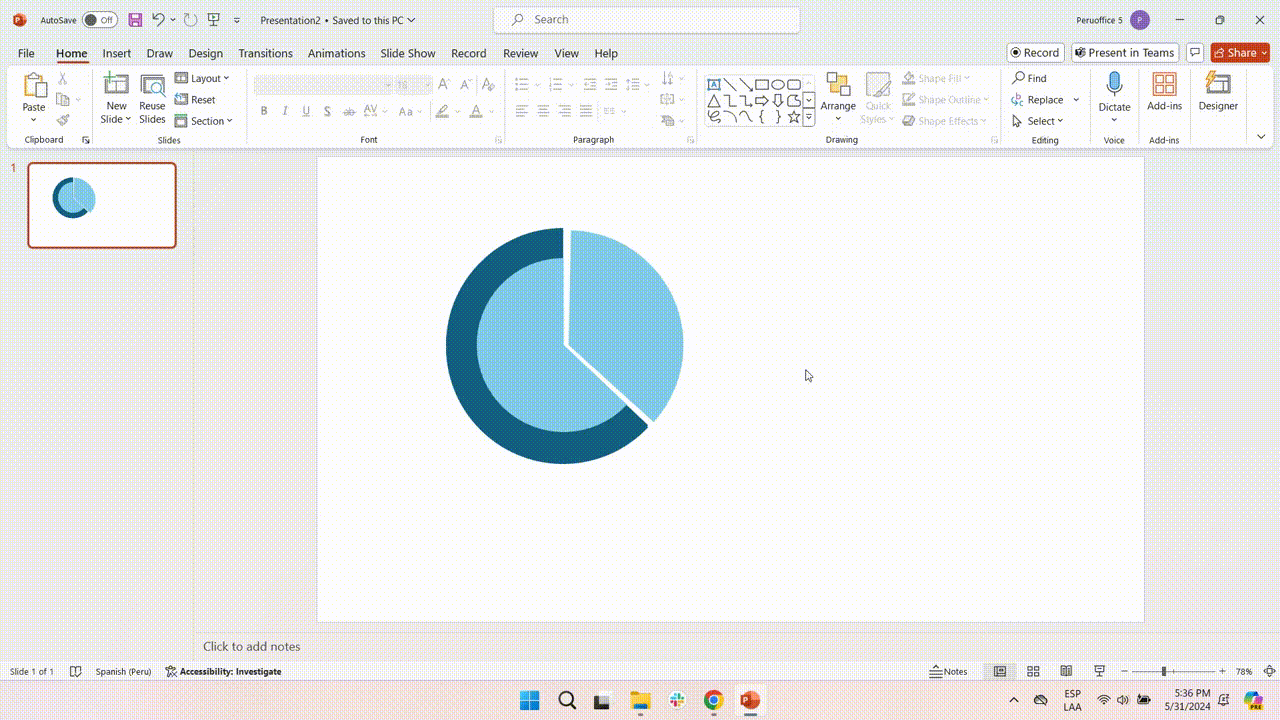
Creating and styling the inner body
Create the first Inner Circle
- Duplicate the first pie chart (the blue one) and change its color to light blue (like the example) to differentiate it from the original. To do this, choose the Shape Fill option.
- Then, make it smaller than the original. To ensure it looks good, adjust it directly over the original.
Create the second Inner Circle
- For this step, duplicate the second pie chart (the light blue) and change its color to blue (like the example) to differentiate.
- Then, make it smaller and adjust it until it looks good.
Inserting data labels
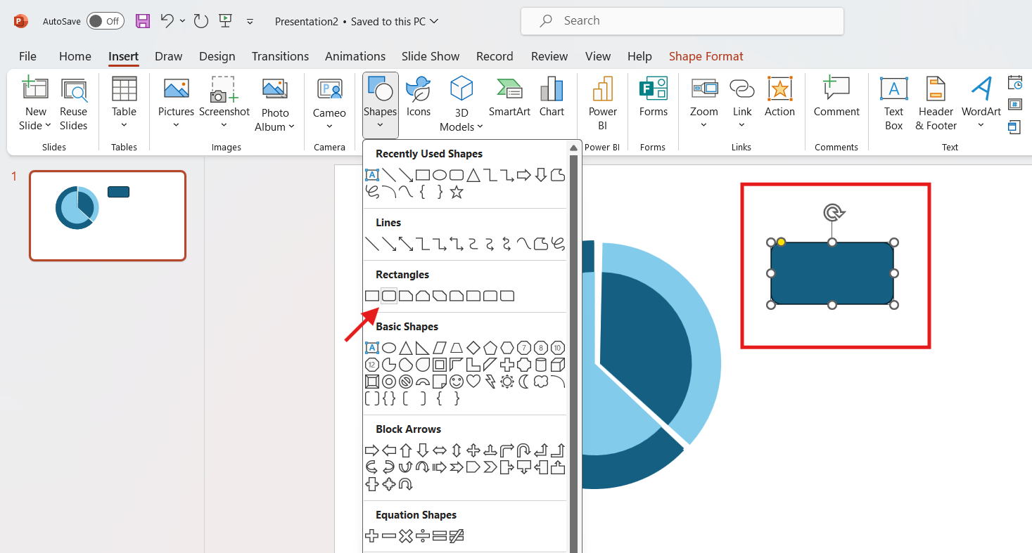
Create data labels
You need to label each section's meaning.
- Go to the Insert tab, then select Shapes. In the rectangles section, select the rounded rectangle option.
- Drag the rectangle where you want your label.
- Repeat the process, changing the second color’s rectangle to light blue (in this example).
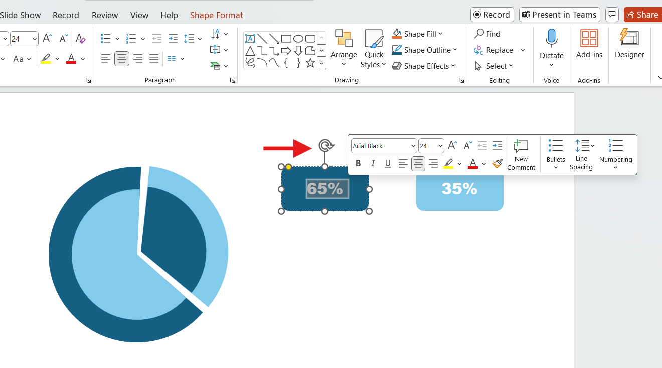
Insert text in labels
- Just double-right-click on the rounded rectangles we created earlier and start typing.
- To customize the text style, select the text and utilize the formatting tools that appear.
Link the labels to the radial chart
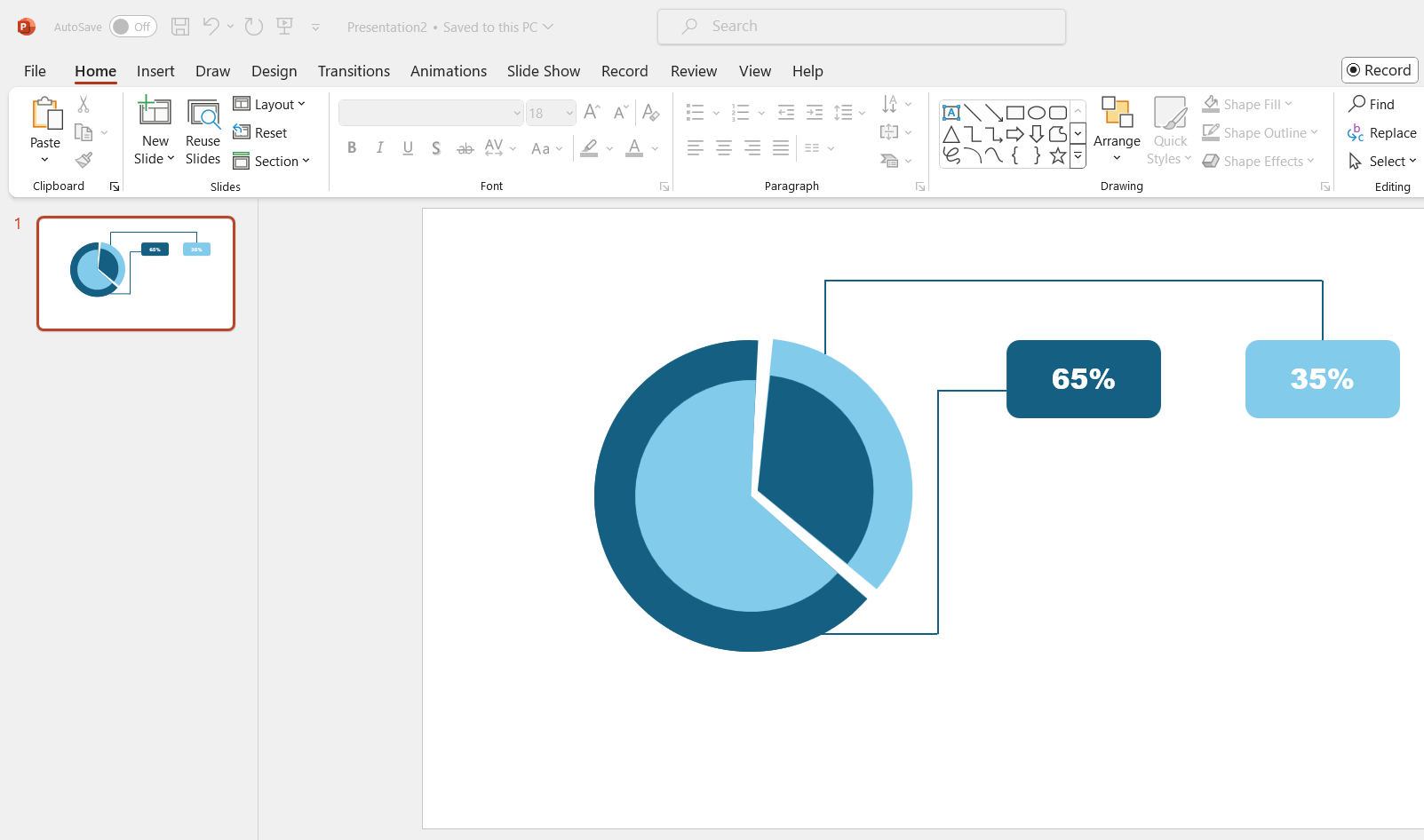
To connect the radial bar chart labels, you need to add lines.
- Click on the Insert tab > Shapes > Lines. Next, draw a line connecting your label to the chart.
- For this step, you will need to draw multiple lines.
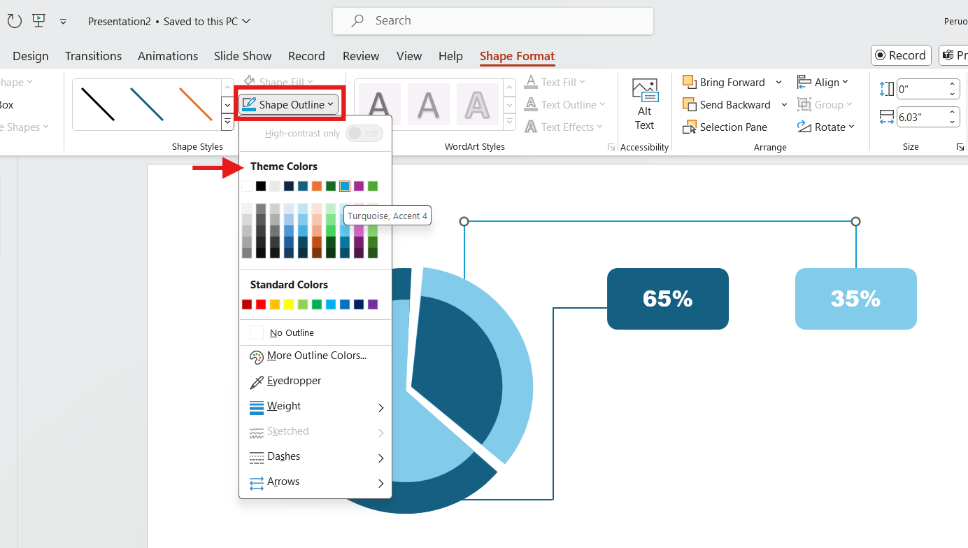
Change lines color
- To change the line's color, click on it and go to the Shape Format tab.
- Next, choose the Shape Outline option. Here, choose the color that matches your radial chart. Repeat the process for all the lines.
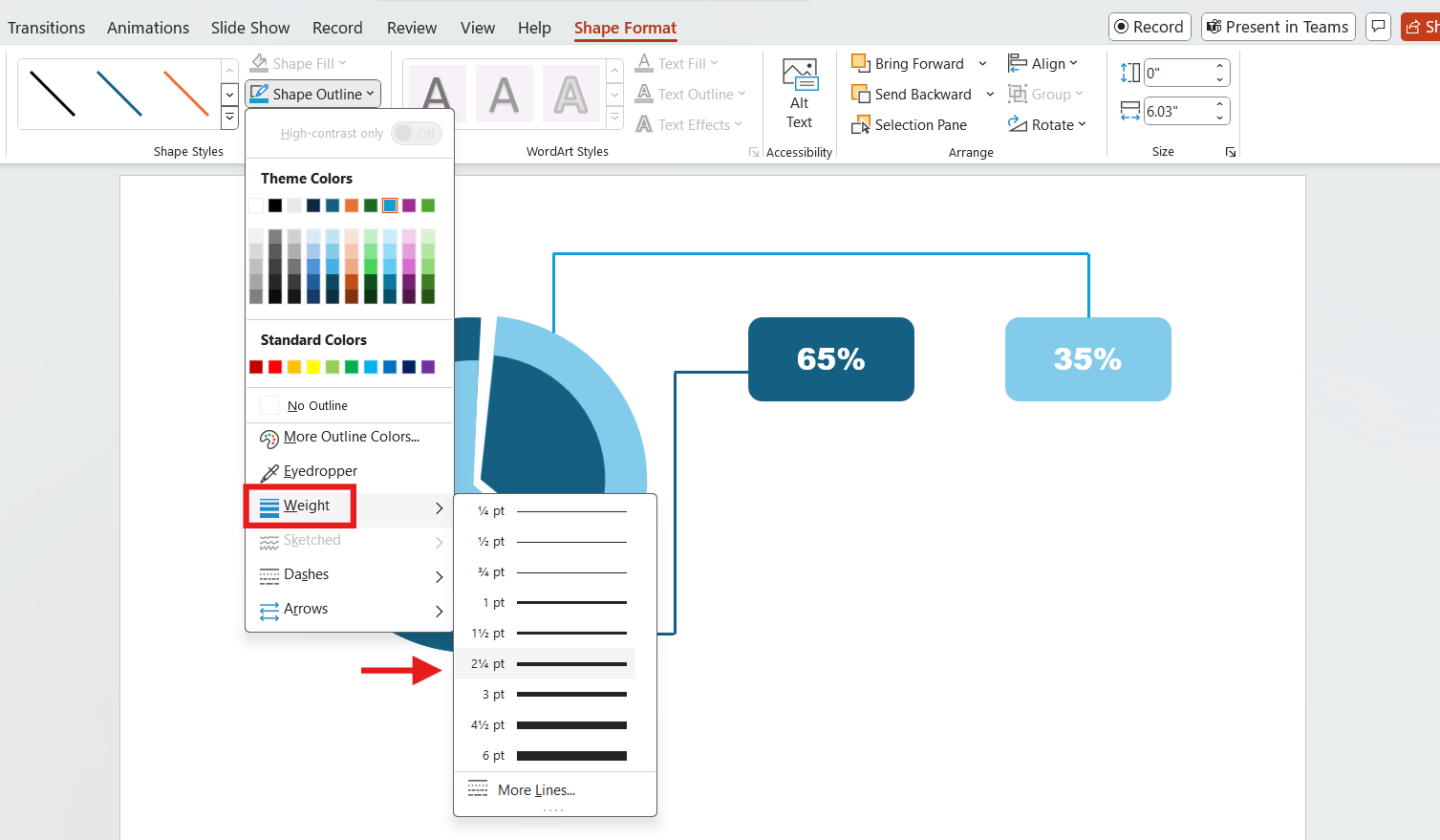
Change lines thickness
The lines are thin by default, so make them thicker for better visibility.
- Click on the Shape Format tab > Shape Outline option > Weight option. Next, choose the weight you prefer.
Adding text
Insert titles
- Click on the Insert tab. Next, click the Text Box button. Finally, draw a text box under each label.
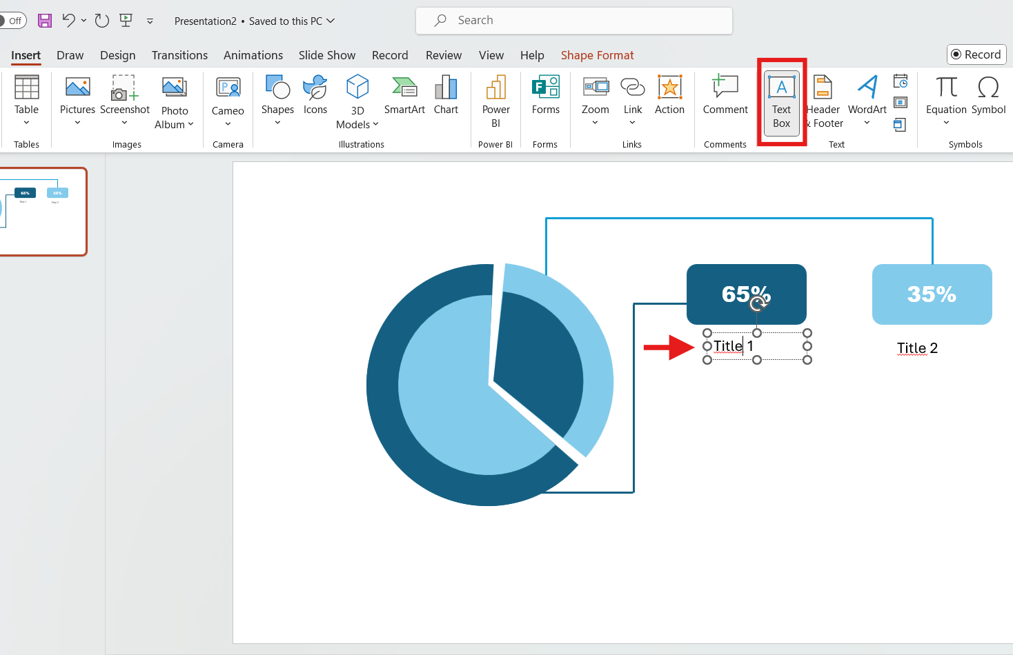
Insert descriptive text
- Click on the Insert tab. Next, click the Text Box button. Finally, draw a text box under each title and start typing.
- For the last step, apply styling and make sure everything is correct.
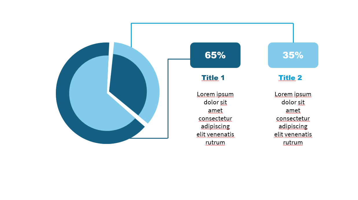
You can add information to the inner sections. This provides more context for your explanation. Display information like category names, units sold, campaign names, your target audience, and more.
And there you have it: a shiny radial chart for your presentation!
Free PPT Radial Chart Templates
A radial chart is a simple way of displaying data in a circular format. However, mastering PowerPoint takes time and practice, especially for beginners who may find it challenging at first.
Luckily, our Templates by 24Slides platform has hundreds of free PowerPoint chart templates. You can download the donut, radial bar, and pie charts here.
All the templates are completely editable. With just a few clicks, you can create a stunning presentation. Have fun customizing them!
Just remember to ensure consistency and keep it simple. After all, knowing how to use PowerPoint charts effectively can make all the difference.
Looking for more effective presentations? 24Slides is the answer
In this article, I’ve shown you why using a radial chart is a game-changer for presenting data. But if you still struggle to communicate your message effectively, you can always rely on professionals.
We are the world's largest presentation design company with 10+ years of expertise and more than 200 designers worldwide.
24Slides supports thousands of companies and professionals each month, allowing them to give powerful on-brand presentations.
You can focus on the content while 24Slides expert designers handle all the visual elements. In less than 24 hours, you'll get a standout, fully editable presentation that will impress your audience.

Ready to upgrade your PowerPoint prowess? Don't miss this content: