Making a Radial Chart in Google Slides: A Step-by-Step Guide

In today's fast-paced world, conveying complex information that captivates your audience can be challenging. Luckily, radial charts, also known as circular charts, are a great way to achieve it.
When it comes to visual impact, the radial chart stands out for one simple thing: its originality. This allows for a dynamic and engaging presentation.
Unlike the most common charts, a radial chart offers a fresh way to compare categories in a circular layout.
In this tutorial, you will learn how to make a radial chart from scratch in Google Slides. By following these simple steps, you'll be able to create stunning charts that effectively display your data. Let's get started!

Today, we'll cover these topics:
- What is a Radial Chart?
- How to make a Radial Chart in PowerPoint
- Free Google Slides Radial Chart Templates
- Deliver powerful presentations with the support of 24Slides
What is a Radial Chart?
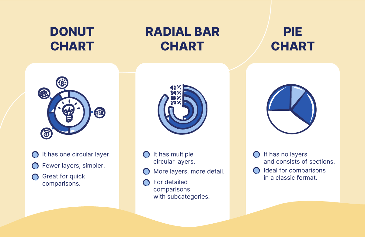
A radial chart is a simple way of displaying data in a circular layout. Here, the total number of segments adds 100%, representing the whole. Therefore, a radial chart can take different shapes.
Tableau's blog highlights two common types of radial charts: donut and sunburst. A donut chart is a pie chart with a hole, while a sunburst chart shows connections across different category levels.
Another common chart you’ll find online is the radial bar chart. Useful for comparing categories using circular bars instead of the classic horizontal bars.
Although different radial charts seem to serve the same purpose, they don’t.
After consulting our expert designer, Carmen Navarrete, here's a quick comparison of the main radial charts and their uses.
How to make a Radial Chart in Google Slides
With the basics covered, let's create a cool radial chart from scratch using Google Slides! We'll explore the easiest way, step by step.
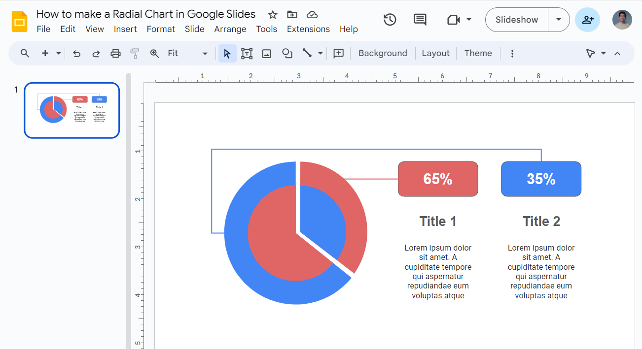
This chart combines a pie chart and a donut chart. This approach lets you compare two sets of proportions or additional information in a visually striking format.
Making the outer body of your radial chart
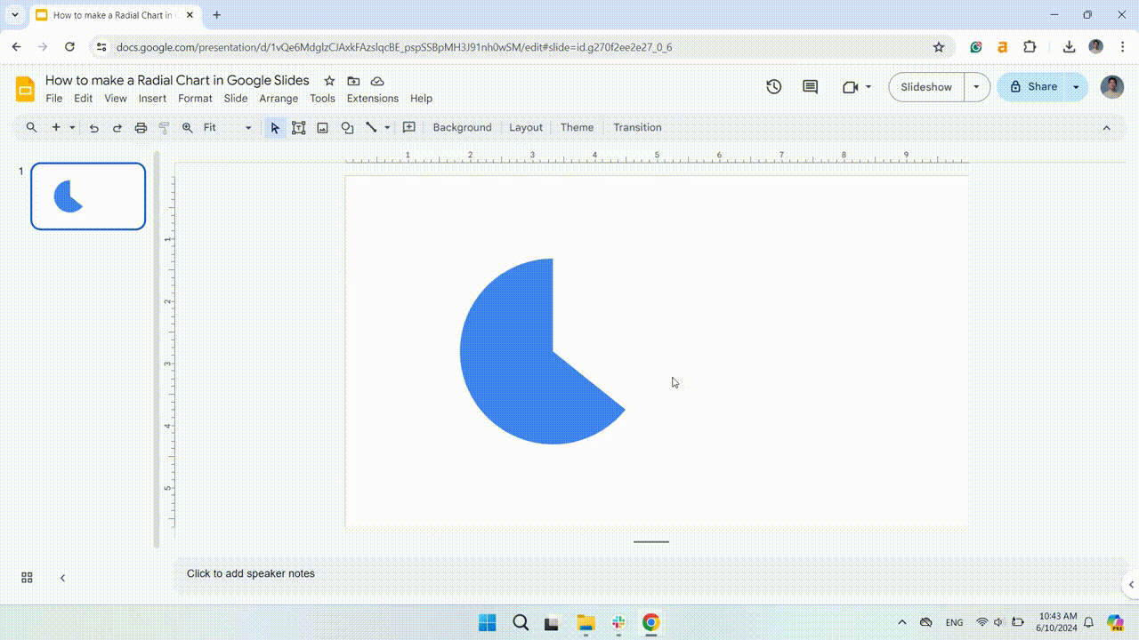
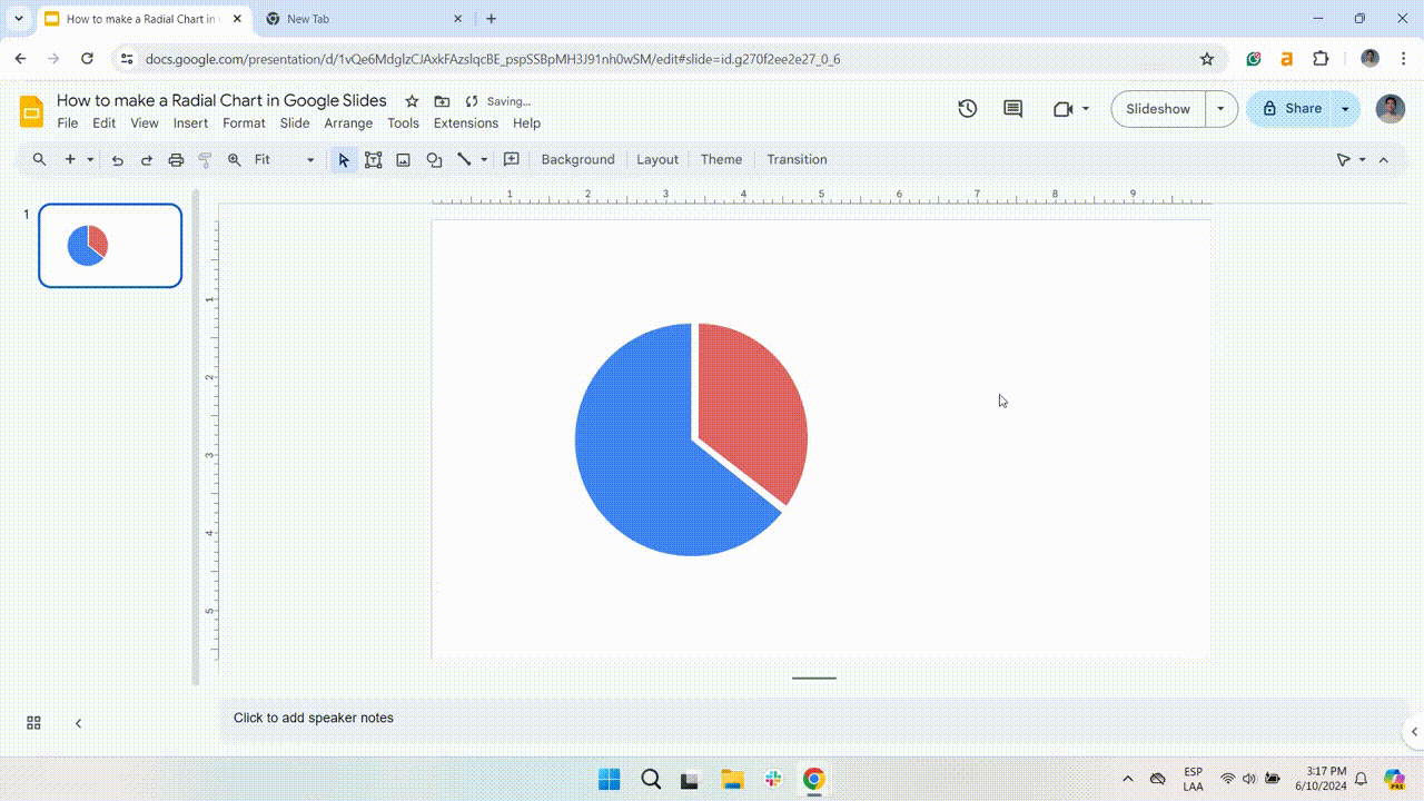
Add a pie chart
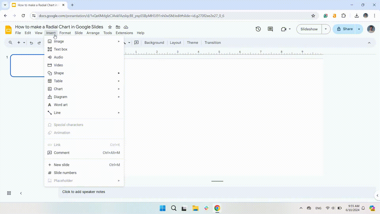
- Select the slide for the radial chart and go to the Insert tab.
- Next, click on Shape > Shapes > Pie.
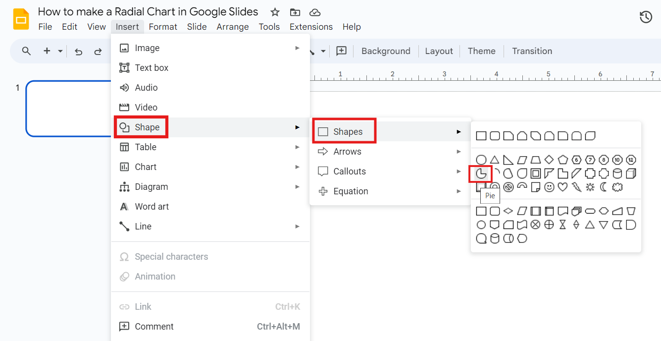
- Click and drag to create the pie. Holding Shift to keep its proportions.
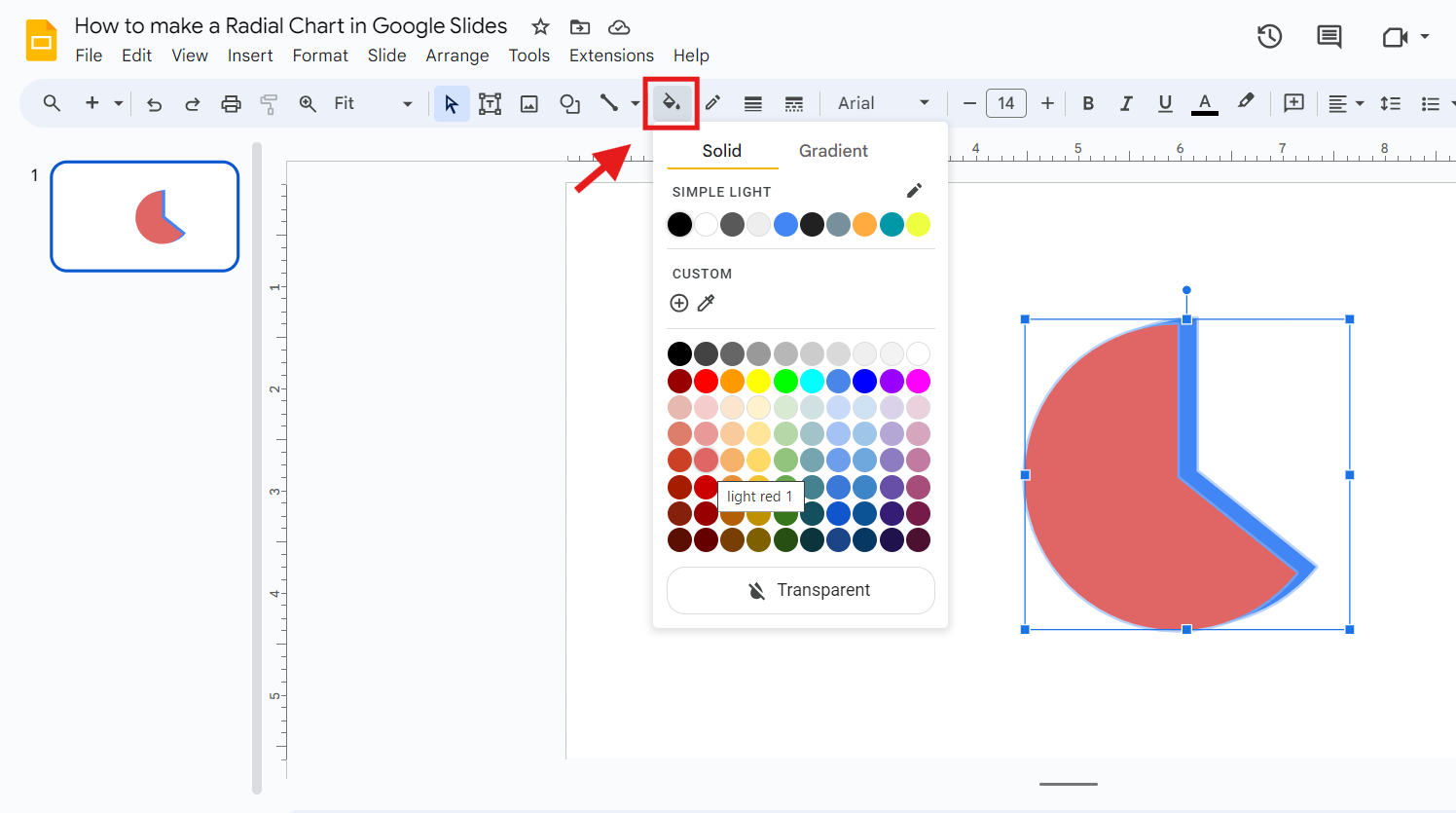
- To change the style, click the pie chart and go to Fill Color.
- For a minimalist look, remove the borders by choosing Transparent in the Border Color options.
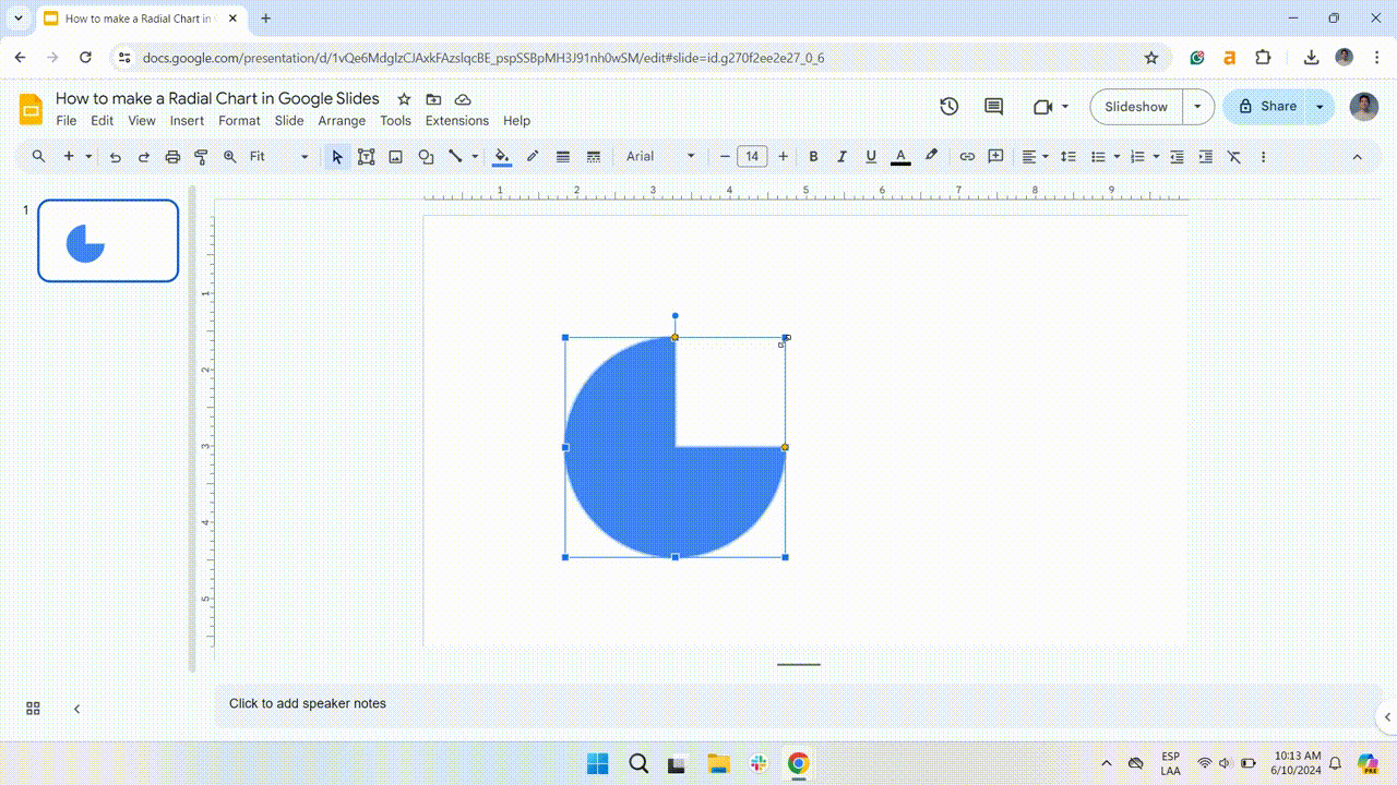
Resize the pie chart
- Click on the shape to resize your pie chart, and a selection box with dots will appear.
- Select and drag any of the yellow dots to change the size of your shape.
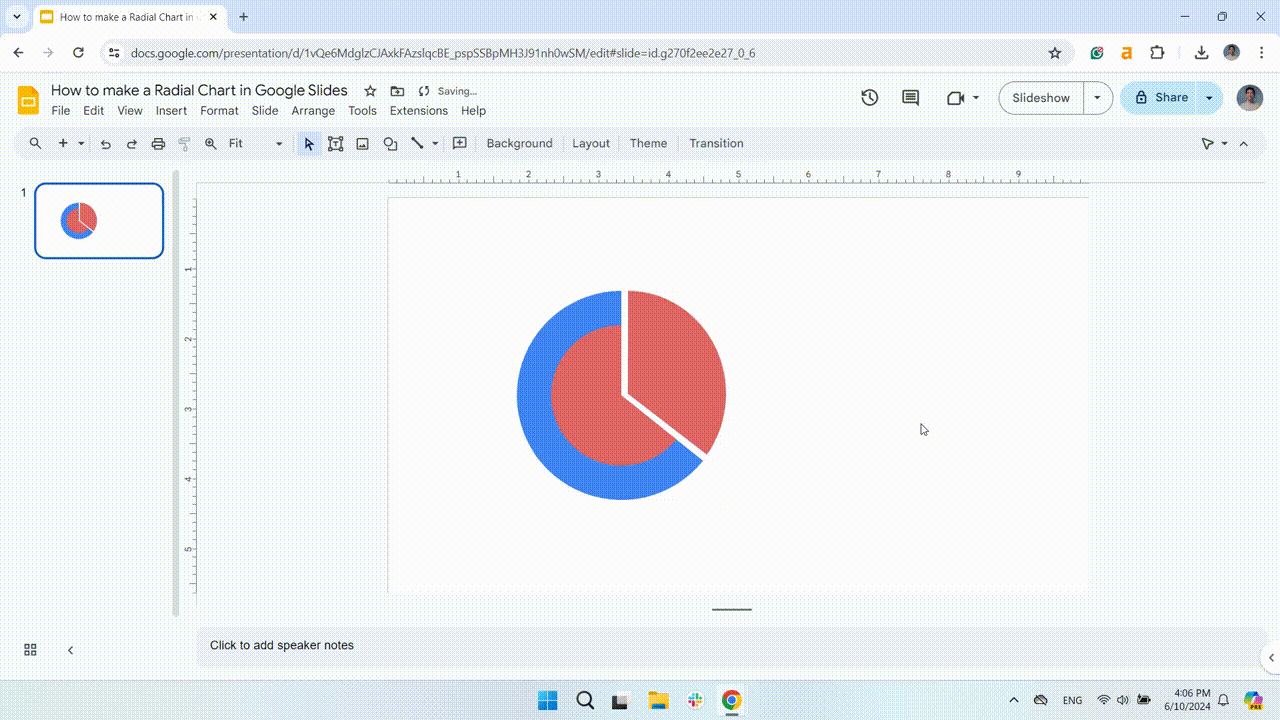
Duplicate the pie chart
- After resizing the shape, copy and paste it (Ctrl C + Ctrl V or Cmd C + Cmd V on a Mac).
- Then, position the duplicate over the original shape and use the red guidelines to align them correctly.
Change the color and position of the duplicate chart
- To differentiate it, click on the duplicate chart and select Fill Color. Choose a different color from the Fill Color options.
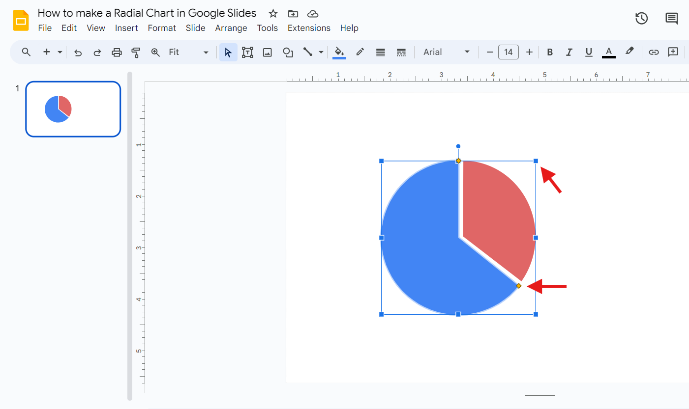
- Once you've aligned both pie charts, click the duplicate chart, and a selection box with dots will appear. Then, rotate the duplicate pie chart.
Resize the duplicate chart
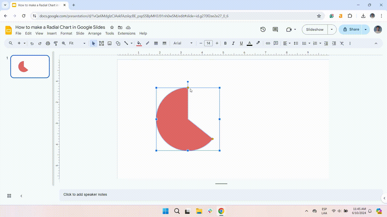
- Separate the duplicated radial chart from the original. Use the blue handles to resize it, creating a pie slice with some space.
- Resize the smaller piece by dragging the yellow dot until the radial lines are parallel. Make sure both charts are aligned.
Creating and styling the inner body
Make the first Inner Circle
- Duplicate the first pie chart (the blue one) and change its color to red to set it apart from the original. To do this, use the Fill Color option.
- Next, make it smaller than the original and align it directly over the original to ensure it looks good.
Making the second Inner Circle
- In this step, duplicate the second pie chart (the red one) and change its color to blue to make it different from the original.
- Next, reduce its size to be smaller than the original. Adjust it until it looks good.
Inserting data labels
Create data labels
Assign labels to explain the meaning of each section.
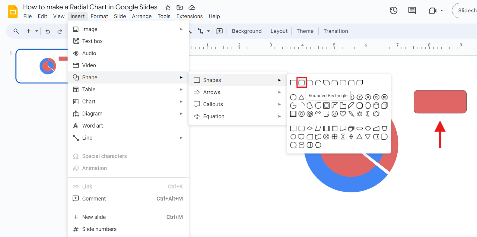
- Go to the Insert tab > Shape > Shapes. Next, in the rectangles section, select the rounded rectangle option.
- Place the rectangle where you want your label.
- Repeat this step, changing the second color’s rectangle to blue (in this example). To change the color, click the rounded rectangle and select Fill Color.
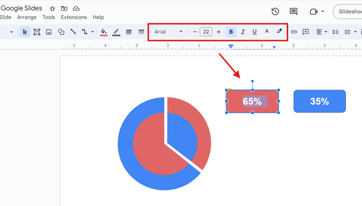
Insert text in labels
- Double-left-click on the rounded rectangles we made earlier and start typing.
- Select the text and use the formatting tools available on the Top Bar to style it.
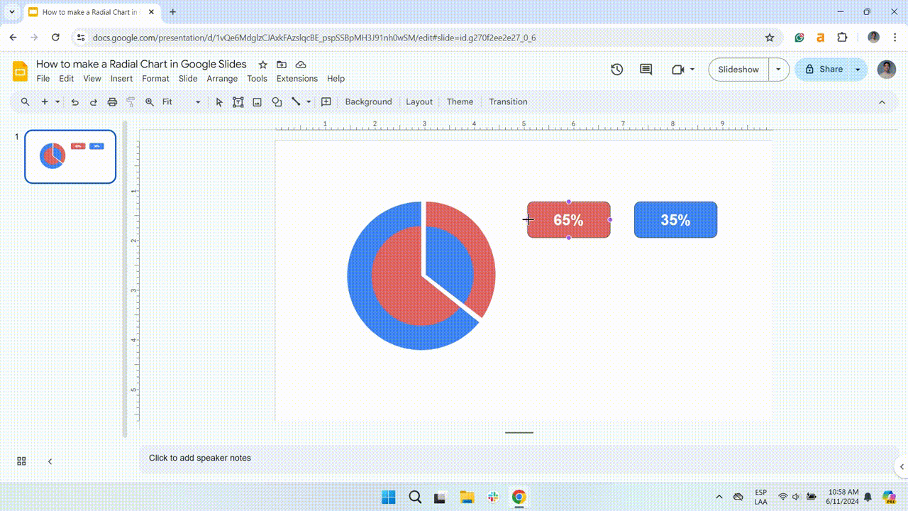
Connect the labels to the radial chart
To connect the radial bar chart labels, you need to add lines.
- For the first label, click on Select Line and choose Line. Create a line that connects your label (the red one) to the chart. Hold shift to draw a perfectly horizontal line.
- For the second label, click on Select Line and choose Elbow Connector. Create a line that connects your label (the blue one) to the chart.
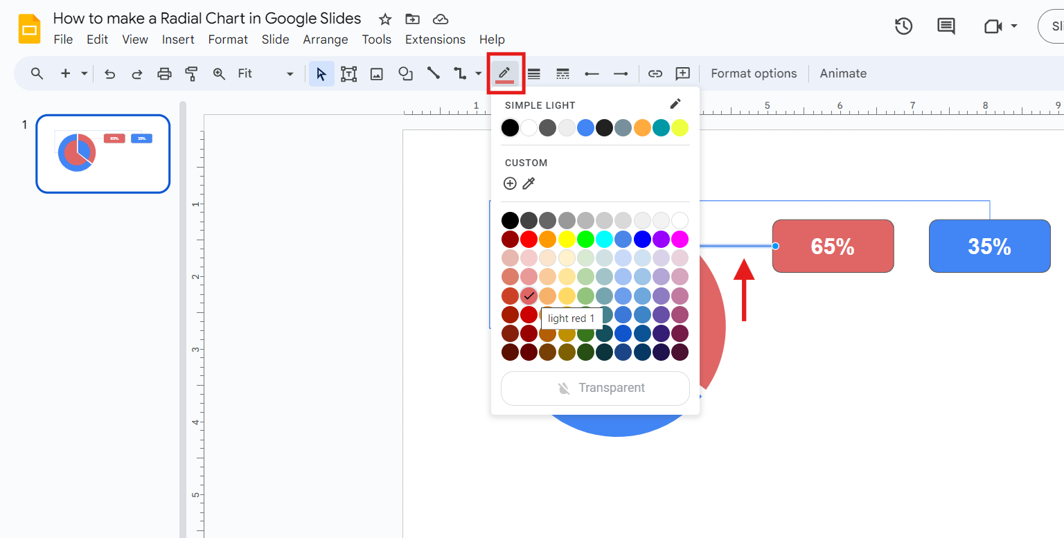
Change lines color
At this point, it’s important to ensure brand consistency.
- Click on the line and go to the Line color tab to change its color.
- Pick a color that matches your radial chart design. Repeat this for the two lines.
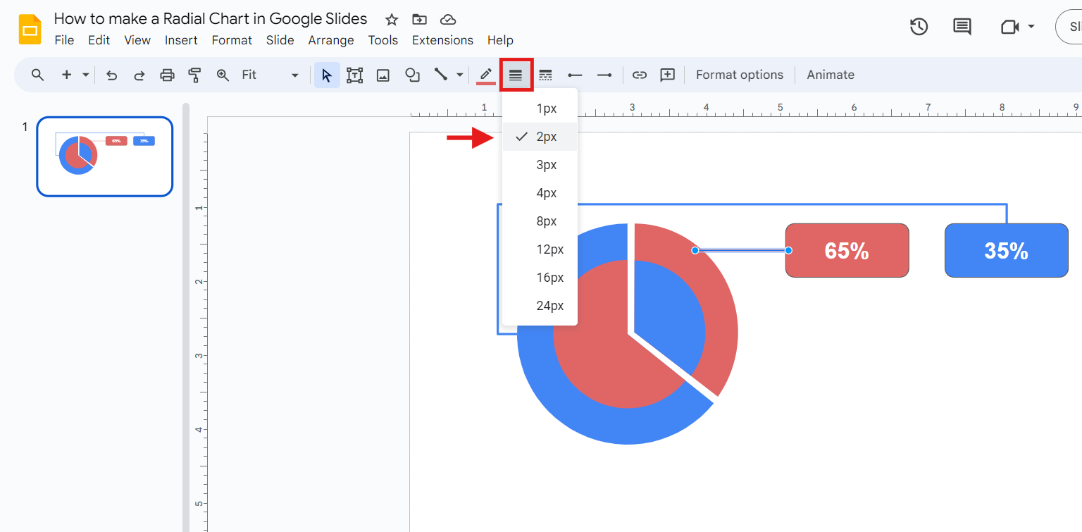
Change lines thickness
Since the lines are thin by default, make them thicker to enhance visibility.
- Click on the line and select Line weight at the top bar. Choose the weight you prefer.
Adding text
Insert titles
- Go to the Insert tab. Next, click the Text Box option. Finally, draw a text box under each label and start typing.
- When you select the text box, you will see more options to align the text on the top right bar.
Include descriptive text
- Go to the Insert tab, click the Text Box option, and drag a text box below each title. Then, start typing.
- Finally, apply styling and confirm everything is correct.
You can add info to the inner sections to give your explanation more context. Display information such as category names, the number of units sold, campaign names, your target audience, and more.
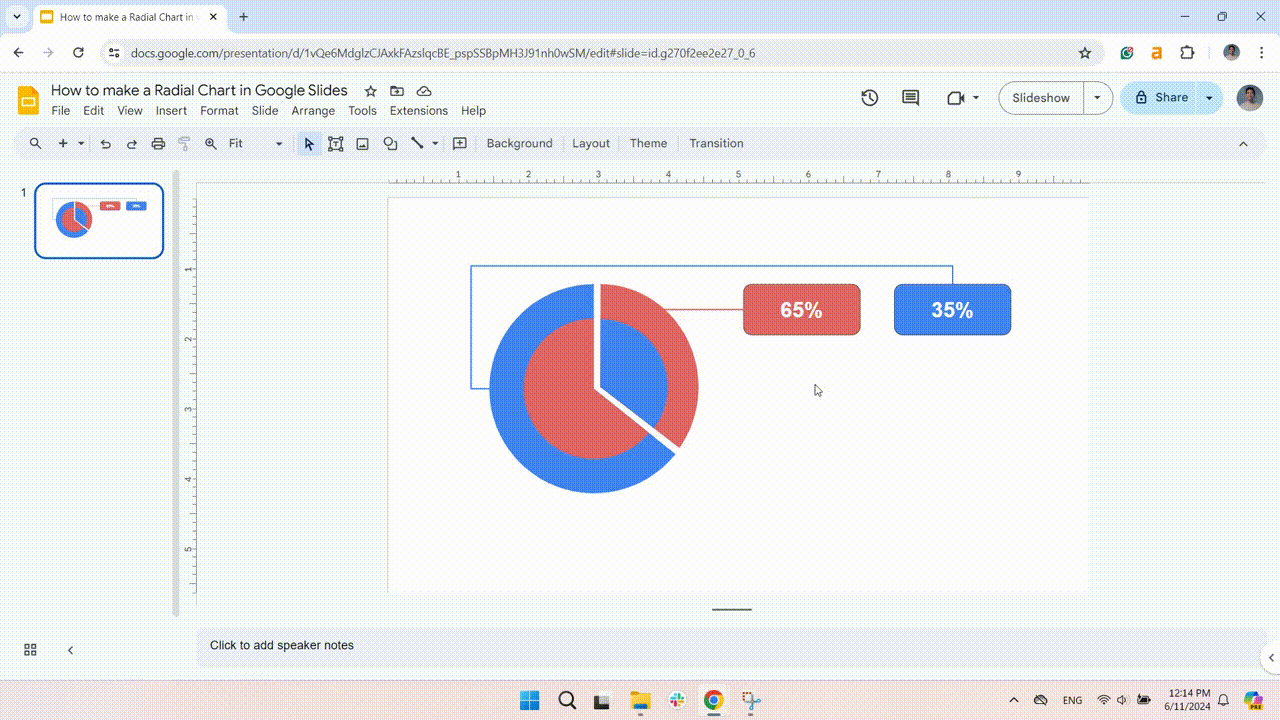
And that’s it, a stunning radial chart for your presentation!
Free Google Slides Radial Chart Templates
In this article, I’ve shown you why a radial diagram is a powerful tool for displaying data. However, becoming a pro takes time and effort. The good news is that using templates can easily enhance your presentations!
Luckily, our Templates by 24Slides platform has hundreds of free Google Slides chart templates. It includes different types of radial charts, such as donut charts, radial bar charts, pie charts, and more.
All are fully editable; just insert your data, and you’ll get a shining presentation in a few clicks. You can also combine charts to add a creative touch. Enjoy customizing them!
Just remember to keep it simple and ensure brand consistency. This approach can make all the difference.
Deliver powerful presentations with the support of 24Slides
At 24Slides, we have over 10 years of experience creating visually stunning presentations that effectively communicate your message.
You can focus on the content while 24Slides' expert designers bring your ideas to life. In less than 24 hours, you’ll get a fully editable presentation that will wow your audience.
With an average satisfaction score of 4.8 out of 5 from over 1.3 million redesigned slides, it's safe to say we're incredibly proud of the product we deliver.
Are you ready to see the magic happen? For just $1, we'll create a unique, customizable one-slide presentation that perfectly represents your brand.

Searching for ways to upgrade your Google Slides presentations? Start with this content!
- Ensuring Brand Consistency: How to Make a Successful Brand Implementation Strategy
- Expert Tips for Creating Charts, Diagrams, and Tables in Google Slides
- How to Create a Flowchart in Google Slides
- How to Make a Pyramid Chart in Google Slides? + Free Templates
- How to Make a Timeline in Google Slides? Guide for beginners