Expert Tips for Creating Charts, Diagrams, and Tables in Google Slides

Have you ever found it difficult to translate complex ideas in a way that engages your audience? You're not alone. We know that effective communication is key, but how to achieve it? That's where visual tools come into play.
Google Slides offers several options for displaying data, making your message clearer and more impactful. However, to unlock its full potential, you need to know what options are available and take advantage of them.
This guide delves into tips and strategies from our team of 200+ world-class designers. Below, you can learn their best practices for creating Google Slides charts, diagrams, and tables. Stay with us!

Here are the topics we'll cover; feel free to explore what's most helpful for you:
- Google Slides Charts
- Google Slides Diagrams
- Google Slides Tables
- Free Google Slides Templates
- Seeking to boost the impact of your presentations? 24Slides has you covered!
Google Slides Charts
Incorporating charts into your Google Slides presentations is a game-changer for showcasing data. Charts make information clearer and more engaging, helping the audience quickly understand and remember key points.
They’re great tools for showing trends, comparing patterns, and making decisions easier.
In addition, they are dynamic and can be customized, allowing users to adapt them to their needs. But first, let's learn how to add charts.
How to Make a Chart in Google Slides?
Google Slides offers two options for adding charts: creating them from scratch or importing them from a Google Sheets document. Here is the first method:
Create a chart from scratch
Here is the step-by-step on how to make a graph on Google Slides:
- First, click on Insert in the menu. Then, click on Chart and select your favorite chart type. Just choose the one that fits your needs.
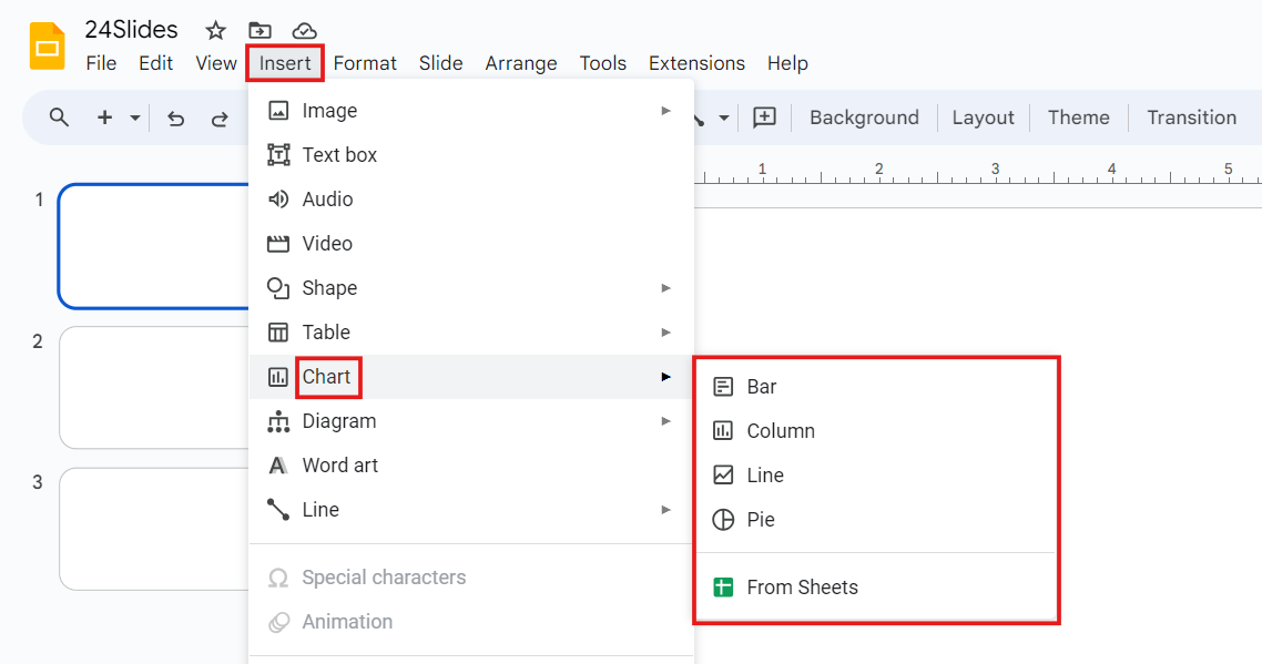
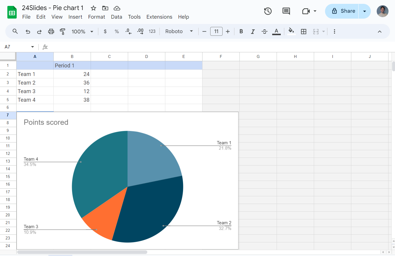
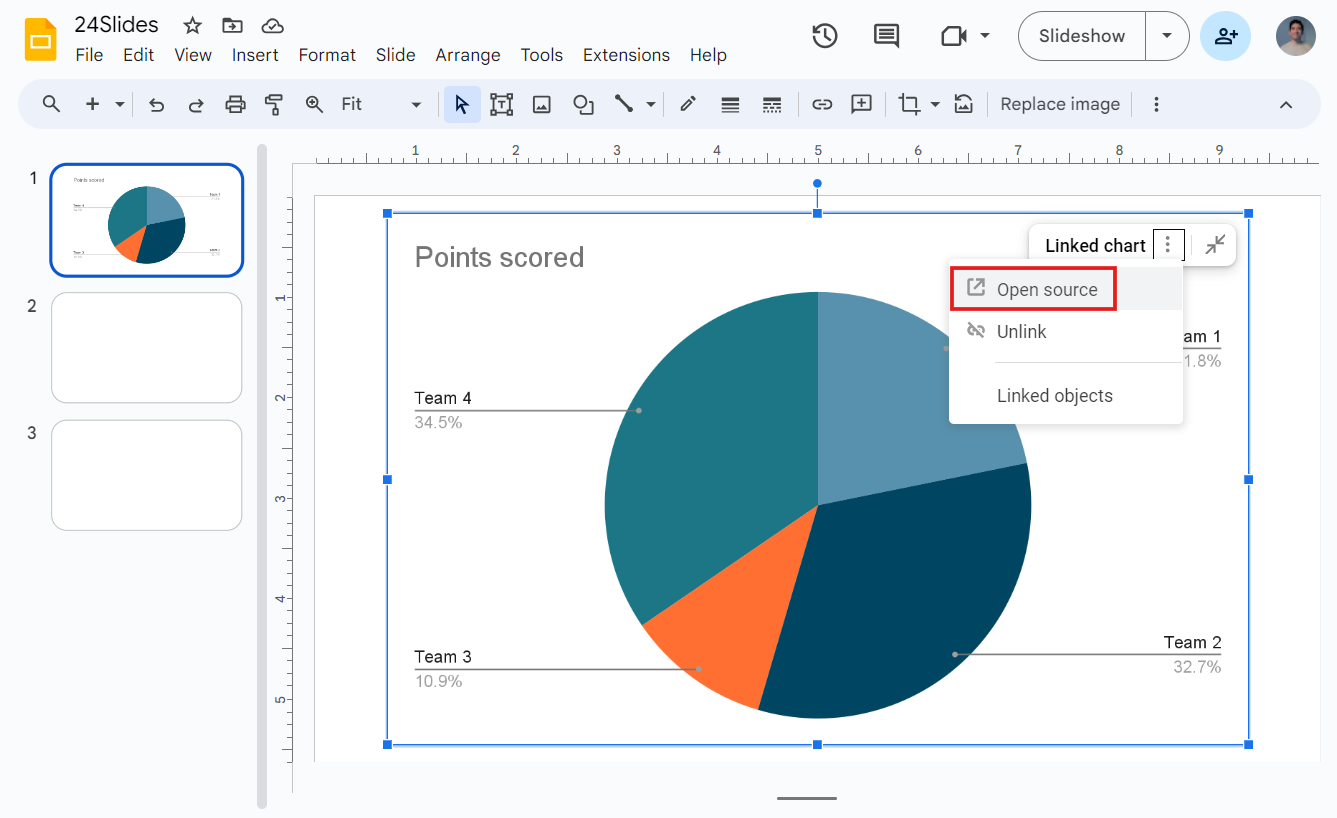
- Your selected chart will be inserted as an image. To edit it, click on the three dots in the upper right corner and select Open Source. A Google Sheets document will open.

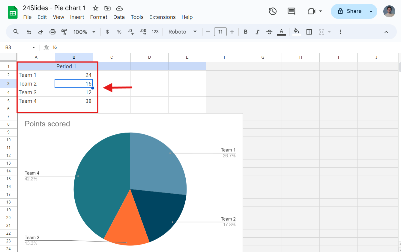
- This Google Sheet document contains your data. Here, you can edit your chart (data and design). Any edits you make will instantly update the chart in the Google Sheet.
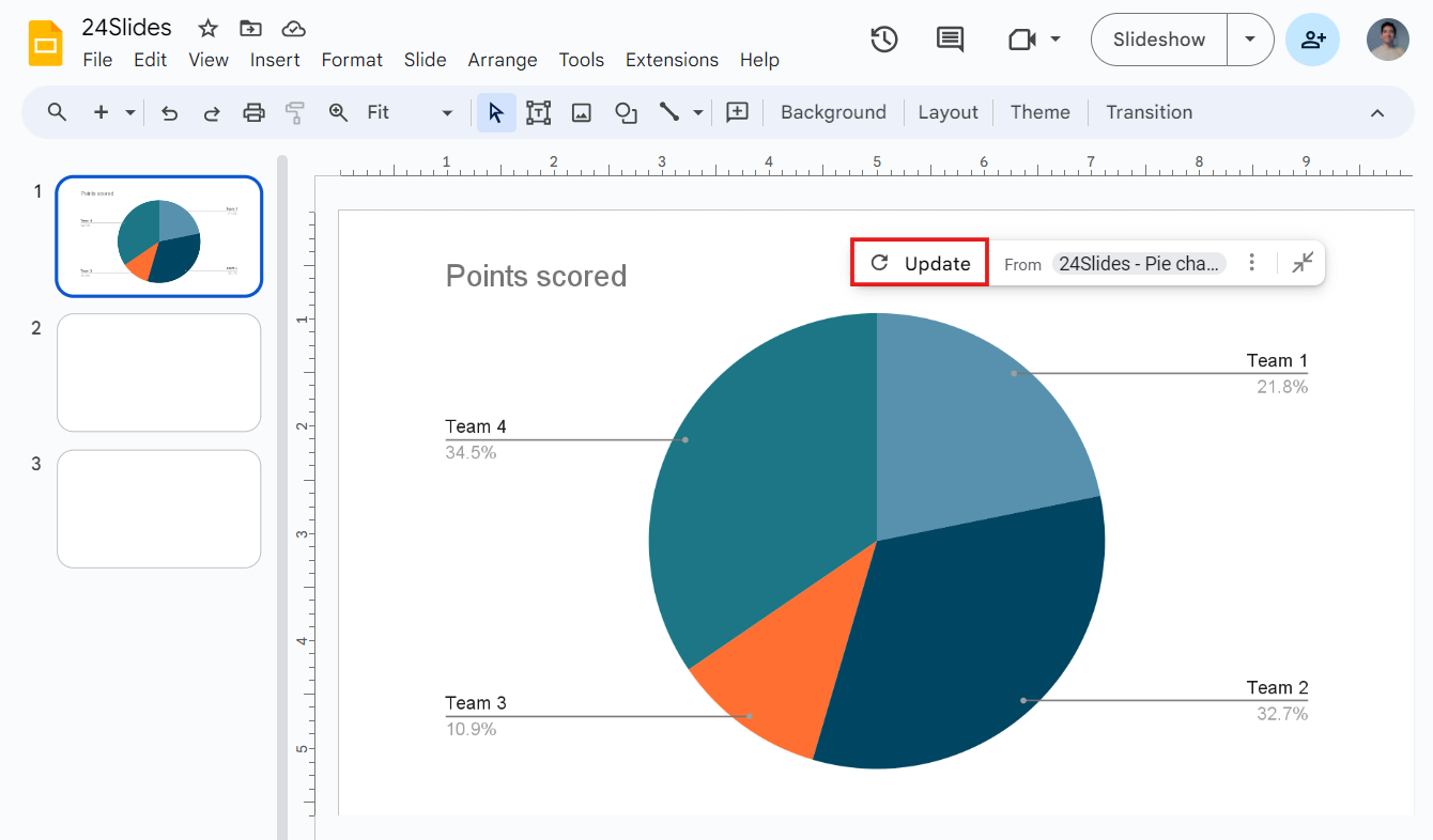
- After making your adjustments in Google Sheets, go back to Google Slides and click Update to implement the changes.
Adding charts from Google Sheets
If you've made a chart in Google Sheets, you can link your presentation to the spreadsheet to add it to your slides.
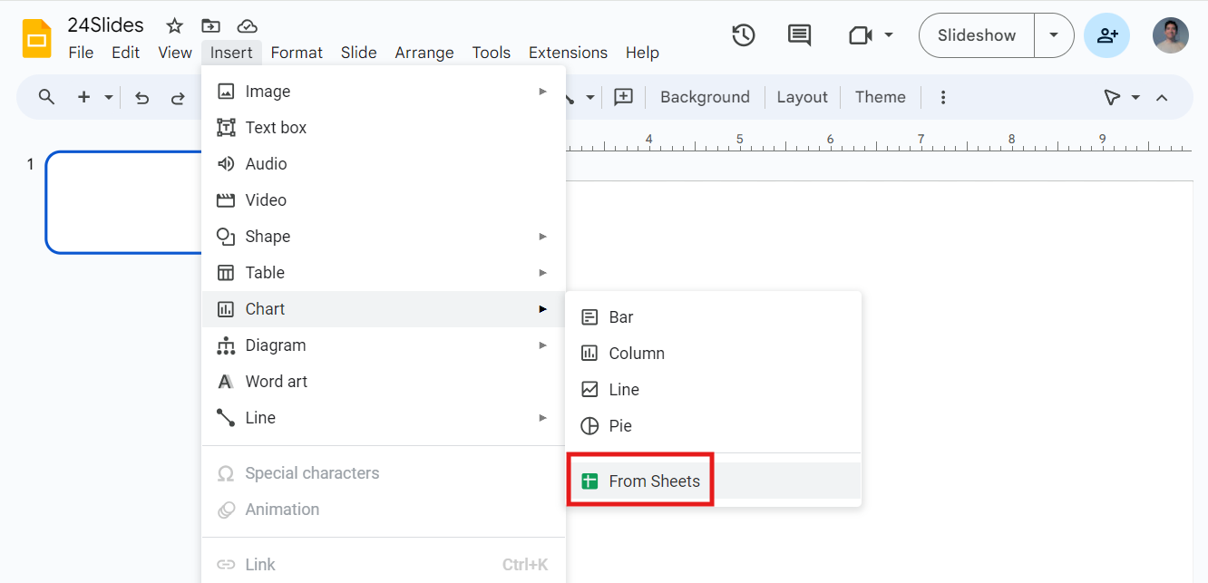
- First, click on Insert in the menu. Then, click on Chart and select From Sheets to add your previously created chart.
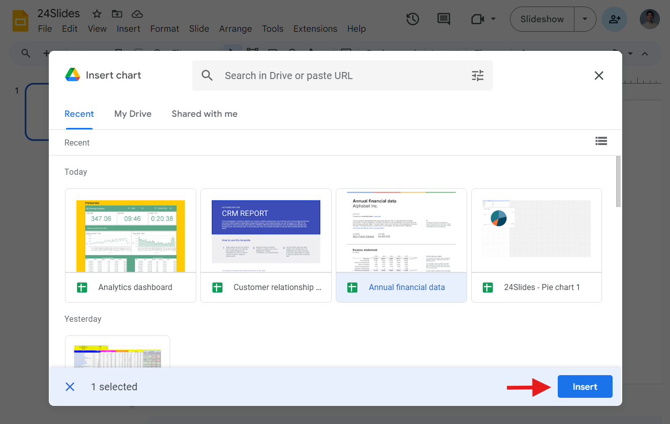
- A window showing all your spreadsheets will appear. Select the one with your chart, and then press Insert.
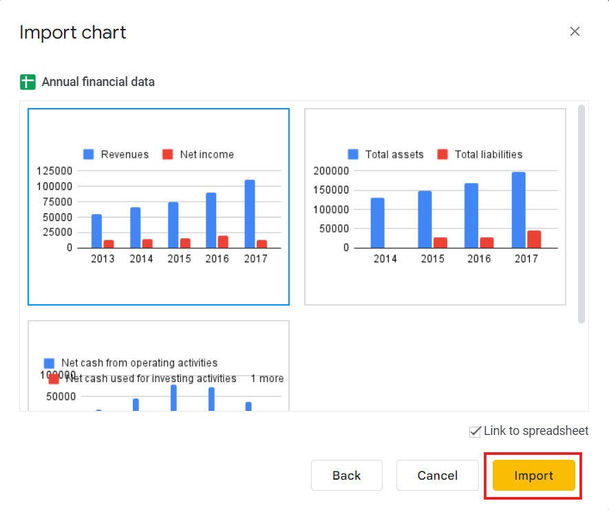
- In the next dialog box, pick your chart and ensure 'Link to spreadsheet' is selected. If not, you won't be able to edit it later. Finally, click Import.
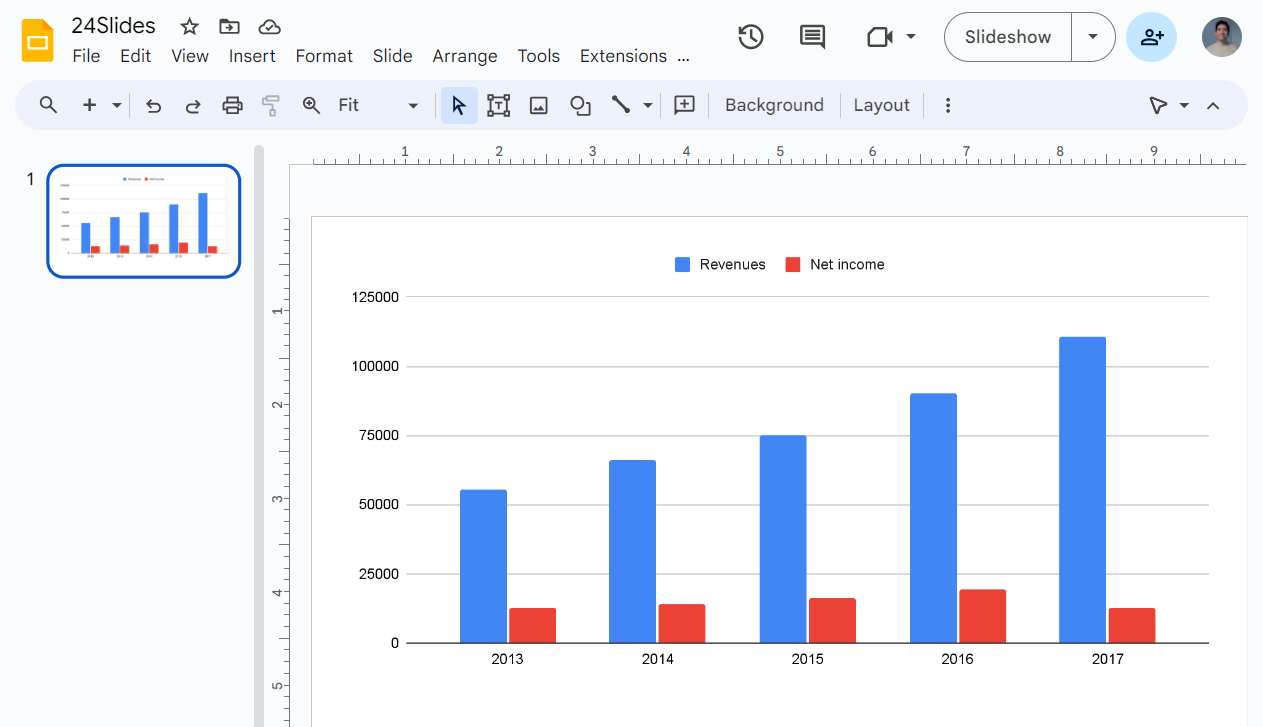
- That's everything! Your slide now includes your chart.
Editing Google Slides Charts
Pick the chart that you want to customize. To edit it, click on the three dots in the upper right corner and select Open Source. A Google Sheets document will open.
Update the data generated by default. You will find it at the beginning.
You can edit the background or chart colors by selecting the element and picking a color from the right panel. As an alternative, click the three vertical dots and choose Edit chart.
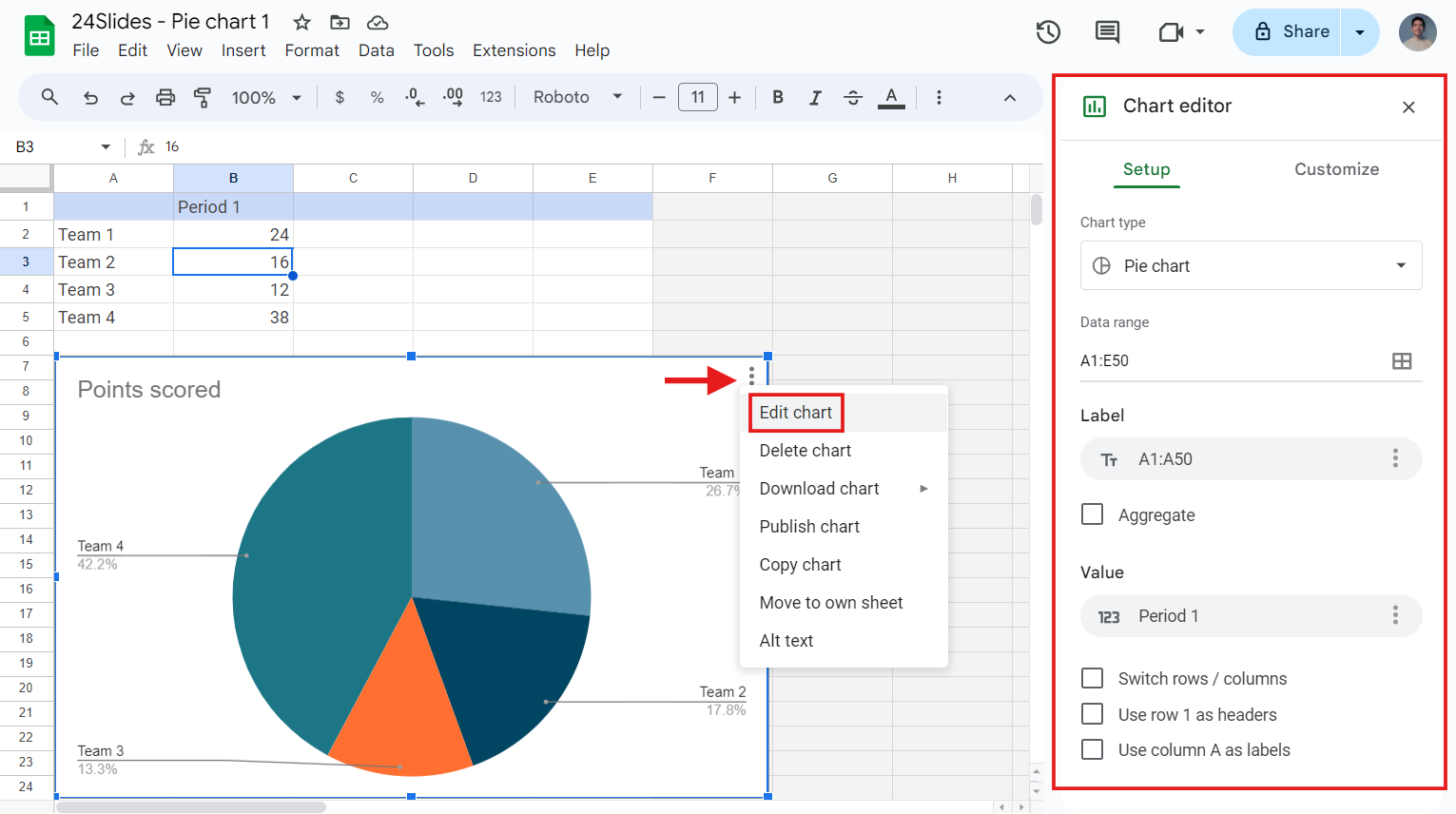
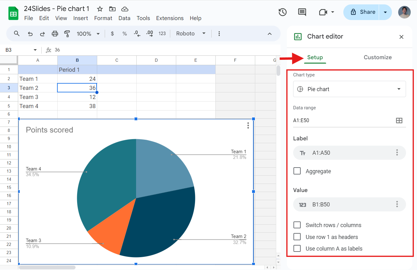
In the Setup tab, you can change the chart type, select the data range, add operations, and change the headers. You can also modify how the data is displayed in the chart.
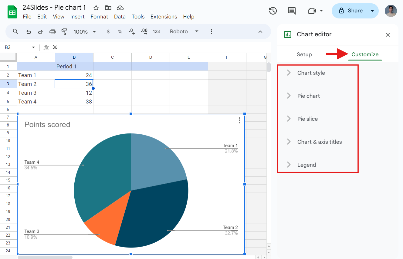
In the Customize Tab, you can adjust different settings. Let's review those that you will always find:
- Chart Style: Here, you can adjust the background color, the color of the chart border, and the font. You can even maximize the graphic and convert it to 3D.
- Chart & axis titles: Enter the text's title and select its font, format, size, and color.
- Legend: Set the format and position of the legend.
You will see different options depending on the chart you are working on. For example, with a bar chart, you can edit the periods' colors in the series submenu, enable data labels, and create error bars.
Bar or line charts have Horizontal and Vertical axis submenus for customizing axes and labels. Some charts have a Gridlines submenu where you can enable gridlines, adjust their color, and change the numbers.
Click the Update button to apply these changes in your Google Slides presentation. Or, copy the chart from Google Sheets using Ctrl/Cmd + C and paste it into your presentation.
How to Format a Chart in Google Slides
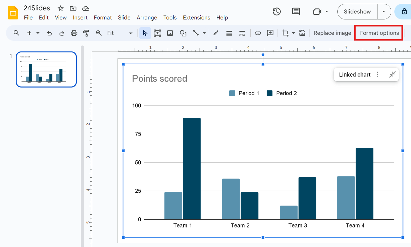
At this point, consider making additional edits to your chart, such as changing its colors or adjusting its format within Google Slides. To do this, select the chart and click Format Options in the top toolbar.
In the right pane, you'll find options to adjust the chart. Expand any menu by clicking on it, then select the formatting options you want to use in Google Slides.
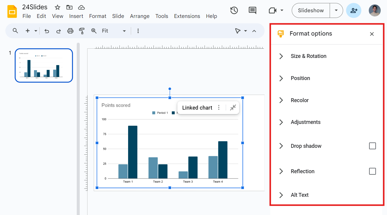
Google Slides lets you use formatting options like:
- Size and Rotation: This menu lets you change the chart's dimensions and rotation by setting the width, height, and scales. You can also resize and rotate the chart by simply dragging and dropping.
- Position: Use the drop-down menu to set your chart's position to the top left or center.
- Recolor: This menu allows you to change the chart's colors by choosing a color scheme from a list.
- Adjustments: From this menu, you can adjust the chart's opacity, brightness, and contrast.
- Drop Shadow: Use this menu to apply a drop shadow to your chart and modify the color, opacity, angle, distance, and blur radius.
- Reflection: You can apply a reflection to the chart and customize its appearance with opacity, distance, and size settings.
- Alt text: This option lets you describe the visual elements for people who might have trouble seeing your content.

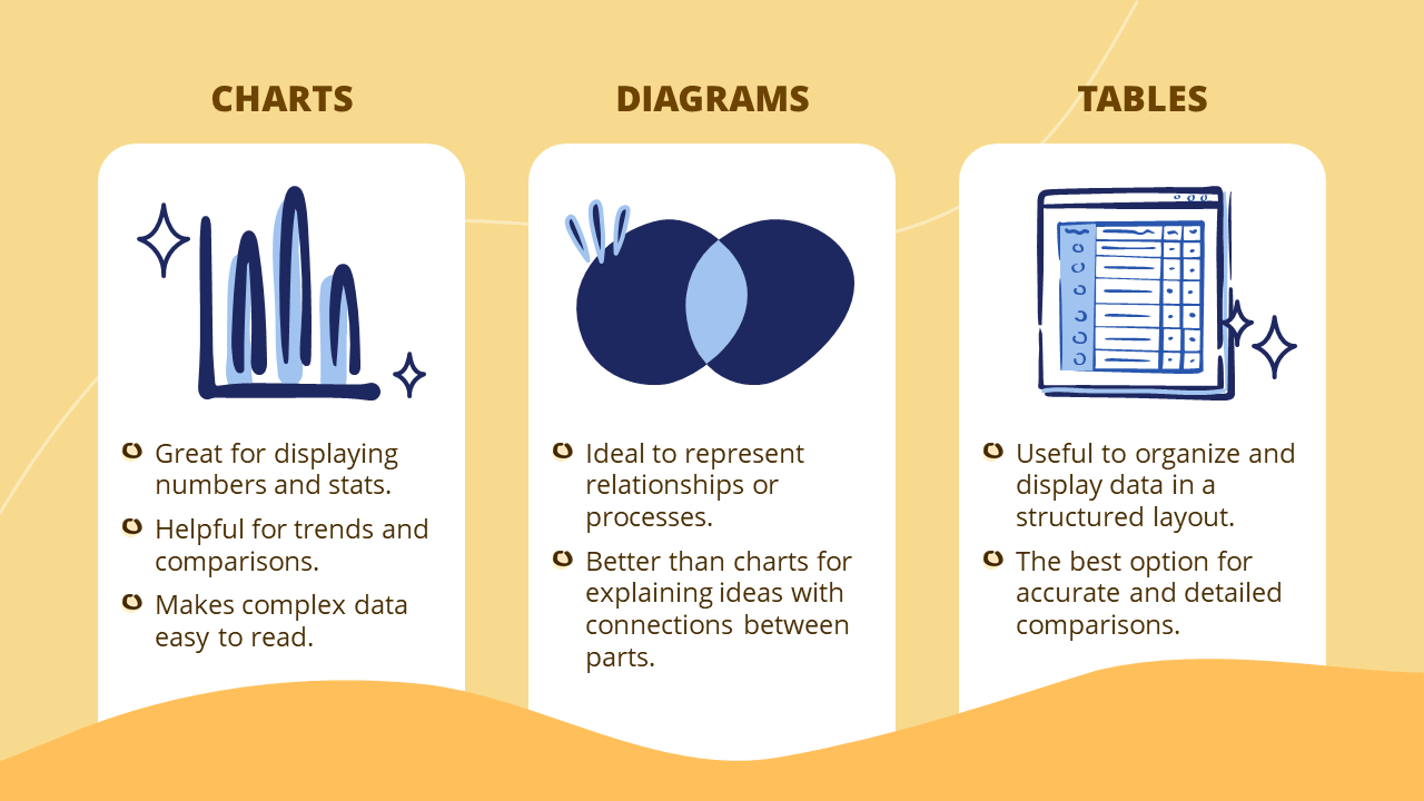
Charts vs. Diagrams vs. Tables
Google Slides has many ways to make information easy to understand. But to do it best, you need to know which tool to use depending on what you want to communicate and how you want to present it.
Imagine you run an online clothing store and want to showcase your year's achievements in a compelling presentation. Here's how you can use Google Slides data visualization tools:
- Charts: A bar chart could be the most convenient way to compare the monthly sales of different categories.
- Diagrams: On the other hand, a diagram is more helpful for explaining the steps of an online purchasing process.
- Tables: Lastly, you can use a table to display the prices and features of your different products.
Remember, choose the best option based on your information.
Types of charts in Google Slides
We already know charts are great for displaying numbers, making comparisons, and simplifying complex data. However, which one is the best for your specific needs?
Below, we’ll explore the four types of charts you can use in Google Slides. Understanding them will help you select the perfect one for your audience.
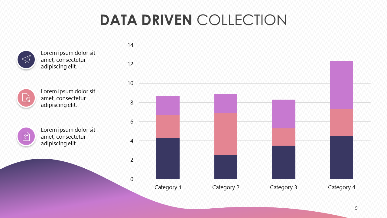
Column chart
Column charts are highly effective for comparing different categories or groups of data. This is why it's awesome for checking out sales, surveys, or financial data.
The vertical bars show changes over time and trends, making information easy to read. Here, you can highlight the difference in quantities.
Are you considering adding it to your presentation? First, click on “Insert” in the menu. Then, click on “Chart” and select “Column Chart.” That’s simple.
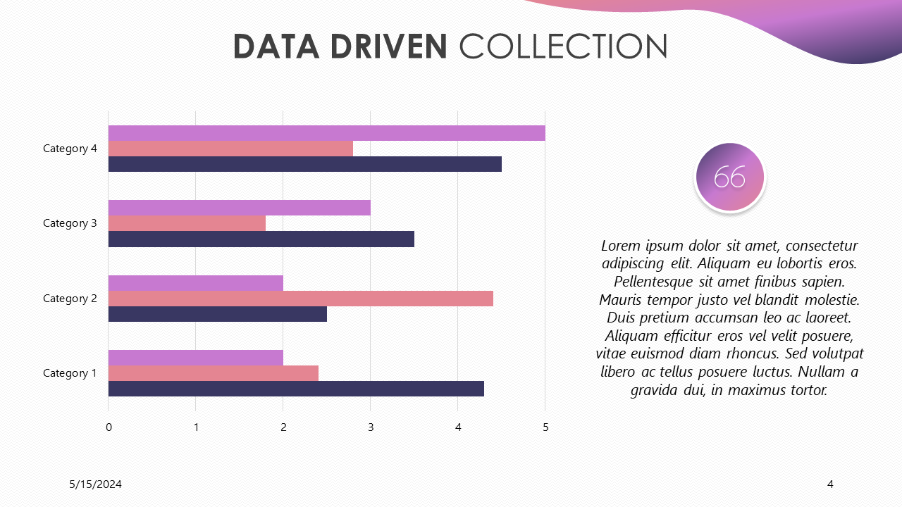
Bar chart
Bar charts make it simple to understand data at a glance. Also, they take up less space, making them ideal for presentations with long labels or large datasets.
Like the column charts, they are useful for illustrating trends and making comparisons. However, the horizontal layout might change how people see the data; keep this in mind.
Now, you just need to know how to add a bar chart in Google Slides. To start, go to “Insert” in the menu. Next, click on “Chart” and select “Bar Chart.”
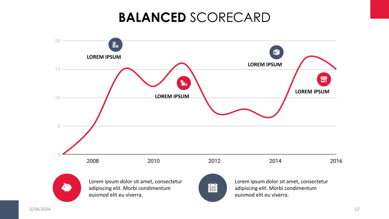
Line chart
Line charts are perfect for showcasing trends over time. They make it easy to identify patterns and fluctuations, enhancing the clarity of complex information for the audience.
You can combine it with other charts, like adding it to a column chart, to show multiple data sets at once. This combination is often referred to as a combo chart.
Are you curious about how to create a line chart in Google Slides? Begin by clicking on the “Insert tab”, then select “Chart,” and choose “Line Chart.”
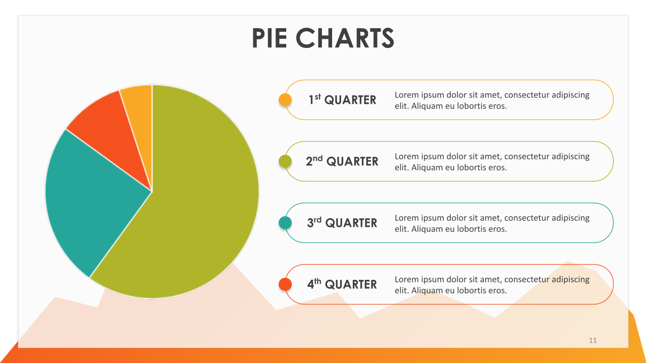
Pie chart
Pie charts are the best option for displaying percentages and proportions. They instantly highlight the largest and smallest values, emphasizing differences between groups.
To make your pie chart unique, customize it with individual details and designs. However, keep the chart to six or fewer sections to maintain clarity and impact.
But how to make a pie chart in Google Slides? Start by clicking on “Insert” in the menu. Next, choose “Chart” and then “Pie Chart.”
“Columns, bars, lines, and pie charts are top picks for clients because they're more descriptive and easier to get for the audience.” Briana/ Design Manager
Google Slides Diagrams
Using diagrams can make your presentations more exciting and engaging. They break down complex concepts into simpler parts, making them easier to understand.
Many people confuse charts and diagrams in Google Slides. However, diagrams have a special feature: they are perfect for showing relationships or processes. On the other hand, charts are great for displaying numbers and making comparisons.
You can customize and adapt diagrams to perfectly convey your message. To unlock their full potential, let's begin by learning how to add them.
How to Make a Diagram in Google Slides?
- First, click on Insert in the menu. Then, click on Diagram and pick the style that best fits your message. In this example, we went with “Cycle”.
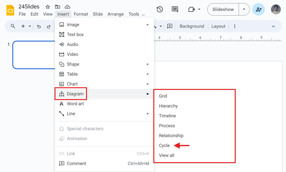
The “Cycle” panel will appear on the right; navigate and select a style for it.
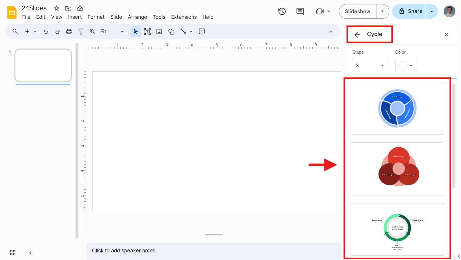
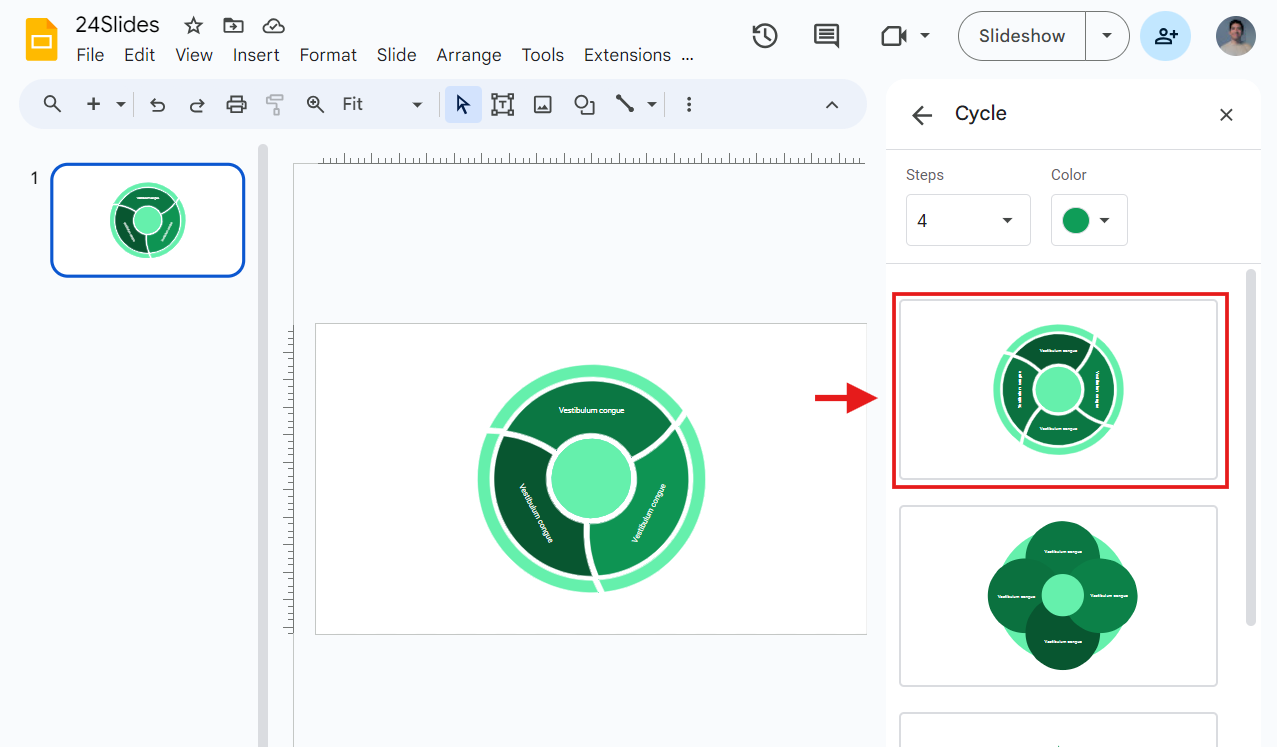
- Once you have chosen your favorite style, you can change the color and number of steps at the top. Remember, the "Steps" option might change depending on the type of diagram you pick.
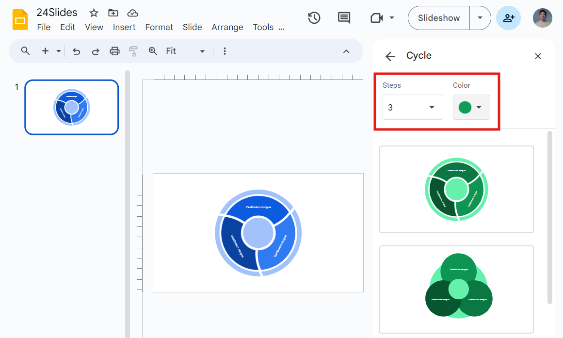
- Pick a diagram to put it on your slide. And that’s it!
The most important types of diagrams in Google Slides
We've looked at the benefits of adding diagrams to your Google Slides presentations. But with so many options, you might be asking: Which diagram should I choose?
After an in-depth search, I compiled the most searched diagrams by users according to Semrush and their key features. Here they are!
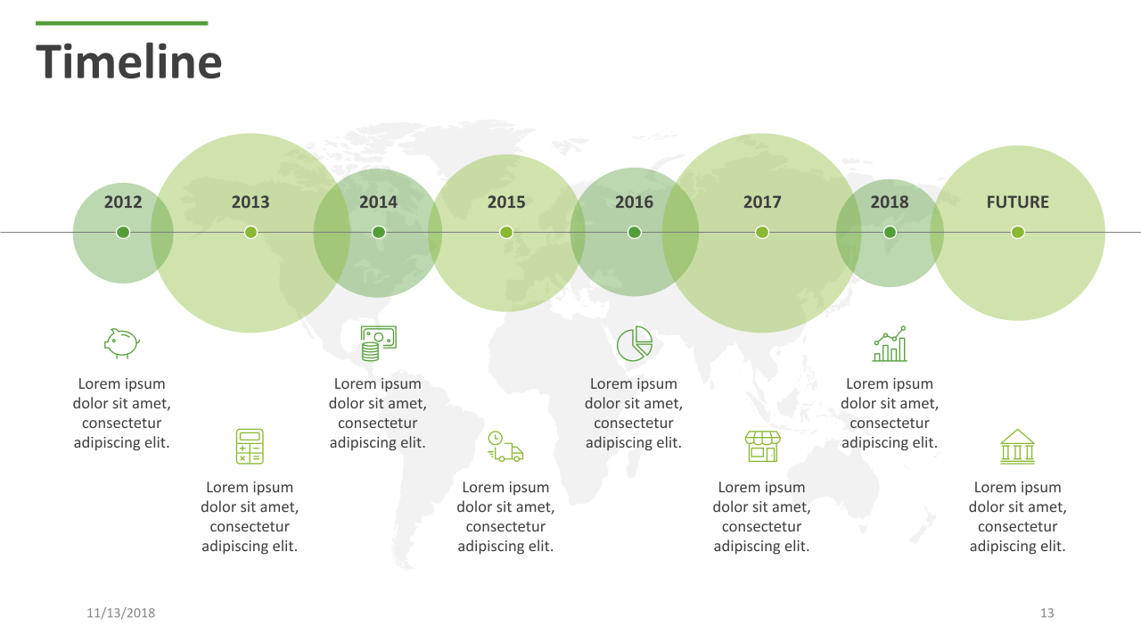
Timeline
A timeline is the best way to represent chronological data. It helps the audience track the sequence of events over a specific period.
Placing events in a linear format makes information clearer and more engaging. Timelines let you share your company's history, outline project phases, or highlight important milestones.
If you're considering adding it, here's the easiest way to make a timeline in Google Slides.
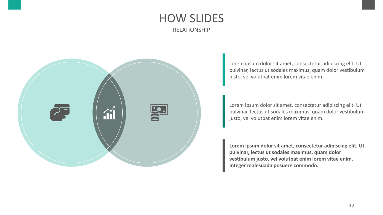
Venn Diagram
Venn diagrams are the most efficient way to show relationships between data sets or concepts. That's why they're popular for comparing products and looking at data.
Overlapping circles let you quickly spot common characteristics between distinct ideas. This helps you compare what's the same and what's different between the chosen groups.
Need help implementing it? Here’s how to make a Venn diagram on Google Slides.
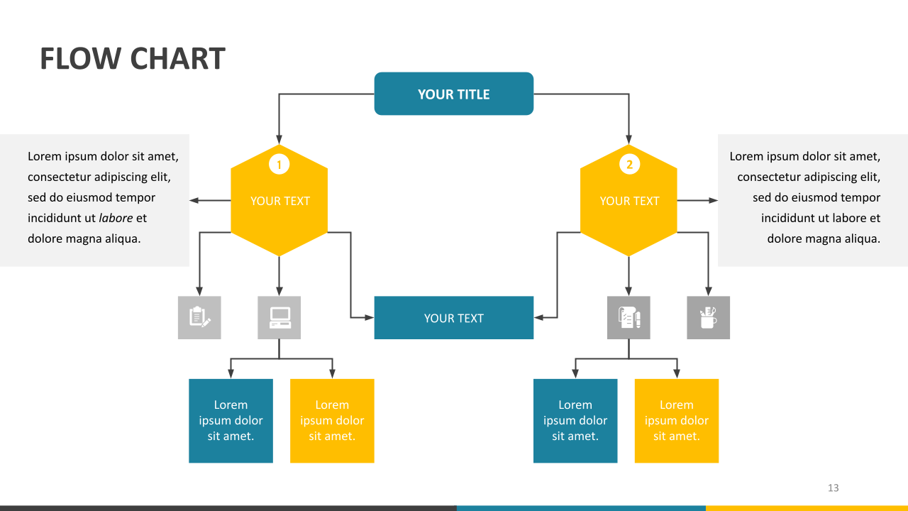
Flowchart
Flowcharts represent step-by-step processes by symbols or lines. Like timelines, they represent a succession of events. However, flowcharts don’t have specific dates.
Flowcharts use symbols to represent actions or decisions, and lines connect them to show what follows. They can even be circular, meaning they are recurrent processes.
Now, you just need to learn how to create a flowchart in Google Slides like a pro.
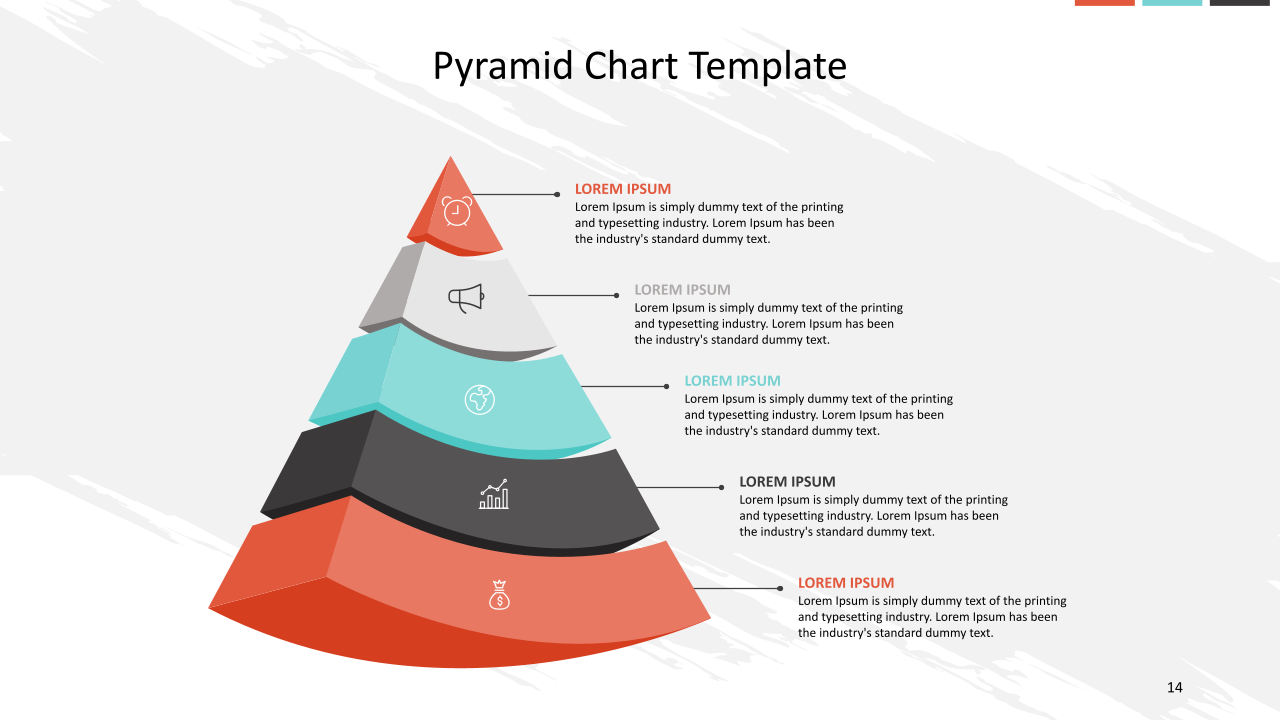
Pyramid Chart
A pyramid chart is a clear and engaging way to show hierarchical data. It shows how important each category is, so the audience can quickly understand the main points.
That's why they're handy for showing demographic info or sales performance in various product categories. With its great flexibility for customization, you can easily adapt it to your specific needs.
To excel with it, mastering how to make a pyramid chart in Google Slides is key.
How to Use Diagrams and Charts Effectively?
We already know the basics of using Google Slides charts and diagrams, but we want to go one step further. Here are the best tips for using diagrams and charts effectively!
- Choose the right graph. This step can help you better communicate your message. For example, a bar chart is better than a Venn diagram for comparing categories.
- Keep it concise. Eliminate unnecessary details to enhance clarity. Stick to the main points for a better presentation. Remember, simplicity is key.
- Add contrast. Use different colors to highlight ideas and make sure essential information stands out. For instance, you can attract attention using bold text with a light background.
- Maintain consistency. Use the same style and format for your presentation to ensure brand consistency. This can totally transform your presentation from okay to professional.
- Use labels properly. Ensure your titles are clear and descriptive to help your audience understand your message. If you need to provide additional context, you can use short legends.
- Be creative. Google Slides offers many tools for customizing charts and diagrams. You can experiment with colors, fonts, symbols, and more. With the combo chart option, you can even mix different charts.
Pro Tip: Creating a Google Slide infographic is one of the most creative ways to present data. They provide a visually engaging and easy-to-follow format for presenting complex information. Briana/ Design Manager
Google Slides Tables
Tables are one of the most classic options for presenting data. But where does their popularity come from? Here's the answer: they are simple to create, organize, and read.
They excel at detailed comparisons and summarizing information, which is why they're a top choice for visualizing financial or statistical data.
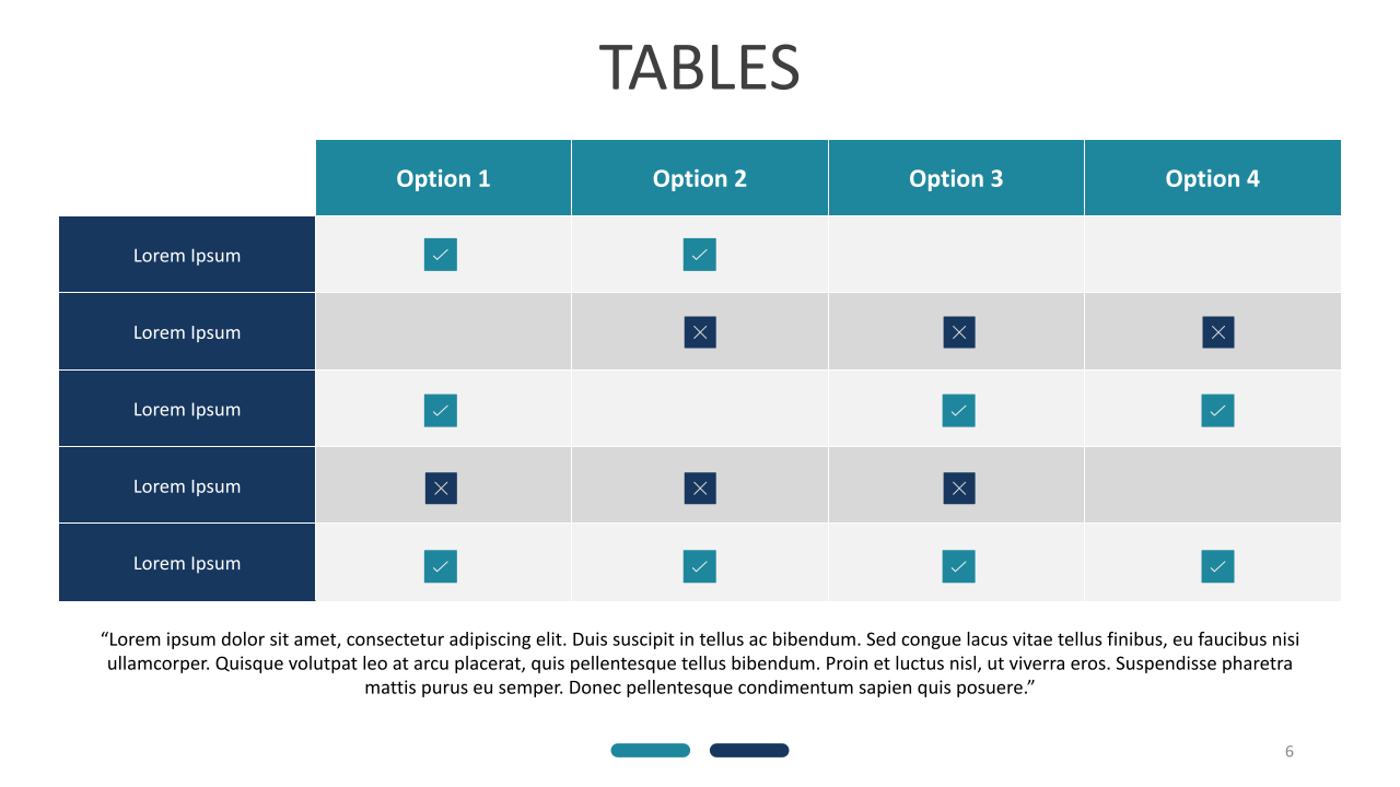
All you have to do is label it correctly and be creative, and reading it will be simple. Here’s an example:
How to Make a Table in Google Slides?
- First, open your presentation and pick the slide you want to edit.
- Go to Insert and click on Table. Then, select the number of rows and columns you need for your table.
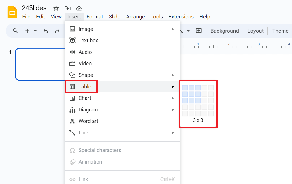
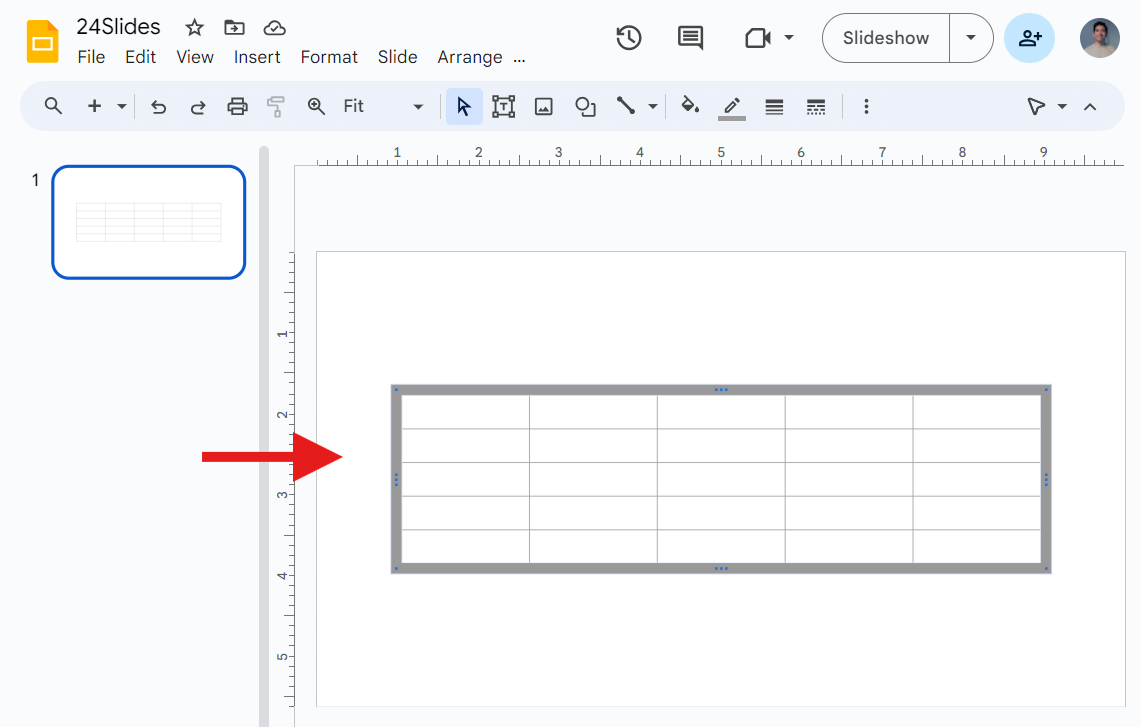
- The table will be on your slide. From here, you can change the number of rows and columns by adding or deleting them.
At this point, you may be asking yourself:
- How do I insert a row in a table in Google Slides? Right-click on a row, then select "Insert row above" or "Insert row below."
- How to make columns in Google Slides? Right-click a row, then click "Insert row above" or "Insert row below."
- How do you size a table in Google Slides? Adjust the table size by dragging its corners.
Now that we've covered the basics, it's time to add some flair to really make it pop!
How to edit a table in Google Slides
Knowing how to change the table design in Google Slides can make all the difference when conveying your message. You can do it using the Format options on the side menu or the Formatting tools on the top menu.
Here’s the step-by-step:
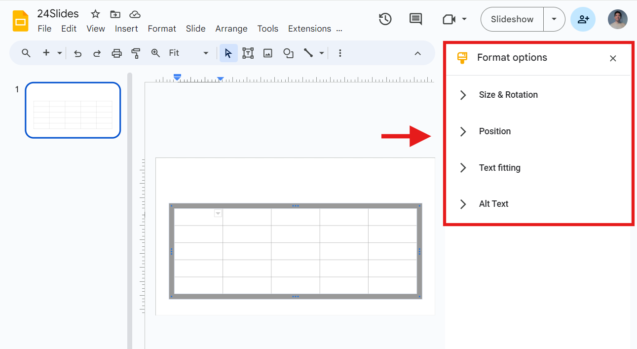
Right-click the table and choose Format Options. A menu will pop up on the right.
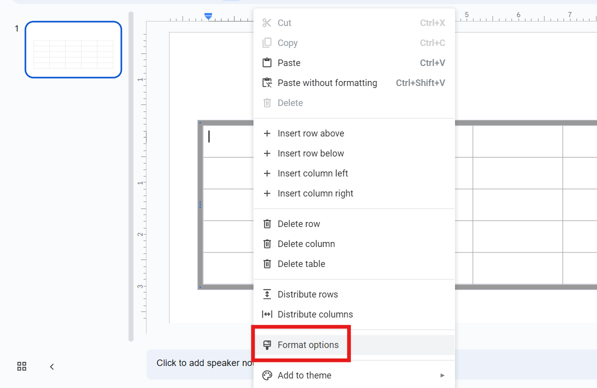
From here, you have the following options:
- Size & Rotation: You can change the “Width” and “Height” values here.
- Position: This option lets you change the “X” and “Y” values. Select the “From” value (Top Left or Center) that you’d like to use to guide you.
- Text fitting: Here you will see values like Indentation, Autofit, and Padding.
- Alt Text: This function lets you detail the visual elements for people who may face challenges seeing your content.
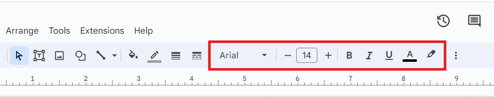
To format the text in your table, select the text and apply the Formatting tools on the top menu bar. Here, you can change the font, font size, text color, etc.
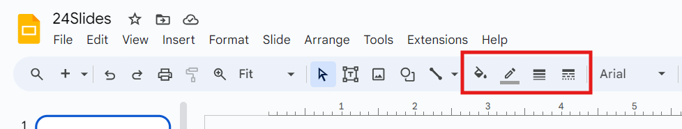
To customize your table a little more, you have the following options:
- To change the table's border or fill color, click on the fill color and border color icons and choose your preferred style.
- To add a border to your table, click the border weight icon in the menu bar and pick the size you want.
- To alter the border dash style, click the border dash icon and select your preferred style.
How to Use Google Slides Tables Effectively?
Tables are a classic and effective way to present information. With a few simple steps, you can create and customize your table. However, to make the most of them, you need to follow these golden rules:
Keep it simple
If you overload your table, it doesn’t matter how good your color palette looks. Simplicity ensures that your audience can grasp the key points.
Keep texts descriptive and concise. In presentations, using fewer words makes the message clearer and reduces distractions. Adequate spacing also enhances readability.
In tables, it is better to use approximations rather than long numbers. Remember to highlight the important points without cluttering them with details.
Highlight important data
As we’ve reviewed, you have “Formatting tools” to make your data stand out in Google Slides. You can highlight the most important information using bold, italics, and fun colors.
Use a color palette that adds contrast to the table, and consider adding shades for alternate rows. This will make your table easier to read.
You can even use icons or symbols to make your presentation more visually appealing.
Ensure brand consistency
Ensure the table matches your brand's colors, fonts, and overall style. This will not only maintain a professional appearance but also reinforce your brand identity.
Brand consistency ensures every interaction with your brand shows the same values and promise, helping build trust and reliability with your customers.
If you're unsure how to begin, here's how to make a successful brand Implementation strategy.
Be creative!
Google Slides offers many options to customize your tables, allowing you to perfect them. Try using different layouts, colors, and fonts. You can even add images or graphics to enhance the visual impact of your tables.
When presenting data, thinking outside the box can make all the difference.
You can create unique presentations that effectively convey your message by experimenting with table designs and visual elements.
Free Google Slides Templates
As I said at the beginning, if you ever struggle to explain complex ideas in an engaging way, you're not alone.
The good news is that our Templates by 24Slides platform has hundreds of free Google Slides chart templates. We also have Google Slides diagrams and table templates to improve your presentations.
All templates are fully editable, allowing you to insert your data. You can even combine charts, diagrams, and tables during your presentation.
If you like any of the examples in this article, you're in luck—they are all free and can be downloaded from our template platform. Enjoy them!
Seeking to boost the impact of your presentations? 24Slides has you covered!
Throughout this article, we have reviewed the benefits of using charts, diagrams, and tables in your Google Slides presentations. We also learned how to add, customize, and effectively use them.
However, becoming skilled in Google Slides takes more time and effort. Luckily, you can always rely on experts and forget about hard work.
With over 10 years of experience, we are the world’s largest presentation design company. We help professionals save time and create impactful presentations.
With an average satisfaction score of 4.8 out of 5 from over 1.3 million redesigned slides, it's safe to say we're incredibly proud of the product we deliver.
We provide presentations that are not only visually appealing but also tailored to your brand. It makes your message stand out and grabs your audience's attention.

Want to improve your Google Slides presentations? Check out this content!